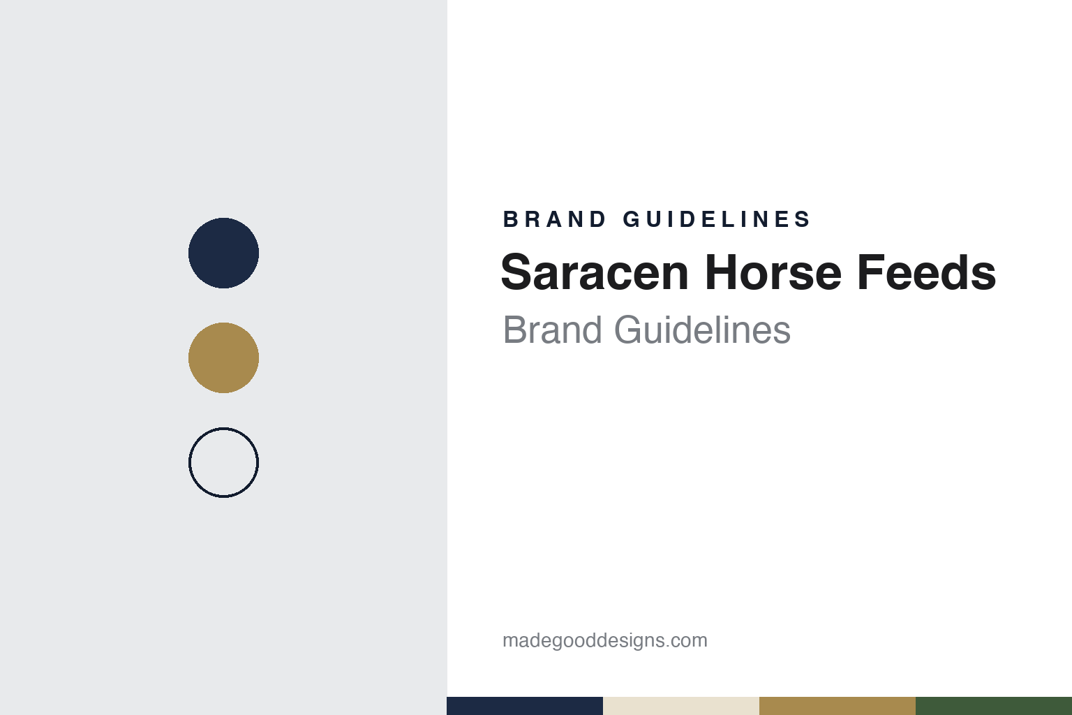
Saracen Horse Feeds Brand Guidelines
A family-owned Kent feed mill, redrawn around a shield.
Aa
Two constants: a navy, oat and brass palette and a precise grotesque register. Abstract homage — not a Saracen product or mark; no bag, shield or logo is reproduced.
Lillico
A horse feed company inside a Kent family business.
Saracen Horse Feeds is a horse feed maker based at Aylesford, in Kent, in the Medway valley. On its current website it calls itself “a family-owned British horse feed manufacturer,” and it says that every bag is “made at our Kent mill.” Its registered office, as listed by Companies House, is the same Aylesford address that W M Lillico & Son Ltd, the Kent agricultural merchant behind Attlee’s Country Store, gives as its own.
That shared address reflects the company’s origins. In June 2016 Saracen’s website, as preserved by the Internet Archive’s Wayback Machine, described the business as “the specialist horse feed division of the Lillico Group.” The same page said that Saracen “became a limited company in its own right in 1989,” and that it “remains within the Lillico Group and under the command of the fourth generation of the founding family, Patrick Walker.” Those are the company’s own words, and we give them as such.
The legal entity has changed since then. Companies House records show that the present Saracen Horse Feeds Ltd was incorporated in January 2010, and it lists one corporate person with significant control, Wls (2020) Limited, notified in March 2022. The register does not say how that holding company relates to the Lillico business, so we leave the connection there.
Today the company still describes itself as family-owned. Its website says it has been working with horses “for over 35 years” and talks about combining hands-on experience with research, without naming the family members who run it. In 2016 it said it stayed true to “the founding values of trust, integrity, quality, and commitment to exceptional customer service.”
The Lillico side of the family business is also still trading from Kent. Its website, under the name Lillico Attlee, presents Attlee’s Country Store and celebrates a century of Parsonage Mill as the store’s home.
Colour
A partnership with Kentucky.
The other constant in Saracen’s story is an American research partner. Kentucky Equine Research (KER), the equine nutrition company founded by Dr Joe Pagan in 1988, has supplied Saracen with expertise for feed formulation, ingredient technology and technical support. Equestrian Trade News reported in November 2021 that “Saracen has worked with Kentucky Equine Research since 2001,” and that the two companies were marking the anniversary with an online seminar series, quoting Saracen’s director John Rawdon-Mogg.
Saracen presents the link as exclusive. In 2016 its website called the company “the exclusive Kentucky Equine Research (KER) Team Member in the UK,” and in 2026 it still describes an “exclusive UK partnership” with KER. The 2016 page added that it was Saracen’s commitment to “nutritionally sound, innovative formulas” and “accessible personal service” that had led it to KER.
The trade press has followed the company’s staff and products. Equestrian Trade News reported in October 2019 that two of Saracen’s nutrition advisors, Rachel O’Sullivan and Stephanie George, had joined the register of the Association for Nutrition as Registered Nutritionists (Animal). In September 2020 the same magazine reported a 2kg travel pouch of Saracen’s Re-Covery Mash, a product it said had been launched the previous year.
Like many horse feed companies, Saracen ties its name to riders. Its website lists brand ambassadors including the dressage rider Carl Hester, the event rider Bubby Upton, the dressage rider Becky Moody and the show jumper Harrie Smolders. The current list also names Abi Lyle, Jesse Campbell, Louise Bell and Marcelle Ward.
Typography
Design and documentation.
The seven brands in this group are all horse feed names: Dodson & Horrell, SPILLERS, Baileys Horse Feeds, TopSpec, Saracen Horse Feeds, Buckeye Nutrition and Triple Crown. Horse feed brands in general sit at many different points in the trade, from family firms that still carry a founder’s name to labels that now belong to much larger animal-nutrition groups, and a single brand can be sold everywhere from a country feed merchant to a national farm store.
A horse feed brand’s identity is usually carried less by a single product than by a bag, a name and the promise printed on it, because the company behind the name may have changed hands, moved its milling or grown far beyond the place where it started. That makes the questions behind each name worth asking plainly: who started it, who owns it now, and where its feed is actually made and bagged.
Each guide separates what independent sources record from what the company says about itself — its founding story, its owners over time, where its feed is made and how its bags and advertising have changed — and marks plainly what rests only on the company’s own word.
Aa
A precise grotesque — the register of a stripped-back identity. (Specimen set in Archivo, a sans STAND-IN; NOT the Saracen logo.)
Saracen
A shield, redrawn after a succession.
A shield is the centre of the company’s newest identity. In a portfolio case study posted in September 2026, the brand designer Dan Barber describes a rebrand for Saracen Horse Feeds carried out between December 2024 and August 2025. He writes that “a recent succession created the moment to evolve the brand without losing the heritage at its core,” and that the aim was to turn a manufacturing-led business into a consumer-facing brand.
Barber describes the result as “a new shield brandmark and a stripped-back visual language,” built on two principles, reduction and precision, and meant to move away from the heritage clichés he saw across the horse feed category. He says the system runs across packaging, apparel, sponsorship and retail, and that “the shield now works as a badge of honour across the equestrian spectrum.” The case study does not name the typefaces or publish the colour values, and Saracen’s own website mentions its rebrand without dating it, so the account here rests on the designer’s description.
The case study also includes an overview of the colour palettes used across the horse feed category. Saracen’s current website, for its part, still frames the brand around family ownership, a Kent mill and the Kentucky partnership, as it did in 2016, and says the company is built on “trust, quality, and science.”
For a design guide, Saracen shows how a small family manufacturer can refresh a heritage emblem rather than replace it. Compare Dodson & Horrell, another English horse feed maker, and Baileys Horse Feeds. For this guide we use navy, oat and a brass accent with a sans, an unofficial interpretation; no product or logo is reproduced.
Explore & save
Keep Saracen Horse Feeds’s identity on hand — save it to a board in the Made Good inspiration library.
Saracen identity set
Pin the Saracen navy, oat and brass palette and the precise grotesque register to your own board.