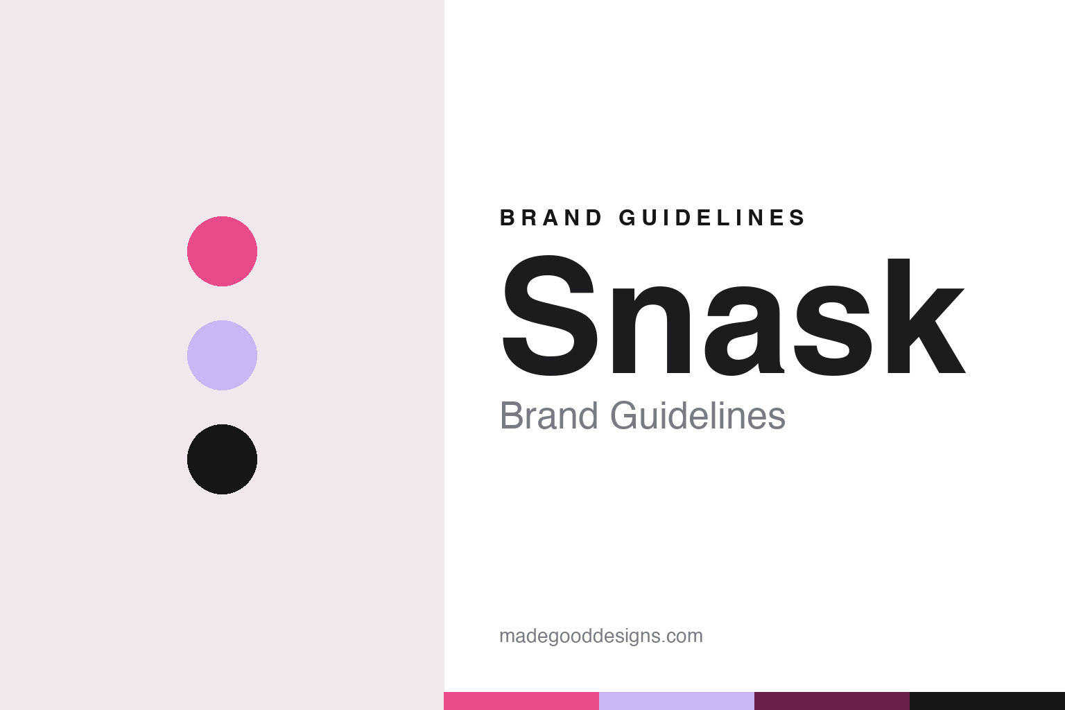
Snask Brand Guidelines
Make enemies, gain fans, keep a bar in the office.
Aa
Two constants: a candy pink, foil lilac and deep plum palette and a fat-face serif register. Abstract homage — not a Snask asset or mark; no logo, icon or wordmark is reproduced.
Three founders, one slang word
A Stockholm agency founded in 2007.
Snask is a creative agency in Stockholm. Dezeen, reporting on 17 April 2020, said that Fredrik Öst co-founded the agency with Magnus Berg and Erik Kockum in 2007, and quoted Öst saying that it sets out to “challenge the industry by doing things differently”. The article was part of a collaboration between Dezeen’s Virtual Design Festival and the Vienna-based Forward Festival, and it was built around a talk that Öst gave at Forward Festival in April 2017.
The name is a piece of Swedish slang. In the same talk, Öst explained that “snask” is slang both for sweets and for filth. The double meaning suits a studio that describes itself in loud terms. Grain Edit, writing on 8 February 2017, quoted the studio’s own description: “We worship unconventional ideas, charming smiles and real emotions.” Those lines are the studio speaking about itself, and they set the tone for much of what it publishes under its own name.
Five years in, the studio was already presenting itself outside Sweden. Computer Arts interviewed Öst at the OFFF festival in Barcelona, and Creative Bloq published the conversation on 17 May 2012. There Öst described Snask as “a design, brand and film agency situated in the heart of Stockholm”. Asked about the studio’s style, he said it made “slick and bold design” and did “strict and wild typography”, and that it used “no and every colour”. He said the team kept an edge by looking at every blog and design website it could find and comparing itself with others.
Hand-made work is part of the story. In an interview with the typography site Typeroom, Öst said the studio liked to work by hand “because it’s more fun and looks better”. He said Snask did not hold to one typographic style and changed with the times, and that it chose typefaces mainly from references and from what foundries were releasing. When a project needed custom lettering, he said, the studio sometimes brought in specialist typographers but usually drew the letters itself.
The founders’ names and roles shift over the years in the press. In the Dezeen piece of 2020 all three founders are named. When the German design magazine Slanted visited Stockholm in the summer of 2021 for its Stockholm issue, #39, it presented the work of Fredrik Öst and Erik Kockum, and it published the feature online on 6 May 2022 together with a video interview with the studio.
Colour
A book, a bar and a band.
The studio’s fullest self-portrait is a book. Snask published Make Enemies & Gain Fans, a mix of studio history, advice and design work, and Öst pointed readers of Typeroom to it when asked what the studio collected. He summed up the studio’s belief for the same interview as “to make enemies and have fans”: to make work that some people hate and others love, and to stop the day you no longer love the work. Grain Edit described the book in 2017 as an account of the studio’s failures and successes.
The book has run to three editions. The Forward Festival magazine announced in November 2024 that Snask had released the third and final edition of Make Enemies & Gain Fans, published by August Dreesbach Verlag. The magazine said this edition came in a holographic rainbow foil cover, with pages printed on matte natural paper for contrast, and that the publisher described the book as a “guide and collection of pink life wisdom, stories, and design bible”. It also quoted the line the title leans on, attributed to Tibor Kalman: “When you make something no one hates, no one loves it.”
The studio has spread into activities beyond client work. Grain Edit listed a record label, a line of the studio’s own beer, the co-founding of Yay Festival and lectures on creative entrepreneurship given around the world. Dezeen reported in 2020 that the agency’s office has its own bar, which serves its own beer, and that the studio had acquired a rock band after its singer agreed to sell it to Öst at an afterparty; the agency now gives lectures that combine live music with design advice.
Those lectures follow a format. Dezeen said Öst structured his 2017 Forward Festival talk as a “setlist” of ideas, with slogans such as “brand yourself”, “dare to be bold” and “don’t mix rock ’n’ roll with the professional”. Read together, the book, the bar, the band and the setlist work as the studio’s identity system: a set of repeatable habits rather than a single logo.
Pink runs through the later material. The 2024 edition’s foil cover and the publisher’s phrase about “pink life wisdom” both appear in the Forward Festival announcement, which also describes the studio’s path “from fledgling agency to advocates of pink enlightenment”. Forward Festival’s speaker page lists the studio as SNASK in capitals and describes it as “a creative agency of misfit geniuses”, the same self-description that Slanted repeated in 2022.
Typography
A studio name that sells an attitude.
Nordic design studios tend to treat their own identity as a working sample of what they sell. Many choose short, single words as names, often borrowed from Danish, Swedish or Norwegian, or from music, printing and craft vocabulary, so the name sits comfortably in a lowercase wordmark and travels across languages without explanation. The studio logo is usually restrained: one typeface, one or two colours, generous white space, and a layout system that carries the personality instead of an illustrated symbol.
Custom typefaces are a recurring thread. A studio that draws a bespoke font for a bank, a brewery or a city will often show the type itself as the hero of a case study, and some studios go further and set up a type foundry as a separate label, licensing retail fonts to anyone. That spin-off then becomes a second brand surface, with its own specimens, website and naming.
Studio shops, printed books, posters, exhibitions and talks extend the identity beyond client work. For anyone building a guide, the lesson is that the studio’s own type, grid and tone of voice are the brand, and they are applied with the same discipline the studio asks of its clients.
Aa
A heavy fat-face serif — after a studio that prints its manifesto in pink foil. (Specimen set in Abril Fatface, a serif STAND-IN; NOT the Snask logo or any studio typeface.)
Snask
Client work, dated.
The studio’s client list, as reported in the press, mixes retail, culture and drink. In the 2012 Computer Arts interview published by Creative Bloq, Öst named H&M and the Stockholm art gallery Liljevalchs as clients he was glad to have won, mentioned a venture into China, and said the studio had recently rebranded Mobiento, a Swedish mobile agency. He said the brief had been to brand the agency and that Snask had done it “the Snask-way”. He added that the studio was then rebranding large companies and making many films.
Film and physical making recur. Dezeen listed a stop-motion movie for a Stockholm opera house among the agency’s work in 2020, along with a beer brewed with Pang Pang Brewery and intended, the article said, to be drunk in the shower before a night out. Grain Edit wrote in 2017 that the studio had built type and props from wood, paper and cake, and described a wooden typographic installation made for the 2014 Malmö Festival, measuring 13 by 8 metres. The same piece said the studio works across design, stop motion and live action.
Talks are a channel in their own right. The 2012 interview was recorded at OFFF in Barcelona; the 2017 talk reported by Dezeen took place at Forward Festival, which the magazine described as running conferences for creatives in Vienna, Munich, Hamburg and Berlin. Forward Festival later published a music playlist curated by the studio and a further conversation with it, and the book announcement of 2024 ran in its magazine.
For a design guide, Snask shows how a small studio can make its name, its book and its habits do the work of a brand identity: a slang word that means both sweets and filth, a manifesto reprinted three times, and a bar and a band that turn lectures into performances. Compare Kurppa Hosk, another Stockholm studio founded two years later, and Werklig, a Nordic studio in this collection. For this guide we use candy pink, foil lilac and deep plum with a fat-face serif, an unofficial interpretation; no product or logo is reproduced.
Explore & save
Keep Snask’s identity on hand — save it to a board in the Made Good inspiration library.
Snask identity set
Pin the Snask candy pink, foil lilac and deep plum palette and the fat-face serif register to your own board.


