Heydays Brand Guidelines
A school project that turned into a studio, and a studio that turned into part of a bigger one.
Aa
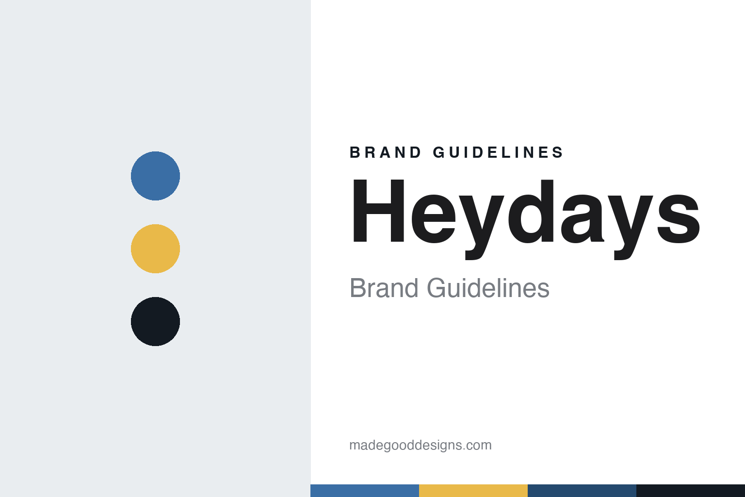
Two constants: a blue, yellow and slate palette and a geometric sans register. Abstract homage — not a Heydays asset or mark; no logo, icon or wordmark is reproduced.
Five graduates in Oslo
A studio started straight out of school, in 2008.
Heydays was an Oslo design studio started by five friends who met at design school. Co-founder Mathias Haddal Hovet told designboom in an interview published on 18 March 2015 that the five had worked together while still students, including paid work after school hours, and that their first joint project was to design and art-direct a Scandinavian hip-hop and R&B magazine. He said they started Heydays straight after finishing school in 2008. The plan, he said, had been modest: to rent a place where they could work on various projects together. Over the summer the plan grew, and they decided to give the studio a real try.
Hovet told the magazine that the five came from quite different backgrounds, with different skills and visual preferences, and that this was part of what made the partnership interesting. Nearly seven years after the start, he said in 2015, the five still worked together and had clients from many countries. designboom described the studio at that time as a design agency based in Oslo, focused on visual identities, digital solutions and the material that goes with them.
Hovet traced the studio’s working method back to school. He said their main teacher, Paul van Brunschot, was a Dutchman trained in advertising rather than graphic design, and that he taught the group to work on the conceptual side first: think big before thinking small and in details, turn problems into opportunities, and treat limitations as useful. Setting strict limits on their own work, Hovet said, had stayed with all five of them. Asked about his own background, he said his father ran a two-person graphic design studio on Norway’s west coast and that he had grown up discussing design at home.
Later reporting names more of the founders. The Norwegian trade site Kom24 described Hovet as a co-founder of Heydays in May 2022, and in November 2024 it named Thomas Lein as a co-founder and adviser and Lars Kjelsnes as a co-founder and creative director of the studio. In March 2023 Kom24 quoted Thomas Lein in the role of creative director.
In the 2015 interview Hovet gave two short rules that he repeats to others. His favourite piece of advice was “answer the phone”, and his personal motto was “question more”. He also said he believed in what he called unbundling: fewer one-stop shops and more specialised teams working together, which he thought gave clients more options and made it easier to try new things.
Colour
Identities for designers, architects and a city bike scheme, dated.
One early identity covered by the London magazine It’s Nice That was for Studio Hansen, a firm of industrial designers. The magazine, in a piece by James Cartwright published on 17 January 2013, said Heydays had built the identity around a simple grid of blue dots that ran across the client’s online and printed material, behind a reductive geometric logo. The magazine noted that it had featured the Oslo studio’s work before and had invited it to guest-post on its site in earlier years.
The 2015 designboom interview showed several more identities. For Mellbye, a Norwegian architecture studio founded in 1954, Heydays said it had worked from the firm’s modernist mindset and created a symbol combining its two main services, architecture and interior; the material shown included a die-cut folder. For the Fosnavaag cultural centre, a new concert hall on Norway’s west coast, the studio described an identity made of ten logos running from calm to stormy, reflecting the contrasts in music and in the dramatic setting. Because the hall had been funded by the local community, Heydays also designed a donor wall almost four metres high, built from tiles in seven categories ranging from small to large gifts. Other identities shown in the interview were for KK Wind Solutions, a company making control systems for the wind power industry, and for the American portrait photographer Wesley Mann.
Hovet said in 2015 that the studio was fascinated by identities that change according to outside forces, such as input from people, physics, sound or data, and that it had recently made an identity and signage system for a concert hall that responded to the soundscape inside the building.
A public commission from the studio is the identity for Oslo City Bike (Oslo Bysykkel), the city’s bike-share service. Logo Design Love, the site run by the identity designer David Airey, featured the symbol in a post dated May 2017 and credited it to Heydays. The post quoted the studio’s description: the identity centres on a simple abstraction of a bike, meant to present itself in an attentive but subdued way, and it opens up in the channels where people use the service. There the mark becomes a lively character that tells riders if something is wrong, warns of slippery roads and gives a high five at the end of a ride. In the studio’s words, product and brand are one and the same.
In March 2023, Kom24 reported that Heydays had made a new brand platform and visual identity for the Norwegian audio technology start-up Nomono ahead of its international launch. The trade site said the studio had worked closely with Nomono’s own design team for more than a year, including a new design system for its digital product, built around the idea of removing noise to strengthen storytelling. Senior designer Felix Skaara told Kom24 that the aim was to put storytelling and creative freedom at the centre, rather than only the product’s functional qualities.
Typography
A shared name for five designers.
Nordic design studios tend to treat their own identity as a working sample of what they sell. Many choose short, single words as names, often borrowed from Danish, Swedish or Norwegian, or from music, printing and craft vocabulary, so the name sits comfortably in a lowercase wordmark and travels across languages without explanation. The studio logo is usually restrained: one typeface, one or two colours, generous white space, and a layout system that carries the personality instead of an illustrated symbol.
Custom typefaces are a recurring thread. A studio that draws a bespoke font for a bank, a brewery or a city will often show the type itself as the hero of a case study, and some studios go further and set up a type foundry as a separate label, licensing retail fonts to anyone. That spin-off then becomes a second brand surface, with its own specimens, website and naming.
Studio shops, printed books, posters, exhibitions and talks extend the identity beyond client work. For anyone building a guide, the lesson is that the studio’s own type, grid and tone of voice are the brand, and they are applied with the same discipline the studio asks of its clients.
Aa
A geometric sans — after a studio known for reductive geometric marks such as its Studio Hansen logo and Oslo City Bike symbol. (Specimen set in Manrope, a sans STAND-IN; NOT the Heydays logo, any client mark or any studio typeface.)
Heydays
New leadership, ARC and Eidra, then Kurppa Hosk.
The studio’s management changed in 2022. Kom24 reported on 30 March 2022 that Sanda Zahirovic would become managing director of Heydays. She had joined in August 2021 in a newly created role as strategy director, coming from a post as strategic adviser at Snøhetta. In a press statement quoted by the trade site, she said she wanted to lead the studio into a new era and to define a direction for design that puts people at the centre and takes their needs seriously.
Ownership changed two months later. Kom24 reported on 31 May 2022 that the Swedish group ARC Arise Consulting was expanding in Norway by buying two design studios, Heydays and Goods. The article said Heydays had been founded in 2008 and was led by Zahirovic, and that Goods had been started in 2019 by a group that included Mathias Hovet, who was described as a co-founder of both studios. The leaders of both studios became partners in ARC. Hovet was quoted in the press release saying that, after working together as sister companies, joining ARC felt like the natural next step. ARC has owned Heydays since 2022; later reporting places the studio within Eidra, the name of the group of strategy, creative and technology companies to which ARC belongs.
The last change came in 2024. Kom24 reported on 11 November 2024 that Neue Design Studio, Heydays and Kurppa Hosk, all part of Eidra, would merge under the Kurppa Hosk name. According to the report, Neue Design Studio and Heydays would become part of Kurppa Hosk from 1 January 2025, building on collaboration that began in 2022 when Heydays first joined Eidra, and Neue had joined the group in May 2024. The merged agency was to have offices in Stockholm, Oslo, Chicago and New York, with Zahirovic as managing director of Kurppa Hosk in Oslo. From that date Heydays no longer operated as a separate studio name, but as part of Kurppa Hosk, according to the merger plan reported by Kom24.
The projects in this record each start from one element: a dot grid for Studio Hansen, a symbol joining two services for Mellbye, ten logos on a scale from calm to stormy for Fosnavaag and a bike abstraction that becomes a character inside the Oslo City Bike service. In 2015 Hovet described the habit behind such work as the lesson from school that stayed with the founders: think conceptually first, and set strict limits on your own design.
For a design guide, Heydays shows how a studio identity can rest on a few clear shapes that change behaviour depending on where they appear, quiet in print and lively in a digital service. Compare Kurppa Hosk, the agency it merged into, and Snask, another Nordic studio in this collection. For this guide we use blue, yellow and slate with a geometric sans, an unofficial interpretation; no product or logo is reproduced.
Explore & save
Keep Heydays’s identity on hand — save it to a board in the Made Good inspiration library.
Heydays identity set
Pin the Heydays blue, yellow and slate palette and the geometric sans register to your own board.