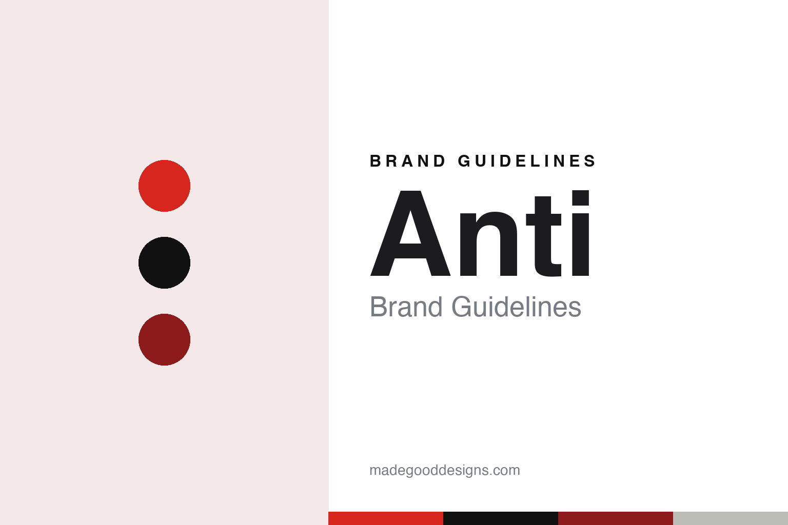
Anti Brand Guidelines
A small punk band that kept the name after the band got bigger.
Aa
Two constants: a red, black and concrete palette and a heavy grotesque register. Abstract homage — not an ANTI asset or mark; no logo, icon or wordmark is reproduced.
A punk band of designers
Two founders, five members, one word: interference.
ANTI is a Norwegian agency that began as a small design studio. In a profile by Ingrid Opstad in Scan Magazine, published on 5 April 2019, the magazine said the agency was established in 2008 by two Norwegians, Kenneth Pedersen and Kjetil Wold, and described Pedersen as CEO and founding partner. Pedersen told the magazine that the ambition from the start was to run a small design agency that had fun, worked internationally and was seen as an independent brand in its own right, challenging both the established design profession and its own clients.
The name came out of that attitude. Pedersen said the founders had wanted an alternative agency, “like a little punk band” doing interesting jobs internationally, and that they went through many possible names, including the joke option Michael Jackson, before rejecting it because it said nothing about thinking differently. They settled on the word interference and on ANTI, which pointed back to the punk culture they liked, and the agency became ANTI – A New Type of Interference. Pedersen told Scan Magazine that the idea had become the cornerstone of the business and that major decisions were made on the basis of interference. He described the agency’s process in three stages, insight, interference and impact: research and workshops first, then the creative intervention, then the result for the client.
The punk-band image also set a size limit that did not last. Pedersen said the founders had feared having too many employees and had aimed to be like a punk band, which never has more than five members. The agency’s own website now tells the same story in short form: it says ANTI started in 2008 as a punk band, a small agency sworn to stay at five people and only do design, and that this failed. Pedersen told Scan Magazine that the agency won an early job in the United States for PepsiCo, which in turn brought more work from Norwegian clients.
Pedersen remains at the head of the business. Kom24, the Norwegian marketing trade site, described him as CEO and founder of ANTI in May 2026, and in September 2026 it quoted him as CEO alongside Kristin Grimstad as managing director, when it reported that Kristoffer Eidsnes, after eleven years at ANTI, was moving from design director to a new role as creative lead across the agency’s disciplines.
Colour
Offices, side projects and a self-effacing identity, dated.
The agency began in Oslo. Scan Magazine reported in 2019 that, as demand grew, ANTI chose not to expand only its Oslo branch but opened a new office in Bergen together with Endre Berentzen and Robert Dalen. By the time of the 2019 profile, the magazine said, ANTI had offices in Oslo, Bergen, Trondheim and Hamar, as well as a small team in the United States, which Pedersen said made it possible to work with local and international clients while drawing on a wide pool of people.
Side projects run through the agency’s history. Pedersen told Scan Magazine that an early in-house ANTI project was a jeans label, ANTI Denim, whose first model was called ANTI SWEDEN, launched with a self-organised “Fashion Week in HELL”, named after the village of Hell near Trondheim. He said the label taught the team about production, distribution and quality control. ANTI then started its own magazine about Norwegian creativity. At the time of the 2019 profile, the agency was working on FARA Cycling, a brand of racing bikes for road and gravel, and on ANTI nstrumental, a film series combining a documentary and a live concert with current music artists. Pedersen also described “Yai-Day”, the last Friday of each month, when staff could take the day to explore something new, from a new ANTI project to a museum visit.
The agency’s own identity was renewed for its tenth anniversary. Scan Magazine said ANTI marked ten years in the autumn of 2018 with a staff trip to Barcelona and a new brand identity. Pedersen described it as an identity that does not sit on top of content or as a signature below it, but is found in what is left unsaid in the content itself: rather than drawing attention away from the work, it is placed in the subconscious, through the lack of initials, as a quality signature. Asked whether ANTI had a house style, he said the agency had probably been “quite dark” in its early years, but that it was no longer guided by a style and instead began each job from a strategic starting point.
Television became a further line of work. Kom24 reported on 5 May 2026 that ANTI’s drama series Rekviem for Selina had premiered on NRK in March 2025, and that the agency was developing a follow-up, Fantasy Resort – et rekviem for Reality, as the second part of a planned trilogy about the media industry, created by Emmeline Berglund, ANTI’s creative lead and partner for TV.
Typography
A name that stands for a method.
Nordic design studios tend to treat their own identity as a working sample of what they sell. Many choose short, single words as names, often borrowed from Danish, Swedish or Norwegian, or from music, printing and craft vocabulary, so the name sits comfortably in a lowercase wordmark and travels across languages without explanation. The studio logo is usually restrained: one typeface, one or two colours, generous white space, and a layout system that carries the personality instead of an illustrated symbol.
Custom typefaces are a recurring thread. A studio that draws a bespoke font for a bank, a brewery or a city will often show the type itself as the hero of a case study, and some studios go further and set up a type foundry as a separate label, licensing retail fonts to anyone. That spin-off then becomes a second brand surface, with its own specimens, website and naming.
Studio shops, printed books, posters, exhibitions and talks extend the identity beyond client work. For anyone building a guide, the lesson is that the studio’s own type, grid and tone of voice are the brand, and they are applied with the same discipline the studio asks of its clients.
Aa
A heavy grotesque — after an agency named for interference and founded on the image of a punk band. (Specimen set in Archivo Black, a sans STAND-IN; NOT the ANTI logo, any client mark or any agency typeface.)
Anti
Recent clients, as reported in 2026.
Recent client work has been reported in the Norwegian trade press. On 2 June 2026, Kom24 reported that ANTI and the Research Council of Norway (Forskningsrådet) had launched a campaign titled “Alt vi ikke vet er verdt å finne ut av” (“Everything we don’t know is worth finding out”), built on the message that research starts with questions rather than answers. The campaign included several short films for social media and a longer film for the council’s own channels, directed by Farzad Farzaneh of Giants & Toys. ANTI’s head of advertising, Torstein Drogseth, told the trade site that the aim was to connect everyday life with the laboratories and show that research is curiosity put into a system.
Ten days later, on 12 June 2026, Kom24 reported that the Norwegian outdoor furniture maker Vestre had launched a new brand platform and visual identity developed with ANTI over the previous year. The report said the work started from Vestre’s role in cities, not only as a furniture producer but as a participant in shaping public space, and that the new system of colours, typography, patterns, imagery and motion principles would run from websites and exhibitions to workwear and the production environment, with new websites built by Unfold. Håkon Meyer Stensholt of ANTI said the ambition was not to redefine Vestre but to understand it better and express it more clearly.
On 7 September 2026, Kom24 reported that the building-supplies chain Byggmax had chosen ANTI as its new advertising agency in Norway after a pitch before the summer. The chain’s head of brand, Sanna Westman, said in a press release that Byggmax had wanted fresh eyes on how it positions itself in Norway, and Drogseth said the agency saw potential in the chain’s simple stores.
The agency’s website today describes its work as a single connected force across strategy, identity, tone of voice, experience and communication, and says: “Some call it brand building. We call it interference.” The line carries the same idea Pedersen gave Scan Magazine in 2019, when he said the name had become the basis on which major decisions are made.
For a design guide, ANTI shows how an agency can turn its own name into a working method and keep its identity in the background of the work rather than on top of it. Compare e-Types and Snask, two other Nordic studios in this collection. For this guide we use red, black and concrete with a sans, an unofficial interpretation; no product or logo is reproduced.
Explore & save
Keep Anti’s identity on hand — save it to a board in the Made Good inspiration library.
Anti identity set
Pin the ANTI red, black and concrete palette and the heavy grotesque register to your own board.