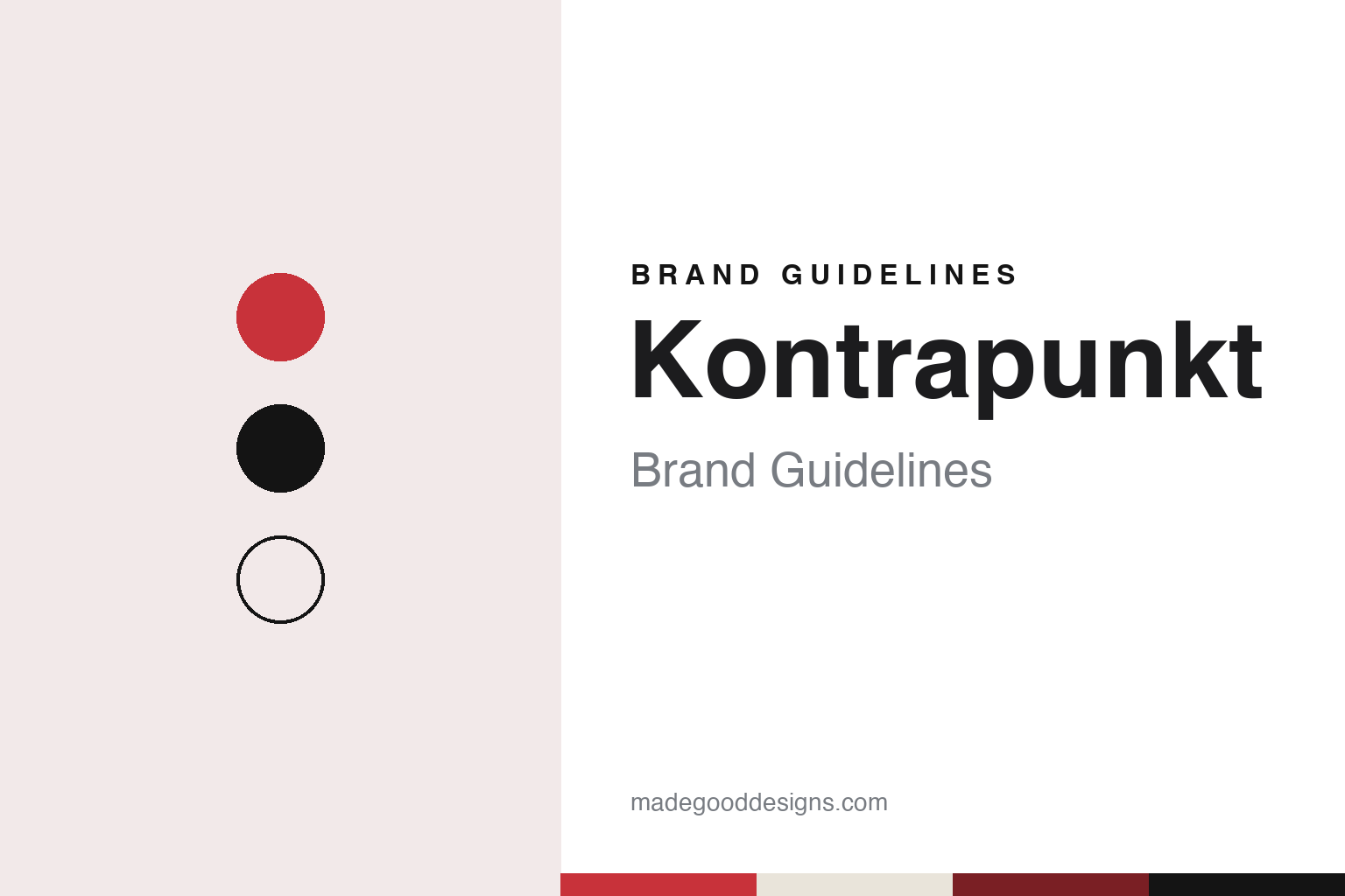
Kontrapunkt Brand Guidelines
Two voices, one line: a studio built on letters.
Aa
Two constants: a red, deep madder and black palette and a grotesque sans register. Abstract homage — not a Kontrapunkt asset or mark; no logo, icon or wordmark is reproduced.
A studio named for counterpoint
Copenhagen, the 1980s, and an architect’s training.
Kontrapunkt takes its name from music. Kontrapunkt is the Danish, Swedish and Norwegian word for counterpoint, the craft of setting two or more independent melodic lines against each other so that they work together. For a design studio the word is a compact statement of method: two voices, the client’s and the designer’s, running side by side. The name is short, it reads the same across the Scandinavian languages, and it sits easily in a plain typographic wordmark.
The studio says it was founded in Copenhagen in the 1980s by Bo Linnemann together with Kim Meyer Andersen. In a journal post titled “A lifetime with letters”, Kontrapunkt describes Linnemann as design director, owner and co-founder, and says he trained as an architect at the Kunstakademiets Arkitektskole in Copenhagen, graduating in 1981. The same post traces his interest in lettering back to the street signs of Gentofte, north of Copenhagen, drawn by Knud V. Engelhardt, whose type for the municipality began in 1923 and carried a small heart over the letter i. Kontrapunkt presents that heart as the starting point of Linnemann’s career in type.
Designmuseum Danmark, introducing an exhibition about the studio in 2026, speaks of four decades of practice and describes work for banks, ministries and museums as well as for infrastructure, sport and business. The studio itself says it works from offices in Copenhagen and Tokyo; its website lists both, with the Tokyo studio in the Shibuya district.
Kontrapunkt has also widened its circle of owners. In a journal post titled “A new generation of partners”, the studio said Philip Linnemann had been named Executive Creative Director, and that four new partners were joining: Johan Lawaetz, who had come in as chief operating officer in August 2019 and was then named chief executive; client director Kim Paulsen; and the two heads of type design, Torsten Lindsø Andersen and Rasmus Michaëlis. Bo Linnemann is quoted there as founding partner, saying the new partners represent a younger generation. The studio’s current case-study pages list Philip Linnemann as CEO and partner.
Colour
Bespoke letters for trains, shoes and furniture.
Custom type is the thread that runs through Kontrapunkt’s own identity. It’s Nice That reported on 11 November 2019 on the studio’s work for Cityringen, the 17-station loop line of the Copenhagen Metro that opened on 29 September 2019. The magazine said the two heads of type design, Torsten Lindsø Andersen and Rasmus Michaëlis, designed a custom dot typeface for the electronic displays inside the trains, and that Kontrapunkt had also worked on the service map and on signage for the new line.
The brief was technical. According to It’s Nice That, the font had to fill a display of 24 by 192 LED dots, had to be an interpretation of the Frutiger Bold used on the Metro’s physical signs, and had to fit the longest station name, Poul Henningsens Plads, without scrolling text. The designers said they usually draw letters on a vertical grid of at least 1,000 units, and here had only 24. The magazine said a 14-dot version of Frutiger had been developed for the original Metro lines but never used, and that the new work updated it for 16-dot displays; the design started seven years before the line opened, while the tunnels were still being dug.
The same article described how the type team formed. Andersen and Michaëlis met at the Royal Danish Academy School of Design in 2014, ran a small studio called ABC for three years, and often collaborated on custom typefaces with Kontrapunkt and its founder, Bo Linnemann, who then invited them to join. “We only do bespoke type design,” they told the magazine, describing a bespoke typeface as one that can cross borders and speak several languages while keeping one voice.
Kontrapunkt’s own case studies show where that type ends up. The studio says it designed a brand typeface for ASICS Tiger in collaboration with Bruce Mau Design, based on the original logo work of Lubalin and Peckolick, for uses from the façade of the Osaka flagship store to a leaflet in a shoebox. For Karimoku Case Study, working with Norm Architects and the Keiji Ashizawa Design team, it says it created an identity, a website, a brand book and a typeface, Case Study Sans, paired with Sabon as a secondary face. The studio also lists type for Maersk, Mitsubishi Motors, Nissan, Danish Crown and the Japanese football league J.League.
Typography
Short names, custom type, a foundry on the side.
Nordic design studios tend to treat their own identity as a working sample of what they sell. Many choose short, single words as names, often borrowed from Danish, Swedish or Norwegian, or from music, printing and craft vocabulary, so the name sits comfortably in a lowercase wordmark and travels across languages without explanation. The studio logo is usually restrained: one typeface, one or two colours, generous white space, and a layout system that carries the personality instead of an illustrated symbol.
Custom typefaces are a recurring thread. A studio that draws a bespoke font for a bank, a brewery or a city will often show the type itself as the hero of a case study, and some studios go further and set up a type foundry as a separate label, licensing retail fonts to anyone. That spin-off then becomes a second brand surface, with its own specimens, website and naming.
Studio shops, printed books, posters, exhibitions and talks extend the identity beyond client work. For anyone building a guide, the lesson is that the studio’s own type, grid and tone of voice are the brand, and they are applied with the same discipline the studio asks of its clients.
Aa
A plain grotesque sans — after a studio whose identity is carried by letters. (Specimen set in Work Sans, a sans STAND-IN; NOT the Kontrapunkt logo or any Kontrapunkt or Kontrapunkt Type typeface.)
Kontrapunkt
A retail foundry and a museum show.
For much of its history Kontrapunkt’s typefaces belonged to its clients. That changed with Kontrapunkt Type, which the studio describes as its retail foundry. In a journal post titled “We Built a Type Foundry”, Kontrapunkt says that for four decades it has drawn custom typefaces for specific clients, and that it now wants to offer a core collection for everyone. The launch families are Duo Sans, which the studio calls its take on the contemporary grotesque; Duo Serif, a transitional serif designed for screens and built on the same proportions and metrics as Duo Sans; and Spatial, a geometric sans the studio calls its love letter to Futura. The post closes with the line “From our workshop to yours”, and the foundry has its own website.
The studio’s work also reached the museum. Designmuseum Danmark in Copenhagen staged LABORATORIUM Kontrapunkt from 12 June to 18 October 2026, the fourth exhibition in its LABORATORIUM series, which looks at the design process behind selected projects. The museum said the show presented seven cases from Kontrapunkt’s four decades of practice, ranging from government institutions and infrastructure to sport and business. It named three marks that Danes meet every day: the hexagon on the DSB S-train, the pharmacy “a” on shop façades, and TV 2’s circle on screen.
The museum also summarised the studio’s approach. It wrote that, in Kontrapunkt’s view, strong identities rarely start from scratch but build on something that already exists, citing a symbol with 150 years of history, a letterform taken from Renaissance apothecary glass, and the lions of a city. That idea of continuity matches the way the studio presents its own name and its own type: a word borrowed from music, and letters drawn for others before being offered for sale.
For a design guide, Kontrapunkt shows how a studio can let type carry its identity: a one-word name from music, a team that draws bespoke letters for trains, sportswear and furniture, and a retail foundry that turns that craft into a product line of its own. Compare e-Types, another Copenhagen studio that spun off a type foundry, and Anti, a Norwegian studio in this collection. For this guide we use red, deep madder and black with a sans, an unofficial interpretation; no product or logo is reproduced.
Explore & save
Keep Kontrapunkt’s identity on hand — save it to a board in the Made Good inspiration library.
Kontrapunkt identity set
Pin the Kontrapunkt red, deep madder and black palette and the grotesque sans register to your own board.