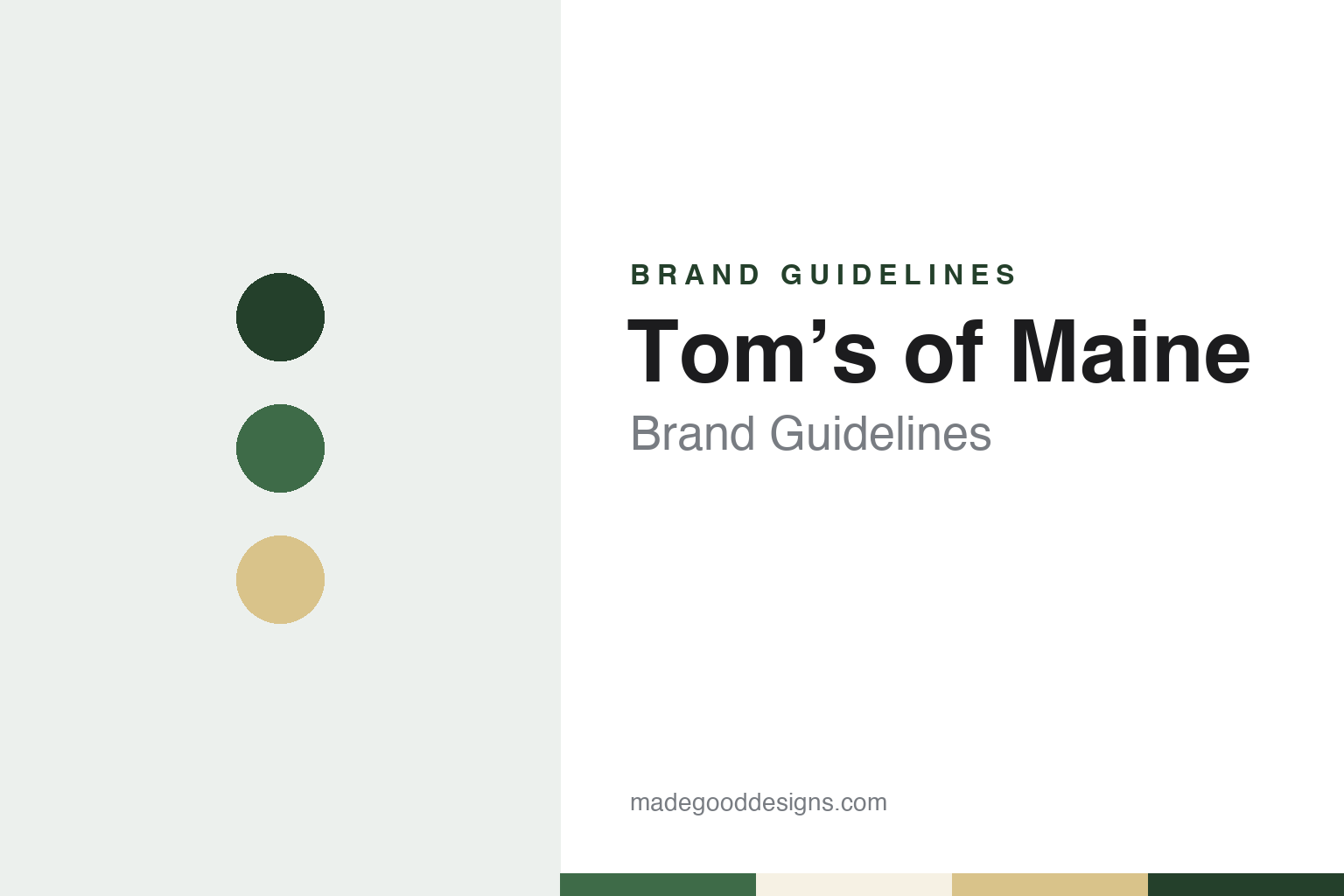
Tom’s of Maine Brand Guidelines
A Maine company that began with a hand-drawn label.
Aa
Two constants: a spruce green and straw palette and a soft hand-label serif register. Abstract homage — not a Tom’s of Maine product or mark; no tube, box or logo is reproduced.
Tom and Kate Chappell
A laundry detergent, a railroad depot and a herb garden.
Tom’s of Maine is named for Tom Chappell, who started the company with Kate Chappell in 1970. In the company’s own telling, on the “Who We Are” page of its website, the couple decided to make their own personal care products because they could not find any on the shelves that met their standards, and they began with a loan from a friend. The business has been based in Kennebunk, a town in the south of Maine, and a 2006 Associated Press report gives the same founding year and founders’ names.
The first product was not toothpaste. The company says its first product was Clearlake, a laundry detergent made without phosphates, and that it went on sale with a “homey hand-drawn label designed by Kate.” That detail is a useful starting point for anyone looking at the brand as a design subject: the earliest piece of packaging the company describes was drawn by one of its two founders, not commissioned from an agency.
Production began in a small space. The company describes a single-line factory in the former Kennebunk railroad depot, where the one line had to be cleaned and set up again every time a different product was made. It says that by 1975 it had launched toothpaste and shampoos, all made in that depot, that Kate’s herb garden out front supplied ingredients, and that passing trains would rattle the building. These are the company’s own recollections, published on its website, and they are the story it chooses to tell about itself today.
From the start, the company says, it paid as much attention to what it left out of its products as to what it put in. That idea has stayed at the centre of how Tom’s of Maine presents itself, and it shapes the language on its website more than any single visual device does.
Colour
From a family business to part of Colgate-Palmolive.
Tom’s of Maine was privately held until March 2006. CBS News, carrying an Associated Press report dated 21 March 2006, said Colgate-Palmolive had agreed to buy control of the company, that the Chappell family would keep a minority stake, and that Colgate would have further opportunities to buy shares over the following years. The report said the deal was expected to close in the second quarter of that year.
The same report quoted Reuben Mark, then Colgate’s chairman and chief executive, as saying that Tom Chappell would stay on to lead the company and that it would remain based in Kennebunk. The report described Tom’s of Maine as a maker of “natural” toothpaste, mouthwash and deodorant, placing the word in quotation marks. English Wikipedia describes the company today as a majority-owned subsidiary of Colgate-Palmolive.
The company’s own account of the sale is brief. On its website it says it became part of the Colgate-Palmolive company in 2006, and that, as part of joining, its “policies, culture, and values would never change.” It adds that “there’s always a part of us that’s still in that first, tiny factory in Kennebunk.” The tone is deliberate: the brand presents its history as continuous, with the depot and the herb garden as touchstones, rather than as a before-and-after.
Colgate-Palmolive is itself the subject of a separate guide in this round, on the Colgate brand. The two sit in the same group but present themselves very differently, and that contrast is part of what makes Tom’s of Maine interesting to study.
The company frames its present-day mission around nature. On its “Our Mission” page it says its goal is “protecting nature for future generations,” that it gives a share of its annual profits to organisations working towards that aim, and that employees are encouraged to spend part of their paid time volunteering. It also describes what it calls its Stewardship Model, a review that it says every ingredient goes through, against four criteria: natural source, safety, effectiveness and environmental responsibility. Those are the company’s words and its own standards, and they are quoted here as such.
Typography
Design and documentation.
Toothpaste and mouthwash brands are seen up close, every day, and usually for only a few seconds at a time. A tube sits on a basin, a bottle sits beside it, and a box is glimpsed on a crowded pharmacy shelf. Their identities tend to be carried by a few repeatable signals: the colour of the tube or carton, the shape and weight of the name, and in some cases the look of the product itself.
Colour does much of the work. Many oral-care names are tied to one strong pack colour, and a shopper often reaches for that colour before reading a word. Toothpaste adds a second surface that most packaged goods lack, the paste or gel squeezed onto a brush, which some brands have made part of their look with stripes or tinted gels. Mouthwash goes further still, because the liquid is visible through a clear bottle and its colour becomes part of the pack.
Each guide in this group looks at who started the brand, who owns it now and how its look has been described over time, and separates what independent sources record from what the company says about itself.
Aa
A soft hand-label serif — the register of a small-company label written with care. (Specimen set in Fraunces, a serif STAND-IN; NOT the Tom’s of Maine logo.)
Tom’s of Maine
A brand that tells its story through its words.
Much of Tom’s of Maine’s identity lives in its language. The company’s website leads with lists of what its products are “Free From” — in its words, artificial flavors, fragrances, colors, sweeteners and preservatives — and with the statement that it does not test on animals. It describes its ingredients as “sourced or derived from plants, minerals, or the earth.” These phrases recur across the site, and for a designer they show how a brand can make a short, repeated set of claims do the work that a mascot or a slogan does elsewhere. They are the company’s claims, and they are reported here only as its own wording.
The founders’ story is the other constant. The hand-drawn Clearlake label, the one-line factory in the railroad depot and Kate Chappell’s herb garden all appear in the company’s account of itself, and the name on every pack is still the founder’s first name joined to the state where the business began. The company’s website marks the years with simple headings — the 1960s, the 1970s, 1975, the 1980s and 1990s — and tells the history in the first person plural, as “we.”
The 2006 sale to Colgate-Palmolive did not change that voice. Tom Chappell stayed to run the business after the deal, according to the 2006 report, and the company still describes itself as rooted in the town where it started. Its website today carries the line “Committed to being a Force for Good” in its footer, which is consistent with the mission language elsewhere on the site.
For a design guide, Tom’s of Maine shows how a founders’ story, a hand-drawn first label and a steady vocabulary about ingredients can carry a brand that now sits inside a much larger group; compare the parent company’s own Colgate guide and the Crest guide, two toothpaste brands that grew up very differently. For this guide we use a spruce green, a deeper depot green, a herb-garden straw and a label cream with a soft serif, an unofficial interpretation; no product or logo is reproduced.
Explore & save
Keep Tom’s of Maine’s identity on hand — save it to a board in the Made Good inspiration library.
Tom’s of Maine identity set
Pin the Tom’s of Maine spruce green and straw palette and the soft hand-label serif register to your own board.


