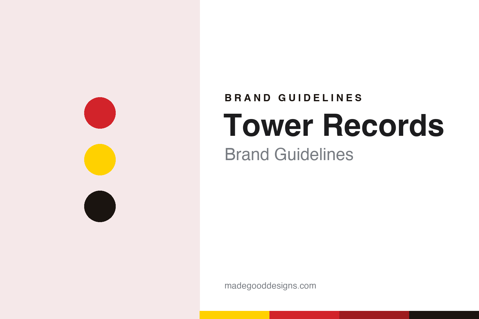
Tower Records Brand Guidelines
A Sacramento record shop named after a cinema, carried on red and yellow.
Aa
Two constants: a Tower red and yellow palette and a condensed poster sans register. Abstract homage — not a Tower Records product or mark; no logo, sign or bag is reproduced.
Tower Cut Rate Drugs
A record counter in a drugstore, named after a cinema.
Tower Records began in Sacramento, California, with Russ Solomon. His father, Clayton Solomon, ran a pharmacy called Tower Cut Rate Drugs, which he had set up in the late 1930s, and as a teenager Russ sold used jukebox records there, The New York Times reported in its 2018 obituary of him. In 1960, Solomon told the paper, he opened a Tower Records store in what had been his father’s drugstore, using borrowed capital, and called it “a neighborhood business.” Deadline put it the same way in 2020: the chain was founded in Sacramento in 1960 “as a section in a drug store.”
The name came from a local cinema rather than from the music. The drugstore and the shop took their name from the Tower Theater, a Sacramento cinema built in 1938 and topped by a neon-lit Art Deco pillar, The New York Times said. English Wikipedia places the original store on Broadway in Sacramento. The company’s own website today tells the story in its own words: the idea of Tower, it says, grew from a business Solomon started as a teenager re-selling 78-rpm jukebox records in his father’s Sacramento drug store.
Solomon soon opened a second Sacramento outlet, the Times said. According to The New York Times, the business took off in 1968, when Solomon opened Tower Records in San Francisco; English Wikipedia dates the San Francisco store, in a former grocery at Bay Street and Columbus Avenue, to 1967. Solomon told the paper that he “stole ideas from supermarket merchandising”: hot-selling records were stacked on the floor, the shop stayed open late, and staff who knew the local music scene ordered the stock for their own store instead of a central office.
That approach went with the name as it spread. The New York Times dates the Greenwich Village flagship in New York to 1983 and says the chain began opening stores abroad in the 1980s, starting in Japan. English Wikipedia records a purpose-built store on Sunset Boulevard in West Hollywood that opened in 1971, which the company now calls, alongside the Greenwich Village store, a landmark in its own right.
Colour
Red and yellow, and an art department with foam core.
Tower’s colours are on record. When Solomon opened a new shop called R5 Records in 2007, on the site of his original Sacramento store, he “no longer had the rights to the Tower Records name, but used its red and yellow color scheme for his logo,” The New York Times wrote in 2018.
Inside the stores, the identity was made by hand. In 2013 the San Francisco Chronicle’s SFGate described the documentary Art Gods: An Oral History of the Tower Records Art Department, written and directed by Strephon Taylor, a musician who had worked as a Tower artist in the late 1980s and early 1990s. It recalled the big, brightly coloured three-dimensional displays that greeted customers in the 1980s, promoting new records by Prince, the Rolling Stones and others, and noted that the artists built them from foam core with X-Acto knives and airbrushed paint. The original art department, the article said, was developed and run by Steve Pollutro at the Berkeley store on Durant Avenue, where Van Halen’s name and tour image were once painted across the walls.
The same article quoted Solomon, from an audio clip in the film, describing a culture in which staff at each store had a say in that store’s identity: “The ideas came from the kids, the employees in the field. I just let them happen.”
Print carried the name too. The chain published an in-store music magazine, Pulse!, which Deadline reported in November 2020 was returning with the relaunched brand. In Japan, Tower Records Japan says on its own website that its stores brought hand-written recommendation cards to the shop floor, and that its poster campaign “NO MUSIC, NO LIFE.” began in 1996; the US company’s website now uses the same line.
Typography
Signs, cases, bags and stickers.
A music, video or electronics shop carried its name on far more than the sign over the door. The same mark turned up on the fascia above a mall entrance, on the plastic rental case handed across the counter, on the paper or plastic bag a customer carried home, on a membership card and on the small price sticker pressed onto a cassette, compact disc or box.
Each of those surfaces asked something different of a logo. A store sign had to read from across a car park or a shopping concourse; a rental case had to survive being opened and returned many times; a bag had to look right when folded, creased and printed in one or two flat colours; a price sticker had to carry a name at the size of a fingernail. Colours that worked on an illuminated sign did not always survive cheap printing, so many retail marks leaned on a few strong, flat tones and simple letterforms.
Each guide in this group sets out who started the store, who has owned the name since, and what became of it, and it marks plainly what rests only on a company’s own word. The palettes and type are our interpretation, not reproductions.
Aa
A condensed poster sans — after the red and yellow of the shop fronts. (Specimen set in Anton, a sans STAND-IN; NOT the Tower Records logo.)
Tower Records
Two companies, one name.
The US stores did not last. The New York Times recorded that Tower declared bankruptcy in 2004 and was forced to liquidate and close in 2006. English Wikipedia gives 22 December 2006 as the day the last US stores closed, and says the Tower website was sold separately to Caiman, which reopened it from Montreal in 2007. Solomon’s own comeback, R5 Records in Sacramento, used the old colours without the old name. He died at his home in Sacramento in March 2018, The New York Times reported.
The name came back in November 2020. Rolling Stone reported on 14 November 2020 that Tower Records had relaunched as an online store, with the return of its Tower Pulse magazine, online performances and planned pop-up shops; the relaunch had been meant for that year’s SXSW festival and was postponed by the coronavirus pandemic. Both Rolling Stone and Deadline named Danny Zeijdel as the new chief executive. English Wikipedia, citing The New York Times, says the brand opened Tower Labs, a gathering space for artists in Brooklyn, in October 2022. The website today sells records, CDs, cassettes and merchandise and describes Tower as “an American original.”
Japan is a separate story. According to Japanese Wikipedia, Tower began in Japan in 1979 as a branch of the US parent, MTS Inc., and in October 2002 the Japanese company, Tower Records Japan, became independent through a management buyout and acquired trademark rights from MTS. The US bankruptcy therefore did not touch it. In June 2012 the Yomiuri Shimbun reported that NTT Docomo had announced it would raise its stake to make Tower Records Japan a subsidiary. Its own history page lists formats including TOWER RECORDS, TOWER RECORDS mini and TOWER VINYL.
For a design guide, Tower Records shows how two colours and a borrowed building name can outlast the company that made them famous. Compare Sam Goody, another American music chain whose name outlived its owners, and Blockbuster, a rental chain whose name also survived its stores. For this guide we use red, yellow and black with a condensed sans, an unofficial interpretation; no product or logo is reproduced.
Explore & save
Keep Tower Records’s identity on hand — save it to a board in the Made Good inspiration library.
Tower Records identity set
Pin the Tower red, yellow and vinyl black palette and the condensed poster sans register to your own board.