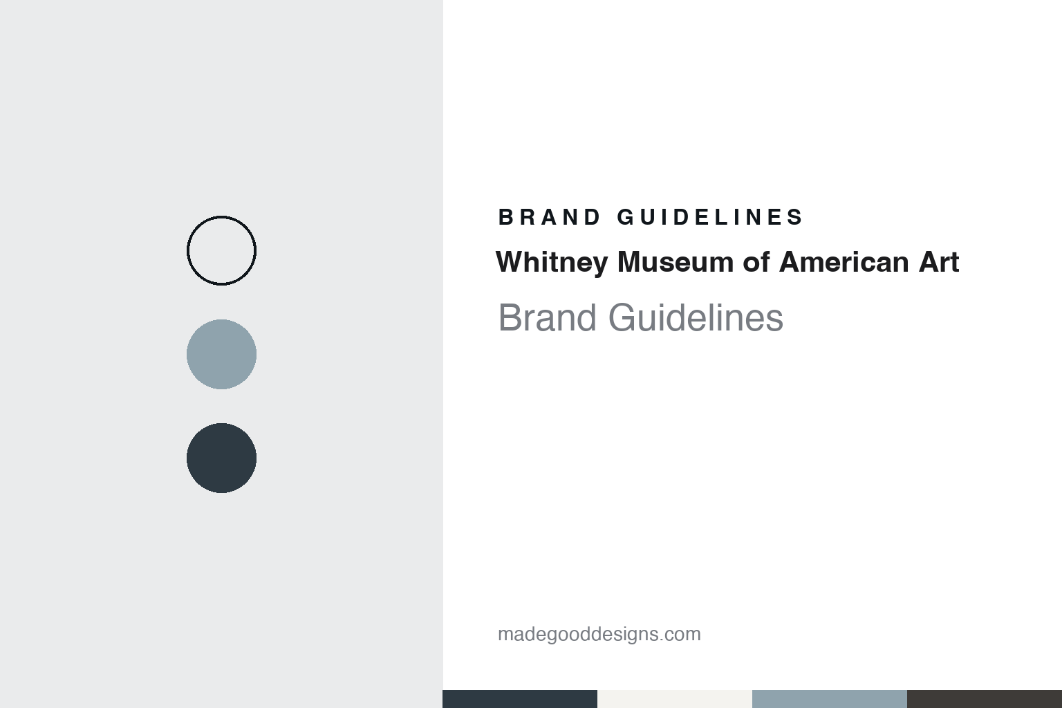
Whitney Museum of American Art Brand Guidelines
A sculptor’s studio club, a granite block on Madison Avenue and a W that bends to fit the art.
Aa
Two constants: a gallery white, Hudson grey, Gansevoort steel and Breuer granite palette and a Swiss neo-grotesque sans register. Abstract homage — not a Whitney Museum asset or mark; no logo, responsive W, photograph or artwork is reproduced.
A sculptor’s museum for American art
A studio club, a declined gift and three row houses on West 8th Street, 1914–1931.
The Whitney Museum of American Art carries the name of its founder. English Wikipedia says Gertrude Vanderbilt Whitney, a sculptor and collector, began acquiring art in 1905, and from 1914 to 1928 ran the Whitney Studio and the Whitney Studio Club in New York, exhibition spaces for the work of avant-garde and little-known American artists. With her assistant Juliana R. Force she gathered nearly 700 works of American art.
Wikipedia says that in 1929 Whitney offered more than 500 of those works to the Metropolitan Museum of Art, which declined the gift. That refusal, together with the attention the newly opened Museum of Modern Art was giving to European modernism, led her to start a museum of her own devoted only to American art. Wikipedia dates the founding to 1930. The architect Noel L. Miller converted three row houses on West 8th Street in Greenwich Village, one of which had been home to the Studio Club, into galleries and a residence for Whitney, and the museum opened on 18 November 1931.
Force became the museum’s director and held the post until 1948. Wikipedia quotes her at the opening: “There may be pictures here that you do not like, but they are here to stay, so you may as well get used to them.” Under her the museum concentrated on new and contemporary American artists, and Wikipedia says it still places particular emphasis on exhibiting the work of living artists. Every two years it organises the Whitney Biennial.
The museum moved twice in its early decades. In 1954 it left Greenwich Village for a small building on West 54th Street, behind the Museum of Modern Art. In 1961 it began looking for a larger site, and in 1966 it opened on the Upper East Side, at the corner of Madison Avenue and 75th Street. Wikipedia says the building, planned and built between 1963 and 1966 by Marcel Breuer and Hamilton P. Smith, set itself apart from the neighbouring townhouses with a stepped façade of granite and its trapezoidal windows. The Whitney stayed in the Breuer building until it closed there in October 2014.
Colour
A Pentagram word mark, a zig-zag line and a set of tickets coloured by type, 2000–2013.
The Whitney’s modern identity begins with a word mark. Dezeen reported on 21 May 2013, in an article by Amy Frearson, that the logo then being replaced was thirteen years old and had been designed by Abbott Miller of Pentagram. The museum said in its own announcement, reproduced by Dezeen, that staff had spent two years in internal discussion about the graphic identity before choosing the Amsterdam studio Experimental Jetset, with the brief of producing a system that would serve as a visual ambassador for the planned downtown building.
The result was the “responsive W”. Dezeen described it as a slender W that changes shape to respond to its setting, forming both a symbol of the museum and a framework for the text and images around it. The designers explained the idea as a zig-zag line, a metaphor for a more complicated history of art, and said the line could also be read as a pulse or a beat. They began to treat the W as a frame to place work in or a stage to place work on, its strokes acting as borders, arrows, connections or columns. Images can sit beneath the line, and for any text set alongside the logo the designers specified Neue Haas Grotesk, which Dezeen described as a redrawn version of a 1950s Swiss typeface.
The museum’s own page on the identity shows how far the system reached. It says the materials were designed by the Whitney’s Graphic Design department working with the new identity, and pictures a stationery suite, a book plate for the museum store, a calendar for the membership programme, the visitor’s guide, children’s materials for the education department and a puzzle game sold in the shop. Its admission tickets, the museum says, are colour-coded according to ticket type. The page also credits the digital studio Linked by Air alongside the museum’s Graphic Design and Digital Media staff. The museum’s statement described the identity as reflecting its “ever-changing nature”.
Typography
A building as emblem, a mark that bends and a shop full of small printed things.
An art museum’s identity often starts with its building. The façade, the roofline or a single unusual window becomes the shape people remember, and posters, tote bags and membership cards borrow from it long before any logo is drawn. Names do similar work. A long official title is shortened in everyday speech to a surname, a place or a set of initials, and many museums eventually adopt that short form as the word mark, sometimes reduced further to a single letter or monogram that can sit on a banner, a ticket or a phone screen. A collection that spans centuries asks for a mark that stays quiet next to the art, so house identities tend to rely on a restrained typeface, a narrow palette and plenty of empty space.
Exhibitions pull in the other direction. Each major show usually gets its own title treatment, colours and imagery drawn from the works on display, and the house mark steps back to a corner of the poster or the catalogue spine. Inside the building, wayfinding carries the identity in its plainest form: floor numbers, gallery names and directions set in the house typeface on walls, lifts and printed maps. The shop and the ticket desk extend it to bags, labels, admission tickets and membership material, where colour can code a ticket type or a membership level. Online, a digital collection site turns the identity into an interface, with image grids, object records and search filters that have to work for researchers and casual visitors alike.
Aa
Swiss neo-grotesque sans — after the plain, tightly set grotesques used beside the responsive W. (Specimen set in Archivo, a sans STAND-IN; NOT the Whitney logo, the responsive W or Neue Haas Grotesk.)
Whitney Museum
From Madison Avenue to a stack of blocks between the High Line and the Hudson.
The W was launched with a move in mind. Wikipedia says construction of a new building by Renzo Piano began in 2010 on a formerly city-owned site at Gansevoort and Washington Streets, at the southern entrance to the High Line park. Dezeen reported on 23 April 2015, again in an article by Amy Frearson, that the building was complete: an asymmetric steel and concrete structure in the Meatpacking District, between the Hudson River and the High Line, whose form, like a stack of differently sized blocks, Piano intended as a response to the warehouses, railway lines and loft buildings around it.
Piano told the magazine that the design emerged from years of conversations with the museum that took it back to its origins downtown. Dezeen said terraces cascade down the side of the building to make outdoor exhibition space overlooking the High Line, that a column-free gallery fills the fourth floor, and that two of the three gallery floors above hold the permanent collection of twentieth- and twenty-first-century art. The entrance on Gansevoort Street sits under a staggered canopy formed by the floors above, opening onto a plaza beside the High Line. The magazine named Cooper Robertson as executive architects and the landscape designer Matthew Nielsen and the Dutch garden designer Piet Oudolf as collaborators on the outdoor spaces, and listed a conservation centre, an education space, a 170-seat theatre, a study centre for works on paper and a library.
Wikipedia says a ceremonial ribbon-cutting took place on 30 April 2015 and the building opened to the public on 1 May 2015. Its four main elevators, conceived by Richard Artschwager, are the only permanent artwork commissioned for the site. Dezeen reported that the Breuer building would be taken over by the Metropolitan Museum of Art. Wikipedia names Scott Rothkopf as director since 2023, after Adam D. Weinberg, who led the museum from 2003.
For a design guide, the Whitney shows an institution whose name came from a person and whose image has moved with its buildings: three row houses in Greenwich Village, a stepped granite block on Madison Avenue and a stack of steel blocks by the river, tied together since 2013 by a single line that changes shape to fit the art beside it. Compare the MoMA and Guggenheim Museum guides. For this guide we use gallery white, Hudson grey, Gansevoort steel and Breuer granite with a sans, an unofficial interpretation; no product or logo is reproduced.
Explore & save
Keep Whitney Museum of American Art’s identity on hand — save it to a board in the Made Good inspiration library.
Whitney Museum identity set
Pin the Whitney gallery white, Hudson grey, Gansevoort steel and Breuer granite palette and the Swiss neo-grotesque sans register to your own board.