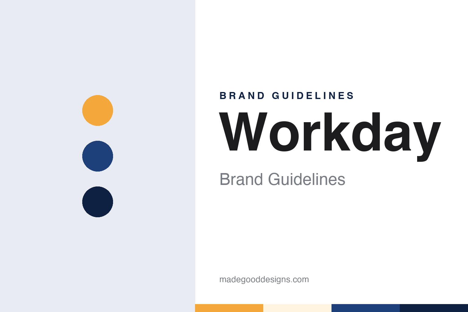
Workday Brand Guidelines
Two PeopleSoft veterans, a fresh start and a horizon over the name.
Aa
Two constants: a daybreak, midday and dusk blue palette and a geometric sans register. Abstract homage — not a Workday asset or mark; no logo, icon or wordmark is reproduced.
After PeopleSoft
A new company, March 2005.
Workday was born out of a takeover. Wikipedia says the company was founded by two former PeopleSoft executives, David Duffield and Aneel Bhusri, after Oracle acquired PeopleSoft in 2005. Duffield had co-founded PeopleSoft, and Computerworld, writing in August 2007, recalled that he and other Workday executives had been involved in an 18-month struggle to fend off Oracle’s hostile bid for the business. They lost that fight, and Duffield told the magazine that Oracle’s win made him think again about business software and in the end led to the creation of Workday.
The dates are well recorded. Computerworld said Workday was established in March 2005 and brought out its opening product, Human Capital Management, in November 2006. That suite dealt with the records a company keeps about its people: hiring, pay, roles and the structure of the organisation. In 2007 the magazine described three more suites on the way, for financial management, resources and revenue, sold together under the banner Enterprise Business Services.
The early company was small and private. Computerworld reported in 2007 that Workday had its headquarters in Walnut Creek, California, that its staff were all in the United States, and that it had been funded by Duffield himself and the venture capital firm Greylock Partners. Its software ran in two hosted data centres rather than on customers’ own servers, which the magazine described as an alternative to the traditional way business software had been sold.
The name suited the subject. Workday’s software was about the ordinary business of a working day: who works where, what they are paid, what the company spends. The word itself is plain English rather than a coined technical term, and the brand that grew around it would lean on that everyday quality, eventually turning the idea of a day, from sunrise to evening, into the basis of its visual identity.
Colour
A horizon, then a refresh.
The Workday logo has long paired the company’s name with an arc above it. When the studio Koto refreshed the identity, Branding in Asia reported in November 2024, the new logo was described as building on the company’s longstanding “Horizon” concept, an arc that stands for optimism and new beginnings. The arc was kept; what changed was the drawing around it. The updated wordmark was given custom letterforms, and the logo family gained a shorthand mark called “The Dub”, which combines the wordmark’s opening W with a compressed horizon for tighter spaces.
The refresh came with a line of positioning. Branding in Asia said the identity was centred on a new positioning line, and that the horizon in the logo suggests a sunrise. The identity tries to hold together two moods, the seriousness expected of software that runs payroll and accounts, and a lighter tone about people and work culture.
Colour does a lot of that work. According to Branding in Asia, the refreshed palette uses warm yellows for energy and cooler blues that suggest reflection and an after-hours focus, supported by a secondary palette of brighter tones and soft gradients. Arcs, gradients and a continuous upward movement are used across marketing and digital screens to reflect the passage of time through the day. Photography was given a direction too, built on natural light and shallow depth of field, with small forward gestures in the pictures.
Type was treated as part of the system rather than an afterthought. Branding in Asia reported that the system starts with a custom logo font drawn from the letterforms of the updated wordmark, to be supported by Workday Sans, a custom typeface then in development and planned with a range of weights and cuts. Koto’s creative director, Caroline Fox, told the publication that the studio had worked as an extension of Workday’s team for about a year, across brand and digital.
Typography
Wordmarks, symbols and screens.
Enterprise software sells something nobody can hold, so its identity has to work on surfaces many consumer brands never think about. The name is the starting point. Some companies coin a word with no prior meaning, which clears trademark searches and domain registration but leaves the brand to build every association from scratch. Others borrow an ordinary word or a fragment of a phrase, which lends a ready image but invites confusion with everything else that shares it.
Mascots and illustrated characters appear more often than the sector’s sober reputation suggests. A friendly figure can soften a product built around tickets, workflows or compliance, though many are quietly retired once a company starts courting larger buyers.
The real brand surfaces are often screens. A login page, an empty dashboard, an error message and a notification email are seen far more often than any advertisement, and their colour, spacing and type do much of the identity work day to day. Annual user conferences add a third surface: the stage set, the keynote slides and the lanyard all carry the system in front of a live audience, which is why many enterprise identities are tested at scale in a convention hall.
Aa
A geometric sans — after a wordmark with a horizon above it. (Specimen set in DM Sans, a sans STAND-IN; NOT the Workday logo, Workday Sans or any Workday typeface.)
Workday
A day, from sunrise to after hours.
Workday today is a listed company with its headquarters in Pleasanton, California, Wikipedia says. The local paper Danville San Ramon reported in May 2019 that Workday had opened a new six-storey corporate headquarters building on Stoneridge Mall Road in Pleasanton, with welcoming remarks from co-founder and chief executive Aneel Bhusri. Wikipedia records that the company went public in October 2012 under the ticker WDAY, and that Bhusri returned to the chief executive role in February 2026.
The brand has also absorbed other names over the years. Wikipedia says Workday acquired Adaptive Insights, a planning software company from Palo Alto, in 2018, and renamed the company and its main product Workday Adaptive Planning. It also says Workday launched a student information system for universities in 2016. In both cases the Workday name was put in front, so the parent brand stayed the one a customer meets, and an acquired name became a description of a product.
That habit makes the identity simple to read. The kit is compact: a single word, a wordmark, an arc and, since the refresh, a short W symbol for tighter spaces. The colours work as a sequence rather than a set: yellow for the start of the day, blue for the end of it. The custom letterforms and the planned Workday Sans tie headlines and interface text to the logo itself.
For a design guide, Workday shows how a plain everyday word can be given a symbol that tells a small story, and how a refresh can keep a long-standing idea while redrawing everything around it. Compare Oracle, the company whose takeover of PeopleSoft preceded Workday’s founding, and SAP, another maker of business software for finance and people. For this guide we use daybreak, midday and dusk blue with a sans, an unofficial interpretation; no product or logo is reproduced.
Explore & save
Keep Workday’s identity on hand — save it to a board in the Made Good inspiration library.
Workday identity set
Pin the Workday daybreak, midday and dusk blue palette and the geometric sans register to your own board.


