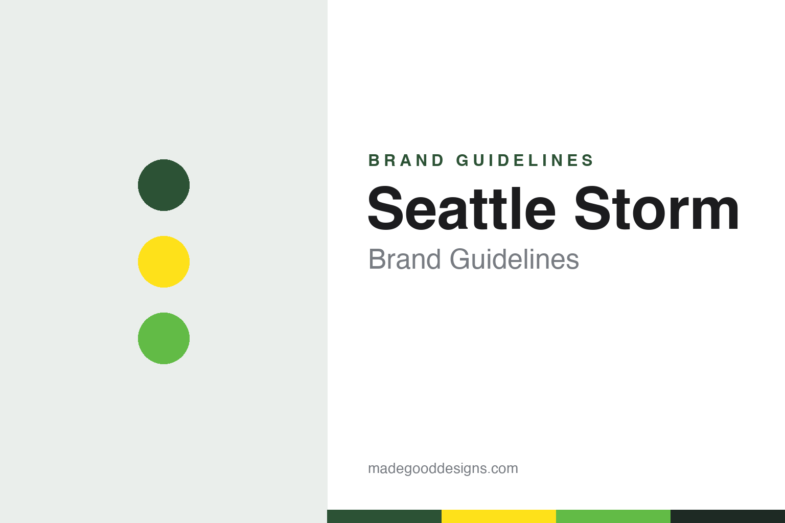
Seattle Storm Brand Guidelines
A rainy-city name, a tower in the ribs of a ball.
Aa
Two constants: a thunder green, lightning yellow and bolt green palette and a squared athletic sans register. Abstract homage — not a Seattle Storm mark; no logo, jersey or wordmark is reproduced.
A name from the weather
A rainy-city name that the club chose before it had a logo.
The Seattle Storm took their name from the city’s climate. The Seattle Times reported in January 2000 that, after months of debate and suggestions that ranged from the Sonic Girls and the Sonicetts to the Seattle Chinooks and the Boom, the new WNBA team had stuck with its original idea. The nickname was approved over the Christmas holiday after a trademark search, and Karen Bryant, the team’s senior director of operations, told the paper it was “the perfect name because of the weather here and what the team plans to do in the league.”
The announcement did not go to plan. The team was run by Full House Sports & Entertainment, the business arm it shared with the NBA’s Seattle SuperSonics, and invitations had gone out for a gala at KeyArena on 19 January at which the name and the logo would be presented together. According to The Seattle Times, a Miami newspaper revealed the names of all four of that season’s expansion teams first: the Storm, the Portland Fire, the Indiana Fever and the Miami Sol. The paper also noted that the name was not new to the city: an amateur soccer club called FC Seattle Storm, formed by players from the original Sounders in the 1980s, had let its trademark lapse after its last season in 1988. The coach, Lin Dunn, liked the name for its sound, and joked that she could call her first two draft picks “Thunder and Lightning.”
English Wikipedia says the team was founded by Ginger and Barry Ackerley, then owners of the SuperSonics, ahead of the 2000 season, and that it followed the Seattle Reign, the city’s club in the American Basketball League from 1996 until that league folded in 1998. The weather theme spread through the club’s presentation. Wikipedia describes the mascot, Doppler, as a maroon-furred creature with a cup anemometer on its head, and says the club’s newsletter was called Stormwatch.
The first logo, as Wikipedia describes it, combined a rounded silhouette of the Space Needle with a green storm cloud, a basketball orbiting the tower through the cloud, and the team name rising at an angle from left to right, cut by jagged strokes meant to suggest lightning.
Colour
Sonics colours, a sale to local owners and a green-and-yellow reset.
The first palette came from the men’s team. Wikipedia says that, like several early WNBA clubs, the Storm were owned by their NBA counterpart and took their cue from the SuperSonics’ “wine and pine” colours of the time, so the original Storm colours were pine green, maroon red, bronze and white. When a group led by the Starbucks chief executive Howard Schultz bought the Sonics and the Storm in 2001, the NBA club went back to green and gold, but the Storm kept their own colours as a way of marketing the team separately.
The two clubs parted in 2008. Wikipedia says the Sonics and the Storm were sold to an Oklahoma City group led by Clay Bennett on 18 July 2006, and that on 8 January 2008 Bennett sold the Storm to Force 10 Hoops, a company formed by four Seattle women, with the WNBA Board of Governors approving the sale on 28 February. The deal kept the Storm in Seattle while the Sonics moved to Oklahoma City later that year. The owners named by Wikipedia today are Dawn Trudeau, Lisa Brummel and Ginny Gilder, with the former player Sue Bird, and the club says the NFL linebacker Bobby Wagner joined the group on 23 July 2025. Force 10 Hoops has owned the Storm since 2008, and Wikipedia says it also kept the original colours at first.
The jersey gained a sponsor in 2010. Microsoft announced on 21 April 2010 that its search engine, Bing, would take the main placement on Storm jerseys as part of a multiyear partnership with the club and the league. Wikipedia says that deal ended after 2013 and that the health-care provider Swedish took over the jersey for the 2016 season.
That season also brought the change of colour. KING 5 reported on 8 January 2016 that the Storm were moving their logos to green and yellow: the design stayed the same, the red and bronze were removed, the yellow was made lighter and the primary logo gained a gray outline. The station noted that the new colours were close to those of the SuperSonics, who had played in Seattle from 1969 to 2008. Wikipedia names the two main shades thunder green and lightning yellow, with white and thunder gray as accents, and says an alternate logo placing the S from the wordmark on a green oval was used on jerseys at times until 2020.
Typography
Design and documentation.
A women’s professional basketball club builds its identity under a different set of pressures from a men’s club in the same city. Many teams in the league were set up in markets that already had an established men’s franchise, and some began life as sister clubs to an NBA team, sharing an owner, a front office and an arena. That arrangement shapes the brand from the start: the women’s team often borrows a colour, a type style or a naming idea from its partner, then has to decide how far to move away from it as it gains its own owners and its own audience.
Colour is usually the first place that independence shows. A club can stay close to the regional palette of the city’s other teams, or pick a combination that no neighbour uses, so that a jersey reads as its own at a glance on television and in the stands. Names tend to come from weather, landscape, local landmarks or a sense of energy, and short single-word names give designers room to build a mark around one strong shape.
Arenas matter too. Teams that share a building with a men’s club, an ice-hockey team or a concert schedule have to make their court, signage and branding stand out on nights when the venue belongs to them, and teams that move between venues carry their identity from one building to the next.
Aa
A squared athletic sans — the register of a jersey number and an arena scoreboard. (Specimen set in Saira Condensed, a squared sans STAND-IN; NOT the Seattle Storm logo or wordmark.)
Seattle Storm
Redrawn in 2021: a tower, a mountain and a bolt.
The current identity arrived on 2 March 2021. In its announcement the club said the new logo kept the image of the Space Needle but placed it within the ribs of a basketball, with the peak of Mount Rainier above it to represent the Pacific Northwest and a lightning bolt at the centre. The club said the new wordmark used a more futuristic typeface, and named three primary colours: Lightning Yellow, a deep Thunder Green and a brighter Bolt Green. Wikipedia notes that the 2021 set kept the 2016 yellow and dark green and replaced the gray with the brighter green.
The launch used the city as a stage. The club said Sue Bird and Jordin Canada would raise a flag with the new logo on top of the Space Needle the next day, and that a mural by the artists Mari Shibuya and Zahyr, produced with the art agency Muros, would go up a block from the team’s arena in Lower Queen Anne.
The team’s home arena has itself changed shape. Wikipedia says KeyArena closed for a rebuild to suit the NHL’s Seattle Kraken, so the Storm played 2019 at the University of Washington’s Alaska Airlines Arena and at Angel of the Winds Arena in Everett, and spent the 2020 season in Bradenton, Florida, during the COVID-19 pandemic. The team moved into the rebuilt building, now Climate Pledge Arena, for the 2022 season, and played its first regular-season game there on 6 May 2022.
For a design guide, the Seattle Storm show how a women’s club can begin inside a men’s club’s palette, keep its own colours when the partner changes course, and later settle on a set that nods to the departed team while drawing its symbols from the city skyline and the mountain behind it. Compare the Seattle Seahawks, the Seattle Kraken and the WNBA itself. For this guide we use thunder green, lightning yellow and bolt green with a squared sans, an unofficial interpretation; no product or logo is reproduced.
Explore & save
Keep Seattle Storm’s identity on hand — save it to a board in the Made Good inspiration library.
Seattle Storm identity set
Pin the Seattle Storm thunder green, lightning yellow and bolt green palette and the squared athletic sans register to your own board.

