Seattle Kraken Brand Guidelines
An S that rises like a wave and a red eye watching from it.
Aa
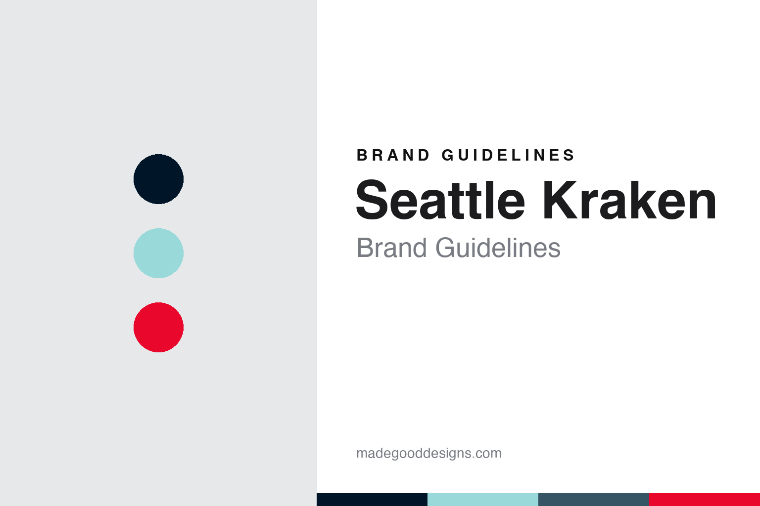
Two constants: a deep sea blue, ice blue and red alert palette and a bevelled maritime capitals register. Abstract homage — not a Seattle Kraken mark; no S logo, anchor or jersey is reproduced.
Release the Kraken
A Post-it note, roughly 1,200 suggestions and a monster from Nordic folklore.
Seattle’s National Hockey League club was approved on 4 December 2018, when the league’s Board of Governors voted to add a team in the city. English Wikipedia says the ownership group was then represented by the investor David Bonderman and the film producer Jerry Bruckheimer, and that the plan rested on a rebuild of the city’s old KeyArena at the Seattle Center, led by the arena company Oak View Group. The team began play in the 2021–22 season.
The name took well over a year to arrive. The club’s own website says the naming search started about six months before the franchise was awarded, with an exploratory lunch between club executives and representatives of Adidas, the league’s uniform supplier. On 23 July 2020 the team finally announced that it would be called the Seattle Kraken, after the sea monster of Scandinavian folklore. In an Associated Press report published that day by The Washington Post, the club’s vice president of marketing, Heidi Dettmer, said the front office had started from roughly 1,200 names and suggestions, cut them to a final five and studied each separately before choosing, and that the decision on Kraken had been made around the start of 2020. The months that followed went into finishing the logo and colours.
The name had been in the air for a long time. Dettmer told the AP that soon after the club put its “NHL Seattle” sign on its office door, a Post-it note appeared the next morning reading “Release the Kraken,” and that the phrase had become something of a rallying cry. Chief executive Tod Leiweke called it “a name born of the fans,” suggested and championed by them. The same report noted other fan favourites, including Sockeyes, Steelheads and Metropolitans, the last a nod to the city’s early hockey history.
The club tied the name to place. Dettmer described Seattle as a city built by the sea and pointed to the deep, dark waters of Puget Sound; general manager Ron Francis told NHL.com on the day of the reveal that the name embodied a connection with the sea and a curiosity about what lies beneath it. Wikipedia adds that the club’s promotional material links the Nordic legend to the region’s history of Scandinavian immigration.
Colour
An S drawn from the Metropolitans, four blues and one red.
The logo was the piece that took longest. The AP report describes the primary mark as a tentacle shaped into an “S” in the style of the logo of the Seattle Metropolitans, the city’s professional club of the 1910s and 1920s. NHL.com’s Nicholas J. Cotsonika wrote on 23 July 2020 that the S follows the Metropolitans’ letter but adds a tentacle and a red eye. Nic Corbett, director of NHL relations at Adidas, told the AP that the mark had to be “noble” and strong, a point he said Francis kept returning to.
The club’s own account of the design names Adidas’s design director for hockey, Matty Merrill, a native of the Pacific Northwest, and says he and colleagues made colour field trips from the company’s Portland headquarters. Merrill is quoted as saying there is a mountain shape at the top of the S, with water flowing down the letter while the Kraken’s tentacle reaches up to pull opponents under. He described the red eye as a “hint of the beast,” with thin red lines on the jersey and socks signalling power lurking beneath the surface.
The palette is almost entirely blue. According to NHL.com, the primary colour is deep sea blue, with ice blue, shadow blue, boundless blue and red alert as secondary colours. The AP described the main tone as a deep dark blue that is almost black, set against lighter blues, and Corbett said the home jersey renderings removed all white so that the stronger colours would stand out. Dettmer told the club’s website that fans had asked for blue or green, and that once the name was chosen, blues drawn from Puget Sound made sense.
A secondary logo gives the city a landmark. The club’s website describes it as an anchor with the Space Needle carved into it, worn on the shoulders of both the home and away jerseys. Wikipedia says players first wore the uniforms at the 2021 expansion draft, held at Gas Works Park.
The club is owned by Seattle Hockey Partners. Wikipedia says the group is led by Bruckheimer, Tod Leiweke and Samantha Holloway, with partners including Adrian Hanauer, Andy Jassy and Tim Leiweke; the former Seahawks running back Marshawn Lynch and the rapper Macklemore joined as minority owners in 2022, and Melinda French Gates in 2026.
Typography
Design and documentation.
An expansion club starts its brand from nothing, so the identity tends to arrive as a sequence of public moments rather than as a single drawing. A name is chosen, sometimes after a fan vote or a shortlist, and announced at an event designed to be filmed and shared. The crest usually follows on the same day or soon after, presented alongside a primary colour set, a secondary mark, a wordmark and the first sweater designs.
Those pieces are meant to work together. The primary logo has to read on a helmet, at centre ice, on a ticket app icon and on a souvenir cap, which pushes designers towards bold silhouettes and a small number of flat colours. Secondary marks often borrow a local landmark, a regional story or a piece of wordplay, giving merchandise a second voice.
Colour names matter as much as the hues themselves. Clubs often give their tones descriptive names tied to place or theme, and those names travel into press releases, retail tags and broadcast graphics. The arena is the last layer: signage, concourse graphics, ice markings and naming-rights wordmarks all have to sit alongside the team’s own marks, so a building’s branding becomes part of how the club looks on screen.
S
Bevelled maritime capitals — the register of a tentacled S, a sonar stripe and an arena ribbon board. (Specimen set in Saira Condensed, a condensed sans STAND-IN; NOT the Seattle Kraken logo or wordmark.)
Seattle Kraken
A renamed arena, a ferry horn, a troll and a sweater that glows.
The arena is part of the identity. The club plays at Climate Pledge Arena, the rebuilt KeyArena at the Seattle Center, close to the Space Needle. Wikipedia says Amazon bought the naming rights on 25 June 2020 and chose a name reflecting its environmental goals; the Kraken’s name, logo and colours were revealed inside the building, then still under construction, a month later. The first home game there was played on 23 October 2021. Wikipedia says the goal horn comes from the ferry MV Hyak, and that players named as the three stars of a home game throw a plush salmon into the crowd, a nod to the fish toss at Pike Place Market.
Later uniforms have drawn on local hockey history. The “Reverse Retro” sweater unveiled on 20 October 2022 used an ice blue base with deep sea blue striping as a callback to the Seattle Ironmen, a Pacific Coast Hockey League team of the 1940s. For the 2024 Winter Classic, played against Vegas, the Kraken wore a deep sea blue sweater with a red S modelled on the Metropolitans’ crest but shaped to the current logo, with the team name written inside; Wikipedia says it was officially unveiled on 22 November 2023. On 4 September 2025 the club introduced an alternate with a black base, glow-in-the-dark details as a nod to bioluminescence, sonar-style stripes on the sleeves and socks, and a glow-in-the-dark patch for the Muckleshoot Indian Tribe.
The mascot arrived a season late. Buoy, a sea troll based on the Fremont Troll sculpture, was introduced before a preseason game against Vancouver on 1 October 2022; Wikipedia says the club had planned to unveil him around Christmas in the 2021–22 season but waited after game postponements during the Omicron wave. In the meantime the team promoted a rescue dog named Davy Jones.
For a design guide, Seattle Kraken shows how an expansion club can root a mythical name in real places: a historic letterform, the colours of Puget Sound, a landmark on the shoulder and a ferry horn in the arena. Compare the NHL, the Seattle Seahawks and the Seattle Mariners, two other Seattle clubs. For this guide we use deep sea blue, ice blue and red alert with a condensed sans, an unofficial interpretation; no product or logo is reproduced.
Explore & save
Keep Seattle Kraken’s identity on hand — save it to a board in the Made Good inspiration library.
Seattle Kraken identity set
Pin the Seattle Kraken deep sea blue, ice blue and red alert palette and the bevelled maritime capitals register to your own board.