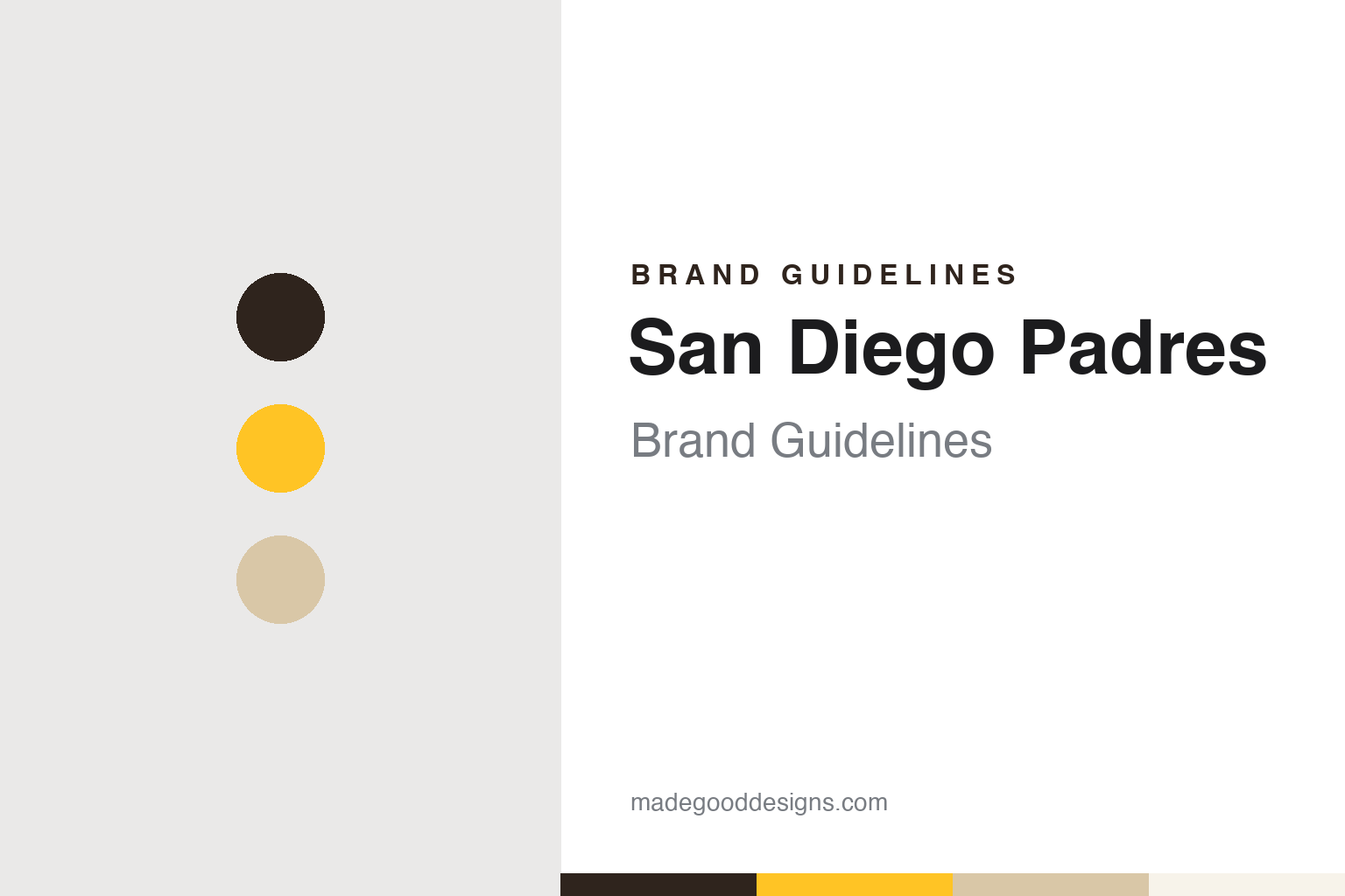
San Diego Padres Brand Guidelines
A name from the missions, a friar with a bat, and a brown that came home.
Aa
Two constants: a friar brown, mission gold and road sand palette and a collegiate block letters and interlocking cap monogram register. Abstract homage — not a San Diego Padres mark; no cap logo, mascot or wordmark is reproduced.
A name from the missions
A minor league name, a Franciscan reference and a friar with a bat.
The San Diego Padres took a name the city already knew. English Wikipedia records that the major league club was founded in 1969 as one of four expansion teams, alongside the Montreal Expos, the Kansas City Royals and the Seattle Pilots, and that it adopted its name from the San Diego Padres of the Pacific Coast League, a minor league team that arrived in the city in 1936. The word is Spanish for “fathers”, and Wikipedia says the name honours the friars of the Franciscan order who founded Mission San Diego de Alcalá in 1769, the settlement around which the city grew.
The mascot comes from the same idea and from the minor league years. Wikipedia describes the Swinging Friar as a rounded figure in a friar’s hooded cloak, sandals and rope belt, with a tonsure, swinging a bat; at home games he rings a mission bell after a win. The character was designed in the 1950s by Carlos Hadaway and was used on team programmes for the 1962 home opener, when the Padres were still a Pacific Coast League club. The major league team kept him in 1969, and its 1969 logo showed the friar swinging a bat inside a sun-like figure ringed with the words “San Diego Padres”. Wikipedia says the Friar is no longer the primary logo but remains the mascot, an alternate logo and a sleeve emblem; since the 1990s he has appeared at the ballpark as a full costume.
The club has played in two main homes. Until 2003 it shared San Diego Stadium, later Qualcomm Stadium, with the Chargers and San Diego State. In 2004 it moved downtown to Petco Park, and Wikipedia records that the move came with an entirely new logo, a shape like home plate with a “Padres” script across the centre and waves along the bottom.
Colour
Kroc, Seidler, and new owners in 2026.
Ownership has changed hands several times. Wikipedia notes that Ray Kroc owned the team from 1974, and that in 1984 the club added his initials, “RAK”, to the left sleeve; the initials stayed until 1986, and they are painted in gold on the front of the press box at Petco Park. The Associated Press reported on 14 November 2023 that Peter Seidler, who was part of a group that bought the Padres in 2012 and who bought out Ron Fowler’s majority stake in November 2020, had died; the team announced it that day. The AP described him as a third-generation member of the O’Malley family, former owners of the Brooklyn and Los Angeles Dodgers. Wikipedia records that the club honoured him with his initials, “PS”, inside a gold heart beside the press box memorials.
A new ownership group followed in 2026. The Associated Press reported on 17 August 2026 that major league owners had approved the sale of the Padres to a group led by private equity investor José E. Feliciano, a co-founder of Clearlake Capital, and his wife and business partner Kwanza Jones, who had agreed in May to buy the club from the Seidler family. MLB.com’s AJ Cassavell wrote on 24 August 2026 that the transaction had been completed shortly after the vote, and that Jones and Feliciano were introduced as the new owners at a press conference at Petco Park that afternoon. Chief executive Erik Greupner and general manager A.J. Preller stayed in charge of day-to-day operations, the AP said.
The colours moved through several eras before the latest one. Wikipedia lists brown and gold as the original colours, with a cream home uniform and a tan road uniform in 1969. In 1972 the club wore all-gold uniforms and a brown cap with a gold front panel shaped like a bell, a reference to the bells of the California missions. Orange joined in 1980; from 1985 to 1990 the team wore brown and orange with a sloped “Padres” script, and Wikipedia credits the buttoned uniforms of 1989 to the firm Sidjakov Berman & Gomez.
Typography
Design and documentation.
A big league club’s identity usually starts with a place. Many franchises carry a city or regional name, and some take a nickname from local history, trade or geography, so the name itself becomes the first piece of the brand. When a club moves, the name often changes with it, while the uniform traditions, letterforms or colour habits of the earlier city may survive in some form.
The cap is a compact part of the system. A cap insignia has to work as a single initial, a monogram or a small symbol that can be read from the stands, stitched in thread and reproduced on everything from tickets to television graphics. Clubs often keep a primary cap mark while adding alternates, anniversary patches and special-event uniforms around it.
Colour tends to move in cycles. Clubs drop a palette, wear something else for years, and later bring the earlier colours back, sometimes after supporters ask for them. Ballparks add another layer: stadium names are often sold as naming rights, so the building’s signage can carry a company’s name and colours beside the team’s own marks. For designers, the lesson is that a sports identity is a set of parts that change at different speeds.
Sd
A squared collegiate slab — the register of block jersey lettering and a cap monogram. (Specimen set in Graduate, a collegiate STAND-IN; NOT the San Diego Padres logo, lettering or wordmark.)
San Diego Padres
Navy, sand and the return of brown.
From 1991 until 2019 the Padres used other primary colours. Wikipedia records that in 1991 the club changed to navy blue and orange, with navy pinstripes at home and a navy cap carrying a white “S” and an orange “D”. With the 2004 move to Petco Park the colours became navy and sand, a beige that replaced orange; for several seasons the road uniform was sand rather than grey. A navy and gold scheme followed in 2016, along with a brown and gold alternate worn mainly at Friday home games, and in 2017 the club went back to navy and white while keeping that brown alternate.
The decision to return was announced early. Sports Illustrated’s Michael Shapiro reported on 25 January 2019, citing Kevin Acee of the San Diego Union-Tribune, that the Padres planned to wear primarily brown uniforms from 2020, and recalled that the club had worn brown and gold from 1969 to 1984 and brown and orange until 1991. The uniforms were unveiled on 9 November 2019. MLB.com’s AJ Cassavell described a fashion show on a stage in the Petco Park outfield: a grey pinstripe road uniform with “San Diego” across the front, a brown road uniform with San Diego in gold, and a white pinstripe home uniform with “Padres” in brown lettering and a gold outline. The Swinging Friar appeared on the sleeve of all three. Times of San Diego reported the next day that executive chairman Ron Fowler told the crowd the club had looked at a variety of styles over about two years, and that focus groups had consistently favoured the brown and gold throwback look.
Wikipedia adds detail on the set. The home jersey brought back pinstripes, absent since 2001, the road set reintroduced a sand colour on pinstripes, and the club wears brown caps with gold lettering. In 2022 a Nike City Connect uniform took a different route: mostly white with pink, mint green and yellow accents, a graffiti-style “San Diego”, a pink and yellow Swinging Friar on the sleeve and a mint cap, intended as a tribute to the San Diego–Tijuana region.
For a design guide, the San Diego Padres show how a colour can leave, survive as a throwback, and return as the main identity after focus groups favoured it. Compare it with the Los Angeles Dodgers, a National League West rival long tied to the O’Malley family, and with Nike, maker of the club’s City Connect uniform. For this guide we use friar brown, mission gold and road sand with a slab serif, an unofficial interpretation; no product or logo is reproduced.
Explore & save
Keep San Diego Padres’s identity on hand — save it to a board in the Made Good inspiration library.
San Diego Padres identity set
Pin the San Diego Padres friar brown, mission gold and road sand palette and the collegiate block letters and interlocking cap monogram register to your own board.