Minnesota Twins Brand Guidelines
A name shared by two cities, a cap monogram that refused to choose, and a handshake across the river.
Aa
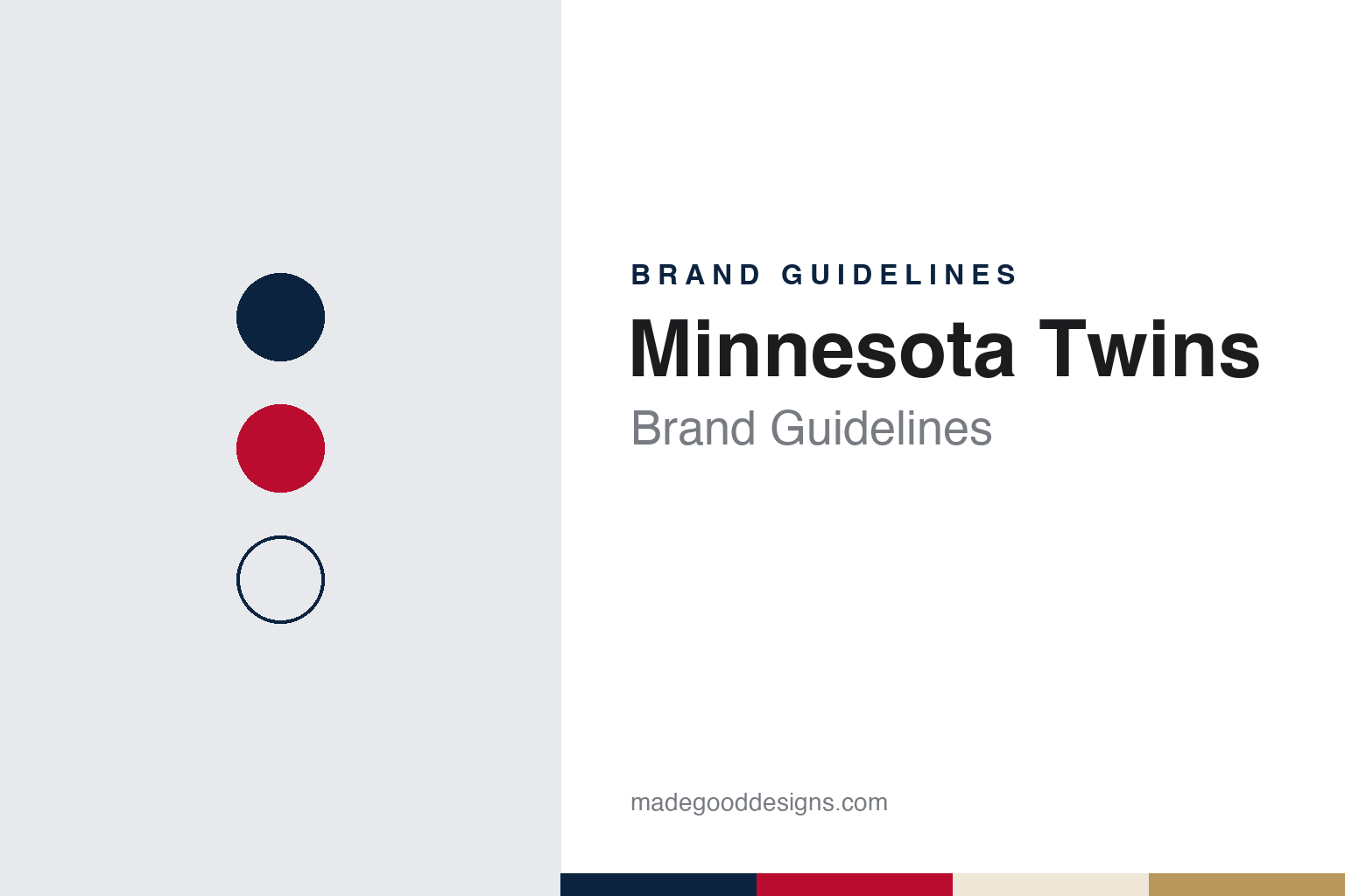
Two constants: a Twin Cities navy, North Star red and cream palette and a script wordmark and interlocking cap initials register. Abstract homage — not a Minnesota Twins mark; no cap logo, script or wordmark is reproduced.
A name for two cities
From Washington to the Twin Cities, with a monogram that took no sides.
The Minnesota Twins began life in another city. English Wikipedia traces the franchise to the minor league Kansas City Blues of 1894 and records that the club moved to Washington, D.C. in 1901 to become one of the eight charter members of the American League. In Washington it was the Senators from 1901 to 1904, officially the Nationals from 1905 to 1955 and the Senators again from 1956 to 1960, although Wikipedia says it was commonly called the Senators throughout. In 1960 the league agreed to let owner Calvin Griffith move the team to the Minneapolis–Saint Paul region, and a new Senators club was formed in Washington for 1961.
The name was chosen to avoid choosing a city. Wikipedia explains that “Twins” comes from “Twin Cities”, the popular nickname for Minneapolis and Saint Paul, and that Griffith did not want to alienate fans in either city by naming the team after one of them. He proposed calling the club the “Twin Cities Twins”; the league objected, and the team became the Minnesota Twins. The club was allowed to keep a “TC” insignia for its caps, and Wikipedia says the interlocking letters were adopted because Griffith knew how bitter the rivalry between the two cities was.
The same idea runs through the team’s handshake logo. Wikipedia describes it as two men, one in a Minneapolis Millers uniform and one in a St. Paul Saints uniform, shaking hands across the Mississippi River inside an outline of the state. The pair are known as “Minnie and Paul”, and the logo appeared on the left sleeve of the original Twins uniforms. The club played at Metropolitan Stadium in Bloomington from 1961 to 1981, then at the Hubert H. Humphrey Metrodome in downtown Minneapolis, which it shared with the Minnesota Vikings. Its present home, Target Field in the city’s Warehouse District, opened for the 2010 season; Wikipedia records that the ballpark is owned by a public body, the Minnesota Ballpark Authority, and that its opening regular season game was played on 12 April 2010.
Colour
Pohlad family ownership, and a cap that came and went.
The owners have been the same family for four decades. Wikipedia describes the Pohlad family as owners of the franchise since 1984, and records that in August 2025 the family said it would keep majority control of the Twins rather than sell, bringing in new limited partners instead, subject to league approval. A member of the family, Joe Pohlad, was the club’s executive vice president of brand strategy and growth when the current identity was introduced, according to MLB.com.
The cap has carried the regional idea through several redesigns. From 1961 to 1971, Wikipedia says, the Twins wore the “Twins” script and numerals in navy outlined in red with navy caps bearing the interlocking TC. In 1972 the script colours were reversed and the pinstripes removed from the home uniform, and in 1973 the club moved to polyester pullovers, including a powder blue road uniform and, for a time, a navy-brimmed red home cap. In 1987 the club brought back pinstripes and introduced the modern “Twins” script, and Wikipedia says it felt established enough by then to put a stylised “M” on the cap without St. Paul fans reading it as Minneapolis. The TC moved to the sleeve, returned as a home cap in 2002, and became the main cap mark again in 2010.
Between those changes the palette picked up a third colour. In 2015, Wikipedia records, the home uniform gained Kasota gold drop shadows, along with a gold-outlined TC cap; a red alternate followed in 2016 and a navy alternate in 2019. A powder blue throwback, a buttoned version of the 1973 to 1986 road set, arrived the next year. By the end of that period, MLB.com later wrote, the club’s marks had become a mismatch of hues, fonts and logos, and a refresh had been under way since 2020.
Typography
Design and documentation.
A big league club’s identity usually starts with a place. Many franchises carry a city or regional name, and some take a nickname from local history, trade or geography, so the name itself becomes the first piece of the brand. When a club moves, the name often changes with it, while the uniform traditions, letterforms or colour habits of the earlier city may survive in some form.
The cap is a compact part of the system. A cap insignia has to work as a single initial, a monogram or a small symbol that can be read from the stands, stitched in thread and reproduced on everything from tickets to television graphics. Clubs often keep a primary cap mark while adding alternates, anniversary patches and special-event uniforms around it.
Colour tends to move in cycles. Clubs drop a palette, wear something else for years, and later bring the earlier colours back, sometimes after supporters ask for them. Ballparks add another layer: stadium names are often sold as naming rights, so the building’s signage can carry a company’s name and colours beside the team’s own marks. For designers, the lesson is that a sports identity is a set of parts that change at different speeds.
Tc
A loose, connected brush script — the register of a club wordmark written rather than set. (Specimen set in Yellowtail, a script STAND-IN; NOT the Minnesota Twins logo, script or wordmark.)
Minnesota Twins
One designer, a North Star and “Twin Cities” spelled out.
The current identity was unveiled on 18 November 2022. Twinkie Town, the SB Nation site that covers the team, reported that day that the club announced the rebrand at the Mall of America, and MLB.com’s Do-Hyoung Park described it as a full brand overhaul, the previous one having come in 1987. Park wrote that one person had been put in charge of a cohesive design across the organisation: Matthew Wolff, a New York-based graphic designer and art director who grew up in the Twin Cities and whose portfolio included football kits for American and international teams. Wolff, Park reported, had never before been hired by a baseball team.
The refresh kept the core marks and redrew them. A sleeker cursive “Twins” script, modelled on the franchise’s earliest wordmark, became the primary logo. Twinkie Town noted that the ends of the T in the TC were trimmed and the C tightened, and that the script and numbers lost their shadows and outlines. The “M” cap returned in a new form, with a small red four-pointed North Star above and between its peaks, a reference to the state’s nickname; Park quoted Wolff as saying the team wanted the M to feel like a sibling of the TC, so both letters were drawn from the same new typeface. A sleeve patch in the shape of Minnesota places the same red star where the Twin Cities sit.
Four uniforms came with it. Park listed a white home set with the new script, grey road pinstripes with a block “MINNESOTA” in navy, a near-black navy alternate that can be worn at home or away, and a cream home alternate with “Twin Cities” across the chest, which Wolff said spelled out what the TC cap had stood for. Wikipedia adds that the cream set leaves out red and carries two crossed navy flags marked for Minneapolis and St. Paul. In 2024 the club added a Nike City Connect uniform built around the state’s “Land of 10,000 Lakes” nickname, with an “MN” on the chest, a yellow star and a sleeve patch showing a loon.
For a design guide, the Minnesota Twins show how a political compromise over a name can become a lasting visual system, with a monogram, a handshake and a star all making the same point about two cities. Compare it with the Minnesota Vikings, the club’s former Metrodome neighbour, and with New Era, maker of the on-field cap that carries the TC. For this guide we use Twin Cities navy, North Star red and cream with a script, an unofficial interpretation; no product or logo is reproduced.
Explore & save
Keep Minnesota Twins’s identity on hand — save it to a board in the Made Good inspiration library.
Minnesota Twins identity set
Pin the Minnesota Twins Twin Cities navy, North Star red and cream palette and the script wordmark and interlocking cap initials register to your own board.