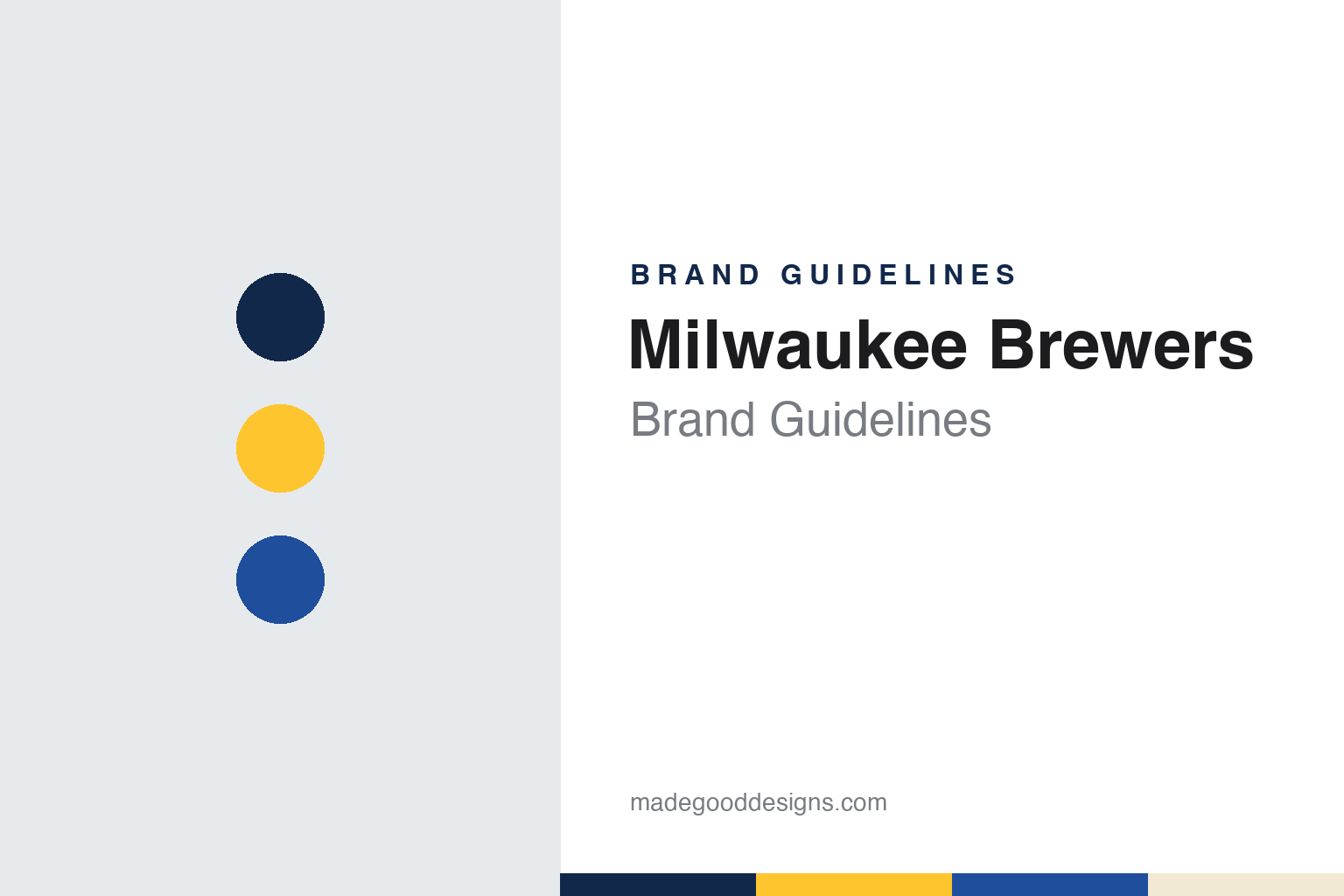
Milwaukee Brewers Brand Guidelines
A borrowed uniform, a hidden pair of letters, and a glove brought back for a fiftieth season.
Aa
Two constants: a brew navy, barley gold and royal blue palette and a slab block lettering and hidden monogram register. Abstract homage — not a Milwaukee Brewers mark; no cap logo, glove logo or wordmark is reproduced.
From Seattle to a brewing city
A one-season Pilots club, a bankruptcy court and a name with local roots.
The Milwaukee Brewers were founded in another city. English Wikipedia records that the club began as the Seattle Pilots, an American League expansion team that played a single season in Seattle, 1969, at Sick’s Stadium. After that season it was acquired in bankruptcy court by Bud Selig, who moved it to Milwaukee, where it played at Milwaukee County Stadium as the Brewers from 1970. An Associated Press report of 13 January 2005 notes that Milwaukee had been without major league baseball since the Braves left for Atlanta after the 1965 season, and recalls that Selig brought baseball back by acquiring the bankrupt Pilots.
The name looks to the city’s industry and its own baseball past. Wikipedia says it alludes to Milwaukee’s association with brewing and has been used by several earlier teams that called the city home, including the minor league American Association club. Wikipedia adds that Selig had planned to adopt navy blue and red in honour of that minor league team, but the move was approved less than a week before the 1970 season began. There was no time to order uniforms, so the club removed the Seattle markings from the Pilots’ blue-and-gold uniforms and sewed “BREWERS” across the front; the outline of the old Pilots logo remained visible.
The league position changed as well as the name. The Brewers stayed in the American League through 1997 and joined the National League in 1998, Wikipedia says. In 2001 the club moved into a new ballpark, which was called Miller Park through the 2020 season and has since been named American Family Field. Seattle later gained a new American League club, the Seattle Mariners.
Colour
From the Selig family to Mark Attanasio.
The Selig family’s control ended in 2005. The Associated Press reported on 13 January 2005 that major league owners had unanimously approved the sale of the Brewers from the family of commissioner Bud Selig to a group headed by Los Angeles investor Mark Attanasio, with the ownership transfer due the following day. The same report says Selig’s daughter, Wendy Selig-Prieb, had been in charge of the franchise since her father became commissioner in 1998, and describes Attanasio as a group managing director of the money management firm Trust Company of the West who grew up in the Bronx. Wisconsin Public Radio, on 14 January 2005, reported that the sale was due to close that day at a Milwaukee law office, ending the link between the club and the Selig family.
The visual history before the sale ran through several sets. After the borrowed Pilots uniforms, Wikipedia says, the Brewers got their own flannel design in 1971 and moved to double-knit pullovers in 1972, with blue and yellow trim; a yellow-paneled road cap followed in 1974. During this period the club’s logo was a beer-barrel figure later known as the Barrelman. In 1994, for the club’s 25th season in Milwaukee, the team replaced its logo with an interlocking “M” and “B” on crossed bats over a diamond, changed royal blue to navy and yellow to a metallic gold, and added forest green. In 2000, ahead of the move to the new ballpark, it adopted a flowing “Brewers” script and a cap “M” underlined by a head of barley, a reference to brewing.
The older logo never fully went away. MLB.com’s Adam McCalvy wrote on 29 October 2019 that the ball-in-glove had been part of the uniform kit since 2006, initially as an alternate look and then with increasing frequency, and that in 2017 the club updated it by pairing the retro yellow with its current navy. In 2018, he added, the script “M” with barley had become the primary logo.
Typography
Design and documentation.
A big league club’s identity usually starts with a place. Many franchises carry a city or regional name, and some take a nickname from local history, trade or geography, so the name itself becomes the first piece of the brand. When a club moves, the name often changes with it, while the uniform traditions, letterforms or colour habits of the earlier city may survive in some form.
The cap is a compact part of the system. A cap insignia has to work as a single initial, a monogram or a small symbol that can be read from the stands, stitched in thread and reproduced on everything from tickets to television graphics. Clubs often keep a primary cap mark while adding alternates, anniversary patches and special-event uniforms around it.
Colour tends to move in cycles. Clubs drop a palette, wear something else for years, and later bring the earlier colours back, sometimes after supporters ask for them. Ballparks add another layer: stadium names are often sold as naming rights, so the building’s signage can carry a company’s name and colours beside the team’s own marks. For designers, the lesson is that a sports identity is a set of parts that change at different speeds.
Mb
A heavy slab serif — the register of block jersey lettering cut with square, brick-like terminals. (Specimen set in Alfa Slab One, a slab STAND-IN; NOT the Milwaukee Brewers logo, lettering or wordmark.)
Milwaukee Brewers
An art student’s glove, redrawn for a fiftieth season.
The ball-in-glove is the centre of the identity. Writing for MLB.com on 22 January 2021, Adam McCalvy recounted that it was drawn by Tom Meindel, an art student at the University of Wisconsin–Eau Claire, who entered a team-sponsored contest in the autumn of 1977 when the club wanted to replace the Barrelman. Meindel’s design combined a lowercase “m” and “b” into the shape of a baseball glove holding a ball. McCalvy reports that the entry arrived in brown and yellow, colours that did not match the club’s palette. The Brewers wore the logo from 1978 to 1993; Wikipedia says that the 1978 set paired it with pinstripes at home and powder blue on the road, with “Milwaukee” in a slanted script across the road jersey.
The return came with the club’s fiftieth season. Paul Lukas of Uni Watch reported on 19 November 2019 that the Brewers had released their new set the previous night, and that the logos and uniforms were created by Rodney Richardson of RARE Design, a designer previously associated with NBA work. The Miller-style “M” was dropped and the ball-in-glove became the primary mark again. McCalvy’s 2021 article lists the changes: the tip of the “b” and the start of the “m”, once separated, are now connected, and the ball sits centred in the glove, with reoriented seams that divide it into three parts. The club made navy permanent in place of the original royal blue, and Lukas noted the new shade of yellow paired with it. Wikipedia adds that royal blue returned as an accent and the metallic gold gave way to a mustard gold.
The uniforms leaned on local reference. Wikipedia describes a cream home uniform, a nod to Milwaukee’s “Cream City” nickname, with “Brewers” in stylised block letters, a grey road uniform reading “Milwaukee”, a navy alternate in script, a home sleeve patch showing a navy baseball with barley seams, and a road patch with a gold Wisconsin map built from Cream City bricks. Lukas wrote that the new block lettering appeared to evoke brickwork. In 2022 a powder blue Nike City Connect uniform added “Brew Crew” in gold and a cap reading “MKE” with the 414 area code. For 2026, Wikipedia says, the road top switched from grey to powder blue, recalling the 1970 to 1985 road uniforms, and a second City Connect set put “Wisco” on the chest.
For a design guide, the Milwaukee Brewers show how a logo with a hidden pair of letters can outlast the marks that replaced it, and return as the anchor of a whole uniform system. Compare it with the Chicago Cubs, a National League Central rival, and with MLB, the league whose batter silhouette sits on every cap. For this guide we use brew navy, barley gold and royal blue with a slab serif, an unofficial interpretation; no product or logo is reproduced.
Explore & save
Keep Milwaukee Brewers’s identity on hand — save it to a board in the Made Good inspiration library.
Milwaukee Brewers identity set
Pin the Milwaukee Brewers brew navy, barley gold and royal blue palette and the slab block lettering and hidden monogram register to your own board.