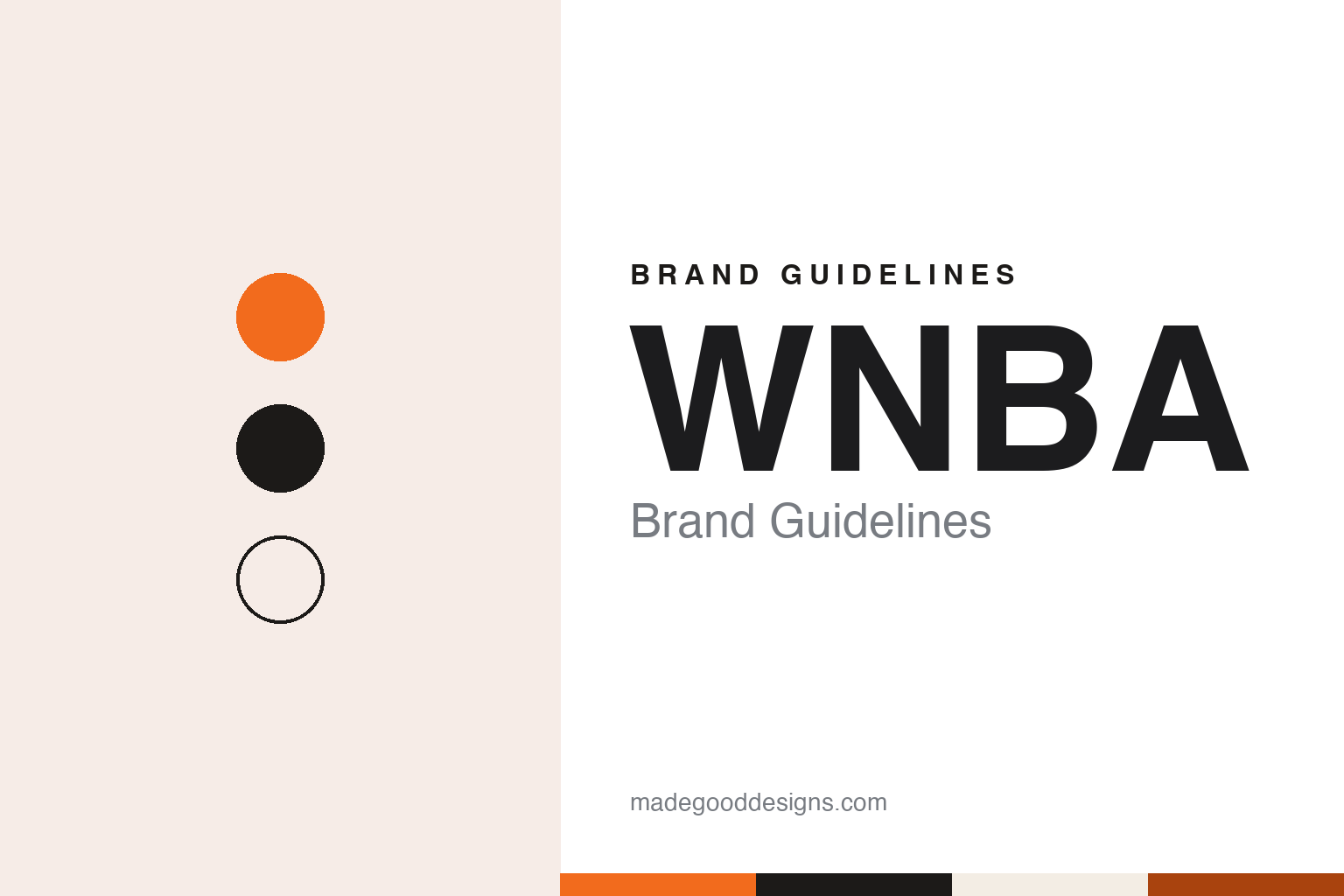
WNBA Brand Guidelines
The 1996 league whose silhouette stepped out of the box.
Aa
Two constants: a court orange, ink and oatmeal palette and a condensed athletic sans register. Abstract homage — not a WNBA asset; no logo, silhouette or uniform is reproduced.
We Got Next
A women’s league approved by the NBA’s owners in 1996.
The Women’s National Basketball Association began as a decision of the National Basketball Association’s owners. On 24 April 1996, the Associated Press reported from New York, the NBA Board of Governors approved the idea of a new professional league for women, to start in the summer of 1997. “We are working on the concept,” said Commissioner David Stern. “It’s all tentative. It’s a working model, subject to lots of changes.” He promised more on television arrangements and on the teams and cities by 1 July.
When the AP republished that story in February 2022, it recalled that the league had launched with a slogan, “We Got Next.”
English Wikipedia records that the approval was announced at a press conference attended by the players Rebecca Lobo, Lisa Leslie and Sheryl Swoopes, and that the league’s opening game was played on 21 June 1997, when the New York Liberty met the Los Angeles Sparks at the Great Western Forum in Inglewood, California, on NBC. The WNBA was set up as the women’s counterpart to the NBA, and its league office is in New York City.
Its leadership has changed titles over the years. Wikipedia lists Val Ackerman as president from 1996 to 2005, followed by Donna Orender from 2005 and Laurel J. Richie from 2011. In May 2019 Cathy Engelbert was named commissioner, a title that replaced the league’s presidency, according to the same source.
Colour
From a slanted shield to an orange tile to a free-standing figure.
Each WNBA logo has shown a basketball player in silhouette, echoing the NBA’s own mark, whose figure, the league’s chief operating officer noted in 2019, sits inside a rectangle. English Wikipedia says the original WNBA mark, which it calls “Logo Woman,” paralleled the NBA logo and was selected from a field of competing designs. A 2023 article on the fan site Winsidr describes that first logo as a red, white and blue shield, slanted on the diagonal like the NBA’s, with the letters WNBA above a player dribbling a ball.
The same Winsidr article dates a change of mark to 2013, when it introduced an orange logo that moved away from the NBA’s red, white and blue.
The more significant redesign came in April 2019. On 8 April the AP’s basketball writer Doug Feinberg reported that the WNBA’s logo was “getting a new look” and that the league was “resetting its brand” ahead of its 23rd season. The league had worked with Sylvain Labs, described as an innovation and brand design consultancy, to study existing and potential fans; with input from players, the two produced the new logo. The league’s chief operating officer, Christy Hedgpeth, told the AP that the target was a younger audience, aged 16 to 34.
The change was in the frame. “They took the silhouette out of the box,” Hedgpeth said, explaining that the NBA logo, the G League logo and the previous WNBA logo all placed the player inside a box. “The box is going away.” She described the new figure as freer, with “more movement,” and said a phrase used in the process, “basketball on our terms,” had resonated with the players.
The Drum, publishing Sylvain Labs’ project on 9 April 2019, added that the new logo would not appear on uniforms or balls until the following year, because of production lead times, but would be used everywhere else across the league. The same announcement named AT&T as a new marquee partner; Wikipedia says its logo went on the front of every team’s jersey, with the jerseys debuting at the 2019 draft.
Typography
Design and documentation.
A sports league or promotion rarely sells a single object. What it builds is a system of marks that has to work everywhere the competition appears: on a television graphic in the corner of a screen, on a ticket, on a replica shirt, on a mat or a pitch, and on a social feed viewed on a phone. That spread of uses tends to push league and promotion logos towards simple silhouettes, a small set of colours and lettering that can survive being shrunk, stitched or animated.
Broadcast packages are a large part of that identity. Score bugs, lower thirds, opening titles and replay wipes repeat the same colours and type across every event, so viewers learn the look of a competition before they know its history. Organisations can refresh these packages on their own schedule, separate from the main logo.
Physical objects carry the brand too. Jerseys, championship belts, trophies, medals and rings are made to be photographed, and their shapes, materials and engraving often echo the primary mark. Studying a league’s identity means looking past the logo file to the graphics, kit and prizes that surround it.
Aa
A condensed athletic sans, in the spirit of league wordmarks. (Specimen set in Barlow Condensed, a sans STAND-IN; NOT the WNBA logo.)
WNBA
Anniversary marks, a cup and a ball.
The league has also used temporary identities around its main mark. Wikipedia records that its 2006 All-Star Game featured custom uniforms that matched a tenth-anniversary logo, and that on 15 March 2021 the WNBA announced a ceremonial logo, basketball and uniforms for its 25th-anniversary campaign, called “Count It.” Anniversary marks of this kind sit beside the primary logo for a season rather than replacing it.
New competitions have brought new names. In January 2020 the WNBA announced an in-season tournament, the Commissioner’s Cup, planned for that season; the COVID-19 pandemic delayed it, and it began in 2021, according to Wikipedia. Its postseason carries sponsors’ names too: since 2021 Google has been attached to the playoff rounds before the Finals, and YouTube TV to the Finals, the same source says.
The ball itself is part of the visual system. Wikipedia says Spalding supplied the WNBA ball from 1997 and Wilson took over in 2022; the women’s ball is a little smaller and lighter than the NBA ball, a size that has been used in senior women’s competitions worldwide since 2004. The league’s uniforms have come from a series of outfitters; Wikipedia notes that Adidas supplied new designs to every team before the 2011 season.
Merchandise has carried the colour into everyday wear: Wikipedia names the league’s orange WNBA hoodie among the items fans bought in 2024, alongside player jerseys.
Within the wider basketball family the WNBA sits alongside the NBA and its G League. When the 2019 logo arrived, the AP noted that it was “different from others affiliated with the NBA,” and Hedgpeth called the unboxed figure “powerful,” “freeing” and “expansive.”
For a design guide, WNBA shows how a league can keep a familiar silhouette while changing the frame around it. Compare the NBA, whose Logoman sits inside a rectangle, and ESPN, which held WNBA rights from the opening 1997 season alongside NBC and Lifetime, Wikipedia says. For this guide we use a court orange, ink and oatmeal with a condensed sans, an unofficial interpretation; no product or logo is reproduced.
Explore & save
Keep WNBA’s identity on hand — save it to a board in the Made Good inspiration library.
WNBA identity set
Pin the WNBA court orange, ink and oatmeal palette and the condensed athletic sans register to your own board.