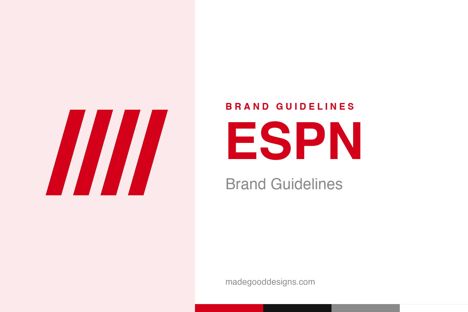
ESPN Brand Guidelines
Four red letters, leaning forward like they’re already running to the next highlight — the sound and speed of sports on TV.
Abstract forward-slanted bars — the italic-motion idea, not the letters. Deliberately not the ESPN wordmark.
Letters that lean into the action
ESPN’s wordmark is built entirely on forward motion.
The ESPN logo is one of the most kinetic wordmarks in media: the letters “ESPN” in bold, italicised, forward-leaning forms that interlock and push to the right. Everything about it says speed, energy, momentum — exactly the feeling of live sports. The letters look like they’re already sprinting to the next play. That’s a perfect match for a brand whose whole business is the excitement, urgency and constant motion of athletics; the mark performs its subject. The forms are based on Aldo Novarese’s 1971 typeface “Stop,” a famously dynamic, forward-slashing face. Our homage keeps that italic-motion idea as abstract forward bars, without the letters.
1985, not 1979
A precise correction about the famous wordmark.
Here’s a detail worth getting right. Although ESPN launched on 7 September 1979, the iconic interlocked-italic wordmark did not exist yet. The 1979 logo was completely different — “ESPN” in a rounded sans set inside a white ellipse with a thick orange border. The forward-leaning, interwoven form we all picture debuted in the 1985 redesign, and it’s that mark, refined over the years, that survives today. It’s a common mix-up (people assume the famous logo is as old as the network), so on a citation-grade page it’s worth being exact: the channel is 1979; the wordmark is 1985. The individual designer isn’t documented, but the typographic DNA — Novarese’s “Stop” — is.
A brand that became a category
ESPN grew into the default word for sports coverage.
ESPN — Entertainment and Sports Programming Network — was founded by Bill Rasmussen and his son Scott (with Ed Eagan), launching the radical idea of a channel dedicated entirely to sports, around the clock. It grew into the dominant force in sports media, so ubiquitous that its programmes (SportsCenter) and its very name became shorthand for “sports on TV.” The bold, energetic wordmark has ridden that whole rise, becoming inseparable from the experience of watching sport. When a brand’s identity is applied billions of times across broadcasts, tickers, apps and merchandise, consistency is everything — and the italic ESPN mark has stayed remarkably steady, accumulating authority as the network became the genre’s centre of gravity.
Motion as a brand asset
ESPN’s logo proves a wordmark can capture a feeling.
The enduring lesson of the ESPN mark is how much emotion and energy a purely typographic logo can carry. There’s no symbol, no illustration — just four letters — yet the italic slant, the bold weight and the interlocking forms combine to communicate speed, excitement and momentum instantly, without a single pictorial element. The type is the story.
That’s a valuable principle: a wordmark isn’t just a name rendered legibly; the way the letters are drawn can express the brand’s entire character. ESPN’s forward lean makes you feel the rush of live sport before you’ve read anything. It’s the same logic behind FedEx’s hidden arrow or the Rolling Stones’ tongue — a mark that embodies rather than merely labels. And because that energy is built into the letterforms themselves, the logo has aged gracefully; motion never goes out of style. For over four decades, through every shift in how we watch sport, ESPN’s tilted red letters have kept sprinting to the right, always chasing the next highlight — which is exactly the feeling a sports network wants its name to give you. Draw the letters with enough conviction, and the wordmark does the emotional work all on its own.
What lingers, in the end, is how much a single well-made mark can carry. ESPN demonstrates that an identity is not just a label on a product but a compressed story — of values, of heritage, of a promise to the people who encounter it. When that story is clear and the symbol that tells it is distinctive and consistent, the brand gains something durable: instant recognition, and the trust that travels with it. The craft lies in choosing the right idea in the first place, then having the patience to let it slowly become iconic.
Type & the wordmark
The logo is bespoke italic lettering.
The ESPN mark is custom interlocked-italic lettering (rooted in Novarese’s “Stop”) rather than a stock font; support type stays clean. The specimen below stands in with a bold italic sans.
This is SportsCenter
Bold, italic, forward — type that reads as pure motion. (Specimen set in Archivo italic, a neutral stand-in.)
ESPN red
One bold, energetic red. Click a swatch to copy the hex.
ESPN’s identity is anchored by a bold red #D4001A (Pantone 032 C; a darker #CC0000 also circulates), with black and white. Lead with the red below.
Explore & save
Keep the motion idea on hand — save the bars homage and ESPN red to a board.
ESPN identity set
Pin the forward-bars homage, ESPN red and the type-as-motion lesson to your own board.


