Marks & Spencer Brand Guidelines
A Leeds market stall, a saint’s name on the label and a food voice-over.
Aa
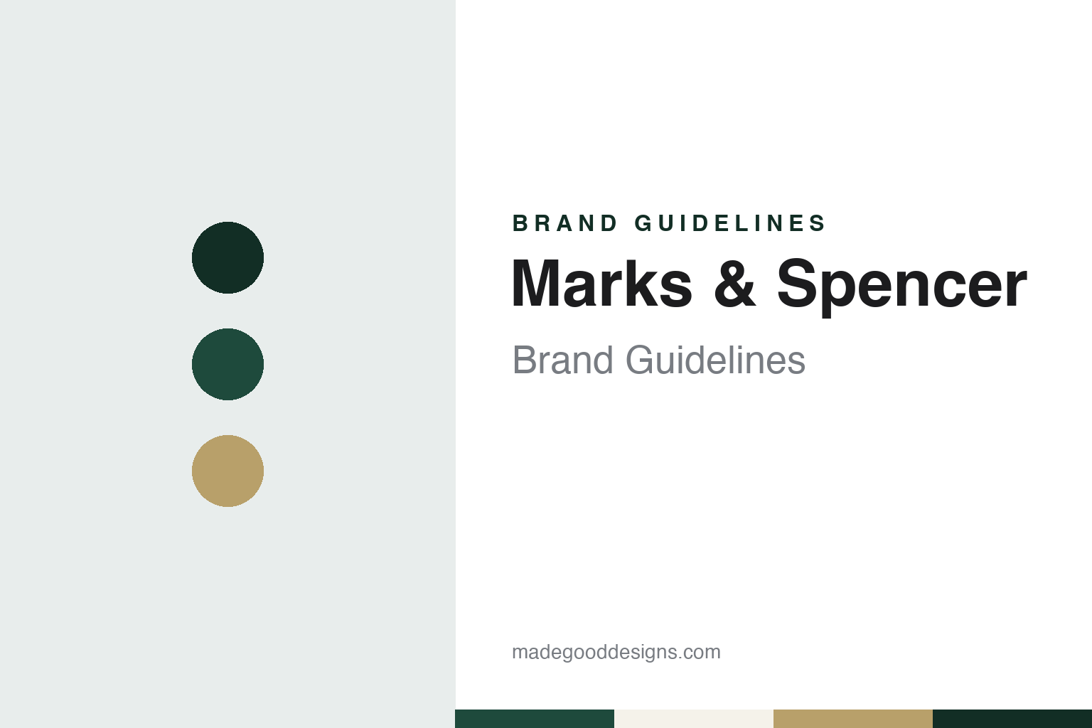
Two constants: a food-hall green, label gold and cream palette and a label capitals register. Abstract homage — not a Marks & Spencer product or mark; no logo, label or packaging is reproduced.
Penny Bazaar
A market stall in Leeds, a cashier from Skipton and a sign that set the price.
Marks & Spencer began on a market stall in Leeds. BBC News, reporting on the company’s identity on 12 March 2000, said that Michael Marks started the business with his partner Thomas Spencer at a Leeds market stall in 1884. English Wikipedia gives more detail: Marks, a Jewish migrant from Slonim in what is now Belarus, set up a penny bazaar at Kirkgate Market in Leeds in 1884 with a loan from the wholesaler Isaac Jowitt Dewhirst, whose cashier was Thomas Spencer, a bookkeeper from the market town of Skipton.
The partnership itself came ten years later. Wikipedia says that in 1894, when Marks took a permanent stall in the Leeds covered market, he invited Spencer to become his partner, and that the two men later traded from Birkenhead market and across the north-west of England.
The family name stayed at the centre of the business after the founders. Wikipedia says Michael Marks’s son Simon Marks became chairman in 1916, that textiles were added in 1926 and food from 1931, and that the company became known colloquially as “Marks and Sparks”. The two surnames, joined by an ampersand, remain the company name, and the short form M&S later became a brand in its own right.
The company keeps its own history close to where it started. Wikipedia records that the M&S company archive is held in the Michael Marks Building at the University of Leeds, with permanent museum-style displays and temporary exhibitions. The site sits in the same city as the Kirkgate stall, and the archive holds the labels, packaging and advertising that make up much of the brand’s visual record.
Colour
A saint’s name on the label, a promise on the back and a voice-over.
For much of the twentieth century the label inside an M&S garment did not say Marks & Spencer. It said St Michael. BBC News reported in March 2000 that the St Michael name was devised in the 1920s by Simon Marks as a lasting tribute to his father, and that by 1928 it had been registered as a trademark, appearing on clothing labels and food packaging alongside the Marks & Spencer name or alone. Wikipedia says the label was extended to food in 1941 and that by 1950 almost all goods were sold under it.
The change came in 2000. The BBC reported that the company was moving the St Michael logo off the main label on products from sausages to socks, and that the label brand would become the Marks & Spencer name. A spokesman told the BBC that customers had not been clear which was the main brand, and that St Michael would become the company’s equivalent of the Woolmark or Kitemark, reappearing as a circular “St Michael Promise” on packaging. The same report described an in-store transformation that ran from new shop fronts and staff uniforms to carrier bags. Wikipedia says a new logo set in the Optima typeface replaced St Michael on packaging, fascias and carrier bags.
Retail Gazette reported on 9 September 2021 that M&S was bringing the label back after 21 years, on two menswear pieces: a rugby shirt with the St Michael logo on the front and a sweatshirt in two colours. The report said the label had been scrapped in 2000 after 72 years and first launched in 1928.
Food advertising added a strapline. Retail Gazette reported on 3 April 2019 that the “This is Not Just” campaign, built on the strapline “this is not just food, this is M&S Food”, was first launched in 2004 and ran until 2007, and that M&S was reviving it after a twelve-year gap with new adverts directed by Charlie Stebbings and Guy Manwaring. Wikipedia says the original films used slow-motion close-ups of food with a voice-over by the actor Dervla Kirwan. The same source says the company has run press advertising since the early 1950s, that the model Twiggy appeared in its television advertising in 1967 and returned in 1995 and 2005, and that the marketing director Steve Sharp introduced a promotional banner, Your M&S, with its own logo in 2004.
Typography
Design and documentation.
A retail identity is read in passing, often from across a street, so it tends to lean on a few repeated signals rather than a single mark. A founder’s name above the door is a common one: a surname turned into a wordmark carries a sense of a particular person and place long after the business has changed hands. The shopfront works at the scale of architecture, where fascia lettering, window frames, awnings and the material of the building itself become part of how a name is remembered.
The carrier bag moves that identity out of the shop and along the pavement, so bag colour can matter as much as the logo itself. A consistent house colour lets a fleet of vans, a loyalty card, a till receipt and a website feel like one voice. Inside, signage and wayfinding do quieter work: department names, aisle markers and shelf labels need a typeface that stays legible at a distance and under strip lighting. Reading these pieces together, rather than the logo alone, gives a fuller picture of how a shop presents itself.
Aa
Label capitals — the register of a sewn-in garment label and a food-hall sign. (Specimen set in Marcellus, a flared-capital STAND-IN; NOT the Marks & Spencer logo.)
Marks & Spencer
Two founders’ names, a son’s tribute and a line about food.
Marks & Spencer’s identity has been built from names. The company name carries the two founders, joined by an ampersand and later shortened to M&S. For seventy-two years the product label carried a third name, St Michael, chosen by Simon Marks to honour his father, so that shoppers met the father on the shopfront and the tribute on the label. The BBC’s 2000 report shows the company deciding that two brand names were one too many, and moving St Michael from the front of the label to a promise on the back.
That decision also explains the 2021 revival reported by Retail Gazette. Once retired, the St Michael label became a vintage marker that the company could bring back on a small number of pieces, with the logo printed on the front of a rugby shirt rather than sewn inside it.
The food campaign did similar work in advertising. A single repeated line, “this is not just food, this is M&S food”, attached the M&S short form to food rather than clothing, and the slow close-up style became recognisable enough that the company revived it in 2019, as Retail Gazette reported, with new films that referred back to the originals.
For a design guide, Marks & Spencer shows how a retailer can run a parent name, a label name and a short form side by side for decades, then consolidate them without losing the older names entirely. Compare it with its fellow British retailer John Lewis, also founded on a family name, and with the grocer Sainsbury’s. For this guide we use food-hall green, label gold and cream with a serif, an unofficial interpretation; no product or logo is reproduced.
Explore & save
Keep Marks & Spencer’s identity on hand — save it to a board in the Made Good inspiration library.
Marks & Spencer identity set
Pin the Marks & Spencer food-hall green, label gold and cream palette and the label capitals register to your own board.