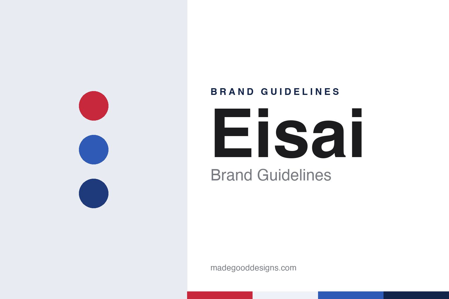
Eisai Brand Guidelines
A laboratory, a sanitary-materials name and a mark drawn as a globe.
Aa
Two constants: an artery red, vein blue and globe navy palette and a rounded-sans display register. Abstract homage — not an Eisai asset or mark; no logo, icon or wordmark is reproduced.
Two predecessor companies
Tokyo, 1936; Saitama, 1941.
Eisai’s own corporate history, published on its website as Eisai: The First 80 Years, begins with its founder Toyoji Naito, whom the company says was born on 15 August 1889 in Ito, a village in Fukui prefecture. The company says he worked for foreign trading houses in Kobe, including a British-owned importer of medicines, before moving to Tokyo in 1915 to join Tanabe Motosaburo Store, a business that is now part of Mitsubishi Tanabe Pharma. There, the company says, he wrote newspaper advertising for the firm’s products, a part of his career that the timeline returns to more than once.
The company traces two predecessors. The earlier one, Sakuragaoka Laboratory, was set up as a limited partnership in Tokyo in 1936, and its products were sold through Tanabe. The second, Nihon Eisai Co., Ltd., was established in 1941. The company’s timeline places it in Saitama prefecture, and the Japanese-language Wikipedia entry gives the town as Honjō, in the Kodama district, not Tokyo. In 1944 the two businesses merged under the Nihon Eisai name.
The house name in use today arrived a decade later. In 1955, according to the company, Nihon Eisai Co., Ltd. became Eisai Co., Ltd., and in 1957 a new head office building was completed in Tokyo. The company was listed on the first sections of the Tokyo and Osaka stock exchanges in 1961. Japanese Wikipedia places the head office in Koishikawa, Bunkyō ward, the address the company still uses.
The founder’s family has stayed close to the top. The company says that in 1966, the year its Kawashima plant opened in Gifu prefecture, Toyoji Naito became chairman and Yuji Naito became president, and that in 1971 Toyoji opened the Naito Museum of Pharmaceutical Science and Industry on the Kawashima site. In 1988 Yuji Naito became chairman and Haruo Naito was appointed president. Japanese Wikipedia describes Haruo Naito as the founder’s grandson.
Colour
A name shortened, a crest simplified.
The word Eisai began as an abbreviation. Japanese Wikipedia explains that the old name, Nihon Eisai, was short for eisei zairyō, sanitary materials such as sticking plasters and bandages, and that the company has no link to a present-day firm of the same Japanese name. On a page titled “Origin of the Eisai Logomark”, the company says Nihon Eisai originally wrote its name in full in Chinese characters, as was usual in Japan at the time, and that the roman spelling “Eisai” was fixed during the Nihon Eisai years after 1941.
The company gives three practical reasons, drawn from the founder’s records, for the 1955 change. Chinese characters took more time and effort to write. So many companies began with Nihon, meaning Japan, that finding Nihon Eisai in a telephone directory meant turning page after page. And the two characters for “Eisai” could be read as “sanitation” and “materials”, so people could assume the company made only dressings and bandages. The answer was a shorter name written in katakana, the phonetic script, which the company says was unusual for a Japanese company name at the time.
The mark changed in two steps. The company says its 1955 logo as Eisai Co., Ltd. showed the name in katakana alongside the roman spelling and added an elaborate red-and-blue motif. In 1967, the year after Yuji Naito became president, the design was streamlined into a cleaner, more rounded form and the katakana were removed to reflect the company’s international ambitions, leaving the logomark much as it appears today. Japanese Wikipedia dates the removal of the katakana from the crest to the same year.
The company also explains the parts of the design. It says the red and blue stand for arterial and venous blood, and that the globe-like form stands for a world faced in every direction, neither East nor West, with the company aiming for a central perspective rather than the top or the bottom of that world. Japanese Wikipedia repeats the reading of the two colours.
Typography
Corporate marks behind the product.
Corporate identity where the end user rarely looks
Component makers and drug companies share an odd identity problem: the people who use their work most often never see the parent name. A brake module, a sensor or a seat frame arrives inside somebody else’s car, and a medicine reaches a patient under a product name, in packaging shaped by regulators as much as by designers. The corporate mark has to work instead for engineers, buyers, investors, recruits and the towns that host the factories.
That audience shapes the names. Mergers in both sectors often produce a blended word built from the two predecessors, or a coined term with Latin or Greek roots chosen because it carries no prior meaning in any market and can be registered worldwide. Other houses keep a founder’s surname or an old place name long after the business has outgrown it.
The visible identity tends to live in plant and laboratory signage, on gatehouses, lorry livery, safety notices and campus wayfinding. Those settings favour plain wordmarks, a single corporate colour and lettering that stays legible from a distance and in a photocopied procedure sheet. Restraint here is a working requirement rather than a style choice.
Aa
A rounded sans display — after the softened globe of the 1967 redesign. (Specimen set in Nunito, a rounded-sans STAND-IN; NOT the Eisai logo, the hhc mark or any Eisai typeface.)
Eisai
A second mark, in handwriting.
Eisai runs a second mark beside the globe. The company describes the hhc logomark as a separate logo that sums up its corporate philosophy, which it calls human health care, and says the lower-case script is modelled on the signature of Florence Nightingale, the nursing reformer who lived from 1820 to 1910. Japanese Wikipedia gives the same account, saying the cursive hhc was taken from Nightingale’s own handwriting.
The phrase is dated in the sources rather than timeless. Japanese Wikipedia says the words human health care emerged from a long-term management plan drawn up in 1987 and became the company’s slogan, and that the corporate philosophy is written into the company’s articles of incorporation. The company’s own timeline adds that Haruo Naito announced a “Commitment to Innovation” in 1990, two years after he became president. The hhc letters now run through the company’s own vocabulary, from its website navigation to programme names that use hhc as a prefix.
The family thread continues into the present. The Japan Times, carrying a Bloomberg report by Kanoko Matsuyama on 11 July 2023, said Eisai had named Keisuke Naito, then a senior vice president and chief strategy and planning officer, to an acting global role, and described him as a member of Eisai’s founding family and a son of chief executive Haruo Naito. The same report said finance chief Tatsuyuki Yasuno would become acting president of the company’s US unit.
For a designer, the Eisai system is a study in two registers held side by side. One is institutional: a short katakana-derived name, a rounded globe and a red-and-blue pairing that the company has used since 1955. The other is personal: a borrowed signature carrying a three-letter idea. The red, blue and navy here, like the rounded type, are our own unofficial reading of that system, not a reproduction of it, in keeping with other corporate houses such as Takeda.
Explore & save
Keep Eisai’s identity on hand — save it to a board in the Made Good inspiration library.
Eisai identity set
Pin the Eisai artery red, vein blue and globe navy palette and the rounded-sans display register to your own board.