Julie’s Brand Guidelines
The Melaka biscuit maker with the girl in the logo.
Aa
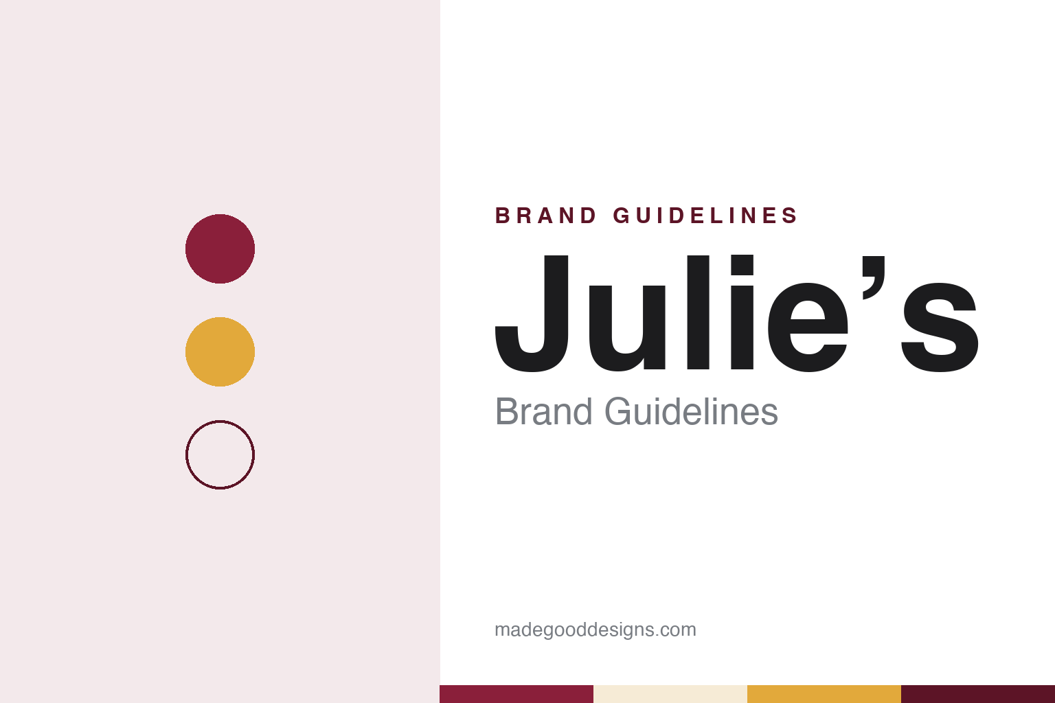
Two constants: a berry red, biscuit gold and cream palette and a rounded friendly sans register. Abstract homage — not a Julie’s product or mark; no pack, logo or biscuit is reproduced.
One oven, one wafer line
A biscuit maker in a Melaka district town.
Julie’s biscuits come from Alor Gajah, a district town in the Malaysian state of Melaka, where the maker, Julie’s Manufacturing Sdn. Bhd., gives its address in the Alor Gajah Industrial Estate. Malay Wikipedia says the company was set up in 1981 by Su Chin Hock and that it has marketed biscuits under the Julie’s name since 1985, citing the company’s own history page.
The company’s dates have moved over time. A 2011 version of its website, preserved by the Internet Archive, named the maker as Perfect Food Manufacturing (M) Sdn. Bhd. and said the Julie’s brand had been in the Malaysian market since 1982. By 2016 the website gave 1985 instead, and the current site says the company started sharing its biscuits in 1985, counting 41 years since. Between 2016 and 2018 the copyright line on the website changed from Perfect Food Manufacturing to Julie’s Manufacturing Sdn. Bhd., the name the company uses today.
The company describes small beginnings. Its achievements page says it started with one oven and one wafer-roll line, and that the factory has since grown to sit on two hectares of land. The 2011 site listed four biscuit oven lines, twelve wafer-roll ovens, a butter-waffle oven, a wafer-book oven and a cake and lady-finger oven, along with mixers and sandwiching and wrapping machines. The company says it went through significant changes to its operations and management in 1999, began working towards international management and food-safety certifications in July 2000, and by 2015 had all three of its factories certified under the FSSC 22000 food-safety scheme. It says its products are certified halal by Malaysia’s Department of Islamic Development (JAKIM) and by the Indonesian Council of Ulama (MUI).
Colour
Peanut butter, Love Letters and a lot of taglines.
The products the company itself has singled out are a sandwich biscuit, a cracker and a wafer roll. Its 2016 history page named Peanut Butter Sandwich, Golden Crackers and Love Letters as its signature products. Today’s range runs from sandwich biscuits and crackers to oat cookies, wafer rolls, wafer cubes, waffles and stick biscuits, and the Le-Mond range, whose lemon variety has had its own recent campaigns, including a “Comfort on the Go” giveaway.
Julie’s has always leaned on slogans. The 2016 site admitted that “some may view us as the company with many taglines.” The 2011 site used the motto “baking better biscuits” and placed Julie’s in the premium biscuit sector, crediting quality, marketing, modern production and “attractive packaging designs.” By 2016 the lines were “Baked with Love” and “The Best of You”; the company describes the latter as an appreciation movement, begun in 2014, built on the stories of people from all walks of life, among them the last Dutch lampshade maker in Singapore. The current site adds “Julie’s, bridging the world with biscuits” and “share a bite, bridge the world,” and frames the brand around a vision of a more open world in which people from all backgrounds share a bite and a moment.
Its advertising has won awards in Malaysia, the company says. Its honours page lists Gong Awards for two films, “Ini Iklan Raya Baru, Tau?” and “The Worst Feng Shui Master”, in categories including script, casting, direction and the use of cultural insights; a shortlist at Spikes Asia; MARKies awards for the most creative out-of-home and the most creative social-media work; and The Star Outstanding Business Awards for best brand, best halal product and best marketing.
Typography
Design and documentation.
The seven brands in this group make malted drinks, snacks and sauces, and they come from Switzerland, Britain, India, Malaysia and China: Ovaltine, Horlicks, Bournvita, Mamee, Julie’s, Munchy’s and Pearl River Bridge. Brands like these sit at many different points in the trade, from family firms that still carry a founder’s name to labels that now belong to much larger food groups, and a single brand can be sold everywhere from a corner shop to a supermarket shelf far from home.
A food brand’s identity is usually carried less by a single product than by a jar, a packet, a bottle and the name on it, because the company behind the name may have changed hands, moved its factory or grown far beyond the place where it started. That makes the questions behind each name worth asking plainly: who started it, who owns it now, and where its products are actually made and packed.
Each guide separates what independent sources record from what the company says about itself — its founding story, its owners over time, where its products are made and how its packaging has changed — and marks plainly what rests only on the company’s own word.
Aa
A rounded friendly sans for a brand drawn as a smiling girl. (Specimen set in Fredoka, a sans STAND-IN; NOT the Julie’s logo.)
Julie’s
The girl in the logo looks up.
The brand is named after, and drawn as, a girl. The company says it has always been “known as the biscuit brand with the humble and kind girl as its logo,” and that a refresh changed her posture: Julie, which it calls its trademark icon, “now looks confidently up,” with colourful rays coming from her to signal the brand’s zest for life. The company says it revamped the whole brand look, feel and experience at the same time. Its export count has grown with it, from more than 60 countries in its 2011 and 2016 web copy to more than 80 countries today, the company says; Malay Wikipedia cites a 2016 report by the Taiwanese news site ETtoday that called Julie’s Malaysia’s largest biscuit exporter, selling in 75 countries.
Julie’s also publishes its brand rules. In 2018 its website introduced “Our Corporate Identity Guide,” saying that “the first impression matters, and so does the 100th,” that the brand visuals include “a core set of identity elements,” and that the guide explains how to combine and apply them consistently. It called “Baked with love” “not just a slogan, but also a guiding principle.” The current site keeps a Brand Guide page with a flip-book version of the guideline and a note that all Julie’s brand features are proprietary.
Julie’s remains a Malaysian company. It gives Alor Gajah as its address and says it runs three factories,.
For a design guide, Julie’s shows how a drawn girl, a run of warm slogans and a published identity guide can carry a Melaka biscuit maker into export markets. Compare Munchy’s, the Johor biscuit maker now owned by Universal Robina, and Arnott’s, the Australian biscuit maker. For this guide we use a berry red, a biscuit gold and a cream with a rounded sans, an unofficial interpretation; no product or logo is reproduced.
Explore & save
Keep Julie’s’s identity on hand — save it to a board in the Made Good inspiration library.
Julie’s identity set
Pin the Julie’s berry red, biscuit gold and cream palette and the rounded friendly sans register to your own board.