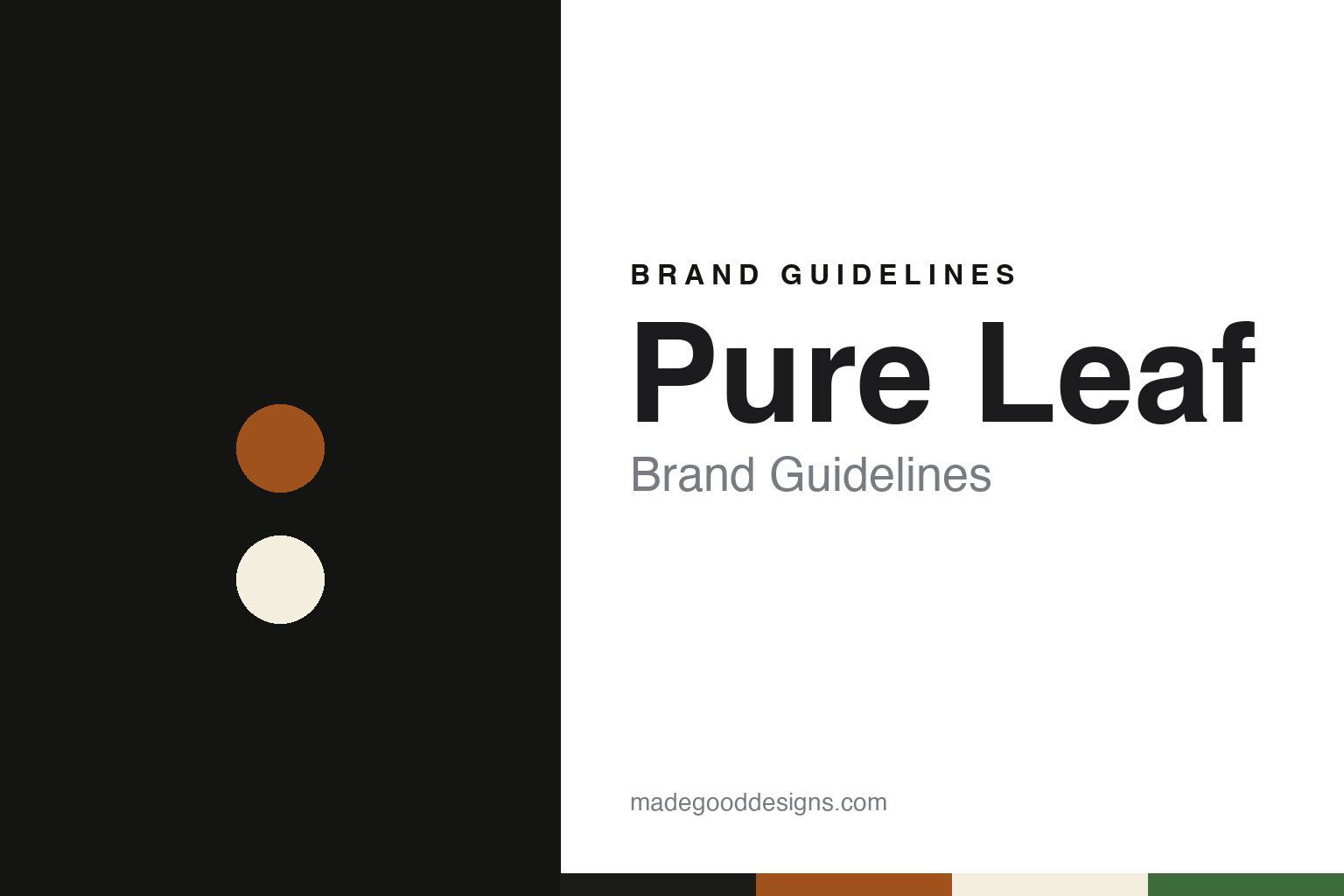
Pure Leaf Brand Guidelines
A Pepsi–Lipton venture, a renamed bottle of brewed tea and a square shape.
Aa
Two constants: a leaf black, brewed amber and label cream palette and a high-contrast serif register. Abstract homage — not a Pure Leaf product or mark; no bottle, label or logo is reproduced.
A tea venture and a renamed bottle
Pepsi’s bottlers, Lipton’s tea and a product once called Lipton Original.
Pure Leaf is an American ready-to-drink iced tea sold by the Pepsi Lipton Tea Partnership, a joint venture of PepsiCo and Unilever. Its roots lie in a deal struck well before the name appeared on a bottle. The Associated Press, in a report carried by The New York Times on 4 December 1991, said Pepsi-Cola and the Thomas J. Lipton Company, a Unilever unit based in Englewood Cliffs, New Jersey, had announced a new venture to develop and market tea-based beverages, due to begin the following January.
The same report said the venture would also widen the distribution of existing Lipton ready-to-drink products through Pepsi bottlers. It named Sheldon Roesch, Pepsi’s vice president for new business and packaging, as head of the venture, and said a Lipton vice president, Richard Kundrat, would run its marketing and sales operations. Trade reports from 2007, 2012 and 2016 describe Pure Leaf as a product of that partnership.
The name reached shelves in 2007, and at that stage it carried the Lipton name as well. Food Ingredients First published the partnership’s announcement on 10 May 2007: Lipton PureLeaf, “formerly known as Lipton Original”, had just arrived in stores with all-natural ingredients, new packaging and updated graphics. The announcement said the drink was made with fresh-brewed tea from leaves handpicked by Lipton’s master blenders, sweetened with real sugar and made without artificial flavours or colours.
The 2007 line was broad. According to the announcement, it spanned green, white and black teas in sweetened and unsweetened flavours, among them green tea with honey, white tea with tangerine and black tea with lemon, along with diet versions. It was sold in glass bottles, individually or in six-packs. Stacy Reichert, then vice president and general manager of the Pepsi-Lipton Tea Partnership, was quoted saying that consumers had told the company how important it was that their tea was “pure, straight from the leaf”. The partnership said the launch would be supported by in-store sampling, promotions and print and online advertising.
Colour
A square bottle in 2012, a new agency and a venture that stayed put.
The brand changed shape in 2012. Packaging Insights reported on 24 May 2012 that Pure Leaf Iced Tea, “a product of the Pepsi Lipton Tea Partnership”, was reviving its classic taste with a summer campaign called “For the Love of Leaves”. Where the 2007 line had used glass, the brand now moved to square-shaped bottles made of PET plastic, which the company said were lightweight and allowed a higher pallet efficiency, meaning more bottles, lighter loads and less fuel used in transport. A single-serve bottle sat alongside a new multi-serve carafe. Mary Barnard of the partnership said it was reintroducing Pure Leaf’s fresh-brewed taste “with a new look”.
The partnership later pointed to that year as a turning point. In an Adweek article of 17 April 2015, Linda Bethea, senior director of marketing for the Pepsi Lipton Tea Partnership, said: “We re-launched the Pure Leaf brand in 2012, and we’ve seen significant growth since then.” The article reported a new Pure Leaf television spot made by the brand’s creative agency, Anomaly, which set out to present the product as “real, leaf-brewed tea”, in contrast, the brand said, with competitors that added “unnecessary ingredients”.
The range kept growing through the decade. A release carried by BevNET on 1 February 2016, datelined Purchase, New York, announced the organic Pure Leaf Tea House Collection alongside new unsweetened black tea with lemon and unsweetened green tea, and quoted Kathy Kennedy, Pure Leaf’s director of marketing, on the brand’s “passion for realness”. Another release on BevNET, dated 8 February 2019, announced Pure Leaf Herbal Iced Teas, a caffeine-free line brewed with hibiscus in mango, peach and cherry versions, presented through Amy Tran, whom the brand called a Pure Leaf tea master.
The joint venture outlasted a sale of Unilever’s wider tea business. Grocery Gazette reported on 19 November 2021 that Unilever had agreed to sell its tea arm, ekaterra, which included PG Tips and Lipton, to the private-equity firm CVC Capital Partners, and that Unilever would keep its tea operations in India and Indonesia “along with a bottled tea venture with PepsiCo”. Some months earlier, in February 2020, Marketing Dive had described Pure Leaf as the iced tea brand “owned by PepsiCo and Unilever’s Lipton”. The Pepsi Lipton Tea Partnership has sold Pure Leaf since the name appeared in 2007.
Typography
Design and documentation.
Ready-to-drink tea, flavored water, sports drinks and craft soda share a cooler shelf, but their packaging asks different things of a label. A tea can or tall glass bottle is often read from several feet away, so the name, the flavor and a colour cue have to work together at a glance, while the back of the pack carries ingredients, nutrition panels and the legal small print that every drink must show.
Flavored-water and sports-drink bottles tend to lean on colour coding, since a shopper picking one flavor from a long row is often matching a hue rather than reading a word. Craft-soda labels sit at the other end: many use illustration, hand lettering or a story on the bottle to suggest a small maker, even when the brand has since become part of a much larger drinks company.
Each guide in this group looks at who started the brand, who owns it now and how its labels, logos and bottles have been described in dated sources, and it marks plainly where a statement rests only on what the company says about itself. The colours and type shown are our own unofficial interpretation.
Aa
A high-contrast serif — the quiet, tea-house register of a brewed iced tea. (Specimen set in Playfair Display, a serif STAND-IN; NOT the Pure Leaf logo.)
A square bottle, a black box and the word no
Modernism Week, hibiscus colours, a London redesign and Amy Poehler.
Pure Leaf’s look has been built around the leaf and the liquid. The 2007 announcement promised a new label and “updated graphics” for the renamed tea, and the 2012 relaunch replaced the glass bottle with a square plastic one. The 2016 release on BevNET described the Tea House Collection as organic black and green teas brewed with fruit and herb notes, such as Sicilian lemon with honeysuckle and wild blackberry with sage, sold in what the brand called its “signature glass bottles”. Pure Leaf marked that launch at Modernism Week, an annual event devoted to midcentury modern design, architecture and culture, with a collaboration with the show-house designer Christopher Kennedy.
Pure Leaf is also the name on boxed teas in Europe, and there the colour work went in another direction. Packaging Europe reported on 7 June 2019 that Pure Leaf was relaunching its premium teas in the United Kingdom and the Netherlands with a global brand and packaging redesign by the London agency PB Creative. The agency, the magazine said, returned to the brand’s original core colour, black, which had taken a back seat to variant shades in earlier designs, and set vivid flavour colours against it to create blocks of brand on the shelf. It added spot-varnish and embossed finishes to signal tea type, and designed box tags with patterns inspired by each tea’s place of origin. Its creative director, Lloyd Moffat, said building on the story of provenance and everyday quality was key.
Advertising in the United States leaned on a single word. Marketing Dive reported on 26 February 2020 that Pure Leaf had launched “No Is Beautiful”, an integrated campaign created with the agency DDB and featuring the actress Amy Poehler, encouraging people, particularly women, to say no to things that do not matter in order to make time for those that do. Poehler’s Parks and Recreation co-star Rashida Jones directed a digital series, “Once Upon a No”, in which Poehler reworked classic bedtime tales; in one, Rapunzel refuses to let down her hair and asks for a staircase or an elevator instead. The campaign mixed television, digital content and an interactive display in Times Square, and its ambassadors included the author Eve Rodsky.
For a design guide, Pure Leaf shows how a ready-to-drink tea can move from a parent’s name to its own while keeping the leaf in the name, a distinctive bottle shape and, in Europe, a return to black. Compare it with Lipton, the tea name behind the partnership, and Gold Peak, Coca-Cola’s bottled iced tea. For this guide we use leaf black, brewed amber, tea-leaf green and label cream with a serif, an unofficial interpretation; no product or logo is reproduced.
Explore & save
Keep Pure Leaf’s identity on hand — save it to a board in the Made Good inspiration library.
Pure Leaf identity set
Pin the Pure Leaf leaf black, brewed amber and label cream palette and the high-contrast serif register to your own board.