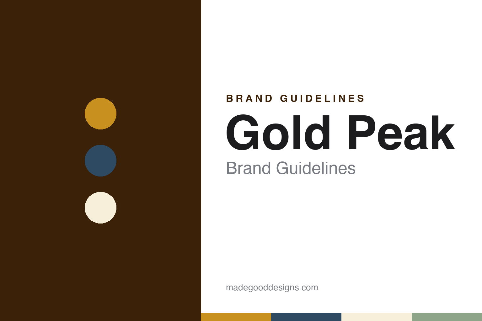
Gold Peak Brand Guidelines
A Coca-Cola iced tea, a lakeside label and a golden glass.
Aa
Two constants: a peak gold, mountain blue and porch cream palette and a soft old-style serif register. Abstract homage — not a Gold Peak product or mark; no bottle, label or logo is reproduced.
An Atlanta launch and a lakeside label
Coca-Cola’s bottled answer to home-style iced tea, sampled at a polo club.
Gold Peak is an American ready-to-drink iced tea made by The Coca-Cola Company, which has owned it since its launch in 2006. Coca-Cola’s own brand page calls it a U.S. ready-to-drink tea brand “launched in 2006 by The Coca Cola Company”. The launch announcement came from Coca-Cola North America in Atlanta and was reprinted by Food Ingredients First on 26 July 2006 and by BevNET on 27 July 2006. It presented Gold Peak as a premium iced tea with a fresh, homemade taste that revived the flavour of classic iced tea, and as a bottled option for people who liked their iced tea made the home-style way.
The opening range covered sweetened, unsweetened, lemon, diet and green tea, sold nationwide in single-serve glass bottles through supermarkets, convenience stores and other retailers. Gloria Garrett, vice president of Coca-Cola North America’s hydration business unit, was quoted calling Gold Peak “the modern, convenient expression of the classic drink we all know and love”. She also said the category was “ripe for a new premium brand with classic iced tea taste”.
The announcement put the package at the centre of the pitch. It described a carafe-like glass bottle carrying a label with a tranquil lakeside scene, meant to conjure “a time and place to be savored”. The premium label, together with the colour of the tea seen through clear glass, the release said, would help Gold Peak stand out among other teas as a sophisticated, upscale brand.
Coca-Cola backed the launch with what it called a fully integrated marketing programme for 2006: national print and radio advertising, point-of-purchase displays, an interactive website, public relations and national sampling. The sampling programme was set to open on 29 July 2006 at the Bridgehampton Polo Club in the Hamptons, New York, where, the announcement said, the brand would invite guests to rediscover the taste of classic iced tea.
Colour
Chilled carafes, tea lattes and a move away from concentrate.
The range widened over the following years. In November 2008, according to Coca-Cola’s press centre as archived by the Internet Archive, the company announced Gold Peak Chilled Tea, a multi-serve version in the sweetened and lemon flavours, packed in what it called a stylish carafe bottle and due to begin shipping to retailers in late January 2009. Beverage Industry reported on 24 April 2017 that Gold Peak, “a brand of The Coca-Cola Co.”, had introduced ready-to-drink tea lattes nationwide in Chai Latte and Vanilla Chai Latte, which the company said could be served hot or cold.
A packaging change followed in 2019. Beverage Industry reported on 9 August 2019 that Gold Peak had debuted a new, modern packaging graphic with a reimagined logo and a contemporary mountain landscape, which the brand said reinforced its tea credentials. The new pack coincided with a campaign called “Real Comforts of Home”, which combined a television commercial, refreshed packaging and an experiential sampling tour. Jessica Wood, the brand’s senior brand manager, was quoted from Coca-Cola’s Journey website: “Home is a feeling, not just a place.” For the campaign, the magazine said, Gold Peak introduced the TEA Shed, a backyard retreat for relaxing with a bottle of tea, outfitted by the home design expert Egypt Sherrod.
Two years later the recipe and the identity changed together. CSP Daily News reported on 4 June 2021 that Coca-Cola had rebranded and reformulated Gold Peak Real Brewed Tea; the company said the drink was now made with real brewed tea leaves rather than concentrates. The same report said the new messaging hierarchy was meant to reinforce the brand’s commitment to real brewed tea and to ingredients such as cane sugar. Coca-Cola’s current brand page carries the same theme, saying Gold Peak starts with tea leaves sourced from the top of the tea plant and brewed once before being bottled.
Typography
Design and documentation.
Ready-to-drink tea, flavored water, sports drinks and craft soda share a cooler shelf, but their packaging asks different things of a label. A tea can or tall glass bottle is often read from several feet away, so the name, the flavor and a colour cue have to work together at a glance, while the back of the pack carries ingredients, nutrition panels and the legal small print that every drink must show.
Flavored-water and sports-drink bottles tend to lean on colour coding, since a shopper picking one flavor from a long row is often matching a hue rather than reading a word. Craft-soda labels sit at the other end: many use illustration, hand lettering or a story on the bottle to suggest a small maker, even when the brand has since become part of a much larger drinks company.
Each guide in this group looks at who started the brand, who owns it now and how its labels, logos and bottles have been described in dated sources, and it marks plainly where a statement rests only on what the company says about itself. The colours and type shown are our own unofficial interpretation.
Aa
A soft old-style serif — the warm, front-porch register of a home-brewed iced tea. (Specimen set in Fraunces, a serif STAND-IN; NOT the Gold Peak logo.)
A golden hue, leaf-like serifs and a spokes-sipper
From a lakeside scene to a mountain, then to the colour of the tea itself.
Landscape has run through Gold Peak’s packaging. The 2006 label showed a lakeside scene; the 2019 redesign, as Beverage Industry described it, set a reimagined logo against a contemporary mountain landscape. The 2021 identity turned attention to the drink itself. According to CSP Daily News, the new packaging highlighted the golden hue of the liquid and emphasised natural flavours with tea leaves and an organic colour palette, and the wordmark was redrawn with subtle leaf-like serifs.
Beverage Industry reported on 6 July 2021 that this new visual identity had begun rolling out in May of that year, and that a summer television campaign called “Front Yard Family” was released to match it. The commercials spotlighted unfiltered family moments in the front yard, such as a surprise attack by a mother with the garden hose or a dash out of the house in a robe to fetch the morning newspaper. Their tagline, “Stay Gold”, was described by the brand as a rallying call for families to stay true to what makes them “uniquely them”, and a promise that Gold Peak would stay true to its real-brewed roots.
The gold theme carried into later advertising. MediaPost reported on 28 May 2024 that Gold Peak had launched a summer campaign called “Real is Gold”, built around the idea of tea brewed with real tea leaves. It introduced a character the brand called its “spokes-sipper”, Norm, who shared his tea-inspired wisdom in a short introductory spot and in social videos planned for cinemas, television, print and in-store promotions. The campaign came from WPP Open X, led by the agency VML and supported by EssenceMediaCom, Village Marketing and Grey. Rosie Bardales, VML’s chief creative officer, told the publication that “Real is Gold” was “a rallying cry to be different”, and that the aim was to transport viewers from everyday life to the tea fields.
For a design guide, Gold Peak shows how a bottled drink can keep one idea, the golden colour of brewed tea, at the centre of its name, its label scenery and its advertising lines while the logo and pack are redrawn around it. Compare it with Pure Leaf, the PepsiCo and Unilever iced tea, and Minute Maid, another Coca-Cola brand. For this guide we use peak gold, brewed amber, mountain blue and porch cream with a serif, an unofficial interpretation; no product or logo is reproduced.
Explore & save
Keep Gold Peak’s identity on hand — save it to a board in the Made Good inspiration library.
Gold Peak identity set
Pin the Gold Peak peak gold, mountain blue and porch cream palette and the soft old-style serif register to your own board.