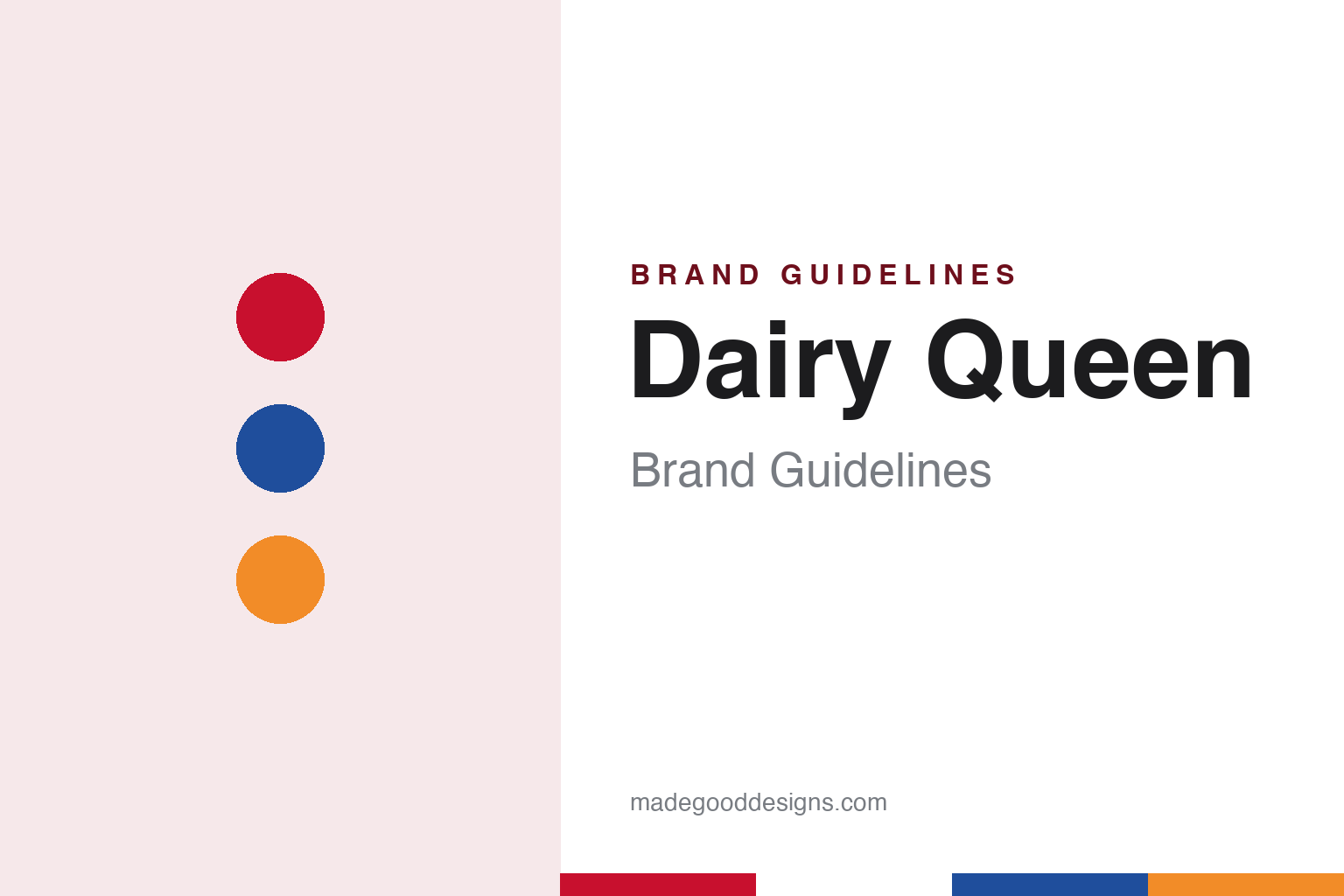
Dairy Queen Brand Guidelines
The Joliet soft-serve stand that became a red ellipse.
Aa
Two constants: an ellipse red, swish blue and swish orange palette and a condensed sign sans register. Abstract homage — not a Dairy Queen product or mark; no ellipse, cone, sign or logo is reproduced.
Joliet
A soft-serve formula, a Kankakee counter and a Joliet store.
Dairy Queen dates its start to 22 June 1940, when a store owned and operated by Sherb Noble opened in Joliet, Illinois, English Wikipedia says. The product behind it came from a father and son: Wikipedia says J. F. McCullough and his son Alex worked out a soft-serve formula in 1938 and persuaded Noble, a friend and customer, to offer it at his ice cream store in Kankakee, Illinois, before the three went on to open the Joliet store together. Wikipedia lists all three as founders.
The Joliet building closed in the 1950s, Wikipedia says, and is now a city-designated landmark. From the start, the chain grew through franchising: Wikipedia says the company has used a franchise system since 1940, and records its arrival in Canada in 1952 at a plant in Melville, Saskatchewan, followed by a standalone store in Estevan in 1953.
As other fast-food chains spread, many Dairy Queen operators added hot food. Wikipedia says the Brazier system, developed by the Dairy Queen operator Jim Cruikshank and introduced in Georgia in 1958, brought broiled hamburgers and hot dogs and later became the national standard for Dairy Queen menus. Brazier stores, Wikipedia says, can be recognised by their red mansard roofs, with second floors used for storage.
The company took the name International Dairy Queen, Inc. in 1962, Wikipedia says, and it remains the parent of American Dairy Queen Corporation, Dairy Queen Canada and other entities that franchise the concept. Wikipedia describes Dairy Queen stores as a fixture of social life in small towns in the Midwest and South in the 1950s and 1960s, and notes that they appear in memoirs and novels of small-town America, including writing by Larry McMurtry and S. E. Hinton’s The Outsiders.
Colour
A Minneapolis group, Orange Julius and Berkshire Hathaway.
Control of the company changed in 1970. Berkshire Hathaway’s 1997 letter to shareholders, written by Warren Buffett, says that in that year a Minneapolis group led by John Mooty and Rudy Luther took control of International Dairy Queen, inheriting a jumble of different franchising agreements, and that the new managers went on to rationalise the operation and extend food service to many more locations.
The company bought other brands along the way. Wikipedia says International Dairy Queen acquired the Orange Julius chain in 1987, and the company later combined the two in “Treat Center” stores, mainly in shopping-mall food courts, that serve drinks and food from the Orange Julius menu alongside Dairy Queen products.
In 1997 Berkshire Hathaway agreed to acquire International Dairy Queen. The same shareholder letter says the deal closed early in 1998, and that shareholders were offered a choice between cash and Berkshire shares. Wikipedia says Berkshire Hathaway has owned the company since 1998, and that International Dairy Queen is headquartered in Bloomington, Minnesota.
Later formats widened the brand. Wikipedia says the DQ Grill & Chill format, with table delivery and self-serve soft drinks in larger stores of a new design, opened its two original U.S. restaurants in Chattanooga, Tennessee, in December 2001. In Texas, Wikipedia says, all Dairy Queen restaurants are run by franchisees, sell a separate hot-food menu branded Texas Country Foods, and are marketed through a website run by the Texas Dairy Queen Operators’ Council rather than the national site. The Blizzard, soft serve blended with mix-ins, joined the menu in 1985, Wikipedia says.
Typography
Design and documentation.
A quick-service brand is met first from the road and only then at the counter. Its identity has to work on a pole sign seen from a moving car, on a roofline, on a lit window after dark, on a drive-through menu board read in a few seconds, and on a cup, bag or box that leaves with the customer. Signage, neon and backlit panels, building shapes, uniforms, mascots and printed packaging all carry the same name, often in very different sizes and materials.
Because many of these restaurants are run by franchisees rather than by the company that owns the name, a sign, a menu board or a paper bag may be ordered, installed and replaced locally, while the mark itself is set by the franchisor. Names, owners and headquarters can also change over the decades as chains are sold, merged or taken private, even when the sign out front looks much the same.
Each guide separates what independent, dated sources record from what the company says about itself — who started it and where, who owns it now, and how its signs, logos and packaging have changed — and marks plainly what rests only on the company’s own word.
Aa
A condensed, upright sans — the register of a roadside sign and a menu board. (Specimen set in Oswald, a sans-serif STAND-IN; NOT the Dairy Queen logo.)
Dairy Queen
From a cone on a sign to a symmetrical ellipse.
The Dairy Queen mark began as lettering. Wikipedia says the original logo was a stylised text sign with a soft-serve cone at one end, and that the red ellipse was adopted in the late 1950s. The early ellipse was asymmetrical, Wikipedia says, with one side point extending further than the other; by the 1970s the two sides were more closely matched. In the 1990s, it says, a boxier store design added red strips near the roofline carrying the slogan “Hot Eats, Cool Treats,” together with a large blue sign that reworked the early cone design.
The initials became the official name in 2001. Wikipedia says “DQ” had been used interchangeably with Dairy Queen for decades before that. In February 2007, Nation’s Restaurant News reported a significant overhaul of the Dairy Queen logo, with an updated font and, in the words of International Dairy Queen, “a more symmetrical ellipse enhanced with gold and blue swishes signifying food and treats.” The magazine said the rollout was due to be completed that year on point-of-purchase material, packaging and television, and that the logo would be available to franchisees who needed new store signage. Wikipedia describes the same update as italicising the letters and adding an orange arc for hot food above and a blue arc for soft serve below. The chain’s chief brand officer, Michael Keller, told the magazine the logo was meant to “show our growth as a brand.”
Advertising gave the ellipse a face. Wikipedia says characters from the Dennis the Menace comic strip appeared in Dairy Queen marketing from 1971 to 2002, and that from 2006 to July 2011 advertising centred on a large mouth licking its lips that morphed into the logo. Slogans have included “We treat you right,” “It’s a real treat!” from 1979 to 1981, “Think DQ” in the 1990s, “So Good It’s RiDQulous” from 2011 and “Fan Food, Not Fast Food” in the later 2010s, Wikipedia records.
For a design guide, Dairy Queen shows how a single shape — a red ellipse drawn for roadside signs — can carry a brand through new menus, new owners and an official change of name to two letters. Compare it with Baskin-Robbins, another American ice-cream chain with a long-lived mark, and Sonic Drive-In, a quick-service chain built around roadside signage. For this guide we use ellipse red, swish blue and swish orange with a sans, an unofficial interpretation; no product or logo is reproduced.
Explore & save
Keep Dairy Queen’s identity on hand — save it to a board in the Made Good inspiration library.
Dairy Queen identity set
Pin the Dairy Queen ellipse red, swish blue and swish orange palette and the condensed sign sans register to your own board.