Carolina Hurricanes Brand Guidelines
A storm seen from above, a warning flag on a stick, and red against black.
Aa
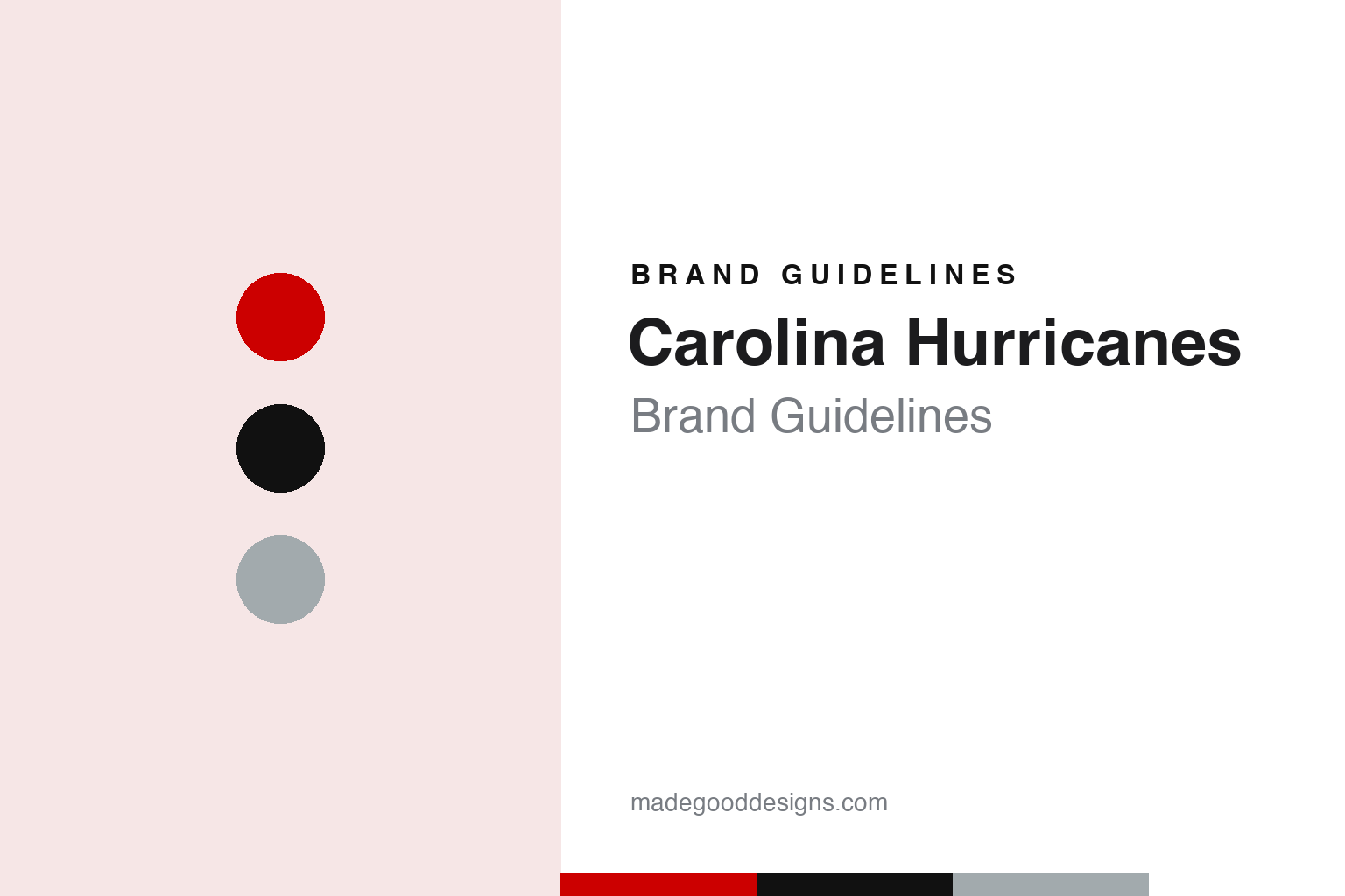
Two constants: a storm red, night black and flag silver palette and a condensed storm-warning capitals register. Abstract homage — not a Carolina Hurricanes mark; no hurricane logo, warning flag or jersey is reproduced.
From the Whale to the storm
A Boston start, two decades in Hartford and a name picked in a hurry.
The Carolina Hurricanes began life a long way from North Carolina. English Wikipedia says the franchise was created in November 1971, when the World Hockey Association awarded a club to Boston; as the New England Whalers it played its early home games at the Boston Arena and Boston Garden from 1972. Scheduling at the Garden, which belonged to the NHL’s Boston Bruins, grew difficult, and the owners moved the team to Hartford, Connecticut, for the 1974–75 season. After a spell at the Big E Coliseum in West Springfield, Massachusetts, the Whalers opened at the Hartford Civic Center on 11 January 1975 and stayed there until 1997.
When the WHA and the NHL merged in 1979, the Whalers joined the older league alongside Edmonton, Quebec and Winnipeg. Wikipedia says pressure from the Bruins forced a name change, and the team became the Hartford Whalers. Their logo was a W with a whale’s tail above it. ESPN, writing on 31 January 2018, described how the negative space between the two shapes forms an H, and noted that the NHL and the Hurricanes jointly own the trademark on that green and blue mark.
Peter Karmanos bought the Whalers in 1994. In March 1997 he announced that the team would leave Hartford after the season, citing the failure to agree a new arena package, and on 6 May 1997 he named the destination: the Research Triangle area of North Carolina and a new arena under construction in Raleigh. Wikipedia says the short time frame led Karmanos to choose the new name himself rather than run a naming contest. The club became the Carolina Hurricanes; later that summer the colours changed as well.
The Raleigh arena was not ready, so the Hurricanes spent their opening two seasons playing home games at the Greensboro Coliseum while practising near Raleigh. They moved into the new building, then called the Entertainment and Sports Arena and now the Lenovo Center, in 1999. Wikipedia says the goal horn from the Hartford Civic Center travelled with the team and is still sounded in Raleigh, one of several Hartford links the club kept, along with broadcasters, equipment staff and executives who made the move.
Colour
A hurricane seen from above, a pair of warning flags and a triangle.
The new name called for a new palette. Wikipedia says that in the summer of 1997 the team dropped the Whalers’ blue, green and silver for a black and red scheme, matching the colours of the North Carolina State University Wolfpack, whose men’s basketball team would share the Raleigh arena. A season later the red was darkened slightly, while the other colours stayed. Wikipedia lists the current colours as black, red, grey and white.
The primary logo has always been a stylised hurricane, a swirl of red and black that reads as a storm seen from above. The secondary mark is a pair of storm warning flags flying from a hockey stick, with a black triangle behind them standing for the Triangle region around Raleigh. Wikipedia says the original uniforms carried the hurricane on the chest and the flags on the shoulders, with red and black warning flags dotted along the hem among silver, red, black and white stripes.
The uniforms have changed several times since. A black alternate arrived in 2008, with the flag logo on the front and a dark grey hurricane on the shoulders. In 2013 a new set stripped out much of the black and silver, removed the flag logo and the hem flags, and switched the lettering to Univers Condensed. When Adidas took over NHL uniforms in 2017, the red sweater brought back black stripes and a dark red warning-flag pattern on the hem.
A new black alternate in 2018 carried an updated flag logo, corrected to show a proper hurricane warning flag, with the shape of North Carolina picked out in the negative space between the flags; the state flag of North Carolina was added to the left shoulder. In 2019 a new white uniform put the nickname “CANES” diagonally across the chest. Wikipedia says it was introduced at the request of the owner, Tom Dundon, who disliked the previous white design.
In August 2022 the black sweater became the full-time home uniform. For the club’s 25th season in Carolina the original 1997 red uniform returned as an alternate for a year, and a red version of the CANES design served as the team’s “Reverse Retro” sweater. In 2025 the white road uniform dropped the diagonal wordmark for the hurricane logo, with a patch of the mascot Stormy on the shoulder.
Typography
Design and documentation.
Hockey clubs often build their marks from things close to home. A crest can take the outline of the land a team plays on, reducing a coastline or an island to a shape simple enough to sit on a shoulder patch or a helmet decal. Weather offers another vocabulary: storm symbols, warning flags and swirling winds translate easily into flat colour and strong silhouettes that read at a distance and on a small screen.
Not every change sticks. A redesign can be introduced with fanfare and withdrawn within a few seasons when supporters push back, and the older mark returns, sometimes slightly refined. Those reversals show how much a logo carries for the people who wear it, and how a club’s visual history becomes part of its brand.
Throwback nights draw on that history directly. Clubs bring out sweaters, colours and logos from earlier eras for a handful of games, and the retail range follows. A new arena adds another layer: concourse graphics, ice markings, signage and naming-rights wordmarks all have to sit alongside the team’s own marks, so the building itself becomes part of how the brand looks on broadcast and in photographs.
CANES
Condensed storm-warning capitals — the register of a diagonal nickname, sweater numbers and arena signage. (Specimen set in Oswald, a condensed sans STAND-IN; NOT the Carolina Hurricanes logo or wordmark.)
Carolina Hurricanes
A change of owner and the Whalers back on the ice.
For two decades the Hartford years stayed in the background. ESPN reported on 31 January 2018 that under Karmanos there had been no effort to put Whalers logos on Hurricanes sweaters, and that Whalers merchandise, though sold through the NHL’s own shops, was not available at Hurricanes home games. That changed with the arrival of a new owner. Wikipedia says the businessman Tom Dundon signed an agreement to buy the team on 7 December 2017 and completed the deal on 11 January 2018, becoming majority owner while Karmanos kept a minority interest. Speaking to the Raleigh radio station ESPN 99.9 The Fan, Dundon told the station he wanted to “explore playing games” in the Whalers jersey and to sell the gear, calling it “part of the legacy,” as ESPN reported.
The plan arrived that autumn. CBS Boston reported on 27 September 2018 that the Hurricanes had announced, through a short video set to the Whalers’ old theme tune “Brass Bonanza,” that they would wear Whalers sweaters on 23 December 2018, when the Bruins visited Raleigh, and again in Boston the following March. The station noted that the Whalers sweaters had not been worn in a game since the team left Hartford in 1997. Hurricanes president and general manager Don Waddell described the nights as a way to celebrate the team’s heritage and the people who laid its groundwork.
The green heritage uniform has returned on selected nights since, and Wikipedia says “Brass Bonanza” plays after the goal horn at those home games. For 2020–21 the club’s Reverse Retro sweater used the 1980s Whalers template on a grey base, grey being a colour both identities shared, and from 2023–24 a white Whalers uniform joined the rotation, and for one game against New Jersey the players warmed up in Cooperalls.
For a design guide, Carolina Hurricanes shows how a relocated club can build a new identity around local weather and geography, then make room for the mark it left behind. Compare the NHL, the New Jersey Devils, opponents on a Whalers night, and the New York Islanders, whose own crest is a map. For this guide we use storm red, night black and flag silver with a condensed sans, an unofficial interpretation; no product or logo is reproduced.
Explore & save
Keep Carolina Hurricanes’s identity on hand — save it to a board in the Made Good inspiration library.
Carolina Hurricanes identity set
Pin the Carolina Hurricanes storm red, night black and flag silver palette and the condensed storm-warning capitals register to your own board.