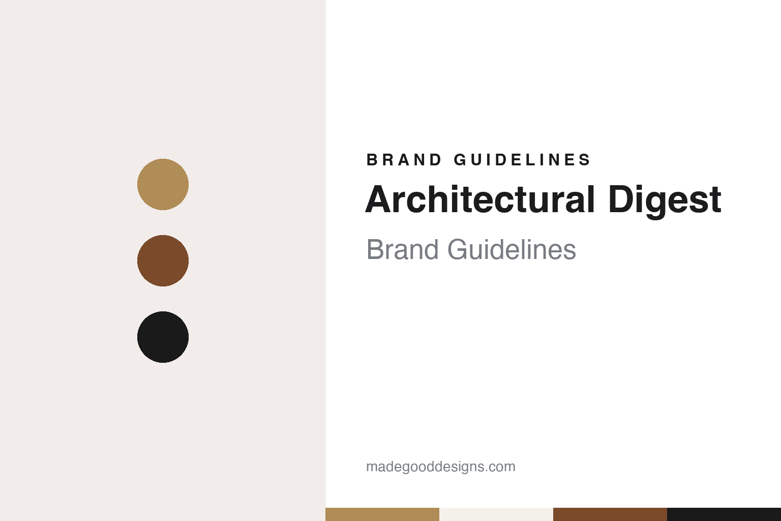
Architectural Digest Brand Guidelines
Two letters, more gracefully spaced, over a full-bleed room.
Aa
Two constants: a gilt brass, plaster and walnut palette and a light high-contrast serif register. Abstract homage — not an Architectural Digest asset or mark; no logo, cover or wordmark is reproduced.
A Southern California directory with a long subtitle
John Coke Brasfield, the Knapp family and a string of subtitles.
Architectural Digest started as a catalogue of houses rather than a magazine about living in them. English Wikipedia’s article on the title says it began in 1920 as a quarterly trade directory called The Architectural Digest: A Pictorial Digest of California’s Best Architecture. Its founder, according to the same article, was John Coke Brasfield, a Tennessee-born publisher who had moved to Southern California and set up the John C. Brasfield Publishing Corporation in Los Angeles, with a focus on pictures of residential architecture, including floor plans, interiors and exteriors.
The publisher’s family stayed with the magazine for decades. Wikipedia names Sarah “Sally” Brasfield Knapp, the founder’s daughter, as a longtime editor, and says that by 1965 her son, Cleon T. Knapp, had acquired the magazine. In 1963 the title had already moved to a bimonthly schedule under a new subtitle, A Pictorial Digest of Outstanding Architecture, Interior Design, and Landscaping. Under Knapp the publication moved into colour.
The subtitles that followed trace the magazine’s shift from building trade to interior decoration. Wikipedia lists The Quality Guide to Home Decorating Ideas in 1966, The Connoisseur’s Magazine of Fine Interior Design in 1971 and The International Magazine of Fine Interior Design in 1976. In 1977 the publishing company was renamed Knapp Communications Corporation. The article notes that the magazine’s principal subjects are interior design and landscaping rather than pure external architecture, that its name is stylised in capitals, and that it now carries the line “The International Design Authority”.
The editor who defined the Knapp-era magazine was Paige Rense. A Condé Nast announcement published by Business of Home on 3 June 2010 says she joined Knapp Communications to work on Architectural Digest in October 1970 and became editor-in-chief in 1975. While there she was also the founding editor of the magazine now known as Bon Appétit. The same announcement describes her approach as remaking Architectural Digest in the tradition of European art books, with a focus on decorating, decorators, architects and their clients, and credits her with a run of themed issues, among them The Architecture Issue, Before & After, Country Houses and Designers’ Own Homes.
Colour
Condé Nast since 1993, and three editors since 2010.
The magazine left the Knapp family’s hands in 1993. The 2010 Condé Nast announcement in Business of Home states that Condé Nast purchased Knapp Communications that year, and English Wikipedia says the deal brought both Architectural Digest and its sister title Bon Appétit into the company. In The New York Review of Books on 4 November 2018, the critic Martin Filler, who had been an editor at Condé Nast’s House & Garden in the early 1980s, recalled that the Condé Nast chairman S. I. Newhouse Jr. bought the Los Angeles-based magazine in 1993 and kept Rense on as editor. Condé Nast has owned Architectural Digest since 1993.
Rense stayed for another seventeen years. According to the 3 June 2010 announcement, Newhouse said that she would retire that August, and that she would remain on the masthead as Editor Emeritus. Filler’s 2018 essay was written on the publication of her retrospective, Architectural Digest: Autobiography of a Magazine 1920–2010, a book whose title sets out the span of the Brasfield, Knapp and early Condé Nast years.
Her successor came from another design title. The Daily Front Row, in a report by Ashley Baker dated 19 May 2016, says Margaret Russell had joined Architectural Digest as editor-in-chief in 2010 after her tenure at Elle Décor. The same report announced the next change: Amy Astley, then editor of Teen Vogue, was named editor-in-chief of Architectural Digest, while Russell moved to a consulting role with Condé Nast. Quoting a Condé Nast statement, the report said Astley would focus on reimagining and expanding the brand’s digital presence across all platforms and formats. It also noted that Astley had spent five years earlier in her career at House & Garden.
By then the magazine had become an international family. Wikipedia lists Condé Nast editions of Architectural Digest in China, France, Germany, India, Italy, Mexico and Latin America, the Middle East, Poland and Spain, with the Chinese edition launched in 2011. A report in the trade publication InPublishing on 17 April 2018 says the original Architectural Digest launched in the United States in 1920 and that AD Italy followed in 1981.
Typography
A masthead, a cover format and a family of editions.
A magazine’s masthead can stay in one plain serif and still change in small steps. Jeremy Leslie of magCulture wrote in September 2015 that the Fantastic Man logo is set in Times Roman, that the earlier covers carried a stacked, centred version of it, and that issue No. 21 broke away from that arrangement before No. 22 returned to it. In No. 22 the magazine also introduced Founders Grotesk, by Kris Sowersby, as a new headline sans. Leslie described pages built on strict typographic rules, with little decoration beyond the fonts, and a look based on an approach rather than a fixed set of devices. It’s Nice That described the same magazine in October 2015 as mostly black and white, with rule lines, two columns and long passages of text.
Other titles put more of the identity into the cover image itself. AnOther says the first cover of AnOther Magazine, in 2001, was a photograph by Nick Knight of two young lovers cast as Adam and Eve, and that Jefferson Hack’s foreword framed it as the magazine’s statement for that season. For its fifteenth anniversary in 2016, It’s Nice That reported, AnOther made a limited edition with a 3D hologram cover of Karl Lagerfeld, made by the holographer Rob Munday, alongside covers of other subjects in the same issue. When reading a magazine’s identity, look at how the masthead is set and how often it moves, which typefaces carry the headlines, and whether the cover photograph or the cover object carries the brand.
Aa
Light, high-contrast serif capitals — the register of the redrawn AD logo. (Specimen set in Bodoni Moda, a high-contrast serif STAND-IN; NOT the Architectural Digest logo and NOT any AD typeface.)
Architectural Digest
The Italian AD of 1981 and the shared redesign of 2018.
The two letters on today’s covers have an Italian origin. In the InPublishing report of 17 April 2018, Ettore Mochetti, editor-in-chief of AD Italy, said that the new look kept true to the original brand and logo that the Italian edition of Architectural Digest had invented in 1981, while modernising the font. On Mochetti’s account, the AD logo began with the Italian edition rather than with the American parent title.
That report describes a coordinated redesign. From the April 2018 issue, the international editions of AD introduced a new cover format, with a larger image and a refreshed logo, created as a joint project by all the editions. InPublishing quotes Condé Nast International as saying the design underlines the importance of brand consistency, while each edition produced its own redesigned April issue with a bold cover reflecting its local design and interiors scene. Mochetti added that the layout reintroduced the full cover, a format the Italian edition had already used for its AD Outdoor and AD Style titles.
The letterforms were redrawn in Spain. Enric Pastor, editor-in-chief of AD Spain, told InPublishing that the new logo had been redrawn by his team’s designer Alejandro Romero and art director Ana Camus, and that it was more gracefully spaced and set with a lighter serif. Pastor said that making the logo larger was a sharp statement for a design magazine, reinforcing its image across print, events and digital. The same report lists brand extensions that had grown around the editions, including AD Outdoor in Italy, The AD Design Handbook in India and AD Collector in France.
The English-language identity runs in parallel. Wikipedia notes that the name Architectural Digest is stylised in capitals, and the subtitle has changed repeatedly since the 1920 directory, from California’s best architecture to fine interior design and, today, “The International Design Authority”.
For a design guide, Architectural Digest shows how a long descriptive name can be carried by an abbreviation, and how a group of editions can share one mark while each cover keeps a local subject. Compare it with the Didone masthead of its Condé Nast stablemate Vogue and with the London interiors monthly The World of Interiors. For this guide we use gilt brass, gallery plaster and canyon walnut with a light high-contrast serif, an unofficial interpretation; no product or logo is reproduced.
Explore & save
Keep Architectural Digest’s identity on hand — save it to a board in the Made Good inspiration library.
Architectural Digest identity set
Pin the Architectural Digest gilt brass, plaster and walnut palette and the light high-contrast serif register to your own board.