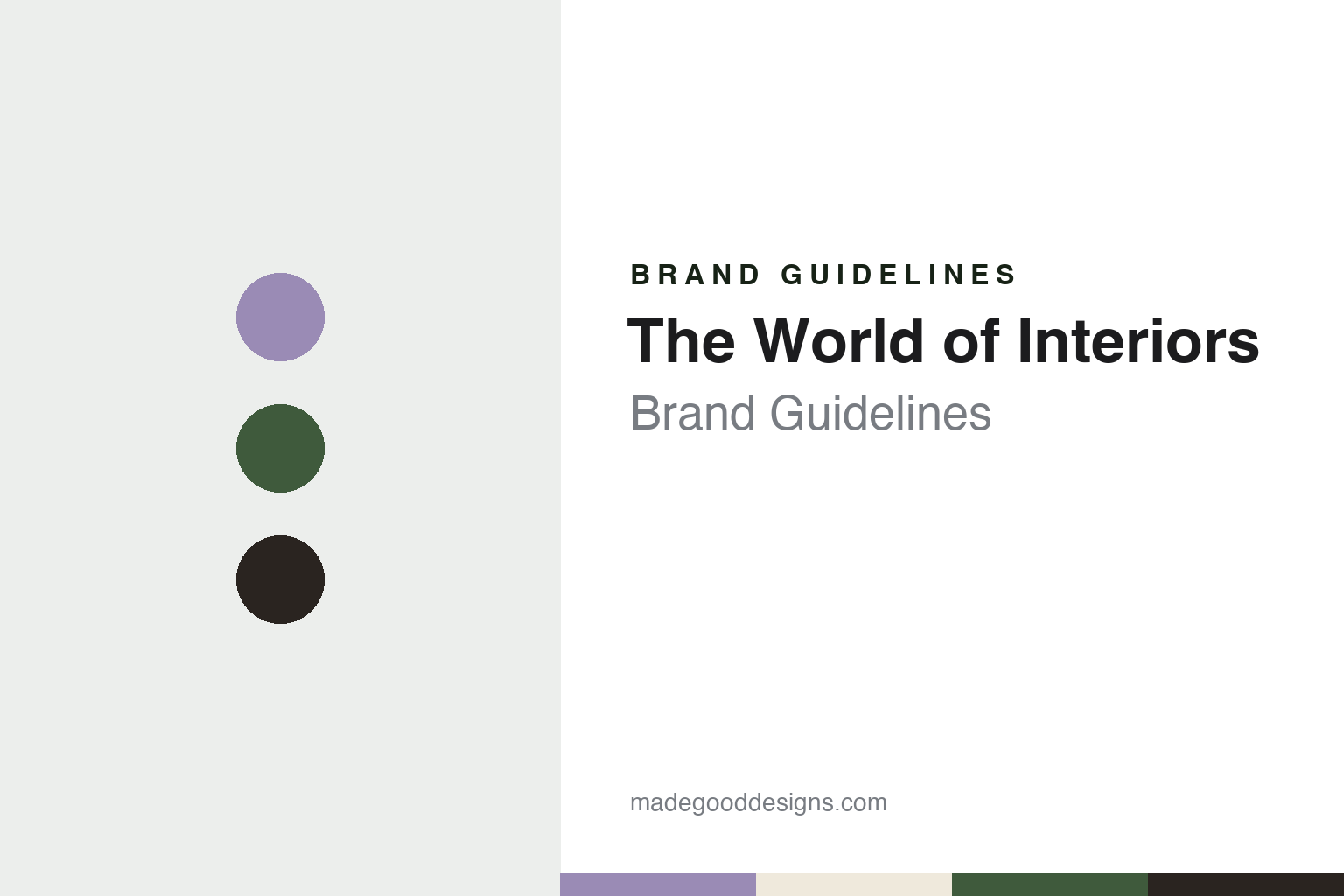
The World of Interiors Brand Guidelines
Palaces to pigsties, photographed on film.
Aa
Two constants: a lavender, green and umber palette and a bookish serif register. Abstract homage — not a World of Interiors asset or mark; no logo, cover or wordmark is reproduced.
Interiors, renamed for America
A Fulham Road launch, a Condé Nast stake and a borrowed-sounding name.
The World of Interiors started life with a shorter name. English Wikipedia says the magazine began as Interiors in November 1981, founded in London by the publisher Kevin Kelly with Min Hogg as editor. The New York Times profiled the title on 1 December 1983, two years into its life, in a piece by John Duka headlined “A British Editor Sets Her Own Style”. Duka described Hogg as a former fashion editor and photographer’s agent, and quoted Kelly as the publisher. A later New York Times feature, by Steven Kurutz on 4 December 2019, added that the independent Interiors had been headquartered above a florist’s shop on Fulham Road.
Condé Nast arrived quickly. The 1983 article reported that after the magazine’s opening six months, Condé Nast, which already owned the British edition of House & Garden, made an offer, and that in June 1982 a deal was closed in which it bought a half interest. The change of ownership brought a change of name. Hogg told the Times that the title had to be altered because a magazine called Interiors already existed in the United States, and that the result was a name she found a little corny. Bernard H. Leser, then managing director of Condé Nast in Britain, told the paper that the company saw the two titles as marginal competitors, with House & Garden carrying merchandise readers could identify with and the newer title devoted to escapism. Kurutz’s 2019 article describes the magazine as published by Condé Nast Britain since 1982.
Hogg’s editorial rules were set out in that 1983 profile. She told Duka that she had seen many places improved by the people who lived in them rather than by decorators, and that she decided to show those people. The magazine ran no how-to articles and often commissioned writers from outside the design trade so that the copy avoided decorating jargon. Hogg supervised the photography herself; she described waiting nine months to shoot a house at Egdon Heath until the copper beech in front of it was at the right stage between bare twigs and full leaf. She also explained her approach to pacing, wanting an issue to move between quiet and fast, colourful and beige, serious and witty, instead of one big picture spread after another.
Colour
Editors, handovers and a light box at Vogue House.
The magazine has changed editors rarely. According to Kurutz’s 2019 report, Rupert Thomas joined the staff as a junior editor in 1992, after working for the art-book publishers Thames & Hudson and Dorling Kindersley, and became editor in 2000, succeeding Hogg. The same article said Min Hogg had died in June 2019; the staff decorated the church for her memorial, the magazine republished her Canary Islands home on its cover, and Thomas wrote a two-page tribute crediting her with the magazine’s approach, summed up in her phrase “everything from palaces to pigsties”.
Kurutz described the working method under Thomas. The title was produced in a corner of the second floor of Vogue House, Condé Nast’s London building on Hanover Square, where Thomas and the art director Mark Lazenby laid out features over a light box, because the magazine still commissioned photography on film. The magazine carried no editor’s letter, and in October 2019 it launched The World of Interiors Index, an online directory of antique dealers, gallerists and upholsterers.
The next handover was reported by New York magazine’s Curbed on 17 September 2021. Matthew Schneier wrote that Thomas would step down and that Hamish Bowles, a long-serving Vogue editor, would succeed him from the following January, while continuing as Vogue’s global editor at large and reporting to Anna Wintour. Schneier noted that, unlike Condé Nast’s other shelter brand, Architectural Digest, The World of Interiors had a single edition.
Another handover followed. Business of Home reported on 24 June 2024 that Emily Tobin, who had spent eleven years at House & Garden, starting as assistant to its editor Sue Crewe, joined The World of Interiors as deputy editor in 2022 and was formally appointed editor in 2024. English Wikipedia says Bowles became creative director-at-large that year, with Tobin taking the editor-in-chief role. Business of Home added that a new website had launched in 2022, carrying print features alongside digital-only stories.
Typography
A nameplate, a cover photograph and a typeface system.
A magazine’s masthead can stay in one plain serif and still change in small steps. Jeremy Leslie of magCulture wrote in September 2015 that the Fantastic Man logo is set in Times Roman, that the earlier covers carried a stacked, centred version of it, and that issue No. 21 broke away from that arrangement before No. 22 returned to it. In No. 22 the magazine also introduced Founders Grotesk, by Kris Sowersby, as a new headline sans. Leslie described pages built on strict typographic rules, with little decoration beyond the fonts, and a look based on an approach rather than a fixed set of devices. It’s Nice That described the same magazine in October 2015 as mostly black and white, with rule lines, two columns and long passages of text.
Other titles put more of the identity into the cover image itself. AnOther says the first cover of AnOther Magazine, in 2001, was a photograph by Nick Knight of two young lovers cast as Adam and Eve, and that Jefferson Hack’s foreword framed it as the magazine’s statement for that season. For its fifteenth anniversary in 2016, It’s Nice That reported, AnOther made a limited edition with a 3D hologram cover of Karl Lagerfeld, made by the holographer Rob Munday, alongside covers of other subjects in the same issue. When reading a magazine’s identity, look at how the masthead is set and how often it moves, which typefaces carry the headlines, and whether the cover photograph or the cover object carries the brand.
Aa
Quiet, bookish serif letters — the register of the magazine’s captions and calm covers. (Specimen set in Cormorant Garamond, a serif STAND-IN; NOT The World of Interiors logo and NOT any typeface used by the magazine.)
The World of Interiors
Covers without celebrities, photographs without styling.
The World of Interiors builds its identity on the photograph more than on the nameplate. Kurutz’s December 2019 article in The New York Times noted that there are no celebrities on its covers, and described the October 2019 cover as a simple photograph of a shaded veranda on a house in the Canary Islands, with barely any type on it. He called the design low-key and almost academic, without gimmicky typefaces or pushed colours, and the photography moody, in chiaroscuro tones. The same issue was printed on heavy 100-gram wood-free coated paper.
The way pictures are made is part of the look. Kurutz reported that the magazine’s photographers aim for a truthful record of how people live, usually in natural light and with little styling, and that its product pages break from the usual cut-out objects on white: the editors have draped new fabrics across a farm field in the Cotswolds. He also described a habit of art-directing stories in advance, with Thomas laying out whole shoots from photographs of the four walls of a room sent by contributors such as the New York editor Carol Prisant.
The cover has been adjusted under the current editor. Business of Home reported in June 2024 that Emily Tobin had helped rebrand the cover, making it more monochrome and letting the photographs do the talking. That continues a line that goes back to Hogg’s 1983 interview, in which she described an editor who supervised every shoot and a magazine about the details of how people actually live rather than where the curtains came from.
For a design guide, The World of Interiors shows how a title can make restraint its signature: a photograph-led cover, an unpopulated room as the cover image, careful captions and a slow change of editors. Compare it with its Condé Nast stablemate Architectural Digest and with the London monthly Monocle. For this guide we use lavender gingham, country-house green and chiaroscuro umber with a bookish serif, an unofficial interpretation; no product or logo is reproduced.
Explore & save
Keep The World of Interiors’s identity on hand — save it to a board in the Made Good inspiration library.
The World of Interiors identity set
Pin The World of Interiors lavender, green and umber palette and the bookish serif register to your own board.