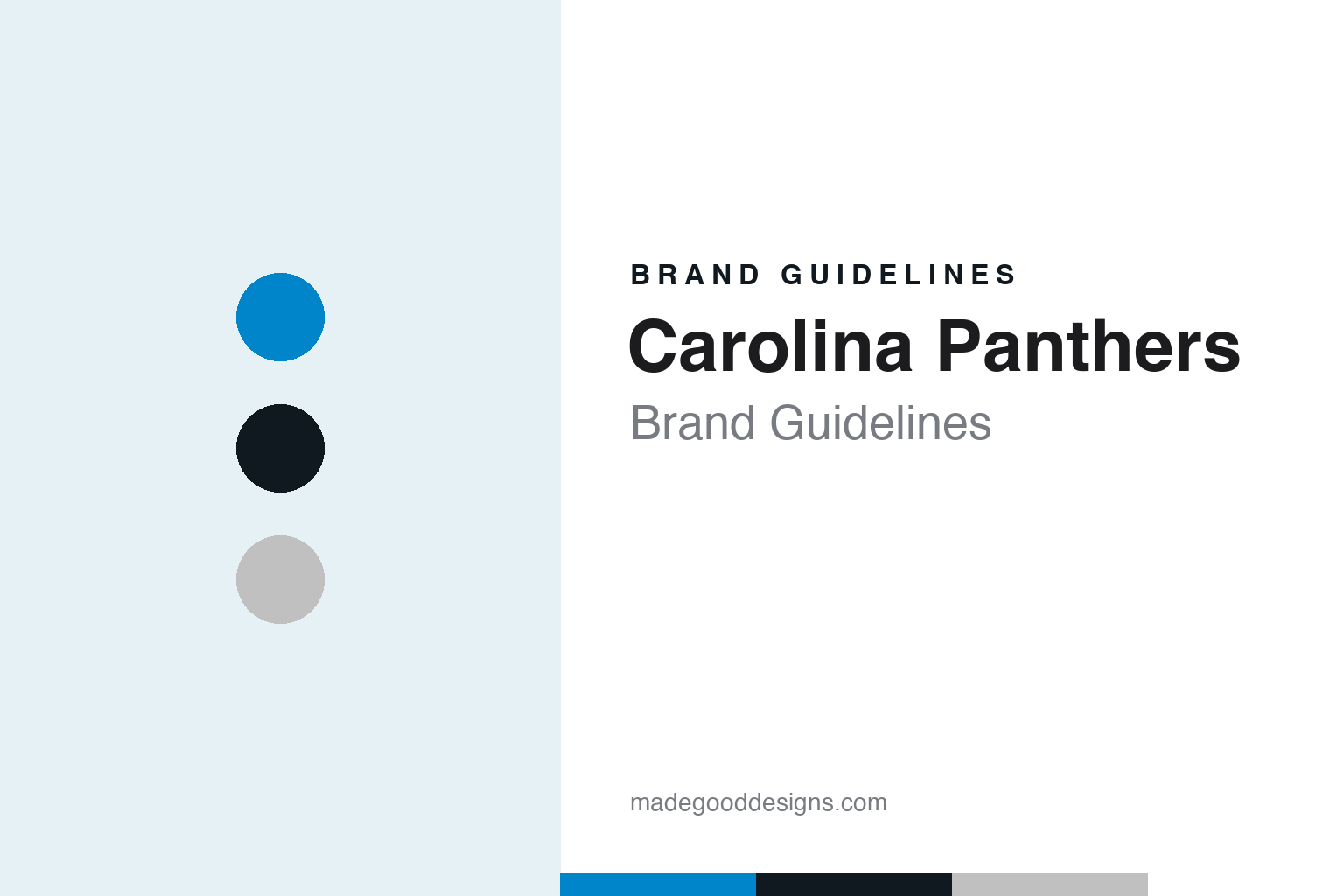
Carolina Panthers Brand Guidelines
From a 1993 expansion award to a panther drawn around two states.
Aa
Two constants: a process blue, black and silver palette and a condensed athletic sans register. Abstract homage — not a Carolina Panthers product or mark; no helmet, uniform or logo is reproduced.
The Carolinas
A six-year bid, two states and a stadium in Uptown Charlotte.
The Carolina Panthers were built from a bid rather than a relocation. The Pro Football Hall of Fame’s team history says the effort began on 16 July 1987, when Jerry Richardson, a former Baltimore Colts wide receiver turned businessman, met a group of interested parties in Charlotte to discuss entering the competition for two NFL expansion franchises, and that he made the bid official on 15 December that year. English Wikipedia says Richardson formed Richardson Sports, a partnership of himself, his family and businessmen from both North and South Carolina, and that he drew inspiration from George Shinn’s successful bid for an NBA team in Charlotte.
The bid was regional from the start. The Hall of Fame says the group brought in Mike McCormack, the former Seattle Seahawks general manager and coach, as a consultant, and that on 15 December 1989 Richardson Sports chose a site in Uptown Charlotte for a privately financed stadium, after considering locations in both states. Wikipedia adds that the group staged preseason games between existing NFL teams from 1989 to 1991 in Raleigh, Chapel Hill and Columbia, South Carolina, to show the demand for professional football across the two states.
The award came in the autumn of 1993. The Hall of Fame says that on 26 October 1993 the Carolina Panthers were awarded an NFL expansion franchise and that fireworks went off over downtown Charlotte as fans gathered to celebrate. Wikipedia says the league’s owners named the Carolina Panthers the 29th member of the NFL that day. The name itself is regional: it speaks for two states rather than one city, and Wikipedia says the franchise represents both North Carolina and South Carolina.
The early home games crossed the state line. Wikipedia says that while the Charlotte stadium was under construction the Panthers played their 1995 season at Memorial Stadium in Clemson, South Carolina, and practised at Winthrop University in Rock Hill. The Charlotte stadium opened in the summer of 1996 as Ericsson Stadium and has been called Bank of America Stadium since 2004. It was designed by HOK Sports Facilities Group for football and also houses the team’s headquarters and administrative offices.
Colour
A logo drawn around a map, a hard-won blue and a 2012 refresh.
The logo was settled before the uniforms. Wikipedia says that by the time the Panthers were announced as an NFL team in October 1993, the logo and helmet design had already been finalised, while the uniform was still being worked out. The shape of the panther logo, it says, was designed to mimic the outline of both North Carolina and South Carolina, so the mark carries the two-state name in its silhouette as well as in its words.
The colours took longer. Wikipedia says the club chose jerseys in white, black and blue with pants in white and silver, and that the exact tone of blue, which it called “process blue”, was a shade lighter than Duke’s and darker than North Carolina’s, and that choosing it proved difficult. The uniform then changed little for years: black socks replaced blue on the black uniform, and black shoes replaced white. A blue alternate jersey was added in 2002. White jerseys usually pair with white pants and blue socks, and black or blue jerseys with silver pants and black socks.
The panther was redrawn in 2012. WBTV, in a report published by WECT on 30 January 2012, said the team unveiled the new logo on a Sunday night, and that a team release described it as giving the logo “a more aggressive, contemporary look” while making it more three-dimensional. The report said the changes were made by the creative department of the National Football League, mostly in the eye and the mouth, and that the team described the refined panther as evocative of the panther statues on the stadium grounds. A new logotype accompanied it: WBTV said the lettering subtly nods to the swipe of a panther through a three-stripe element in the “A” of PANTHERS. ESPN.com news services reported the same day that the brow and fangs were more pronounced, that the new logo used a darker shade of blue, and that the club would phase it in through 2012.
Later changes came through the uniform supplier and the league’s alternate rules. Wikipedia says that after Nike became the NFL’s jersey supplier in 2012, the collar was altered to carry the phrase “Keep Pounding”, honouring the former player and coach Sam Mills, who had used the words in a speech to the team before a 2003 playoff game. The same year the club paired black jerseys with new black pants for an all-black look with blue socks and silver helmets. An all-blue Color Rush uniform followed on Thanksgiving Day 2015, and in 2019 new Nike Vapor Untouchable uniforms kept the colours and numbers but extended the pant stripes down to the socks and removed the hip logos. In 2022, after the NFL again allowed alternate helmets, the club introduced a black helmet with no white elements in the logo.
Typography
Design and documentation.
A professional football club’s visual identity has to work at very different scales: a mark painted on the side of a helmet, a wordmark stitched across a jersey, a logo printed on a ticket, and signage that spans a stadium façade. Helmet logos in particular are designed to read from a distance and from several angles, so they tend to rely on a single bold silhouette, a limited set of colours and clear outlines that separate the mark from the shell beneath it.
When a club relocates or changes its name, designers face a choice between continuity and a clean break. Some identities carry an existing symbol to a new city and change only the place name in the wordmark; others introduce a new name, a new animal or figure, and a new palette while keeping a link to local history or geography. Regional names, which describe a state or an area rather than one city, are often chosen to widen the audience a team speaks to.
Uniform refreshes usually follow a slower rhythm. Clubs adjust outlines, update typefaces for numbers and names, introduce alternate or throwback jerseys, and refine colour values, often in partnership with the league’s uniform supplier. The guides in this round look at how those decisions show up in each club’s logo, colours and lettering.
Aa
A condensed athletic sans — the register of a stadium wordmark and a sideline banner. (Specimen set in Oswald, a sans STAND-IN; NOT the Carolina Panthers logo, wordmark or numerals.)
Statues, a mascot and a new owner
Bronze panthers at the gates, Sir Purr on the sideline and a 2018 sale.
The stadium carries the mark in bronze. Wikipedia says two bronze panther statues flank each of the stadium’s three main entrances, with the names of the original personal-seat-licence owners engraved on their bases, and that life-sized bronze statues of Mike McCormack and Sam Mills stand outside the building. The 2012 logo, by the team’s own account as reported by WBTV, was meant to echo those statues.
The game-day cast uses the same palette. Wikipedia says Sir Purr, an anthropomorphic black panther in a jersey numbered “00”, has been the mascot since the club’s debut season, that the cheerleaders are the Carolina TopCats, and that the drumline is called PurrCussion. A “Keep Pounding” chant, introduced in 2012, is split between the two sides of the stadium before the opening kickoff of each home game.
Ownership changed in 2018. Wikipedia says Richardson announced in December 2017 that he would sell the team amid workplace-misconduct allegations, which the NFL then investigated. ABC11 in Raleigh-Durham reported on 22 May 2018 that the league’s owners had unanimously approved David Tepper’s purchase of the team from Richardson at their spring meeting in Atlanta, and quoted Tepper on the name: “It’s going to be the Carolina Panthers.” Wikipedia says the sale closed on 9 July 2018; Tepper has owned the club since then.
For a design guide, the Carolina Panthers show how a regional name can be drawn into a mark, with a panther whose outline follows two states, a blue chosen to sit between two local universities and a 2012 refresh that sharpened the face without changing the idea. Compare the league in our NFL brand guidelines, a division rival in our Atlanta Falcons brand guidelines and the uniform maker in our Nike brand guidelines. For this guide we use process blue, panther black and silver with a condensed sans, an unofficial interpretation; no product or logo is reproduced.
Explore & save
Keep Carolina Panthers’s identity on hand — save it to a board in the Made Good inspiration library.
Carolina Panthers identity set
Pin the Carolina Panthers process blue, black and silver palette and the condensed athletic sans register to your own board.