Cash App Brand Guidelines
An email payment product that settled on lime green and a dollar-sign name.
Aa
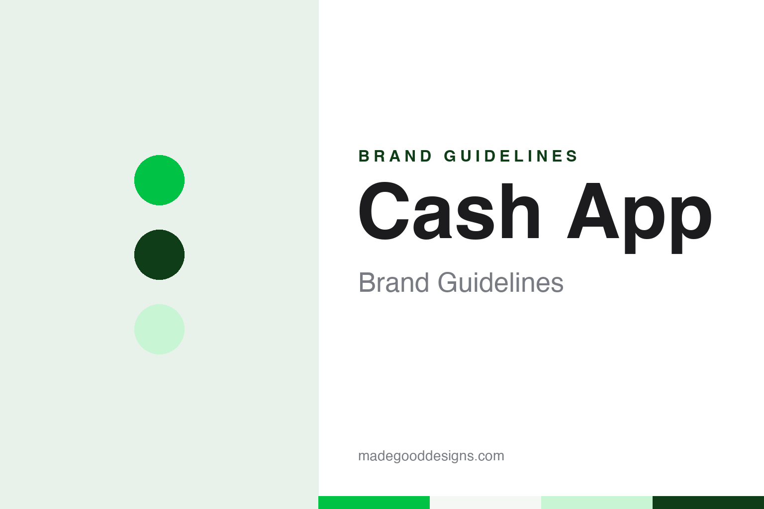
Two constants: a lime green, forest ink and card black palette and a heavy grotesque sans register. Abstract homage — not a Cash App product or mark; no icon, card or logo is reproduced.
Square Cash
Money by email, a museum visit and a colour change.
Cash App began as Square Cash, launched by Square on 13 October 2013, according to English Wikipedia, which also credits Square co-founder Jack Dorsey and Brian Grassadonia with contributing to the product. It was a way to send money to another person with a debit card by email or text message, whichever bank each person used, and at launch it was meant only for transfers between people rather than for shopping.
The clearest account of how the product was designed comes from The Verge, which published a long feature by Ellis Hamburger on 6 November 2013. It describes Robert Andersen, then Square’s creative director and, the article says, the company’s fourth employee, being asked by Dorsey in January 2013: “What if you could send money to people over email?” Dorsey wanted a product so simple that it would barely have an interface. When he saw Andersen’s first designs he asked for a fresh start and suggested a walk to the Museum of Modern Art. There, The Verge says, Andersen stopped in front of Mark Tansey’s painting The Occupation, which he described as detailed but monochromatic and washed over with red; he went back to the office filming the street on his iPhone, applied a coloured filter to the footage and showed it to Dorsey, who approved.
The same feature records two decisions that still shape the brand. The first was about friction: one of Dorsey’s directives was that people should not have to invent a new username and password, because handing a friend money in person needs neither. After months of internal testing, The Verge says, the team reversed the usual sign-up flow, so that a person started by writing an email and copying Square into it. The second was about colour. Before launch, the Cash website and emails were dressed in teal, which Andersen said the team loved; Dorsey called it drab and asked for something more fun and energetic, and a few iterations later the team settled on a bright lime green.
Colour
The $cashtag, the card and a parent called Block.
The second piece of identity arrived in March 2015, when The Verge reported that Square was opening Square Cash to businesses. To use it, a business created a “$Cashtag”, which the article described as a screen name preceded by a dollar sign. The Verge noted that the handle could be shared on a business card or a website, and that it let a seller ask to be paid without giving out a full name. English Wikipedia says the $cashtag became available to individuals and organisations as well as business owners.
The card followed. On 4 May 2017 Recode, writing on Vox, reported that Square had begun inviting some Square Cash users to order a prepaid card linked to their balance, a month after Dorsey had teased it. The black card carried no printed name: customers were prompted to supply a signature, which was laser-printed on the front instead, and a Square spokesperson told Recode the signatures were screened. Wikipedia records virtual cards from September 2016, bitcoin trading from January 2018 and stock trading from October 2019, as the product grew into what Wikipedia describes as a digital wallet under the name Cash App.
The parent company changed its name too. English Wikipedia says that on 1 December 2021 Square announced it would change its company name to Block, Inc.. Wikipedia lists Cash App within Block’s portfolio. Wikipedia also records that Block closed Cash App’s European Union operations, run under the name Verse, in August 2023, and that Cash App ceased operating in the United Kingdom on 15 September 2024, leaving the service focused on the United States.
In January 2025, Wikipedia records, Block reached a settlement with a group of state financial regulators over Cash App’s anti-money-laundering programme.
Typography
Design and documentation.
A payment brand lives on very small surfaces. Its app icon sits in a grid of rounded squares on a phone screen, often no larger than a fingertip, so the mark has to survive at a few millimetres across and still be recognised next to dozens of others. That pressure tends to reduce money-app identities to a single letter, a symbol or a solid field of colour, and it makes the colour itself do much of the work a wordmark would do on a larger page.
Colour ownership in this category is partly a matter of repetition. A tone that appears on the icon, the in-app buttons, the card, the confirmation screen and the advertising becomes associated with the brand through sheer exposure, even where no official value is published. For a designer studying the category, the useful exercise is to note which surfaces carry the colour and which stay neutral.
Physical signage follows different rules. A payment card has to sit alongside bank and network marks, and an agent-location sign has to read from across a street, in daylight and under shop lighting, on windows already crowded with other notices. The same identity can appear in a simplified form outdoors and a richer form on screen, and studying both versions shows how a system is built to flex.
$
A heavy grotesque sans — the register of a handle, a balance and a card. (Specimen set in Archivo, a sans-serif STAND-IN; NOT the Cash App logo.)
Cash App
A colour, a symbol and a name that became the product.
Cash App’s identity is built from very few parts. There is the green, which The Verge’s 2013 account shows was a deliberate replacement for an earlier teal; there is the dollar sign, which since 2015 has prefixed every $cashtag; and there is the name itself, which moved from “Square Cash”, a product label under a company brand, to Cash App, a standalone name.
The 2013 feature is useful to a designer because it shows the identity being made under unusual constraints. The article’s headline describes it as a product designed with no design at all, and Dorsey wanted it to have barely any interface. The Verge describes Andersen’s process as moving from a painting seen in a museum, to filtered street footage, to a website and emails, to a colour picked after Dorsey asked for something more fun and energetic. The Tansey painting that started it was red; the brand that came out of it was green.
The $cashtag added a second, typographic signature. Because a handle such as “$name” is written with a currency symbol in front, every time someone shares a payment link on a sign, a business card or a social profile, the brand’s symbol travels with it, even when the logo does not appear.
The card extended the same thinking into a physical object. Recode’s 2017 report describes a black card on which the holder’s own signature, rather than a printed name, was laser-printed on the front — a personal mark placed where a card would normally carry standard lettering.
For a design guide, Cash App shows how one colour, chosen during design and held through a change of name, and one symbol placed in front of every user handle can carry a payment brand across email, an app icon, a card and a sign in a shop window. Compare it with Venmo, another app for sending money to friends, and Visa, the card network used by many payment cards. For this guide we use lime green, forest ink and card black with a sans, an unofficial interpretation; no product or logo is reproduced.
Explore & save
Keep Cash App’s identity on hand — save it to a board in the Made Good inspiration library.
Cash App identity set
Pin the Cash App lime green, forest ink and card black palette and the heavy grotesque sans register to your own board.