Chicago Bears Brand Guidelines
From a Decatur starch works team to navy, orange and a wishbone C.
Aa
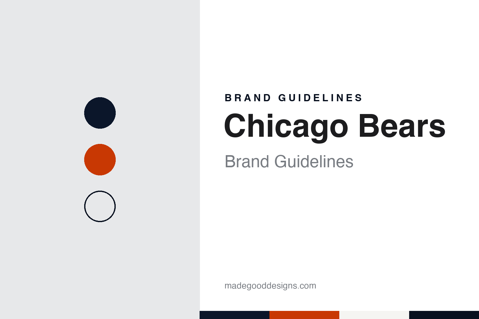
Two constants: a navy, burnt orange and white palette and a condensed athletic sans register. Abstract homage — not a Chicago Bears product or mark; no helmet, uniform or logo is reproduced.
Decatur
A starch company’s team becomes the Bears.
The Chicago Bears began as a company team in central Illinois. English Wikipedia says the club was founded in Decatur, Illinois, in 1919 as the Decatur Staleys, a works team of the A. E. Staley food starch company, and that this was a typical start for several early professional football teams. The company hired George Halas and Edward “Dutch” Sternaman in 1920 to run the side, and on 17 September 1920 the Staleys became charter members of the American Professional Football Association, the league that was renamed the National Football League in 1922.
Football in Decatur was meant to promote the business. Wikipedia’s article on the team’s logos and uniforms says that in 1920 the Staleys used the Staley company’s own logo, because the club was intended to help advertise the company. Full control of the team passed to Halas and Sternaman in 1921, and the club moved north to Chicago that year. Under an agreement with Staley, the partners kept the name Chicago Staleys for the 1921 season in return for a payment from the company.
The name that stuck arrived a year later. Wikipedia says that in 1922 Halas changed the team’s name from the Staleys to the Bears, and that the team moved into Wrigley Field, home of the Chicago Cubs baseball club. Like several early NFL teams, the Bears took their nickname from the city’s baseball team: young bears are called cubs, so the football side became the larger animal. The Bears played home games at Wrigley Field through the 1970 season and have played at Soldier Field, on the lakefront on the Near South Side, since then.
The early kit looked nothing like the modern one. Wikipedia says the Staleys’ first official uniforms in 1920 were red jerseys with brown stripes, a vertical-stripe design common in the 1920s, when strips of canvas helped players grip a rounder ball. After the move to Chicago and the change of name, the team switched to blue jerseys in 1923.
Colour
Illinois colours and a family-held club.
The Bears’ colours come from a university. Wikipedia says Halas liked the bright orange and blue of his alma mater, the University of Illinois, and that the Bears adopted those colours in darker shades: a navy blue and an orange close to burnt orange. The same article lists the blue as Pantone 5395 and the orange as Pantone 1665, and the logos and uniforms article adds that in 2002 the team’s blue was made slightly darker to bring it into line with league standards.
The colour balance moved around before it settled. Wikipedia describes a white jersey with orange-and-blue stripes in 1932, all-orange jerseys with navy numbers by 1933, and a 1936 experiment with striped helmets and fourteen alternating navy and orange stripes on each sleeve that lasted a single season. By 1949 the team wore the navy shirts with rounded white numerals that it is still known for, and in 1957, when the league asked home teams to wear dark jerseys and road teams white, the Bears’ white jersey took blue numerals with orange trim and three sleeve stripes. Wikipedia notes that the rounded jersey numerals set the Bears apart from the block numbers most clubs wore through the 1960s. Since 2012 Nike has supplied the uniforms; Reebok and Champion did so earlier.
Ownership has stayed in one family. Wikipedia says the A. E. Staley company owned the club from 1919 until 1921, when Augustus Eugene Staley transferred it to Halas, who took Sternaman on as a partner. Sternaman left the organisation after the 1932 season and Halas held control from then on. On 1 November 1983 Halas’s daughter Virginia Halas McCaskey took over as majority owner, with her husband Ed McCaskey as chairman. Wikipedia says their son George H. McCaskey, team chairman since 2011, became principal owner in 2025. The Halas–McCaskey family has controlled the club since 1921, and its headquarters, Halas Hall, is in Lake Forest, north of the city. For the 1984 season the team added Halas’s initials, GSH, to the left sleeve of its jerseys in his honour, and Wikipedia says the initials were enlarged when Nike took over in 2012.
Typography
Design and documentation.
Visual identity in professional American football works across a few fixed surfaces. The helmet logo is a mark seen often, applied as a decal on a curved shell and read from a distance on television and in the stands, so it tends to be a compact shape with a clear outline that still works when it is small. Many helmet marks are a single letter, a monogram or a simple symbol, set on a shell colour that is part of the identity in its own right.
Uniform colours carry much of the recognition. A team usually works with two or three main colours plus white, used across home and road jerseys, pants, socks and trim, and the stripe patterns on sleeves and pants become recognisable details over time. Alternate and throwback uniforms let a team revisit older looks without replacing its main kit.
Wordmarks are the custom lettering used for team names on merchandise, signage and broadcast graphics, often paired with the helmet logo. Numerals on jerseys follow their own drawn styles. In stadiums, end-zone graphics painted on the turf repeat the wordmark and colours at large scale, and midfield logos give the field its own centrepiece. For a designer, the useful lesson is how one small mark has to hold together across a helmet, a jersey, a field and a screen.
Aa
A condensed athletic sans — the register of a stadium wordmark and a sideline banner. (Specimen set in Oswald, a sans STAND-IN; NOT the Chicago Bears logo or numerals.)
The wishbone C
A helmet letter and a bear head.
The Bears had few official logos in their early decades. Wikipedia says the first Chicago Bears logo, introduced in 1940, showed a black bear running with a football, and that a navy blue bear standing on top of a football followed in 1946. Neither mark was designed for a helmet, because professional teams only began putting logos on helmets in the late 1950s and early 1960s.
That change produced the letter the club is known for. In 1962 the Bears introduced the “wishbone C”, initially white with a black outline. Wikipedia notes its resemblance to the C long worn on the Cincinnati Reds’ baseball caps and to the University of Chicago Maroons’ C of 1898. The only notable change came in 1974, when the letter turned orange with white and navy trim. A navy bear head followed as an alternative mark in 1963, and a revised orange bear head arrived in 1999.
The two marks traded places in 2023. Reporting for WGN on 10 August 2023, Larry Hawley wrote that the Bears now listed the “Bear Head” as their primary mark on the team website and the wishbone C as the secondary mark, after both had been recognised as primary marks since the 1990s. A team spokesperson told WGN that the bear head had been a co-primary mark for years, that it was unique to the Chicago Bears brand, and that the change gave retail, media and league partners clarity to start the creative process with it. Hawley noted that the bear head does not appear on the uniform but features on stadium signs, official apparel, the website and social media. He wrote that the wishbone C has been on the helmet since the early 1960s, white at first and orange from the mid-1970s, and that the change would not affect it or the C at the centre of the Soldier Field turf, where it has sat for most of the team’s time at the stadium since 1971.
For a design guide, the Chicago Bears show how a works team’s borrowed name and a university’s colours can settle into a navy shirt, rounded numerals and a single helmet letter that outlasts every bear drawn beside it. Compare it with the Green Bay Packers, another Midwestern club whose single-letter helmet mark dates from the early 1960s, and the NFL, the league the Staleys joined as charter members in 1920. For this guide we use navy, burnt orange and white with a sans, an unofficial interpretation; no product or logo is reproduced.
Explore & save
Keep Chicago Bears’s identity on hand — save it to a board in the Made Good inspiration library.
Chicago Bears identity set
Pin the Chicago Bears navy, burnt orange and white palette and the condensed athletic sans register to your own board.