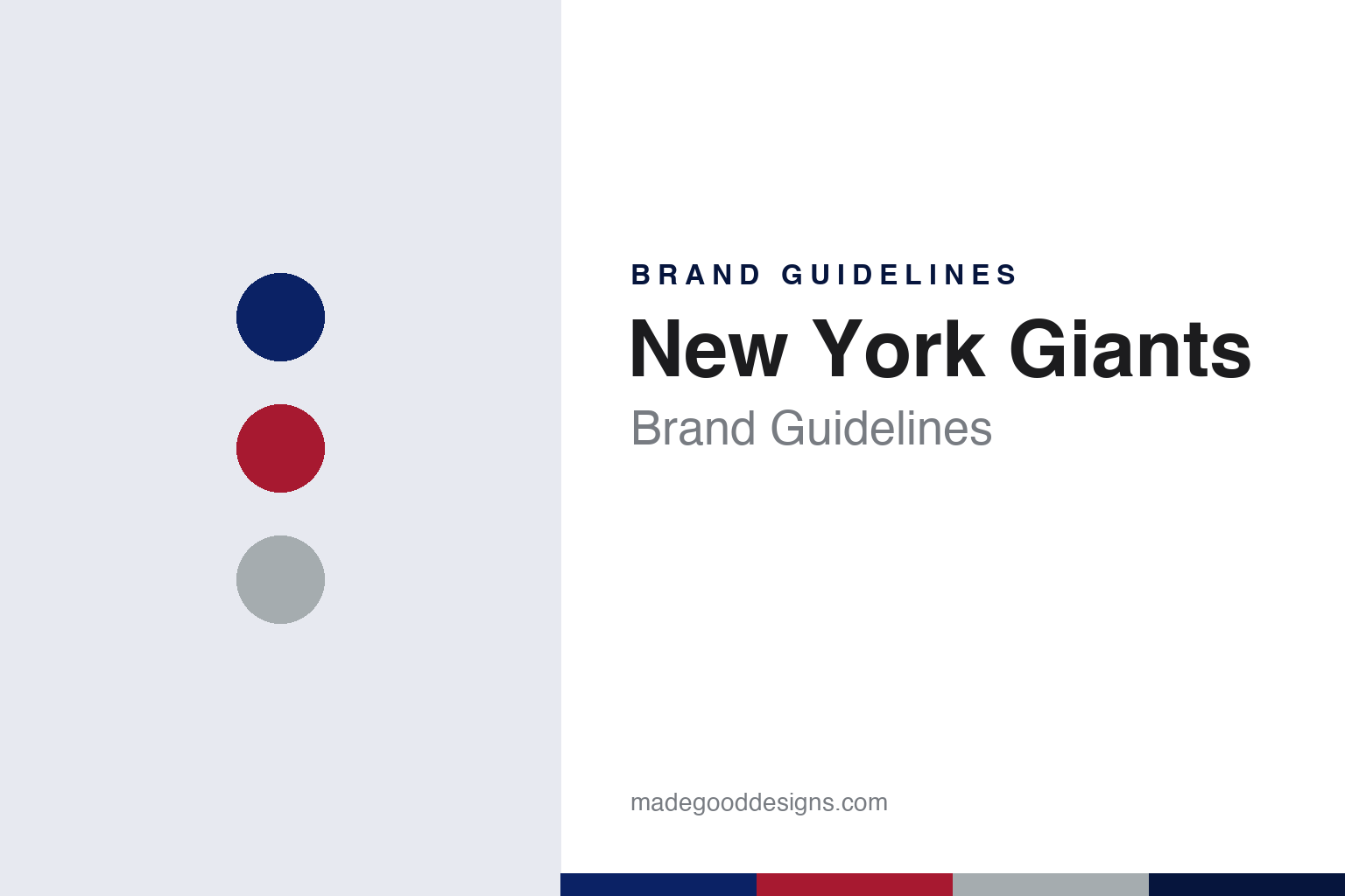
New York Giants Brand Guidelines
Lowercase ny, an italic GIANTS and a red that keeps coming back.
Aa
Two constants: a dark blue, red and grey palette and a condensed athletic sans register. Abstract homage — not a New York Giants product or mark; no helmet, uniform or logo is reproduced.
Football Giants
A borrowed name, made legal with one extra word.
The New York Giants began with a franchise and a borrowed name. English Wikipedia says the NFL granted a franchise on 1 August 1925 to Timothy Mara and Will Gibson for their newly organised team in New York City, the New York Football Giants. The Pro Football Hall of Fame’s team history says Tim Mara bought the franchise in 1925 and that his sons, Jack and Wellington, later succeeded him at the head of the club.
The “Giants” name already belonged to a baseball team in the same city, and the football club solved the overlap on paper. Wikipedia says the team was incorporated in 1929 as the “New York National League Football Company, Inc.” and changed that in 1937 to “New York Football Giants, Inc.”, to tell itself apart from the baseball Giants. The baseball club moved to San Francisco after the 1957 season, but the football team still uses the longer form as its corporate name, and fans and broadcasters still use it too. The nicknames “Big Blue” and “G-Men” sit alongside it.
Wellington Mara was part of the story from the start. Writing on Heavy.com on 23 July 2022, Kevin Boilard described him as a ball boy for the club in 1925 who became its owner and president from 1959. In 2022 the team stitched his motto, “Once a Giant, Always a Giant”, into what it called a “Heritage Neckline” inside its new classic jersey.
Ownership was later split between two families. The Hall of Fame says Preston Robert Tisch bought half of the club in 1991, and that the two owners became co-CEOs; Wikipedia’s account of the club’s finances places the sale in 1990, while its history heads the period that follows “Mara and Tisch era (1991–present)”. Wikipedia lists John Mara and Steve Tisch as the club’s owners today, with John Mara as president and Steve Tisch as CEO.
Colour
Five homes, and a city name kept after the move.
The Giants have moved more often than their name suggests. Wikipedia lists the Polo Grounds from 1925 to 1955, Yankee Stadium from 1956 to 1973, the Yale Bowl in New Haven for 1973 and 1974, Shea Stadium for 1975, and then Giants Stadium in the Meadowlands of East Rutherford, New Jersey, from 1976 to 2009. Since 2010 the club has played at MetLife Stadium, which Wikipedia describes as a 50/50 partnership with the New York Jets. The training centre and headquarters are also in East Rutherford.
The move across the Hudson shaped the logo. Wikipedia says the uppercase “NY” used in 1975 was replaced a season later by the team nickname in bold italic white capitals, GIANTS, and that this change was prompted by the move to the Meadowlands. When the club brought its lowercase “ny” back as the primary logo in 2000, Wikipedia notes that the change drew controversy because the team still played in New Jersey. Wellington Mara answered that the club was not making a political statement, and said the team had always represented the New York/New Jersey metropolitan area, from the Polo Grounds to New Jersey.
Colour has moved too. Wikipedia lists the colours as dark blue, red and white, with grey as a fourth tone in some marks, and says the team has worn blue helmets since 1949. Writing for ESPN on 16 May 2024, Jordan Raanan noted that “Big Blue” could easily have been “Big Red”: red played a bigger part in the colour scheme through much of the club’s early decades, until the Giants went mainly with blue and white. Wikipedia says the Giants usually wore red jerseys at home before 1953, and that a white jersey with red Northwestern stripes (three parallel bands, the centre one roughly twice as thick) arrived in 1954. From 1957, player numbers in a small white Futura sat beside the red centre stripe on the back of the helmet, and moved to the front as well in 1958.
Typography
Design and documentation.
Visual identity in professional American football works across a few fixed surfaces. The helmet logo is a mark seen often, applied as a decal on a curved shell and read from a distance on television and in the stands, so it tends to be a compact shape with a clear outline that still works when it is small. Many helmet marks are a single letter, a monogram or a simple symbol, set on a shell colour that is part of the identity in its own right.
Uniform colours carry much of the recognition. A team usually works with two or three main colours plus white, used across home and road jerseys, pants, socks and trim, and the stripe patterns on sleeves and pants become recognisable details over time. Alternate and throwback uniforms let a team revisit older looks without replacing its main kit.
Wordmarks are the custom lettering used for team names on merchandise, signage and broadcast graphics, often paired with the helmet logo. Numerals on jerseys follow their own drawn styles. In stadiums, end-zone graphics painted on the turf repeat the wordmark and colours at large scale, and midfield logos give the field its own centrepiece. For a designer, the useful lesson is how one small mark has to hold together across a helmet, a jersey, a field and a screen.
Aa
A condensed athletic sans — the register of a helmet wordmark and a stadium end zone. (Specimen set in Barlow Condensed, a sans STAND-IN; NOT the New York Giants logo, script or numerals.)
The ny
A quarterback, two letters and an italic word.
Wikipedia groups the club’s marks around three ideas: a “giant” football player poised to throw, the word GIANTS, and the initials of New York. Before 1961 the official logo was the giant quarterback, created by Marie Barclay Steinmuller, who Wikipedia says also drew the original “ny”. The figure at first towered over the New York City skyline, then over Yankee Stadium, then over Giants Stadium; the current version throws without a stiff-arm and wears a helmet with a facemask.
The lowercase “ny” went on the sides of the blue helmet in 1961. Wikipedia says the uppercase “NY” of 1975 was itself built from stripes, matching a striped uniform of the same season, and that the italic, underlined GIANTS script then served as the primary logo from 1976 to 1999. In 2000 an updated blue and red “ny” returned, shown in white on the helmet, and the script became secondary. A 2005 version that set GIANTS in block letters above a circled “ny” was demoted in 2007, and the underlined script stayed in the end zones.
The club now mixes eras on purpose. Boilard wrote in 2022 that the new classic uniform recalled the 1980s and 1990s and put the old GIANTS logo on the helmet in place of the “ny” used since 2000. Raanan reported in 2024 that the Century Red uniform for the franchise’s 100th season combined a modernised 1933 jersey, 1925 tan pants and red socks with a blue stripe, and a winged 1938 helmet, and that it was designed by Nike in collaboration with the Giants. He quoted Doug Murphy, the club’s director of creative services, saying the team had researched past uniforms to get the details right; the 1933 jerseys had long sleeves, while the new one does not. The season patch used a shield shaped like the Polo Grounds, zeros drawn like Giants Stadium and a central figure inspired by the skyline quarterback.
For a design guide, the New York Giants show how a club can keep a small set of marks in rotation, bringing a letter pair, a script and a painted figure back as it moves between eras and stadiums. Compare it with the Chicago Bears, another club that grew up in the 1920s league, and the NFL, which granted the Giants their franchise in 1925. For this guide we use dark blue, red and grey with a sans, an unofficial interpretation; no product or logo is reproduced.
Explore & save
Keep New York Giants’s identity on hand — save it to a board in the Made Good inspiration library.
New York Giants identity set
Pin the New York Giants dark blue, red and grey palette and the condensed athletic sans register to your own board.