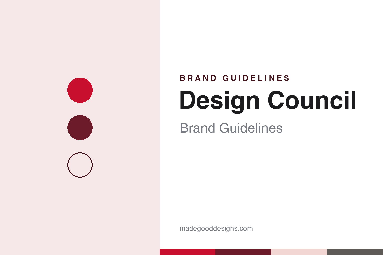
Design Council Brand Guidelines
A red-and-white council that has argued for design since 1944.
Aa
Two constants: a red-and-white palette deepened with claret and a humanist sans register. Abstract homage — not a Design Council asset or mark; no logo, icon or wordmark is reproduced.
A council for industrial design
From the Board of Trade, December 1944.
Design Council began life under another name. Wikipedia says the organisation was set up on 19 December 1944 as the Council of Industrial Design, often shortened to COID, and that it was founded by Hugh Dalton, then President of the Board of Trade in the wartime government. Its stated objective was to promote “by all practicable means” the improvement of design in the products of British industry. That wording explains a great deal about the identity the council has carried since: it was created to talk to manufacturers and the public about design, not to sell a product of its own.
Wikipedia names S. C. Leslie as director in the council’s opening years and says he played an important part in the Britain Can Make It exhibition of 1946. His successor from 1947, Sir Gordon Russell, set out the organisational model that, Wikipedia says, lasted for the next forty years. Under Russell the council combined exhibitions with product endorsements, direct services to industry, commercial publishing and retail, so its name appeared on a wide range of surfaces, from show stands to printed matter.
The present name arrived in 1972. Wikipedia says the organisation changed its name to the Design Council that year, under Sir Paul Reilly. In 1976 it was incorporated as a registered charity by royal charter, although it continued to operate as a non-departmental public body. Today the council describes itself on its website as the UK’s national strategic advisor for design, and Wikipedia quotes its stated mission as being “the UK’s national champion for design”.
The council has a long paper trail. Wikipedia says it published its own magazine, Design, from 1949 until the summer issue of 1999, and that the council’s archive is held at the University of Brighton Design Archives. The council has also published a book, Eight Decades of British Design, which it describes on its website as a layered portrait of British design history.
Colour
A building in the Haymarket and a run of identities.
For four decades the council also had a public front door. Wikipedia says the Design Centre, in London’s Haymarket, was officially opened on 26 April 1956. Wikipedia says the Design Centre was closed to the public after a restructuring in 1994, and that the council continued to operate from the building until 1998.
The relaunch that followed the 1994 restructuring brought a new visual identity, and it did not last long. Design Week reported on 9 November 1995 that the Design Council was to drop its identity less than a year after it had been designed by The Partners. The magazine said the slogan-based identity system had been introduced at the council’s official relaunch the previous December, that it had not yet been fully implemented, and that the council was talking to other design groups about a replacement. David Stuart, a partner at The Partners, told Design Week that the decision “came as a bolt from the blue”. A council spokeswoman confirmed the review but would not say who was taking part.
The council’s current mark followed in 1996. Design Week reported on 28 February 2023 that the council’s red logo was designed in 1996 by the Edinburgh-based consultancy Tayburn McIlroy Coates, and that it is set in Quay Sans, a typeface designed by David Quay and Freda Sack. In the same report, chief executive Minnie Moll said the branding had not been reviewed since 1996. David Bennett, creative director of OPX Studio, described the logo to the magazine as “steeped in history and heritage”.
Wikipedia also records changes in status that shaped what the council is. On 1 April 2010 it set up a trading subsidiary, Design Council Enterprises Limited. On 1 April 2011 it ceased to be a non-departmental public body of the Department for Business, Innovation and Skills and became an independent registered charity, and on the same day it merged with the Commission for Architecture and the Built Environment, which now operates as Design Council CABE.
Typography
A council, a building and a red mark.
Schools and cultural institutions carry identities that work differently from those of consumer brands. Many began with a crest, a seal or a formal Latin motto, the visual language of charters and certificates, and later added or swapped in a plain wordmark that sits more easily on a website, a banner or a tote bag. Others never had a crest at all and built their recognition on a single letter, a typeface or a set of initials.
The building often does as much work as any mark. A façade, an extension or a distinctive staircase becomes the image that photographers, students and visitors repeat, and a new wing can change how an institution is pictured for decades. Posters are a second, older surface: a steady programme of exhibition and event posters, set in a consistent grid or typeface, can define a place more clearly than its logo.
Exhibitions, catalogues, yearbooks, journals and reports extend that system into print, and each title is a chance to test the identity at a new scale. When reading these guides, look at the whole family of surfaces together: the mark, the building, the posters and the publications usually tell one story.
Aa
A humanist sans — after a council whose red logo has been set in Quay Sans since 1996. (Specimen set in Source Sans 3, a sans STAND-IN; NOT the Design Council logo, Quay Sans or any council typeface.)
Design Council
The Double Diamond and a 2023 refresh.
One of the council’s diagrams works as a piece of identity in its own right. On its website the Design Council says that in 2003 it was promoting a strategic approach to design and the value of design management, but had no standard way of describing the process behind it. It says Richard Eisermann, then its Director of Design and Innovation, asked his team how to describe the design process, and the answer became the Double Diamond: two diamond shapes for discovering and defining a problem, then developing and delivering answers. Eisermann is quoted by the council saying the team’s work was to “codify it, rename the steps and popularise it”. The council now publishes the Double Diamond under a CC BY 4.0 licence. Wikipedia adds that in 2021 Minnie Moll introduced a mission called Design for Planet, and Sarah Weir had been appointed chief executive in 2017.
A later change to the look came in 2023. Design Week reported on 28 February 2023 that OPX Studio had refreshed the council’s branding with a simplified design system and graphic language, keeping the 1996 red logo. Bennett told the magazine that the earlier brand had felt “quite scattergun”, with varied visual styles, and that OPX had decided to “strip all that out” and start again with typography and colour. He described the council as “a red and white brand”, and said a key moment came when the team removed all black copy and worked instead with a deep claret. Photography was rebalanced to separate hero images from secondary ones.
Design Week said the refresh launched alongside a sustainability and accessibility audit of the new guidelines by Mia Allers, design lead on gov.uk at the Government Digital Service. For digital work the audit was based on the AA level of WCAG 2.1. Moll told the magazine that “good design serves both people and planet”, and that the council wanted to “walk the talk” on its Design for Planet mission. OPX also built the refresh around a film carrying the line “Design made it possible”, published on the council’s website.
For a design guide, Design Council shows how a public body can keep one red mark for decades while its buildings, publications and diagrams carry the rest of its identity. Compare Cooper Hewitt and HfG Ulm, two other design institutions in this collection. For this guide we use red, claret and blush with a humanist sans, an unofficial interpretation; no product or logo is reproduced.
Explore & save
Keep Design Council’s identity on hand — save it to a board in the Made Good inspiration library.
Design Council identity set
Pin the Design Council red, claret and blush palette and the humanist sans register to your own board.