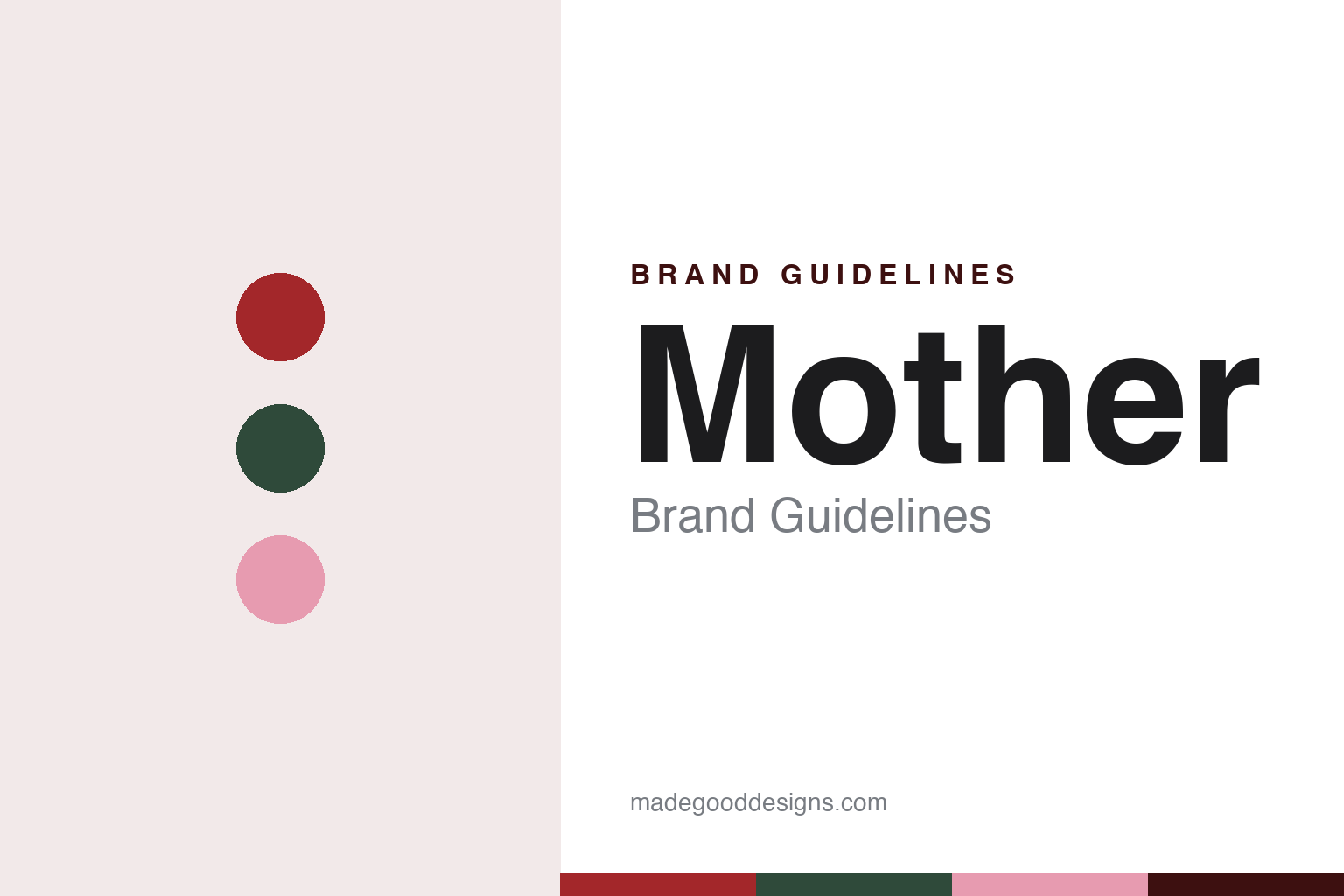
Mother Brand Guidelines
A London agency that began at a kitchen table and still keeps its mothers on the wall.
Aa
Two constants: a curtain red, forest green and sofa pink palette and a warm display serif register. Abstract homage — not a Mother asset or mark; no logo, icon or wordmark is reproduced.
A kitchen table in London
London, 1996.
Mother took its name from the family rather than from its founders. English Wikipedia says the agency was founded in London in 1996 by Mark Waites, Stef Calcraft, Libby Brockhoff and Robert Saville, around a kitchen table, and the design magazine OnOffice told the same kitchen-table story in an article by Alia Akkam published on 5 November 2024. Unlike the agencies named for a row of surnames, the company carries a single common word, and it has stretched that word across everything it does.
The first client is part of the story. OnOffice said Mother was founded in part to launch the British television channel Channel 5 in 1997, and the magazine linked the agency’s look to the era of 1990s Cool Britannia. It’s Nice That, in a profile by Alex Bec dated 2 June 2008, said the agency was initially based in Soho before moving east, and described it as a wholly independent agency.
That independence is still how the company describes itself. Its London website calls Mother “an independent creative company”, and English Wikipedia describes it as an independent global advertising agency with a design division, Mother Design. The company’s website groups its offices and spin-offs under the heading “Motherverse”, listing Mother London, Mother New York, Mother Los Angeles, Mother Shanghai and Mother Berlin alongside Mother Design and other units, and OnOffice named the same four cities outside London.
The family name runs through those units. The Drum reported on 19 October 2020, in an article by John Glenday, that Mother had launched a new independent agency called Other, based in the Mother building on Redchurch Street and reporting to global chief executive Michael Wall and founder Robert Saville. Saville told The Drum: “There will always be Mother and now there is Other.” The Drum’s report used the same family language, saying that Mother had “given birth” to the new company.
Colour
A tea warehouse in Shoreditch.
The building is part of the identity too. OnOffice said Mother first settled into its Shoreditch office in 2004, in a former Lipton tea-packing warehouse known as the Biscuit Building, and that the original interior was designed by the California-based practice Clive Wilkinson Architects. English Wikipedia gives the same year and architect. It’s Nice That placed the agency in the Biscuit building in 2008, in what it called the creative hub of Shoreditch.
Twenty years later the ground floor was reworked rather than replaced. OnOffice reported that the London design practice Holloway Li gave the communal areas a gentle refresh, turning the ground floor into a shopfront where staff eat together and hold informal meetings, and which in the evenings becomes Downstairs at Mother, a programme of music, talks and exhibitions open to the public. Co-founder Alex Holloway told the magazine that the agency wanted “an evolution rather than a revolution”.
The details are where the colours come from. OnOffice said the original stainless-steel reception desk was kept and given an illuminated cloak, set against suspended bare bulbs and deep red curtains, and that the old heavy dining tables were replaced with Big Red, picnic-style tables and benches in fibreglass and structural foam coated in resin, made by the fabricator Uma using surfboard techniques. Two stainless-steel kitchen islands were set off by splashes of forest green and more red, with open shelves of vintage tableware.
On the mezzanine, the magazine said, framed portraits of employees’ mothers still hang on one of the walls, now beside Holloway Li’s T4 sofa modules in pink and orange, a design first shown at the 2022 London Design Festival. Helen Sullivan, Mother’s facilities director, said the new design felt “inherently Mother”.
Typography
A family name, a warehouse and a wall of mothers.
An advertising agency is in the odd position of selling identity work while needing one of its own. Many agency names are simply the founders’ surnames joined together, sometimes with an ampersand, a plus sign or a slash, and over time those strings are often shortened to initials. That shortening is itself a design decision: a run of capitals reads as a mark rather than a list of people, and it survives the departure of the partners whose names it holds.
Other agencies pick a single word, an animal or a punctuation mark as the anchor, and let the typography do the rest. Because an agency rarely has a product on a shelf, its identity lives on surfaces that are easy to overlook: the reception wall, the office building and its signage, the credentials deck, the business card, the “about” page and, above all, the website, which is often rebuilt more often than the logo. For a designer studying these brands, the useful questions are how the name is set, how the mark behaves when it is shortened or extended for a new office, and how much of the agency’s self-promotion borrows the tone of the work it makes for clients.
Aa
A soft, warm display serif — after a London agency with red curtains and a wall of family portraits. (Specimen set in DM Serif Display, a serif STAND-IN; NOT the Mother logo or any Mother typeface.)
Mother
Monkeys, cinemas and a lot of clients.
The agency’s own name sits behind a long list of client work, and the press has recorded some of it by date. It’s Nice That listed, in 2008, a spoof of the Levi’s “Odyssey” film for the soft drink Lilt, a West Side Story “Face Off” for Supernoodles, celebrity cinema ads for Orange, the film “What goes around” by Nagi Noda for Coca-Cola, a Peter Blake live art project for Coca-Cola and the outdoor project “London Ink” for the Discovery Channel. The same profile named Penguin, Boots, PG Tips and the Post Office among London clients, with Dell in New York and Nike in Buenos Aires.
One pair of characters ran across two clients. English Wikipedia says Mother created Al and Monkey in 2001 for ITV Digital, and later brought them back as the face of PG Tips. The Independent, in a column by Claire Beale on 22 December 2008, named Mother as the PG Tips agency and described a Christmas Day ad in which Al and Monkey reworked the Morecambe and Wise breakfast sketch over a pot of tea. English Wikipedia dates Boots’ “Here Come The Girls” to Christmas 2007, the Orange Gold Spots to 2003–2009, and the start of Mother’s work for Stella Artois to 2008.
The roster has kept changing. OnOffice named Ikea, KFC and Marks & Spencer among the clients in 2024, and The Drum listed Bloom & Wild, Grundig and Jaguar Land Rover’s rental service The Out as the first clients of Other in 2020. English Wikipedia says Mother New York began in Hudson Yards in Manhattan and has since moved to Gowanus, Brooklyn.
For a design guide, Mother shows how a single family word can hold an agency, a set of spin-offs and a building together, down to a wall of staff mothers and a pair of red curtains behind a steel desk. Compare Anomaly, another agency named with a single word rather than its founders, and Wieden+Kennedy, an independent agency named for its two founders. For this guide we use curtain red, forest green and sofa pink with a serif, an unofficial interpretation; no product or logo is reproduced.
Explore & save
Keep Mother’s identity on hand — save it to a board in the Made Good inspiration library.
Mother identity set
Pin the Mother curtain red, forest green and sofa pink palette and the warm display serif register to your own board.