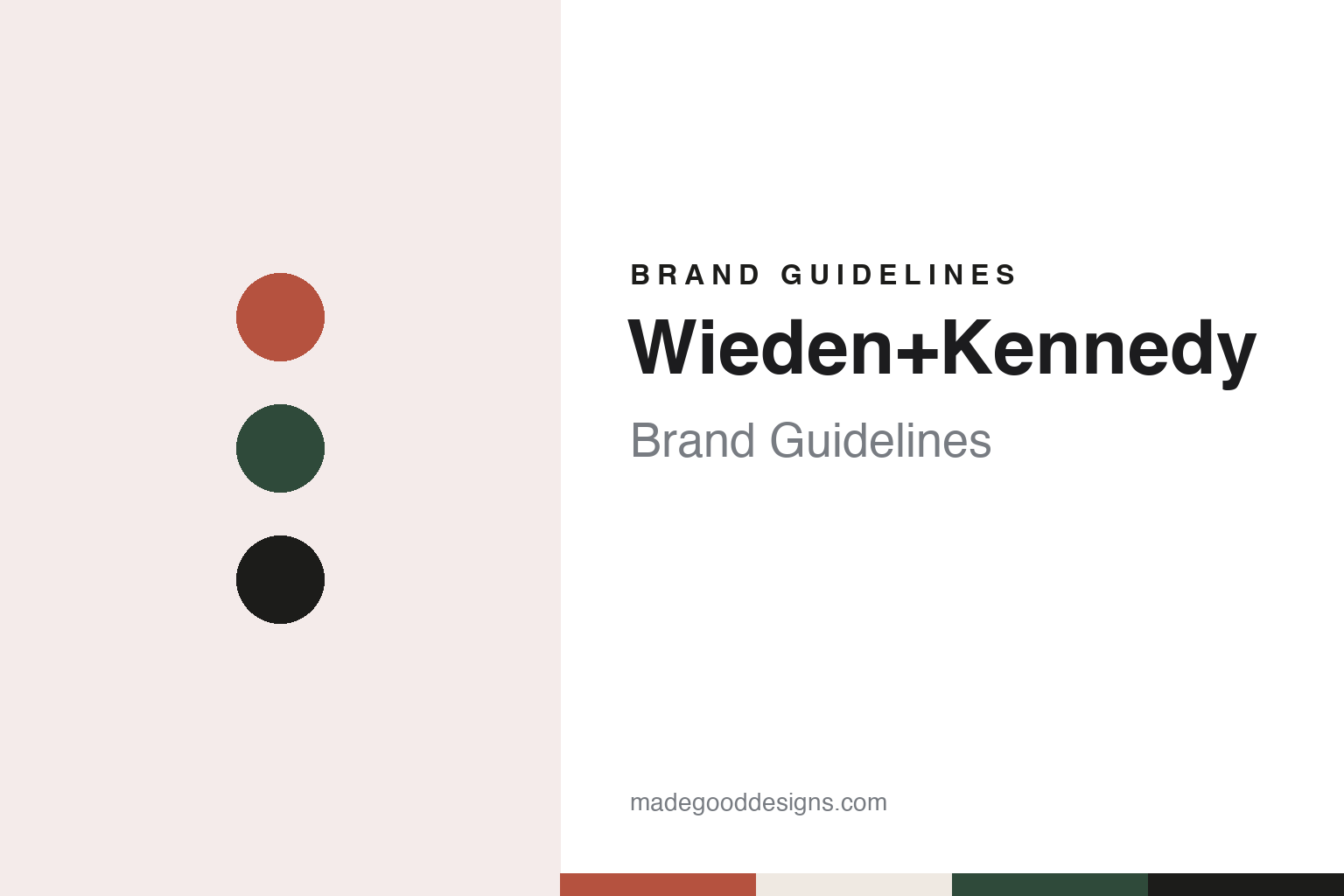
Wieden+Kennedy Brand Guidelines
Two founders’ names, joined by a plus sign, kept in Portland.
Aa
Two constants: a brick, fir and ink palette and a plain grotesque sans register. Abstract homage — not a Wieden+Kennedy asset or mark; no logo, icon or wordmark is reproduced.
Two names from the Portland trade
Portland, 1 April 1982.
Wieden+Kennedy takes its name from its two founders, Dan Wieden and David Kennedy, and it still carries both surnames, now joined by a plus sign. Wikipedia says the agency was earlier styled Wieden & Kennedy. It was founded in Portland, Oregon, on 1 April 1982, and Portland is still its headquarters.
The two men met in the Portland advertising trade. Willamette Week reported on 12 October 2021 that Kennedy grew up in Oklahoma, studied art in Chicago and moved to Portland in 1979 with the agency McCann-Erickson. An obituary of Wieden carried by The Boston Globe on 7 October 2022 said Wieden, a Portland native who had studied journalism at the University of Oregon, joined McCann-Erickson in Portland as well and teamed up with Kennedy there. Around 1980, the Globe said, both men moved to the William Cain Agency, where one of the clients was Nike, the sports-shoe company based in nearby Beaverton. They left Cain in 1982 to start their own firm, with Nike as their sole client.
The founding date became part of the agency’s story. An obituary quoted by OPB on 1 October 2022 described the start on April Fool’s Day 1982 “with a card table, a few chairs, some cardboard file cabinets, and one client—Nike.” Willamette Week noted that the firm was set up far from the advertising centres of New York and Chicago. The Globe quoted Wieden reflecting years later that “no one in their right mind would start an international agency in Portland, Oregon.”
The partnership paired a writer with an artist. The Globe cited The Oregonian describing Wieden as the radical writer and Kennedy as the philosophical artist, and recalled that Nike’s founder Phil Knight had introduced himself to the pair with the words “I’m Phil Knight, and I hate advertising.” Wikipedia says the agency’s opening work was a set of three television commercials for Nike, aired during the New York City Marathon in October 1982.
Colour
A client line, and the work around it.
The relationship with Nike grew in steps. The Globe reported that Nike also gave its advertising for the 1984 Summer Olympic Games to the agency Chiat/Day, and that a Wieden+Kennedy commercial the following year for a Honda scooter, with Lou Reed riding through New York City to his song “Walk on the Wild Side”, caught Knight’s attention. After that, the Globe said, Knight put far more of Nike’s work with the Portland firm.
The line the obituaries tied to Wieden is a client tagline rather than a slogan of the agency’s own. According to the Globe, Wieden’s team had made Nike advertisements for different sports and athletes and wanted a single phrase to bind them together, and Wieden said he came up with “Just Do It” largely on his own. The tagline appeared on a television commercial in July 1988, the Globe reported, directed by Kennedy and featuring the runner Walt Stack on a route that took him over San Francisco’s Golden Gate Bridge. The aim, the paper said, was to sell a shoe to people of any age or fitness level.
Kennedy’s hand ran through the Nike work of those years. Willamette Week said he worked on the “Just Do It” campaign, on the advertisements that linked Michael Jordan and Spike Lee with the brand, and on the Honda campaign with Lou Reed. The Globe added the “Bo Knows” commercials for Nike cross-training shoes, which featured the athlete Bo Jackson and the guitarist Bo Diddley.
The client list widened well beyond sportswear. The Globe named McDonald’s, Ford, Coca-Cola, Samsung, ESPN and Uniqlo among the companies the agency has worked for, and Willamette Week listed Old Spice, Heinz and FanDuel alongside Honda. Wikipedia credits the agency with the “This is SportsCenter” campaign for ESPN, the Old Spice campaign “The Man Your Man Could Smell Like” and the Honda film “Cog”.
One long-standing client sits outside commerce. Willamette Week described the American Indian College Fund as a longtime Wieden+Kennedy client, and reported that one of the last projects Kennedy worked on was a campaign for the fund titled “This Is Indian Country”, launched on 11 October 2021, Indigenous Peoples’ Day.
Typography
Surnames, a warehouse and a plus sign.
An advertising agency is in the odd position of selling identity work while needing one of its own. Many agency names are simply the founders’ surnames joined together, sometimes with an ampersand, a plus sign or a slash, and over time those strings are often shortened to initials. That shortening is itself a design decision: a run of capitals reads as a mark rather than a list of people, and it survives the departure of the partners whose names it holds.
Other agencies pick a single word, an animal or a punctuation mark as the anchor, and let the typography do the rest. Because an agency rarely has a product on a shelf, its identity lives on surfaces that are easy to overlook: the reception wall, the office building and its signage, the credentials deck, the business card, the “about” page and, above all, the website, which is often rebuilt more often than the logo. For a designer studying these brands, the useful questions are how the name is set, how the mark behaves when it is shortened or extended for a new office, and how much of the agency’s self-promotion borrows the tone of the work it makes for clients.
Aa
A plain grotesque sans — after an agency name set as two surnames and a plus sign. (Specimen set in Work Sans, a sans STAND-IN; NOT the Wieden+Kennedy logo or any Wieden+Kennedy typeface.)
Wieden+Kennedy
A warehouse, a trust and a handover.
A large part of the agency’s public face is its building. Allied Works Architecture, the Portland practice led by Brad Cloepfil, says Dan Wieden hired it in the late 1990s to design the agency’s global headquarters, and that the two firms chose a derelict warehouse in Portland’s then-emerging Pearl District. Allied Works says the masonry and timber-frame building was renovated, seismically stabilised and placed on the National Register of Historic Places, with shops and restaurants opened at street level. Inside, it says, workspaces are grouped as “mini-agencies” around the perimeter while a new five-storey concrete atrium, a building within a building, rises in the centre. The firm’s project bibliography lists a feature on the building in Architecture magazine in June 2000.
AIGA Eye on Design, writing on 11 August 2016, described the headquarters as a former frozen-food warehouse that takes up an entire block, with the atrium used for meetings, lectures, parties and live music. It quoted executive creative director Susan Hoffman, one of the agency’s early employees, on a set of house rules that includes “Fail harder” and “Don’t act big”.
The agency has stayed independent. The Globe reported in October 2022 that Wieden+Kennedy had remained independent while other agencies were taken over by international groups, and that it is now run by a trust suggested by Dan Wieden to secure that independence. Writing for D&AD on 3 October 2022, Bob Hoffman said Wieden had put the agency into a trust intended to keep it independent.
The founders handed over in stages. Willamette Week said Kennedy retired from the agency in 1995 to concentrate on sculpture and charitable work, and reported that he died on 10 October 2021. OPB reported, citing his obituary, that Wieden stepped into a chairman role and away from active agency life in 2015; it reported on 1 October 2022 that he had died at his home in Portland on 30 September 2022.
Beyond Portland, Wikipedia lists offices in New York, London, Amsterdam, Shanghai, Tokyo and Delhi, with São Paulo added in late 2010.
For a design guide, Wieden+Kennedy shows how an agency can keep two founders’ surnames as its name for four decades, swap an ampersand for a plus sign and let a converted warehouse do much of the talking. Compare Nike, the client the agency was founded with, and Ogilvy, a New York agency founded in 1948. For this guide we use brick, fir and ink with a sans, an unofficial interpretation; no product or logo is reproduced.
Explore & save
Keep Wieden+Kennedy’s identity on hand — save it to a board in the Made Good inspiration library.
Wieden+Kennedy identity set
Pin the Wieden+Kennedy brick, fir and ink palette and the plain grotesque sans register to your own board.