Stedelijk Museum Brand Guidelines
A museum that has treated its catalogues and posters as its face.
Aa
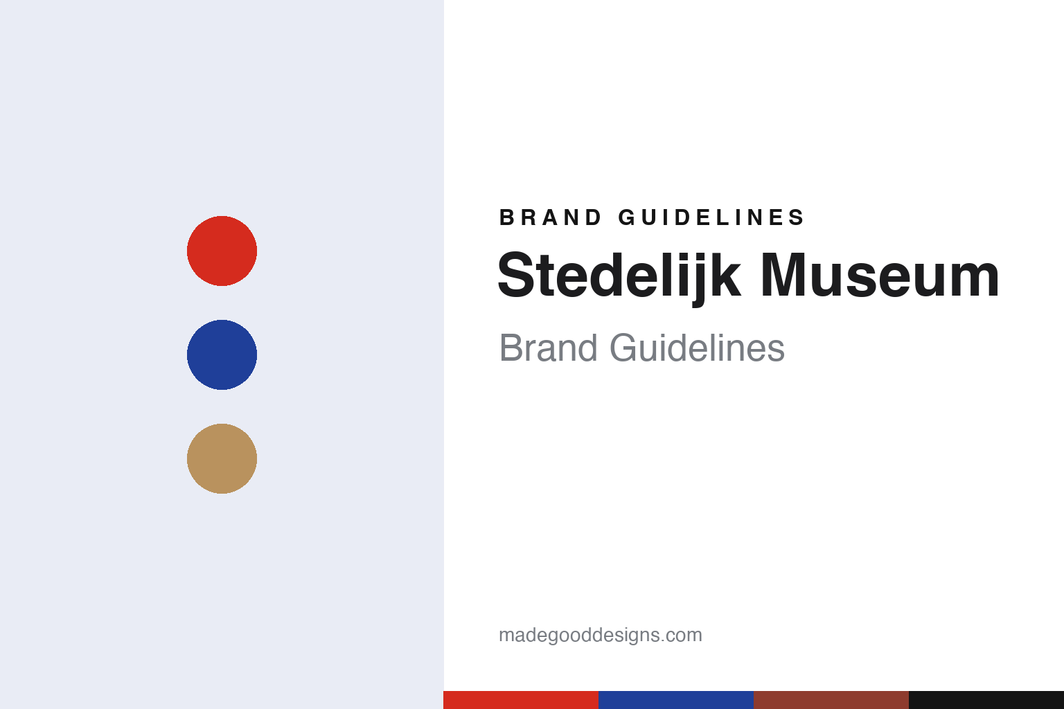
Two constants: a red and blue palette on brick, paper and white, and a neo-grotesque sans register. Abstract homage — not a Stedelijk Museum asset or mark; no logo, icon or wordmark is reproduced.
A municipal museum on Paulus Potterstraat
Amsterdam, September 1895.
The name says what the museum is: Stedelijk Museum means municipal museum. Wikipedia says the Stedelijk Museum Amsterdam opened on 14 September 1895 as an initiative of the local authority and private individuals. Its Dutch Neo-Renaissance building on Paulus Potterstraat was designed by the architect Adriaan Willem Weissman and built between 1891 and 1895, a short walk from the Rijksmuseum. Wikipedia says construction was largely funded by Sophia Adriana de Bruyn, whose collection was cared for by a society founded in 1874 to form a public collection of contemporary art. Dezeen, reporting on 6 September 2012, described Weissman’s original building of 1895 as red brick.
The early collection was a mixed one. Wikipedia lists militaria of the Amsterdam militia, Asian art and objects from museums of chronometry and of medicine and pharmacy among the early holdings. Cornelis Baard was appointed curator in 1905 and became director in 1920, and over those years the city began building its own collection of modern art. In 1933 a collection of books came to the museum, and Wikipedia says its interests later widened to book design and typography. A Museum of Applied Art opened on the ground floor of the west wing on 15 December 1934, with furniture, glass, ceramics, textiles, graphic design and posters.
The museum’s design story is tied to one man. Eye magazine, in an article by Mafalda Spencer in its Summer 1997 issue, says Willem Sandberg’s work for the museum began with a set of pictorial statistics for an exhibition in 1928, and that he designed its catalogue for an exhibition marking the museum’s fortieth anniversary in 1935. Eye dates his appointment as curator to 1937; Wikipedia gives January 1938. Eye says he took the post on condition that he would not have to give up designing the catalogues. Both sources say he became director in 1945, a post Wikipedia says he held until Edy de Wilde took over in 1963.
Colour
Catalogues, posters and the letters SM.
Sandberg treated print as the museum’s public face. Eye said in 1997 that for Sandberg the graphic devices usually associated with a museum, such as street signs, posters, museum journals and especially catalogues, were central to expressing its image and making its activities visible. He saw the catalogue as a “taster” for an exhibition, and catalogues were made available by subscription before shows opened. Eye credits him with a long run of catalogues, and says that after 1945 he did the design work in the evenings, once the day’s running of the museum was done.
The look of that work is distinctive. Eye describes torn paper shapes, images half hidden behind tracing paper, Kraft paper, textile swatches and rough sugar paper, alongside script types set against bold Egyptian and sans-serif faces. Many catalogues, the magazine says, were printed at least in part on re-used paper, so that each copy was different, while reproductions of paintings were usually printed on smooth white paper and tipped in. Red and blue recur through his work of the late 1930s. Eye also says a museum bookplate of 1940 shows Sandberg using the enlarged letters SM, which he went on to use repeatedly as a symbol for the Stedelijk Museum, and that in 1997 the device was still in use, in a different typeface.
Sandberg changed the building as well. Eye says that as curator he had the coloured terracotta tiles of the entrance hall and staircase painted white, and commissioned Johannes Itten to design a cloth to soften the light from a new roof. Wikipedia says an annex known as the Sandberg Wing was built in 1954, and that departments of applied art and of prints and drawings were set up in 1945 and 1954.
A second designer shaped the museum’s printed voice after him. Wikipedia says that from 1964 the graphic designer Wim Crouwel was responsible for the design of the Stedelijk’s posters, catalogues and exhibitions, working under De Wilde, who was director from 1963 to 1985. When the designers of the museum’s later identity described their earlier work for it, they named Crouwel’s work as a reference point.
Typography
A brick building, a white wing and a lettered S.
Schools and cultural institutions carry identities that work differently from those of consumer brands. Many began with a crest, a seal or a formal Latin motto, the visual language of charters and certificates, and later added or swapped in a plain wordmark that sits more easily on a website, a banner or a tote bag. Others never had a crest at all and built their recognition on a single letter, a typeface or a set of initials.
The building often does as much work as any mark. A façade, an extension or a distinctive staircase becomes the image that photographers, students and visitors repeat, and a new wing can change how an institution is pictured for decades. Posters are a second, older surface: a steady programme of exhibition and event posters, set in a consistent grid or typeface, can define a place more clearly than its logo.
Exhibitions, catalogues, yearbooks, journals and reports extend that system into print, and each title is a chance to test the identity at a new scale. When reading these guides, look at the whole family of surfaces together: the mark, the building, the posters and the publications usually tell one story.
Aa
A neo-grotesque sans — after a museum whose 2012 S logo is set in Union, a typeface drawn from Arial and Helvetica. (Specimen set in Arimo, a sans STAND-IN; NOT the Stedelijk Museum logo, Union or any museum typeface.)
Stedelijk Museum
A new wing and a new S, 2012.
The museum’s current image was set by a long closure. Wikipedia says the Weissman building closed at the end of 2003 at the insistence of the fire department, and that the museum moved into the former Post CS building for four and a half years. In 2006 the city placed the Stedelijk in a foundation that leases the building from the city and manages the municipal collection on its behalf. From August 2010 the museum ran a programme called The Temporary Stedelijk in the restored but unfinished historic building, and it reopened to the public on 23 September 2012 with the group show “Beyond Imagination”.
The new wing changed how the museum meets the street. Dezeen reported on 6 September 2012 that Benthem Crouwel Architects had completed a curvy white extension, part of it underground, which the magazine likened to the underside of a kitchen sink. The entrance moved to a transparent facade facing the open lawn of Museumplein, the upper edges of the white volume reach out to shelter the plaza, and two escalators in an enclosed tube link the levels. The shop and restaurant sit beside the entrance, with a large exhibition hall and a library below ground.
The identity was renewed at the same time. In a news release of 2 August 2012, the museum said Mevis & Van Deursen, who had designed the identity for The Temporary Stedelijk from 2010 to 2012, were creating a new visual identity covering the logo, website, publications, newsletter, stationery and posters. Armand Mevis and Linda van Deursen said the Temporary Stedelijk identity had referenced the museum’s graphic tradition and Wim Crouwel’s work in particular, and that for the reopened museum they had chosen an entirely new house style. The museum described the new logo as the name “Stedelijk Museum Amsterdam” set in capitals in the shape of an S, in Union, a typeface designed in 2009 by Radim Peško. Writing in frieze issue 160, dated January–February 2014, Emily King said the designers’ references were to type in art, particularly concrete poetry, and that the typography resists finesse in a way that had riled many of their colleagues.
For a design guide, the Stedelijk Museum shows how catalogues, posters and a lettered mark can carry an institution as clearly as its building. Compare MoMA and Design Academy Eindhoven, two other design institutions in this collection. For this guide we use red, blue and Kraft brown with a neo-grotesque sans, an unofficial interpretation; no product or logo is reproduced.
Explore & save
Keep Stedelijk Museum’s identity on hand — save it to a board in the Made Good inspiration library.
Stedelijk Museum identity set
Pin the Stedelijk Museum red, blue and Kraft palette and the neo-grotesque sans register to your own board.