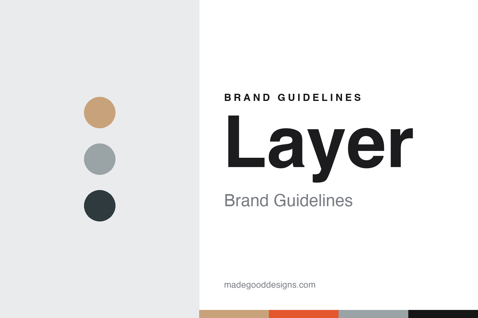
Layer Brand Guidelines
A designer’s name taken off the door, and a studio name put in its place.
Aa
Two constants: a palette of oak, grey and a single bright accent and a geometric sans register. Abstract homage — not a Layer asset or mark; no logo, icon or wordmark is reproduced.
From a name to Layer
Benjamin Hubert’s studio, renamed in 2015.
Layer is the London design studio of the industrial designer Benjamin Hubert. Before it had that name, it traded under his own. Dezeen reported on 9 September 2015 that Hubert had relaunched his studio under a new name that day, and that he had set up the eponymous studio five years earlier. Under his own name the studio had designed furniture and homeware for brands including Moroso, Ligne Roset and Menu; Dezeen listed ceramic containers patterned with raised seams, a sofa with legs tucked into its corner seams and blown-glass lamps with hand-cut patterns among its recent pieces.
The change of name was presented as a change of direction. Dezeen said Layer would design both physical and digital goods, including connected products and software. In an interview with Dezeen’s Dan Howarth, Hubert said the studio was “rebranding to Layer and it’s not just a rebrand, it’s a reposition”, and described the new business as an experience-driven design consultancy. He said the studio was not turning its back on furniture but re-focusing, and that its responsibility was “to use design for more than just the next nice chair”.
The interview also explains why a studio might drop a founder’s name. Hubert said that when a designer’s name is above the door, people assume the work reflects that designer’s personal taste, and he contrasted that personal, style-led approach with what he wanted Layer to be: something “a bit more democratic, a little bit more accessible”. He added that the change of name was there to communicate more readily what the studio does. Ten years later he returned to the point. Dezeen reported on 3 April 2025 that Hubert described Layer itself as his key project, and as a risk he took in repositioning away from the formerly eponymous brand.
The launch came with a communications plan of its own. Dezeen reported in 2015 that Hubert planned to use the “crowdspeaking” platform Thunderclap, on which backers pledge their social media audiences rather than money, to build interest around specific Layer projects. He told the magazine the aim was to create enough momentum to take projects to an investment or governmental level.
Colour
Charities, wheelchairs and speakers: projects with dates.
At the 2015 relaunch, Dezeen named Nike, BMW, Samsung, Braun and Oral-B as companies the studio was set to work with. The opening three projects to appear under the new name were a collection box for the UK cancer charity Maggie’s, a conceptual smartphone application with the Carbon Trust about climate change, and a modular acoustic system for flexible workspaces. An app for Maggie’s was also in development, and Hubert said software would become an increasing focus alongside hardware.
A well documented early project is a wheelchair. Dezeen reported on 3 May 2016 that Layer had unveiled the Go wheelchair, a prototype to be shown at Clerkenwell Design Week that month, following six months of research with wheelchair users and medical professionals. The seat and foot bay were to be made to measure by feeding a user’s biometric data into 3D-printing software; the seat was specified in a semi-transparent resin and a shock-absorbing thermoplastic polyurethane, and the foot bay in titanium. The magazine also described carbon-fibre spokes, a wheel surface designed to lock into custom gloves to help with self-propelling in wet conditions, and an app for choosing options and colours. In 2025 Hubert told Dezeen that Go had been among the early major projects launched under the Layer name.
Consumer electronics followed. In the same 2025 feature Hubert listed the Beosound Balance and Beosound Emerge speakers for Bang & Olufsen, dated 2020 and 2021, among the projects that represent the studio, and described them as audio products reworked as objects for the home. He also listed Foil, an installation for Braun at the London Design Festival that used kinetics and light to show an enlarged interpretation of a razor blade, and a project for the pet brand Earth Rated that covered a new brand identity, a range of products and packaging. A monograph on the studio, published by Phaidon and written by Max Fraser, was part of the same list.
Furniture never disappeared. Dezeen noted in 2017 that the studio’s own breakout space used Pair chairs that Layer had designed for Fritz Hansen, along with the studio’s Spinning lights and its own acoustic dividers.
Typography
A plain name for a mixed team.
An industrial-design consultancy sells a way of working rather than a product, so its identity has to be built from things that usually belong to clients. That shapes the visual habits seen across the field. Many studios set their names in a plain lowercase or all-caps wordmark with no symbol, a quiet signature meant to sit beside a client’s logo without competing with it. The name itself tends to follow one of two routes: the founders’ surnames, joined or hyphenated, which put personal reputation at the front, or an invented short word that can outlast the people who started the firm and travel more easily after a merger or a sale.
The real brand surface is the case study. A project page with a clear brief, process sketches, prototypes and finished objects does the work that packaging does for a consumer brand, and clean product photography on neutral backgrounds becomes the house style. Studio spaces carry the identity too: workshops, model rooms and material libraries appear in press images and recruitment pages. For a designer studying these firms, the useful lesson is restraint in the mark and consistency in how the work is shown.
Aa
A geometric sans — after a studio that swapped a personal name for a short common word. (Specimen set in Manrope, a sans STAND-IN; NOT the Layer logo or any studio typeface.)
Layer
A Hackney studio and a tenth birthday in Milan.
The studio’s identity is visible in its own rooms. Dezeen reported on 20 March 2017 that Layer had moved into a warehouse in Hackney, east London, and had lined the new offices with coloured display boxes framing elements of recent projects. The magazine said the colour and style choices were meant to reflect the studio’s brand identity. Visitors entered through a black stained-oak door with glossy signage; the kitchen and dining area used a warmer palette of oak and soft grey; industrial shelving held scale models, materials and production samples; and exposed tech cabling ran through the studio. Hubert told Dezeen the interior was designed to inspire the team with a constantly changing display of work, samples and research, and that the cabling gave the space a raw and honest expression while letting desks be added easily. The team, the magazine said, included researchers, engineers and industrial, graphic and digital designers.
The tenth anniversary was marked in public. Dezeen reported on 28 March 2025 that Layer would show 101010, an exhibition at the 10 Corso Como concept store during Milan design week, combining past projects with six new prototypes made with earlier collaborators. They included Keep, a mouth-blown fermentation vessel made with Orrefors; Host, a modular home for bees made with Andreu World; an oil lamp made with Muuto; Collect, a rain catchment tower using a Kvadrat textile; Cool, stackable earthenware cooling elements made by Bitossi Ceramiche; and Shield, a garment developed with the British fashion brand Raeburn. Dezeen said the title referred to the past decade and the decades to come, to binary code and to the venue’s address. Hubert told the magazine the new pieces were meant to raise discussion about how design can respond to challenges facing society, and that this time the studio had chosen traditional crafts rather than technology as its starting point.
For a design guide, Layer shows how a designer-led studio can rename itself to put a process ahead of a personal signature, while keeping the furniture work that made the founder’s name. Compare Moroso, one of the furniture brands Hubert worked with under his own name, and MAP Project Office, another London industrial design studio in this collection. For this guide we use stained oak, soft grey, slate and a single orange accent with a geometric sans, an unofficial interpretation; no product or logo is reproduced.
Explore & save
Keep Layer’s identity on hand — save it to a board in the Made Good inspiration library.
Layer identity set
Pin the Layer oak, grey, slate and orange palette and the geometric sans register to your own board.