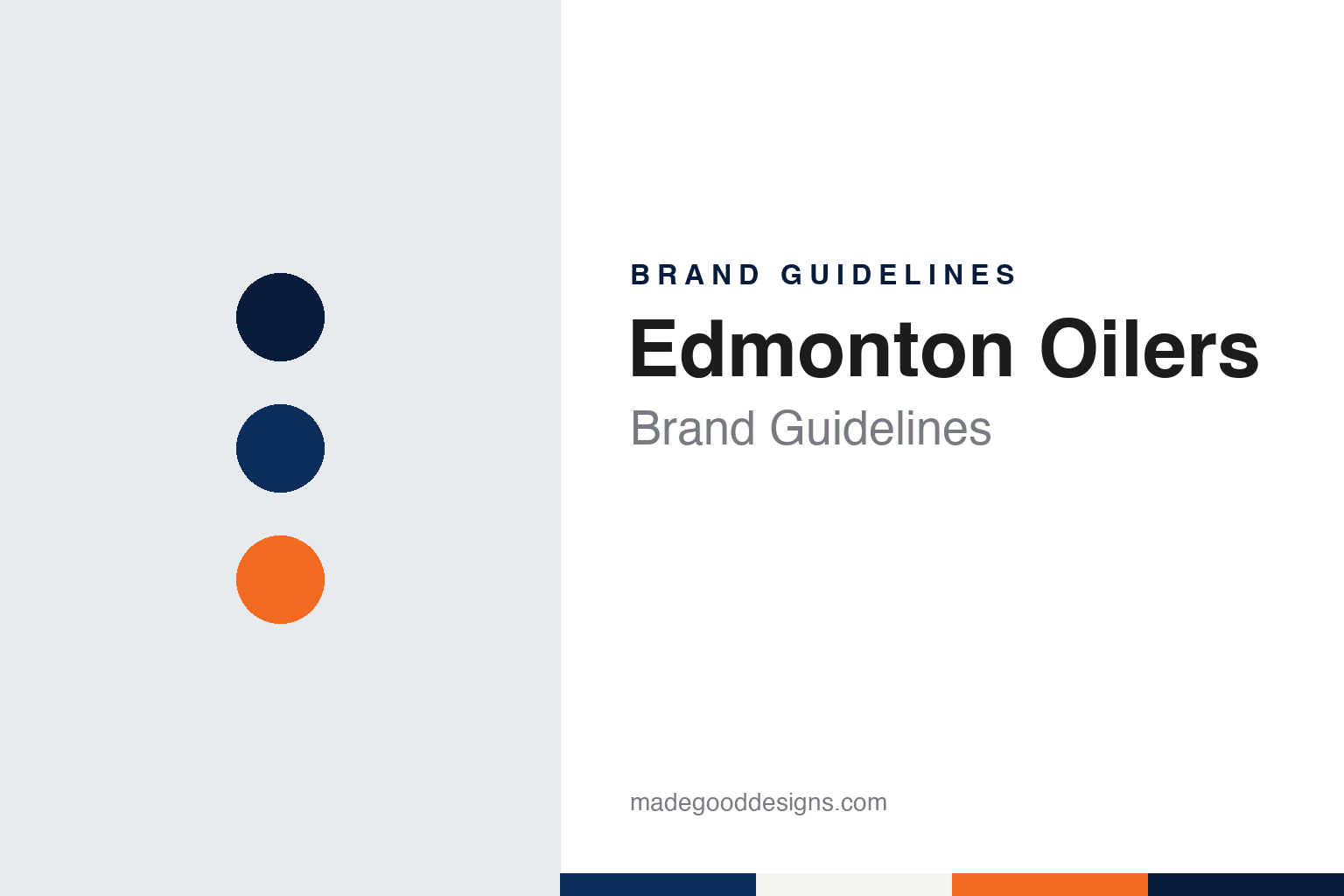
Edmonton Oilers Brand Guidelines
An oil drop over a city name, in blue and orange, then copper, then orange again.
Aa
Two constants: an oil blue, derrick orange and midnight palette and a condensed sans register. Abstract homage — not an Edmonton Oilers product or mark; no crest, sweater or logo is reproduced.
Alberta Oilers
A WHA club named for the province, then the city.
The Edmonton Oilers began in a rival league. English Wikipedia says the club was granted one of the twelve founding franchises of the World Hockey Association on 1 November 1971, owned by “Wild Bill” Hunter and his partner Charles Allard. Hunter already ran the junior Edmonton Oil Kings, and early in 1972 the new professional club was announced under that name before it was changed to the Oilers, a nod to the oil industry that shaped the city.
The first season brought a detour in the name. Wikipedia says the WHA had planned a second Alberta team, the Calgary Broncos, which collapsed before playing a game. The Edmonton club was renamed the Alberta Oilers on the expectation that it would split home games between Edmonton and Calgary. In practice it played every home game at the Edmonton Gardens, and the following year it became the Edmonton Oilers again. In 1974 the team moved into the new Northlands Coliseum, its home until 2016.
Ownership changed hands in the WHA years. Wikipedia says Hunter and Allard sold the club in 1976 to the Vancouver property investor Nelson Skalbania, who made the Edmonton businessman Peter Pocklington a partner and then sold him his share the following year. When the WHA folded in 1979, the Oilers were one of four of its clubs taken into the National Hockey League, alongside the Hartford Whalers, Quebec Nordiques and Winnipeg Jets; Wikipedia notes that the Oilers are the only one of the four still playing in the same city under the same name.
Pocklington sold the team in 1998 to the Edmonton Investors Group, a consortium of local backers led by Cal Nichols. A decade later it changed hands again. CBC Sports reported on 18 June 2008 that the NHL’s board of governors had approved the sale of the Oilers to Daryl Katz, the head of the Rexall pharmacy business, after all members of the investors group agreed to sell earlier that year. CBC said Katz had promised to keep the team in Edmonton and to pursue a new arena to replace the building then called Rexall Place. That arena, Rogers Place in downtown Edmonton, opened in 2016.
Colour
Orange first, blue later, the drop throughout.
The crest has kept one idea since 1972. Wikipedia says the original logo was designed by James Harvey, a graphic designer at the Alberta public relations firm Francis, Williams, Johnson and Payne Ltd. It placed the club name beneath an oil drop, in the blue and orange still associated with the team, but with the balance reversed: orange was the dominant colour and blue the trim. For the first few games of 1972 the word “ALBERTA” filled the space where player names would later go, until the club settled into Edmonton for good.
In 1974–75 the sweater switched to a blue base with orange trim. Wikipedia says the version of the crest on the home sweater that season showed a white oil drop on a dark orange field with the name in deep blue, while the away sweater used an orange logo with a blue drop. When the club joined the NHL in 1979 the alternate versions were dropped, and the blue-and-orange sweater with the round oil-drop crest took the form it kept through the 1980s. Wikipedia notes that Nike supplied the club’s sweaters from 1982 to 1989.
The crest’s colours changed in 1996. The team’s colours became midnight blue and copper with red trim, the shoulder yokes were removed from the away sweater, and an alternate logo nicknamed the “Rigger” was added to the shoulders. In 2001 the club introduced a third sweater, designed by the comic artist Todd McFarlane, then a minority owner, and his studio. Wikipedia describes it as a sharp departure: no oil-drop crest, no copper, two shades of silver-grey against midnight blue, and a primary logo of flying gears with an oil drop on top. Both the Rigger and the McFarlane sweater were retired in 2007 with the league’s switch to Reebok Edge uniforms.
Blue and orange came back in stages. Wikipedia says a 2008 alternate closely resembled the 1980s blue road sweater, that it became the main home jersey for 2009–10 as blue and orange returned as the primary colours, and that the midnight blue sweater survived as a third jersey until 2012.
Typography
Design and documentation.
A hockey sweater carries its identity in a few fixed places. The crest sits large on the chest, where it has to read from the upper rows of an arena and on a television screen at the same time, so club marks are often built from bold, simple shapes with thick outlines that hold up when stitched in twill. Shoulder patches add a secondary mark, and the numbers on the back and sleeves follow their own lettering style, which often echoes the wordmark.
Colour changes are the clearest signal of a new era. A club that swaps one palette for another usually reworks the crest, the striping on the sleeves and hem, the helmets and the arena dressing together, because the colours have to match across every surface fans see. Third jerseys give teams room to test an alternate mark or a throwback palette without retiring the main identity, and several alternates have later been promoted to the primary set.
The ice itself is part of the system. Centre-ice logos are painted under the surface along with the lines, and the boards, banners and scoreboard graphics repeat the same marks, so a redesign reaches far beyond the sweater.
Aa
A condensed sans — the register of shoulder numbers and arena boards. (Specimen set in Barlow Condensed, a condensed sans STAND-IN; NOT the Edmonton Oilers logo.)
The surge of orange
The WHA colours return, and a lynx joins the bench.
For 2015–16 the club brought out an alternate sweater modelled on its original WHA design, with orange as the main colour. Wikipedia says supporters adopted it quickly and filled home games with it, calling the effect the “Surge of Orange,” and the team wore it at the 2016 Heritage Classic. When adidas took over league uniforms for 2017–18, the orange sweater became the Oilers’ home design, built on the 1980s template with midnight blue returning as an accent. A midnight blue alternate followed for 2019–20, and the 1980s blue sweater came back for 2022–23.
Throwbacks fill the gaps. Wikipedia lists a 2020–21 “Reverse Retro” that swapped orange and blue on the 1980s white sweater, a second Reverse Retro in 2022–23 that reworked the McFarlane alternate in orange, and a blue sweater for the 2023 Heritage Classic modelled on the Edmonton Mercurys of 1952, with an enlarged oil drop around the number, a white ribbon carrying the full team name and brown trousers and gloves in the manner of early twentieth-century equipment.
The mascot arrived with the new arena. CBC News reported on 26 September 2016 that the Oilers had introduced Hunter, a Canadian lynx, as the team’s mascot. The club told CBC it had developed the character by surveying Edmonton schoolchildren from kindergarten to Grade 9, and that the lynx was the clear favourite. Hunter is named for “Wild” Bill Hunter, who founded the team in 1972, and Wikipedia says he wears number 72 for the same reason. Stew MacDonald, chief commercial officer of Oilers Entertainment Group, said in the club’s release that the mascot was a way to strengthen the team’s connection with the community; CBC also noted that reactions online were mixed.
For a design guide, the Edmonton Oilers show how a single oil drop can absorb a reversal of its colours, a decade of copper and a comic artist’s gears and still read as the same club. Compare it with NHL, the league the Oilers joined in 1979, and Vancouver Canucks, a western Canadian club with its own run of colour changes. For this guide we use oil blue, derrick orange and midnight with a sans, an unofficial interpretation; no product or logo is reproduced.
Explore & save
Keep Edmonton Oilers’s identity on hand — save it to a board in the Made Good inspiration library.
Edmonton Oilers identity set
Pin the Edmonton Oilers oil blue, derrick orange and midnight palette and the condensed sans register to your own board.