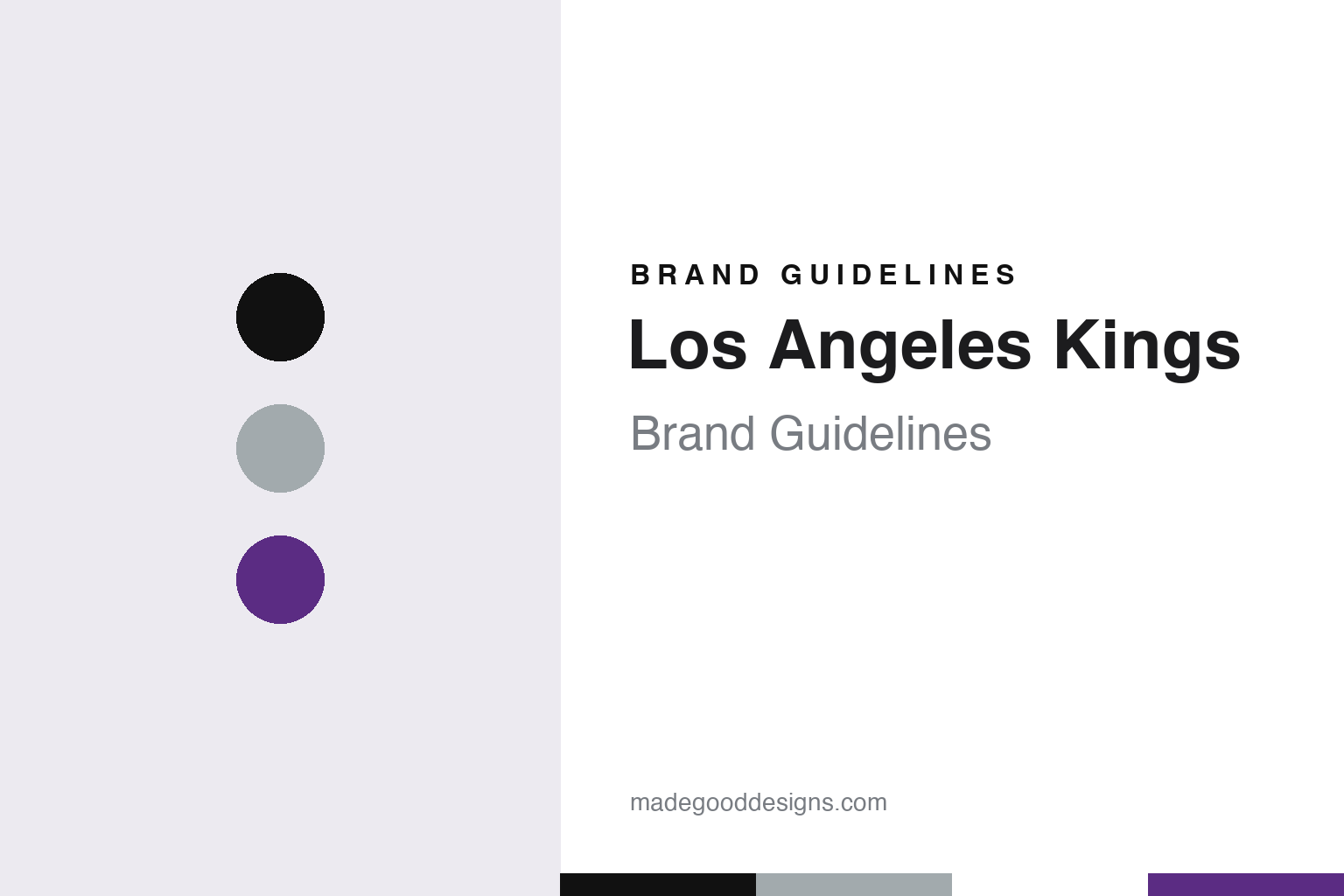
Los Angeles Kings Brand Guidelines
A crown, a banner and two palettes that keep trading places.
Aa
Two constants: a banner black, crest silver and Forum purple palette and an engraved royal capitals register. Abstract homage — not a Los Angeles Kings mark; no crown, banner logo or jersey is reproduced.
An air of royalty
Jack Kent Cooke, a fan contest and the colours of a king.
The Los Angeles Kings were one of six clubs added to the National Hockey League when it expanded for the 1967–68 season. English Wikipedia says the Canadian entrepreneur Jack Kent Cooke was awarded the Los Angeles franchise on 9 February 1966 and that the team was founded on 5 June 1967. Cooke already owned the city’s basketball team, the Lakers, and the two clubs would share an owner, an arena and a colour scheme for years.
The name came out of a contest. According to Wikipedia, Cooke held a fan contest to name the team and then chose “Kings” because he wanted the club to carry “an air of royalty.” For the same reason he picked purple and gold, colours traditionally linked with royalty. The purple was later given an official name, “Forum blue,” after the arena Cooke built for his teams, and the same pairing was adopted by the Lakers.
That arena was not ready in time. Wikipedia records that Cooke had wanted the Kings to play at the Los Angeles Memorial Sports Arena, but an agreement with a rival minor-league club stood in the way, so he decided to build his own. The Kings began their opening season at the Long Beach Arena on 14 October 1967, and the Forum in Inglewood opened on 30 December 1967. The team played there for 32 seasons before moving in 1999 to the downtown arena now called Crypto.com Arena, which it shares with the Lakers.
The original uniforms were plain. Wikipedia describes purple and gold sweaters with single-colour striping on the shoulders and tail, worn with purple pants trimmed in white and gold, and a crown logo on the chest; for a time in the 1970s gold pants were paired with the gold sweaters. White trim was later added to the numbers, and names went on the backs. From 1980 to 1988 the sweaters gained a contrasting yoke running from sleeve to sleeve, white was added to the socks and tail stripes, and the names and numbers moved to standard block lettering.
In the same years the club also used a banner logo, with the word “KINGS” spelled out across a pennant-like shape. Wikipedia notes that by the late 1980s the word had been enlarged to break out of the banner’s edges, a detail that would matter when the colours changed.
Colour
From Cooke to Buss, McNall and, since 1995, Anschutz and Roski.
Cooke owned the Kings until 1979. Wikipedia’s list of owners then runs to Jerry Buss, who bought the Kings together with the Lakers and the Forum and held the hockey club until the late 1980s. The next owner was Bruce McNall, a coin collector whom Wikipedia’s history section says bought the team from Buss in 1987. McNall’s ownership is the hinge of the visual story, because his arrival brought a new palette.
Wikipedia says the club changed its colours to black and silver just in time for the arrival of Wayne Gretzky in a trade with the Edmonton Oilers on 9 August 1988, and that the new scheme mirrored the colours of the Los Angeles Raiders football team. The banner logo was redrawn in silver and black, and this time the word “KINGS” was fully enclosed. Wikipedia notes that the enclosed shape drew comparisons with the Chevrolet bowtie. The sweaters kept much of the earlier template, but the contrasting yoke gave way to sleeve stripes that carried the sleeve numbers. With minor changes to lettering and pant striping, that set lasted until the 1997–98 season.
Ownership changed again in the mid-1990s. After McNall sold the club in 1994, Wikipedia lists Joseph M. Cohen and Jeffrey Sudikoff as owners for a short period, and on 6 October 1995 a bankruptcy court approved the purchase of the Kings by Philip Anschutz and Edward P. Roski. Anschutz and Roski have owned the Kings since 1995. Wikipedia identifies Anschutz as the owner of Anschutz Entertainment Group, which operates the downtown arena the two men built and to which the team moved in 1999.
The new owners oversaw a full rebrand. For the 1998–99 season, Wikipedia records, the Kings unveiled a purple, silver and white scheme using a lighter purple than the Forum era. The primary mark became a shield carrying three royal symbols: a lion wearing sunglasses, a crown and the sun, with the city name along the hem of the sweater. A purple alternate with an updated crown logo followed for 1999–2000, and in 2002 the crown was promoted to primary while the shield moved to alternate status.
The club’s costumed mascot reflects the royal theme. Since 2007 it has been Bailey, a lion who wears No. 72, a number Wikipedia links to the average temperature in Los Angeles. Writing for ESPN on 9 September 2011, Dan Arritt described the mascot as a six-foot lion that celebrates home wins by sliding across the ice on a four-wheel ATV, and reported that it was named in honour of Garnet “Ace” Bailey, the club’s former director of pro scouting. Wikipedia says an earlier mascot, Kingston the snow leopard, appeared in the early 1990s.
Typography
Design and documentation.
A hockey sweater carries its identity in a few fixed places. The crest sits large on the chest, where it has to read from the upper rows of an arena and on a television screen at the same time, so club marks are often built from bold, simple shapes with thick outlines that hold up when stitched in twill. Shoulder patches add a secondary mark, and the numbers on the back and sleeves follow their own lettering style, which often echoes the wordmark.
Colour changes are the clearest signal of a new era. A club that swaps one palette for another usually reworks the crest, the striping on the sleeves and hem, the helmets and the arena dressing together, because the colours have to match across every surface fans see. Third jerseys give teams room to test an alternate mark or a throwback palette without retiring the main identity, and several alternates have later been promoted to the primary set.
The ice itself is part of the system. Centre-ice logos are painted under the surface along with the lines, and the boards, banners and scoreboard graphics repeat the same marks, so a redesign reaches far beyond the sweater.
Aa
Engraved royal capitals — the register of a crown crest, a banner wordmark and an arena ribbon board. (Specimen set in Cinzel, an inscriptional serif STAND-IN; NOT the Los Angeles Kings logo or wordmark.)
Los Angeles Kings
Two palettes and one banner, traded back and forth for decades.
Since the late 1990s the Kings have moved between their two palettes rather than abandoning either. Wikipedia says that in 2008 the club introduced an alternate sweater inspired by the 1988–1998 look, with a new logo: a black and silver banner carrying the updated crown and an “LA” abbreviation on top. Three years later a new away sweater completed the return to black and silver. The 1988-era “Kings” script came back on the helmets until 2013, when it was replaced by the current script. Purple and gold reappeared on “Legends Night” home dates from 2010–11 to 2016–17, when the club wore its late-1970s sweaters.
Alternates have tested the edges of the identity. In 1995–96 the Kings wore a third jersey with a fading black splash, medieval-style serif lettering and a bearded figure in a golden crown; Wikipedia says it became known as the “Burger King” jersey and was dropped after one season. For the 50th anniversary in 2016–17 the club wore silver alternates with metallic gold accents and a purple neckline set with five gold diamonds as a nod to the original colours. Two “Reverse Retro” designs with Adidas swapped eras: the earlier one, in 2020–21, rendered the 1988–1998 template in purple and gold, and the second, in 2022–23, put the 1980–88 design on a white base with purple stripes and gold accents.
The 1990s look then became the main identity again. Wikipedia says the Kings brought back the 1992–1998 white uniform as a heritage design in 2019–20 and replaced their silver alternates with a modernised version of it before the 2021–22 season, worn with chrome helmets. On 20 June 2024 the club unveiled a new primary logo, which Wikipedia describes as a modernised version of the 1988 logo, together with home and away uniforms based on the 1988–1998 set, though the sleeve numbers no longer sit on the contrasting stripe. On 7 October 2025 a black alternate followed, with the classic crown crest in front and lettering based on the wordmark in the primary logo, a design Wikipedia says drew on the purple and gold crown uniforms worn from 1967 to 1980.
For a design guide, Los Angeles Kings shows how a club can keep two complete colour systems alive, using one for the primary set and the other for anniversaries and alternates, while a single banner shape carries the name across both. Compare the NHL, the Los Angeles Lakers, which shared Cooke’s purple and gold, and the Edmonton Oilers. For this guide we use banner black, crest silver and Forum purple with an engraved serif, an unofficial interpretation; no product or logo is reproduced.
Explore & save
Keep Los Angeles Kings’s identity on hand — save it to a board in the Made Good inspiration library.
Los Angeles Kings identity set
Pin the Los Angeles Kings banner black, crest silver and Forum purple palette and the engraved royal capitals register to your own board.