EXPO Brand Guidelines
An ink company, a whiteboard and an eraser.
Aa
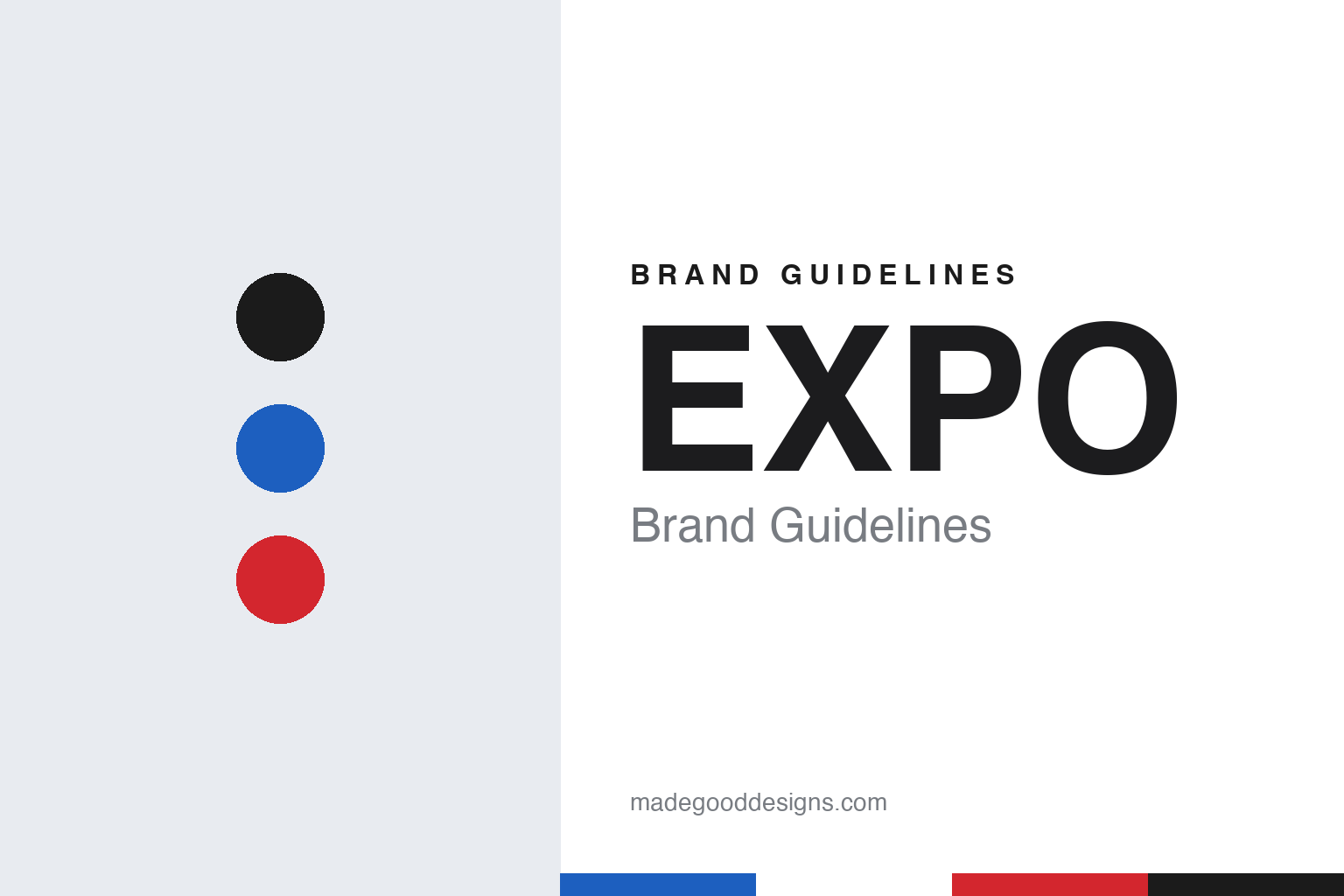
Two constants: a marker black, board blue and marker red on whiteboard white palette and a bold grotesque sans register. Abstract homage — not an EXPO product or mark; no marker, board or logo is reproduced.
An ink company in Chicago
The marker came from a firm more than a century old.
EXPO is a brand of one of the older American ink businesses. English Wikipedia says the company behind it was founded in 1857 by Frederick W. Redington and William H. Sanford, Jr. in Massachusetts as the Sanford Manufacturing Company, citing the Made in Chicago Museum. The firm did not stay in New England for long. Wikipedia says it moved to Chicago in 1866, and that five years later the Great Chicago Fire destroyed its Chicago location; new facilities were built and operations resumed.
The company moved again after the Second World War. Wikipedia says that in 1947 the Sanford Ink Company had to leave its site to make room for a new expressway, and settled in Bellwood, Illinois, a suburb west of Chicago, where it still maintains a facility.
The dry-erase marker arrived in the 1970s. English Wikipedia says that in August 1976 the company launched the Expo dry-erase marker, a pen designed to write on a whiteboard and be wiped away. A decade later the formula changed. Wikipedia says that in November 1986 Sanford launched a new marker named Expo II, which used an alcohol-based ink instead of methyl isobutyl ketone, a solvent. It adds that Sanford discontinued Expo II in the 2010s and moved the line to the alcohol-based ink.
Sanford was by then a sizeable writing-instruments group. Wikipedia says it became a public company in August 1985, and that its brands came to include Sharpie, the permanent marker, alongside EXPO.
Colour
From a single marker to a whiteboard system.
The brand grew from one pen into a family of products built around the board. The EXPO website, as archived by the Internet Archive in March 2016, sorted its range into markers, surfaces and accessories. Under markers it listed original, clickable, magnetic, washable, scented and two-in-one dry-erase pens, neon window markers, “bright sticks” and a Vis-à-Vis wet-erase line. Under accessories it listed block, precision and extra-large erasers, a microfibre cleaning cloth, liquid cleaners and cleaning wipes, and under surfaces it offered combination, magnetic and calendar boards and boards for children.
The same archived site shows how the brand spoke at the time. Its tagline was “embrace your space”, and instead of technical copy it offered household ideas: a family chore board, a morning “prep list” for each member of a family, and a board on the fridge for food requests. It also pointed teachers to a Scholastic Expo Writing Center, a classroom resource with the children’s publisher.
Newell Brands’ current brand page takes the idea further, describing EXPO less as a marker than as a place to think. It says EXPO “gives you the space to organize, solve problems and turn early thoughts into great ideas”, and that its erasable markers and collaboration tools are meant for school, home and work. The copy talks about the “messy middle” of an idea, where thinking is “circled and arrowed, crossed out and erased with a fingertip”, and says the brand believes in “starting before you know the answer”.
Typography
Design and documentation.
Marker brands work in a narrow visual space. The product is a tube, a cap and a tip, so much of the identity sits on surfaces only a few centimetres wide: the barrel print, the cap colour and the pack that holds a set together. Cap and barrel colours usually signal the ink inside, which means the product itself doubles as a colour chart, and the brand mark has to sit alongside that chart without fighting it.
Packs carry the rest of the work. A set is often shown fanned out in a window or on a printed card, letting the range of colours act as the main image, while a wordmark, a tip type and an ink type are named in a few short lines. Brands aimed at classrooms and children tend towards rounded type and bright primaries; office and studio lines tend towards plainer sans serifs and a single strong house colour.
Naming is a design tool too. Colour names, scent names, themed sets and tip descriptions all add a layer of language that the logo alone cannot carry, and a well-chosen name can make a single colour memorable long after the pack is gone.
Aa
A bold, plain grotesque, legible from the back of a room. (Specimen set in Archivo, a sans STAND-IN; NOT the EXPO logo.)
EXPO
From Sanford to Newell Brands.
Newell bought the business in the early 1990s. English Wikipedia says Sanford was acquired by the Newell Company on 14 February 1992, and the Newell Brands article describes the deal as the purchase of “a manufacturer and marketer of writing instruments, including the Sharpie and Expo brands”. Newell has owned EXPO since 1992.
The writing business grew around it. Wikipedia says Newell went on to acquire Eberhard Faber in 1994, Berol in 1995 and the German technical-drawing maker Rotring in 1998, the year Sanford was split into Sanford North America and Sanford International. In 2000, it says, Gillette sold its writing-instruments division to Newell Rubbermaid, and Sanford became Sanford, L.P.
The parent company has changed its own name twice since then. Wikipedia says Newell, which began in 1903 in Ogdensburg, New York, as a maker of curtain rods, became Newell Rubbermaid in 1999 after buying Rubbermaid, and that after a deal with Jarden announced in December 2015 the combined business took the name Newell Brands. Wikipedia says the group moved its headquarters to Hoboken, New Jersey, in 2016 and later returned to the Atlanta area, and Newell Brands’ own website gives its headquarters as Atlanta, Georgia.
Wikipedia says that in 2019 the business known as Sanford Business-to-Business was renamed Newell Custom Writing Instruments, a change reported by the promotional-products trade title ASI Central in October 2019, and it lists EXPO among that division’s brands with Sharpie, Paper Mate, Parker and Waterman.
Today EXPO sits in a wide writing and art portfolio. Newell Brands’ brand list includes EXPO alongside Sharpie, Paper Mate, Prismacolor, Elmer’s, X-ACTO and the scented Mr. Sketch markers.
For a design guide, EXPO shows how a brand can be built around impermanence: its products are made to be erased, and its voice is about drafts, not finished work. Compare its stablemates in our Sharpie brand guidelines and our Mr. Sketch brand guidelines, or a fellow classroom colour brand in our Crayola brand guidelines. For this guide we use marker black, board blue and marker red on whiteboard white with a bold grotesque sans, an unofficial interpretation; no product or logo is reproduced.
Explore & save
Keep EXPO’s identity on hand — save it to a board in the Made Good inspiration library.
EXPO identity set
Pin the EXPO marker black, board blue and marker red palette and the bold grotesque sans register to your own board.