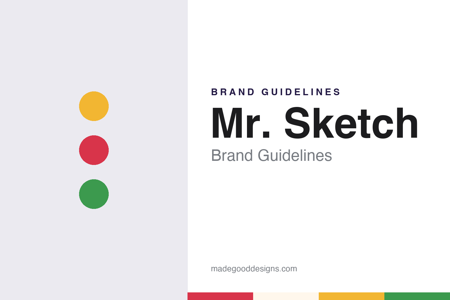
Mr. Sketch Brand Guidelines
A colour you can smell.
Aa
Two constants: a cherry red, lemon yellow and mint green palette and a bouncy rounded sans register. Abstract homage — not a Mr. Sketch product or mark; no marker, pack or logo is reproduced.
An ink company’s scented line
The name belongs to a nineteenth-century ink business.
Mr. Sketch is a brand of scented markers, and English Wikipedia says it is owned today by Newell Brands. The name comes from an older business. English Wikipedia’s article on the company now called Newell Custom Writing Instruments says it was founded in 1857 in Massachusetts by Frederick W. Redington and William H. Sanford Jr. as the Sanford Manufacturing Company, that it moved to Chicago in 1866, and that it rebuilt after the Great Chicago Fire destroyed its premises there. The same article says that in 1947 the firm moved to Bellwood, Illinois, to make room for a new expressway, and that it still keeps a facility there.
The marker name itself is on the public record. The United States Patent and Trademark Office’s status file for the word mark MR. SKETCH shows an application filed on 9 December 1963 and a registration on the Principal Register on 29 June 1965. In that filing the applicant gave 30 January 1963 as the date the mark was first used in commerce, and the record still lists the registration as live, with Sanford, L.P. as owner. English Wikipedia dates the introduction of Mr. Sketch markers by Sanford to 1965, citing that registration, so the two dates sit side by side: first use claimed in 1963, registration granted in 1965.
Writing in BrandlandUSA on 24 January 2012, its editor, Garland Pollard, described Mr. Sketch as sets of water-soluble markers that smell like their colours, and gave four pairings as examples: black and liquorice, red and cherry, yellow and lemon, brown and cinnamon.
Colour
Scents as a naming system.
A 2016 capture of the brand’s own website, mrsketch.com, preserved in the Internet Archive, describes the core scented markers as bright, water-based colours each with its own scent, naming Blueberry and Apple as examples, and says they came in two varieties for drawing thick or thin lines: a chisel tip and a slimmer Stix marker. English Wikipedia likewise lists chisel and fine-point versions.
The same archived site shows how the brand stretched that idea into themed sets. An Ice Cream pack, introduced with an “I scream, you scream” line, offered scents such as Chocolate, Strawberry and Lemon Ice. A Movie Night pack, in the site’s words, offered deliciously scented movie themes such as Buttery Popcorn and Nacho Cheese. An Intergalactic Neon set paired extra-bright colours with names such as Rotten Melon Alien Ooze and Pineapple Shooting Star. Every product description on the page carried the same small line: “Artificially scented. Do not eat.”
By then the name had also moved beyond markers. The 2016 site listed scented twistable crayons and twistable gel crayons, a range of scented washable markers, and a combo pack in a carrying case presented as “the Mr. Sketch factory” come to life. It also offered a printable colouring book under the name Scentivities, a coinage that folds scent into the name of its activity content. The page grouped the range under plain headings, Products, Scentivities and Buy Online, with the scent named in each product’s description.
Pollard wrote in 2012 that the markers had a cult appeal, with fans posting videos online, and he dismissed as untrue an urban legend that the government had made Sanford stop producing them. He also argued that Mr. Sketch should be connected to the Sanford name rather than to Sharpie, a brand he described as all about being indelible.
Typography
Design and documentation.
Marker brands work in a narrow visual space. The product is a tube, a cap and a tip, so much of the identity sits on surfaces only a few centimetres wide: the barrel print, the cap colour and the pack that holds a set together. Cap and barrel colours usually signal the ink inside, which means the product itself doubles as a colour chart, and the brand mark has to sit alongside that chart without fighting it.
Packs carry the rest of the work. A set is often shown fanned out in a window or on a printed card, letting the range of colours act as the main image, while a wordmark, a tip type and an ink type are named in a few short lines. Brands aimed at classrooms and children tend towards rounded type and bright primaries; office and studio lines tend towards plainer sans serifs and a single strong house colour.
Naming is a design tool too. Colour names, scent names, themed sets and tip descriptions all add a layer of language that the logo alone cannot carry, and a well-chosen name can make a single colour memorable long after the pack is gone.
Aa
A bouncy, rounded display sans. (Specimen set in Baloo 2, a rounded-sans STAND-IN; NOT the Mr. Sketch logo.)
Mr. Sketch
From a Chicago ink maker to Newell Brands.
Mr. Sketch has changed hands as part of Sanford rather than on its own. English Wikipedia says Sanford became a public company in August 1985 and that on 14 February 1992 it was acquired by the Newell Company, the business now called Newell Brands. Newell has owned Sanford, and with it Mr. Sketch, since 1992. The same article says the parent took the name Newell Rubbermaid after acquiring Rubbermaid and other companies in 1999, and that in 2000 Gillette sold its writing-instruments division to Newell Rubbermaid, whose stationery arm became Sanford, L.P. In the years between, the article says, the group added Eberhard Faber in 1994, Berol in 1995 and the German technical-drawing firm Rotring in 1998, the same year Sanford was split into North American and international divisions.
The marker sits in a family of Sanford names. English Wikipedia credits Sanford with launching the Expo dry-erase marker in August 1976, and lists Sharpie, Paper Mate, Expo, Parker and Waterman among the brands handled by its successor, which it says was renamed Newell Custom Writing Instruments in 2019 and runs a plant in Atlanta, Georgia. Pollard, writing in 2012 when the parent was still Newell Rubbermaid, said the Sanford name had been neglected within the group. The archived 2016 Mr. Sketch site carried a copyright line for Newell Brands Office Products.
For a design guide, Mr. Sketch shows how a brand can make a second sense part of its identity: each colour carries a scent name, and themed packs turn that naming into a story, from ice cream to movie night to outer space. Compare a fellow children’s colour classic in our Crayola brand guidelines and its Sanford stablemate in our Sharpie brand guidelines. For this guide we use cherry red, lemon yellow and mint green with a rounded sans, an unofficial interpretation; no product or logo is reproduced.
Explore & save
Keep Mr. Sketch’s identity on hand — save it to a board in the Made Good inspiration library.
Mr. Sketch identity set
Pin the Mr. Sketch cherry red, lemon yellow and mint green palette and the bouncy rounded sans register to your own board.