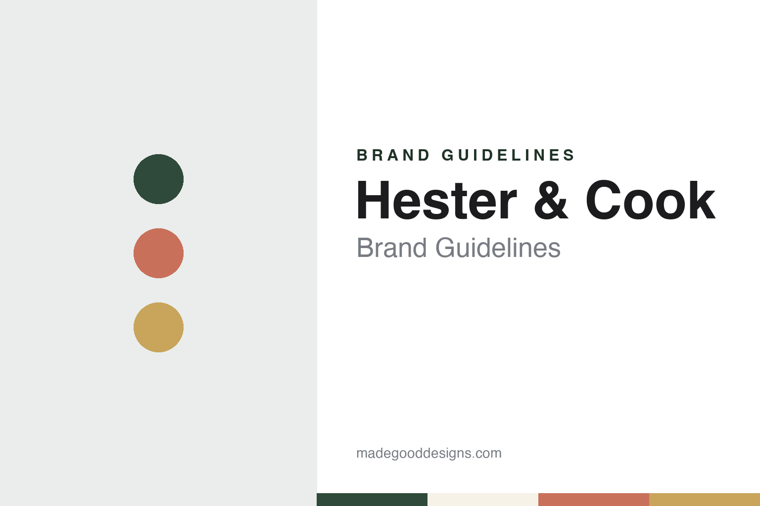
Hester & Cook Brand Guidelines
Art for the table, printed on paper.
Aa
Two constants: a garden green, terracotta and brass palette and a table serif register. Abstract homage — not a Hester & Cook product or mark; no placemat, illustration or logo is reproduced.
A doorknob, a bottle and a basement
The first product had nothing to do with paper.
Hester & Cook is a Nashville, Tennessee company that makes illustrated paper goods for the table. The company says it was started by a husband-and-wife team, Robbie Cook and Angie Hester Cook, in the basement of their home, and its name joins the two surnames. Angie Hester Cook is the company’s chief executive and Robbie Cook its president, according to the company’s website.
The first product came from a renovation. In a letter published on the company’s site, Angie Hester Cook says the couple were sharing wine with friends when Robbie suggested turning a vintage doorknob into a wine stopper. That idea became KnobStoppers. The company says the product was launched within months at the Atlanta wholesale market in the summer of 2005 and its site now marks the anniversary under the line “Cheers to 20 Years”.
The early catalogue stayed with salvaged objects. The company says it moved next into vintage flatware, and that Robbie Cook designed the first Spoondelier, a chandelier made from vintage silver-plate spoons.
The turn to paper came from a single illustration. Angie Hester Cook writes that, after the company’s first few years, she commissioned a drawing of a dinner plate with a fork, knife and spoon. That artwork became the company’s first paper placemat, called The Perfect Setting, and the placemat became the start of a line. The company now describes paper placemat pads and table runners as its signature products.
Colour
Painted pictures, printed on paper.
Hester & Cook’s products are built around artwork. The company says nearly all of them feature the hand-rendered work of digital and fine artists, and its About page introduces its in-house design team alongside the illustrators it works with. The roles it lists include a fine art director and illustrator, a senior product director, a product development design manager, a product designer and illustrator, and a junior designer, so the artwork is commissioned and also drawn in house. The page lists the favourite media of its in-house illustrators, among them graphite and gouache and pen and watercolour.
Outside artists widen the range. The company names collaborators including Vicki Sawyer, Elizabeth Foster, Janet Hill and Laura Stoddart, as well as Catherine Greenup, Celeste Clark, Roiann Ridley and Maggie Vandewalle, and studios credited as Burleigh and Bewilderbeest. Several of these artists have their own collections on the site, so the artist’s name works as a way of browsing alongside the season or the subject.
The paper range is wider than the placemat. The company’s website groups its Party & Paper Goods into paper placemats, paper table runners, paper napkins, menus and accents, place cards and serving papers, together with a Honeycomb Paper Collection of folding decorations. Stationery sits next to the tableware, with greeting cards, boxed notes sold under the Little Notes name and desk items, and the site also sells Fresh Cut Paper pop-up flower bouquets and a gift-wrap range of bags and tags.
Collections are arranged by theme and by season. The website lists floral, fruit-and-vegetable, coastal and patriotic designs, as well as Halloween, autumn and Thanksgiving, and Christmas ranges, with further sections for handmade felt pieces and personalised items. A home and decor department covers tabletop, kitchen, lighting and pet products. On one Christmas placemat pad, the product description says the placemats are designed and printed in the USA, and sells them as a padded set of tear-off sheets, the format at the centre of its range.
Typography
Design and documentation.
The brands in this group all make or sell the things people buy for a celebration: paper plates and napkins, balloons, banners, tableware, decorations and the catalogues and shops that bring them together. Party-supply brands sit at many different points in the trade, from small design studios that print their own papers to wholesale makers and national retail chains, and a single name can turn up on a supermarket shelf, in a mail-order catalogue and on a party table at home.
A party brand’s identity is usually carried less by one product than by colour, pattern and a recognisable name, because the company behind it may have changed hands, moved its production or widened its range far beyond where it started. That makes the questions behind each name worth asking plainly: who started it, who owns it now, and where its goods are actually designed and made.
Each guide separates what independent sources record from what the company says about itself — its founding story, its owners over time, where its goods are made and how its look has changed — and marks plainly what rests only on the company’s own word.
Aa
A refined old-style serif. (Specimen set in Cormorant Garamond, a serif STAND-IN; NOT the Hester & Cook logo.)
Hester & Cook
Shops, sweets and a foundation.
The wholesale business has grown a retail side in its home city. Hester & Cook says it runs shops in the Nashville neighbourhoods of White Bridge and Hillsboro Village and a flagship store in Franklin, Tennessee. The stores carry the full mix of tableware, stationery, decor and lighting, including a lighting range sold under the Zafferano Lighting name.
The company has also bought another Nashville brand. Hester & Cook says its most recent acquisition was the Bang Candy Company, a maker of chocolate confections, and that a Bang Candy shop operates in downtown Nashville.
Giving is part of how the company presents itself. Its About page says Robbie and Angie Hester Cook founded the Wonderful Life Foundation in 2009, a nonprofit that gives direct financial help to families facing hardship from life-threatening illnesses, and that Hester & Cook donates a portion of its sales to the foundation. The company’s stated mission is “We exist to serve by elevating experiences that create meaningful connection.”
The brand’s visual identity follows from its products. The placemat pad is the format, the commissioned illustration is the content, and the artist and the season are the organising ideas. The company’s own origin story makes the same point: its paper line began with one commissioned drawing of a place setting, The Perfect Setting.
For a design guide, Hester & Cook shows how a paper brand can be built on commissioned artwork, with named illustrators, seasonal collections and one dependable format carrying the range. Compare a London tableware label in our Talking Tables brand guidelines and a California card maker turned party brand in our Meri Meri brand guidelines. For this guide we use garden green, terracotta and brass with a serif, an unofficial interpretation; no product or logo is reproduced.
Explore & save
Keep Hester & Cook’s identity on hand — save it to a board in the Made Good inspiration library.
Hester & Cook identity set
Pin the Hester & Cook garden green, terracotta and brass palette and the table serif register to your own board.


