Hy-Vee Brand Guidelines
Two founders’ surnames folded into one store name.
Aa
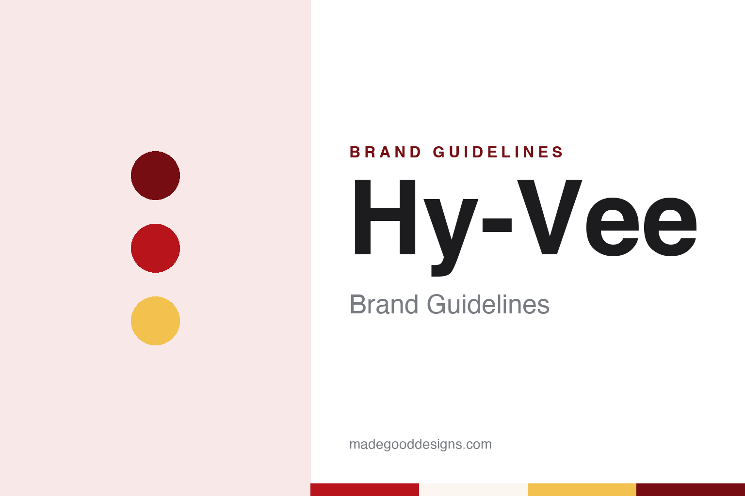
Two constants: a cart red, corn gold and prairie white palette and a friendly geometric sans register. Abstract homage — not a Hy-Vee product or mark; no sign, cart or logo is reproduced.
Beaconsfield
A supply store, a partnership and shared profits.
Hy-Vee’s name records a partnership. Supermarket News, in a history by Elliot Zwiebach published on 14 November 2005 for the company’s 75th anniversary, says Charles Hyde and David Vredenburg met in 1921, when Vredenburg and Earl Lewis were running a group of stores under the Vredenburg & Lewis banner and Vredenburg hired Hyde, who rose to store manager. English Wikipedia places that work within the General Supply Company, a business based in Lamoni, Iowa.
In mid-October 1929, the paper says, the two men pooled their money to buy the Beaconsfield Supply Store in the small town of Beaconsfield, Iowa, and they opened it in early 1930, selling groceries, dry goods and work clothes. The store ran on credit, and customers could bring in eggs, cream or chickens to trade for goods. A company history quoted by the paper casts Vredenburg as the outgoing merchant and Hyde as the quieter partner who kept the books. That original store closed on 1 July 1933, but by then the partners, trading as Hyde & Vredenburg, were running other stores. Wikipedia says the Beaconsfield building was placed on the National Register of Historic Places in 2007.
The way they ran those stores shaped the company. Supermarket News says that in 1933 they began sharing profits with store managers, paying them a share of each store’s net profit and letting them run it as if it were their own — an idea Vredenburg borrowed from J.C. Penney. A state tax on chain stores led the partners to split their business in April 1935, with Hyde’s Iowa stores becoming Hyde’s Service Stores and Vredenburg’s Missouri stores keeping the Supply Store name; when the tax was declared unconstitutional later that year they joined up again but kept both banners.
David’s son Dwight Vredenburg joined full time in 1935 and extended profit-sharing to regular staff at the store he managed. On 3 January 1938, the paper says, store employees signed articles of incorporation for Hyde & Vredenburg Inc., trading their shares in individual stores for stock in the new company, and Dwight was elected president. The office moved from Lamoni to Chariton, Iowa, in 1945, and the two founders retired on 1 January 1949.
Colour
A contest, a cart-shaped logo and a slogan set to music.
By the early 1950s the stores still carried a jumble of names — usually the town followed by Supply Store, with exceptions such as Hyde’s Service Store and Vredenburg’s Grocery, Wikipedia says. In 1952 the company held an employee contest for a single new name, and the winner was Hy-Vee, built from the first parts of the founders’ surnames, Hyde and Vredenburg. Wikipedia says three employees submitted the winning entry and that the first store to carry the name opened in Fairfield, Iowa, in 1953.
The company reached Des Moines in 1959. Supermarket News says that because it had once owned a mill in Lamoni, competitors called the company “the cornmeal merchants.” Ownership took its present shape the next year: the paper says changes in securities law led the privately held company to create the Hy-Vee Employees’ Trust in 1960 as its main stockholder, rather than list its shares publicly, and Wikipedia describes Hy-Vee as employee-owned.
The 1960s also gave the brand its early visual and verbal signatures. Wikipedia says Hy-Vee introduced its first private-label products and a new logo in 1956. In 1963, Supermarket News says, it introduced a new logo showing the company name in white on a red background shaped like a shopping cart, along with a slogan the paper gives as “A Helpful Smile in Every Aisle.” Wikipedia gives the slogan as “Where There’s a Helpful Smile in Every Aisle,” first used in the chain’s first television commercial that year, and says the company name officially became Hy-Vee Food Stores, Inc., in 1963.
Expansion followed across the Midwest. In 1969 the company opened a stand-alone pharmacy in Cedar Rapids under the Drug Town banner, later renamed Hy-Vee Drugstores, and bought the Swanson’s Stores group, which took it into Minnesota. Wikipedia lists later entries into South Dakota, Nebraska, Illinois and Kansas. In 1995 the headquarters moved from Chariton to West Des Moines and the name was shortened to Hy-Vee, Inc. In April 2024 the company announced it was buying the Strack & Van Til grocery chain in northwest Indiana, which Wikipedia says would operate as a wholly owned subsidiary.
Typography
Design and documentation.
A supermarket brand reaches people through more than a logo. The name on the fascia above the entrance, the lettering on the trolley bays and the colour of the car-park signs are often the first parts of the identity a visitor sees, and they are built to be read from a distance, in daylight and after dark.
Inside, the same identity has to work at a much smaller scale: on aisle markers, shelf-edge labels, department headers and the uniforms of the staff. Those pieces are usually planned as a system, with a fixed set of colours, a limited number of typefaces and rules for how the logo sits beside signs that change every week.
The identity then leaves the store on shopping bags and receipts, and on the packaging of the chain’s own-label ranges, where the retailer’s name or a separate sub-brand appears on everything from cans to cartons. Each guide below sets out who founded the chain, who owns it now and how its name and mark have changed over time, separating what independent sources record from what the company says about itself.
Aa
A friendly geometric sans — the register of a store sign and a weekly ad. (Specimen set in Poppins, a sans-serif STAND-IN; NOT the Hy-Vee logo.)
Hy-Vee
A portmanteau, a red cart and a jingle.
The Hy-Vee name is a portmanteau: the first syllable of Hyde and the first of Vredenburg, respelled so that the pair reads as one short word. It replaced a set of town-by-town store names with a single banner in 1952, and it was chosen by employees rather than handed down by the founders, who had retired three years earlier.
The 1963 logo described by Supermarket News put that word inside a familiar supermarket object: the name in white, set on a red field shaped like a shopping cart. Wikipedia records other logo changes in 1956 and 1994.
The slogan has run through several logo changes. Introduced in 1963 and carried into the chain’s first television commercial, it became a jingle in the 1990s, Wikipedia says, with music by Annie Meacham and James Poulsen. Its wording — a helpful smile in every aisle — is about the people in the store rather than the goods on the shelves. Private label has grown alongside the name: Wikipedia says the company introduced its HealthMarket private-label line in 2001, and HealthMarket also names the natural and organic sections inside larger stores.
For a design guide, Hy-Vee shows how a name built from two founders’ surnames, a red cart and a line about service can hold together a company that its employees both named and own. Compare it with Publix, another employee-owned grocer, and Wegmans, a regional chain named for its founders. For this guide we use cart red, corn gold and prairie white with a sans, an unofficial interpretation; no product or logo is reproduced.
Explore & save
Keep Hy-Vee’s identity on hand — save it to a board in the Made Good inspiration library.
Hy-Vee identity set
Pin the Hy-Vee cart red, corn gold and prairie white palette and the friendly geometric sans register to your own board.