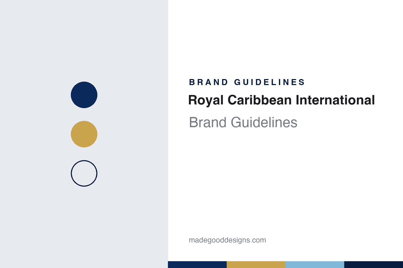
Royal Caribbean International Brand Guidelines
A Norwegian crown and anchor, redrawn for a Miami group.
Aa
Two constants: a navy, gold and light blue palette and a square-serif register. Abstract homage — not a Royal Caribbean asset; no crown and anchor, ship, logo or wordmark is reproduced.
Norwegian owners, Caribbean name
Shipowners from Oslo and Bergen take on Miami.
Royal Caribbean began as a venture of Norwegian shipping families. English Wikipedia says Royal Caribbean Cruise Line was founded in 1968 by Anders Wilhelmsen & Company, I.M. Skaugen & Company and Gotaas Larsen; the same article’s summary box gives the founding year as 1969, in Norway, so we give both dates. The line put its opening ship, the Song of Norway, into service about two years after it was set up, followed by the Nordic Prince and, in 1972, the Sun Viking.
The names of those ships — the Song of Norway, the Nordic Prince and the Sun Viking — referred to the owners’ home country, while the company’s own name referred to the Caribbean, where the ships sailed from Miami.
The emblem dates from the same years. The design site LogoLounge, reporting in August 2020, said the familiar crown and anchor mark had been in use since 1969.
English Wikipedia sets out the later steps. In 1986 the line leased a stretch of coast at Labadie in Haiti as a private destination for its guests, renamed Labadee. In 1988, after a corporate restructuring, it introduced the Sovereign of the Seas, and the “of the Seas” suffix became the naming formula for its ships, followed by the Monarch of the Seas and the Majesty of the Seas in the early 1990s. The company listed its shares on the New York Stock Exchange in 1993.
The early fleet was also rebuilt rather than simply replaced. English Wikipedia says the Song of Norway was lengthened in 1978 by inserting a new midsection, and the Nordic Prince was stretched in the same way in 1980; during both conversions the sterns were reshaped to create more open deck space.
Colour
From Cruise Line to International, and a group.
In 1997 the company merged with the Greek line Celebrity Cruises and changed the line’s name from Royal Caribbean Cruise Line to Royal Caribbean International, English Wikipedia says. A holding company, then called Royal Caribbean Cruises Ltd., was formed to own both brands, and the line has been its wholly owned subsidiary since then, based in Miami.
The holding company changed its own name in 2020. LogoLounge reported in August 2020 that Royal Caribbean Cruises Ltd. had become Royal Caribbean Group and, working with the New York design firm Chermayeff & Geismar & Haviv, had updated its whole identity. According to that report, the crown and anchor was tightened and its points sharpened, the mark was shown in gold on navy blue, and the lettering moved to a square-serifed typeface with, in the magazine’s words, “much more personality” than the old version. The report said the group name made clearer that the parent owned several sub-brands, and that Royal Caribbean International would be set apart with a modular logo containing a white-on-black version of the crown and anchor.
The group mark and the line’s mark share a symbol but, as LogoLounge described them, not a colour treatment. English Wikipedia’s infobox shows a further version of the line’s logo, captioned as in use since 2024.
The corporate history includes one contest that went the other way. In 2002 the British company P&O Princess, which had agreed to combine with Royal Caribbean, accepted a takeover by Carnival instead and paid Royal Caribbean a break fee, The Guardian reported in October that year; Royal Caribbean said it regretted the decision.
Typography
Design and documentation.
A cruise brand is read first at a distance. The funnel is the tallest flat surface on a ship and usually carries the line’s mark or colours, so it has to work as a silhouette against sky and sea, legible from a pier, a tender or a port-city skyline. The hull livery does similar work at water level: a band of colour, a painted name and a port of registry at the stern, and often a logo near the bow, all applied at a scale where fine detail disappears and simple shapes carry the message.
Ashore, the identity moves into terminal signage: check-in hall banners, gangway graphics, luggage tags and directional boards that guide people who may not share a language. Onboard, wayfinding has to cope with long corridors, many decks and port and starboard sides; deck numbers, stair-tower colours and pictograms tend to matter more than any wordmark. Printed collateral such as brochures, daily programmes, menus and keycards then carries the typeface and palette into the hand. For a designer, the useful lesson is how one mark has to stretch from a steel funnel down to a cabin door sign.
Aa
A square-serif — the register of the 2020 redraw. (Specimen set in Roboto Slab, a slab-serif STAND-IN; NOT the Royal Caribbean logo or wordmark.)
Royal Caribbean International
The name on the hull.
On the ships themselves, the brand has been expressed through paint. Cruise Industry News reported in June 2021 that the Quantum of the Seas, which entered service in 2014, had introduced a new colour template for the line with a light blue hull, later added to selected older ships, including the refurbished Freedom of the Seas. In 2020, the same report said, Royal Caribbean updated its livery again, painting a much larger version of the ship’s name along each side of the new Odyssey of the Seas. The magazine described it as the line’s second new look in a decade.
The line also took its name ashore. English Wikipedia says that in 2000 Royal Caribbean ran land-and-sea “cruise tours” in Alaska using glass-domed railway carriages, and over the following two years added cruise tours in Europe, announced jointly with its sister brand Celebrity Cruises. The Oasis of the Seas and Allure of the Seas entered service in 2009 and 2010; in December 2012 the line ordered a further ship of that class from STX France, and in February 2013 it announced the Quantum of the Seas and Anthem of the Seas, being built at Meyer Werft in Germany, according to the same article.
Today Royal Caribbean International remains a subsidiary of Royal Caribbean Group, headquartered in Miami, which also owns other cruise brands, according to English Wikipedia and the 2020 LogoLounge report. Its private destination at Labadee in Haiti, leased since 1986, and its “of the Seas” ship names have stayed constant through the changes of corporate name and mark.
For a design guide, Royal Caribbean International shows how an emblem chosen at the founding can be kept for more than half a century by redrawing it rather than replacing it. Compare Carnival Cruise Line, which built its logo from a funnel, and Norwegian Cruise Line, another Miami line with Norwegian roots. For this guide we use crown navy, anchor gold and a light hull blue with a slab serif, an unofficial interpretation; no product or logo is reproduced.
Explore & save
Keep Royal Caribbean International’s identity on hand — save it to a board in the Made Good inspiration library.
Royal Caribbean identity set
Pin the Royal Caribbean navy, gold and light blue palette and the square-serif register to your own board.