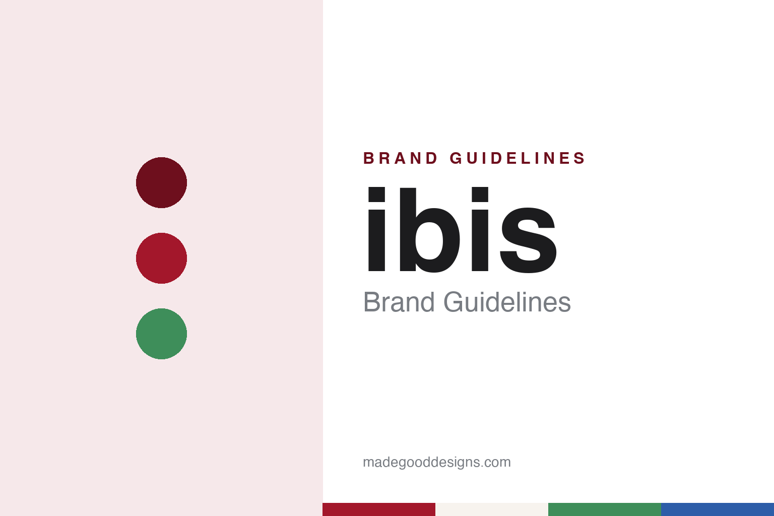
ibis Brand Guidelines
The Bordeaux economy hotel with a pillow for a logo.
Aa
Two constants: a pillow red, Styles green and budget blue palette and a rounded lowercase sans register. Abstract homage — not an ibis asset or mark; no pillow logo, sign or hotel is reproduced.
Bordeaux, 1974
A lighter Novotel with a bird’s name.
The ibis brand began with a single hotel in Bordeaux in 1974. Les Echos, in a history of the Accor group published on 29 June 2010, records that this was the year the company then known as SIEH launched ibis as an economy hotel chain, opening its hotel in Bordeaux at the same time as it bought the Courtepaille restaurant business. The company had been founded in 1967 by Paul Dubrule and Gérard Pélisson around a Novotel at Lille, and English Wikipedia describes ibis as conceived inside that group, then called Novotel-SIEH, as a more affordable, lighter version of Novotel.
The brand predates the name of its owner. Les Echos says SIEH took over Jacques Borel International in 1982 and that the combined group changed its name to Accor in 1983. When The New York Times profiled the group on 24 July 1990, it listed the hotel chains it ran as Sofitel, Novotel, Mercure, Ibis/Urbis and Formule 1, with the economy brand written as a paired name.
English Wikipedia traces the early spread of the brand beyond France. It says an ibis opened in the United States in 1983 and that the chain operated in Texas, Florida and Georgia before leaving the American market by the end of the 1980s, citing The New York Times of July 1990 and the French trade paper L’Hôtellerie. In the following decades, Wikipedia says, the brand opened hotels in South Korea, China and Thailand between 2003 and 2005, in Moscow in 2009 and in Japan in 2011.
Throughout, the brand has used its name in lower case. English Wikipedia notes that it is stylised as ibis, and the group’s own listings write it that way, alongside the two sister names that joined it later, ibis Styles and ibis budget. The word itself is also the name of a wading bird.
Colour
The 2011–12 megabrand and a revamped identity.
The defining change in the brand’s recent history came when Accor folded two of its other economy names into it. English Wikipedia says that in September 2011 Accor rebranded All Seasons as ibis Styles and Etap Hotel as ibis budget, turning ibis into what the group called its economy “megabrand”. Business Traveller, reporting on 22 June 2012, described the programme under chief executive Denis Hennequin as transforming the design and comfort of every hotel under the new umbrella.
The article set out how the identity itself was handled. According to Business Traveller, the opening step was to revamp the visual identity of all three brands. Accor’s global chief marketing officer, Grégoire Champetier, told the magazine that the old look “had aged, the signage, the typography”. The logo, the report said, remained the ibis pillow, with ibis coloured red, ibis Styles green and ibis budget blue, so a single symbol was kept and the colour told the guest which tier of the family they were in.
The same report described changes inside the hotels. Accor said it wanted to bring “modernity, simplicity and well-being” to the whole family. Public areas at ibis hotels were to gain large interactive screens behind reception, more wood fittings for a natural feel, mixed seating so that guests could use the space like a lounge, and a bar placed at the centre. Business Traveller named a pilot property at Port d’Italie in Paris and said the ibis London ExCeL would be among the early hotels to get the new look. For ibis Styles, the magazine reported, Accor wanted to give local designers and franchisees more freedom, so that each hotel fitted the ibis blueprint while still being individual.
Later experiments kept design in view. English Wikipedia, citing Engadget of 28 September 2012, says ibis tested Sleep Art, a robot that made a painting from the movements, sounds and heat changes of a sleeping guest, and turned it into a mobile app some six months later.
Typography
Design and documentation.
Hotel identities tend to live in many places at once. A crest or wordmark appears on the façade, the lobby signage, the key card and the doorman’s cap, and each of those surfaces asks something different of the mark: legibility from across a street, quiet presence on a pillow card, crisp reproduction when it is embroidered in thread or pressed into a wax seal. A hotel group can keep a simplified version of the mark alongside the full lockup, so that a monogram or single initial can stand in where the complete name will not fit.
Uniforms carry a large share of the visual language. Colour, cut, buttons and badges signal role as much as brand, and they often repeat the palette of the interiors. Liveried cars, shuttle buses and boats extend the same tones onto the street, where a consistent paint colour can become part of how guests recognise the property from a distance.
Room collateral is where the system is read up close: stationery, menus, door hangers, toiletry labels and in-room guides. Typography and spacing matter more here than anywhere else, because guests handle these pieces and keep some of them as souvenirs.
Aa
A rounded lowercase sans — the register of a friendly roadside sign. (Specimen set in Nunito, a sans-serif STAND-IN; NOT the ibis logo.)
ibis
One symbol, three colours and a lower-case name.
The ibis identity is a lesson in keeping one sign and changing what surrounds it. The brand name has been written in lower case, a short bird’s name that reads quickly from a road or a station forecourt. When Accor gathered its economy hotels into one family in 2011 and 2012, it did not invent a new symbol. Business Traveller reported that the logo remained the ibis pillow, and that each brand in the family was given its own colour: red for ibis, green for ibis Styles and blue for ibis budget.
Under that arrangement the colour on the sign marks the tier, while the pillow and the shared name mark the family. The move retired two names, All Seasons and Etap Hotel, and placed the hotels that had carried them under the ibis name. Business Traveller quoted Accor’s marketing chief saying the previous signage and typography had aged, and reported that the programme covered the visual identity, bedding and the refurbishment of communal areas, which the magazine singled out as a particular challenge. The magazine also reported that Accor said franchisees had responded positively to the changes and would help to carry them out.
The interiors carry the identity further than the sign. The 2012 programme described wood fittings, lounge-like seating and a central bar in ibis public areas, and a looser brief for ibis Styles that let local designers vary each hotel within a shared blueprint. The same family structure sits alongside the group’s midscale Novotel brand, from which ibis was developed.
For a design guide, ibis shows how a single, plain symbol — a pillow — can carry an economy brand through decades, and how colour alone can split one name into a family of tiers without losing the recognition the original sign had earned. Compare it with Accor, the group behind it, and Marriott. For this guide we use pillow red, Styles green and budget blue with a sans, an unofficial interpretation; no product or logo is reproduced.
Explore & save
Keep ibis’s identity on hand — save it to a board in the Made Good inspiration library.
ibis identity set
Pin the ibis pillow red, Styles green and budget blue palette and the rounded lowercase sans register to your own board.