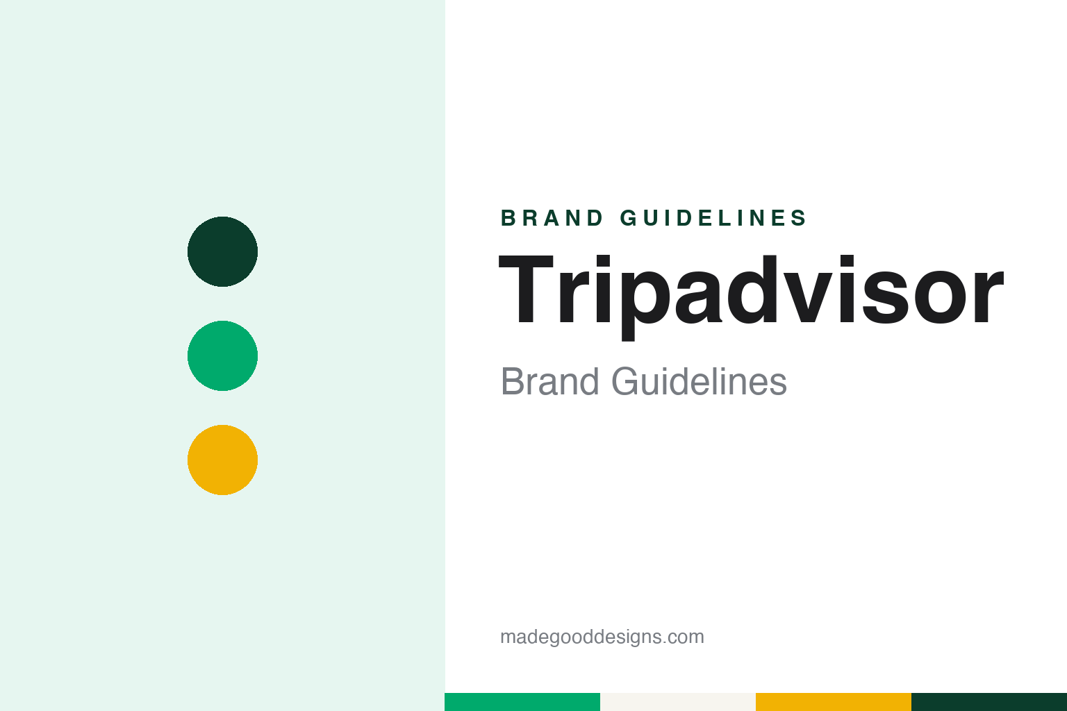
Tripadvisor Brand Guidelines
The travel-advice site with an owl, a custom sans and a lowercase a.
Aa
Two constants: a trip green, mustard and pine palette and a round geometric sans register. Abstract homage — not a Tripadvisor asset; no owl, icon or logo is reproduced.
An owl near Boston
Kaufer and partners, a search idea and a site launched in 2000.
Tripadvisor was founded in February 2000. English Wikipedia names the founders as Stephen Kaufer, Langley Steinert, Nick Shanny and Thomas Palka — and says Kaufer came up with the idea after being frustrated while planning a family holiday. The company is headquartered in Needham, Massachusetts.
The earliest description of the business comes from the company itself. In a press release dated 1 September 2000, announcing its first round of venture financing, TripAdvisor described its product as web technology that “searches, filters, sorts and ranks” travel information so that consumers could find material on destinations quickly. The release said the company was licensing the technology to other web sites and travel providers, that it would launch at tripadvisor.com “this fall”, and that it was “located west of Boston”. Wikipedia names Flagship Ventures and the Bollard Group among the early backers of that round. The site that followed became known less for search technology than for the reviews and opinions posted by travellers themselves.
The name was written for its first two decades with a capital A in the middle, TripAdvisor, and the original mark paired the wordmark with a cartoon owl. Wikipedia dates that first logo from 14 February 2000 to 29 January 2020. The owl acquired a name of its own, Ollie, which Design Week used when it reported on the 2020 redesign. In the first logo the owl had a yellow head and two eyes in different colours, a detail Design Week singled out when it described what the redesign removed.
Colour
IAC, Expedia, a spin-off and a quarter century.
Ownership changed quickly. Wikipedia and TechCrunch both record that IAC/InterActiveCorp bought TripAdvisor in 2004, and that in 2005 IAC spun off its travel businesses, TripAdvisor among them, as Expedia. TripAdvisor spent the following years inside that group, buying travel sites of its own; Wikipedia lists the 2007 purchase of Smarter Travel Media, which brought SeatGuru and Cruise Critic, among many acquisitions.
In December 2011 Expedia completed the spin-off of TripAdvisor as a separate public company. TechCrunch reported on 21 December 2011 that the shares had debuted on the NASDAQ under the symbol TRIP, with IAC chairman Barry Diller as chairman and Stephen Kaufer, the co-founder, as chief executive. Kaufer told the publication that the company would keep building its social and mobile products as a public company. TechCrunch described cost-per-click advertising as its main source of revenue at the time, and noted that the site operated in China under a separate name, Daodao.
The way the brand talked about its reviews also drew scrutiny. The Guardian reported on 2 September 2011 that the UK Advertising Standards Authority had opened a formal investigation into the site’s claims of “trusted” and “honest” reviews, following a complaint from the reputation-management company KwikChex; Wikipedia records that the slogan “reviews you can trust” was later removed from the UK site.
Leadership and structure have since changed again. Wikipedia says Matt Goldberg has been chief executive and president since July 2022, and that in April 2025 Tripadvisor completed a merger with its controlling shareholder, Liberty TripAdvisor Holdings. Skift, marking the company’s 25th anniversary in June 2025, reported Goldberg’s view that Viator, its marketplace for tours and activities, had become the strategic centre of the business, and that the company was adding AI tools across its brands. The group’s other names, according to Wikipedia, include TheFork, Cruise Critic and Holiday Lettings.
Typography
Design and documentation.
Travel sites live on small screens as much as large ones, so their identities are tested at very different sizes. A wordmark that reads well across the top of a desktop search page has to survive as a home-screen app icon, a favicon in a browser tab and a tiny badge on a booking confirmation email. Many travel brands answer that problem with a compact symbol or a single letter that can stand alone when the full name will not fit, and keep the wordmark for larger placements.
Colour does a lot of work in this category. A consistent brand colour helps a user spot the right app among dozens on a phone and recognise the brand inside a crowded comparison results page. Mascots and characters play a similar role: an animal, a figure or a costumed spokesperson can carry a brand across television, social video and outdoor advertising without relying on the name alone.
Television spokespeople and recurring advertising characters have long been part of the travel-site playbook, giving a web service a face and a voice. When a company refreshes its identity, these elements are often redrawn, retired or brought back, so it is worth checking the date of any logo, icon or campaign before treating it as current.
Aa
A round geometric sans — the register of a review card and an app tab bar. (Specimen set in Poppins, a sans-serif STAND-IN; NOT Trip Sans and NOT the Tripadvisor logo.)
Tripadvisor
A simpler owl, a custom typeface and one lowercase letter.
A well-documented moment in the identity is the refresh of early 2020. Design Week reported on 31 January 2020 that the New York studio of Mother Design had updated the logo as the first step of an identity refresh to be rolled out over the year. The headline change was to the owl: Mother Design called it an “exercise both in reduction of complexity and amplification of character”. The two differently coloured eyes and the yellow head went, and Ollie was rendered in black only. The studio said it had “retained its inherent personality but refined its geometry for better reproduction at all sizes”.
The same refresh changed the name on the page. TripAdvisor became Tripadvisor, with a lowercase a. Design Week quoted the company as saying the “subtle change” reflected the way people recognise the name and say it as a single word after twenty years. The magazine also described a set of functional icons drawn by Mother Design — a parasol for rest, a backpack for hiking, a double bed for a stay — alongside new symbols for hotels, eating and search.
Colour and type moved the other way from the logo. While the owl became monochrome, Design Week said the identity kept a varied palette, naming shades including TripGreen, orchid, salmon, rose, sand, moss, pine and mustard. A custom typeface, Trip Sans, was supplied by Colophon Foundry; Mother Design said it was chosen to carry “the real, global, human connection the brand believes in”. Wikipedia’s logo captions date that 2020 owl to 30 January 2020 and show it in use until the middle of 2025.
For a design guide, Tripadvisor shows how a mascot can be kept and still simplified — the owl survived two decades, a change of owners and a public listing, and then lost its colour so that it could shrink to an app icon without losing its face. Compare it with Expedia, the group it was spun off from in 2011, and Airbnb, another travel brand built around a single drawn symbol. For this guide we use trip green, mustard and pine with a sans, an unofficial interpretation; no product or logo is reproduced.
Explore & save
Keep Tripadvisor’s identity on hand — save it to a board in the Made Good inspiration library.
Tripadvisor identity set
Pin the Tripadvisor trip green, mustard and pine palette and the round geometric sans register to your own board.