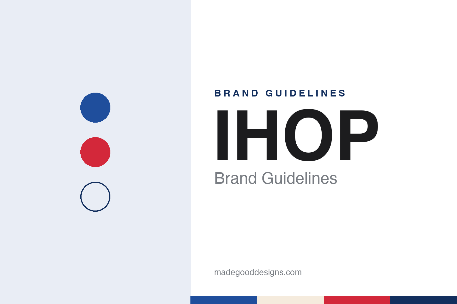
IHOP Brand Guidelines
A blue-roofed pancake house that shortened its name and learned to smile.
Aa
Two constants: a roof blue, smile red and syrup cream palette and a rounded friendly sans register. Abstract homage — not an IHOP product or mark; no roof, smile or logo is reproduced.
The International House
Two brothers, an artist and a blue roof.
IHOP opened as the International House of Pancakes on 7 July 1958, English Wikipedia says, at a site on Riverside Drive that it places in Burbank, California. Nation’s Restaurant News, in an obituary carried by Entrepreneur on 28 June 2004, placed the original restaurant in the Toluca Lake section of Los Angeles. Wikipedia names the founders as the brothers Jerry and Al Lapin together with Albert Kallis, a commercial artist, with help from Sherwood Rosenberg and William Kaye. It says Kallis and his wife Trudy were early investors, and that Trudy is said to have come up with the name.
The 2004 report described Al Lapin Jr. as an entrepreneur who had run a series of coffee carts in Los Angeles before he noticed fast-food chains flourishing in Southern California and decided to open a restaurant of his own, convinced that pancakes and waffles could be marketed to a mass audience. He started the original IHOP with his younger brother, Jerry. The restaurant, the report said, stood out for its chalet theme, its boysenberry-flavoured syrups, its blue roof and unusual pancake dishes such as Tahitian Orange Pineapple. As president and chairman, Lapin expanded the chain through franchising in the 1960s and built a conglomerate, International Industries, that came to include Orange Julius and other food chains.
The building was the brand. Wikipedia says the prototype IHOP was a steep-roofed A-frame with a distinctive blue roof, and that the last restaurant built to that design was completed in 1979. Many IHOP locations no longer use the A-frame, though several still stand around the United States. Wikipedia also records that the second and third restaurants, in Panorama City and in Baldwin Hills, where the chain took over a former Brown Derby restaurant, are still open for business.
The 2004 report also credited the chain’s growth to franchising: Lapin, it said, expanded the business in the 1960s by selling franchises, while the parent company, International Industries, went on to collect other restaurant and food brands under one roof. The pancake house and its pitched blue roof travelled with those franchises.
Colour
From International Industries to Dine Brands.
The short name arrived in 1973, when the chain shortened its name to IHOP for marketing purposes, Wikipedia says; since then the full name and the acronym have been officially interchangeable. Television commercials of the period used a cartoon kangaroo. In 1976 International Industries was renamed IHOP, Inc., and IHOP Corporation was formed as a holding company for IHOP and other chains, including Love’s Wood Pit Barbecue and Original House of Pies, the latter sold soon afterwards.
Ownership then changed several times. Wikipedia says IHOP Corp was bought in 1979 by Wienerwald Holding, owner of the Wienerwald and Lum’s chains. After Wienerwald filed for Chapter 11 protection in 1982, it sold IHOP Corp in 1983 to a buyer new to the restaurant business. Through the 1980s the breakfast menu widened to include the lunch and dinner items found at other family-restaurant chains of the time.
In 2007 the pancake chain became the buyer. IHOP Corporation announced in July 2007 that it would acquire the bar-and-grill chain Applebee’s, and the purchase closed on 29 November 2007; in June 2008 the parent company renamed itself DineEquity, Wikipedia says. A second rename followed a decade later. Food Business News reported on 21 February 2018 that DineEquity, the parent of Applebee’s and IHOP, had changed its name to Dine Brands Global, Inc., with chief executive Stephen P. Joyce saying the new name reflected a shift in strategy and a culture with greater autonomy and accountability at the level of each brand. Wikipedia describes IHOP as owned by Dine Brands, with its restaurants overwhelmingly run by independent franchisees.
The format has kept stretching. Wikipedia says IHOP Express, a quick-service version for airports, school campuses, military food courts and travel centres, opened in 2011, with a standalone public location in downtown San Diego the same year. A franchisee opened a combined Applebee’s and IHOP in downtown Detroit in 2018, and the chain has spread through franchise partners into the Middle East, Central and South America and Asia, with the franchising group M.H. Alshaya opening IHOP restaurants in the Middle East from 2012.
Typography
Design and documentation.
A quick-service brand is met first from the road and only then at the counter. Its identity has to work on a pole sign seen from a moving car, on a roofline, on a lit window after dark, on a drive-through menu board read in a few seconds, and on a cup, bag or box that leaves with the customer. Signage, neon and backlit panels, building shapes, uniforms, mascots and printed packaging all carry the same name, often in very different sizes and materials.
Because many of these restaurants are run by franchisees rather than by the company that owns the name, a sign, a menu board or a paper bag may be ordered, installed and replaced locally, while the mark itself is set by the franchisor. Names, owners and headquarters can also change over the decades as chains are sold, merged or taken private, even when the sign out front looks much the same.
Each guide separates what independent, dated sources record from what the company says about itself — who started it and where, who owns it now, and how its signs, logos and packaging have changed — and marks plainly what rests only on the company’s own word.
Aa
A rounded friendly sans — the register of a menu cover and a roadside sign. (Specimen set in Fredoka, a sans-serif STAND-IN; NOT the IHOP logo.)
IHOP
A frown turned into a smile.
The current logo dates from June 2015. Restaurant Business reported on 2 June 2015 that IHOP was replacing a logo it had used for more than 20 years, in a move meant to show off its family friendliness. The updated design makes the O and the P of the name part of a prominent smile. Kirk Thompson, the chain’s vice president of marketing, said the red banner in the previous version had “appeared as a person’s frown”, and the chain presented the new mark as bringing its “commitment to smiles” to life. The logo rolled out on the website, menus and selected restaurant signage, and the chain marked it with a “Summer of Smiles”, a series of events held around the country to celebrate people and organisations making a difference in their communities. Wikipedia describes the change as removing the old decorative elements and adding a curved line under the O and P.
The brand has also been willing to play with its own name. In June 2018 IHOP announced that it would “flip” its name to IHOb. ABC7 in Los Angeles reported on 11 June 2018 that the chain had revealed the b stood for burgers, and that its Twitter handle had changed to @IHOb. Wikipedia describes the episode as a marketing campaign for the chain’s hamburgers, meant to address the perception that IHOP was still mainly a breakfast restaurant, and says IHOP parodied it the following year to promote a burger made with a pancake.
The identity combines a blue roof that began as architecture in 1958, an acronym that began as a marketing abbreviation in 1973, and a red smile that replaced a perceived frown in 2015. The A-frame is no longer built, but Wikipedia says several of the old buildings still operate, while the acronym and the 2015 smile make up the current logo.
For a design guide, IHOP shows how an acronym can stand in for a long descriptive name without losing it, and how a logo can be redrawn so that the letters read as a face. Compare it with Waffle House, another American breakfast chain, and McDonald’s, another American restaurant chain whose buildings are part of its identity. For this guide we use roof blue, smile red and syrup cream with a rounded sans, an unofficial interpretation; no product or logo is reproduced.
Explore & save
Keep IHOP’s identity on hand — save it to a board in the Made Good inspiration library.
IHOP identity set
Pin the IHOP roof blue, smile red and syrup cream palette and the rounded friendly sans register to your own board.