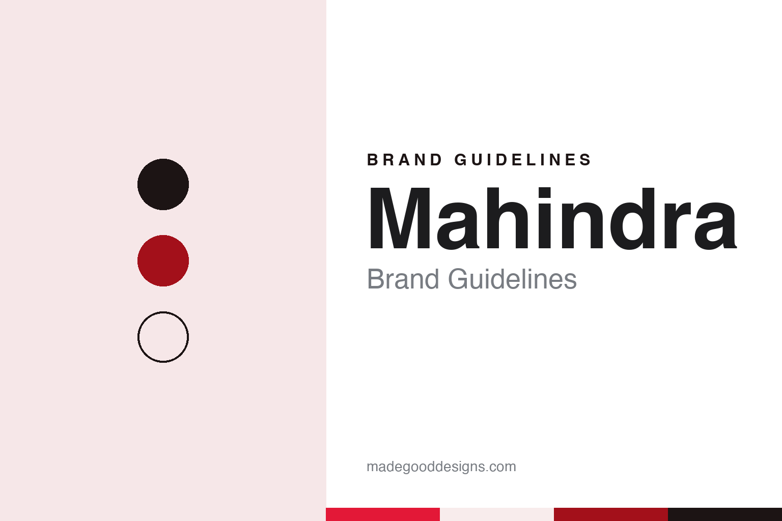
Mahindra Brand Guidelines
Two brothers, one rename and a mark split in two.
Aa
Two constants: a red, deep red and steel black palette and a Condensed sans register. Abstract homage — not a Mahindra asset or mark; no logo, emblem or wordmark is reproduced.
Mahindra & Mohammed
Steel traders of 1945 and a new name in 1948.
The Mahindra name began as one half of a partnership. English Wikipedia says the company was incorporated in 1945 as Mahindra & Mohammed by the brothers J. C. Mahindra and K. C. Mahindra together with Malik Ghulam Muhammad, and that it was set up to trade steel. The same article places the start in Ludhiana, in Punjab.
The partnership did not survive the upheaval of 1947. English Wikipedia records that Malik Ghulam Muhammad left the company after the Partition of India and moved to Pakistan, where he later held high office. In 1948, the article says, K. C. Mahindra changed the company’s name to Mahindra & Mahindra. The new name kept the rhythm of the old one, two names joined by an ampersand, but now both halves were the family’s own.
Vehicles came early. English Wikipedia says the brothers won a contract to make Willys Jeeps in India and began producing them in 1947, building on their steel trade with British suppliers. The company was listed on the Bombay Stock Exchange in 1956, and by 1969 it was exporting utility vehicles and spare parts. Over the following decades the business spread far beyond steel and Jeeps: the article dates a tractor division to 1982 and a technology division, now Tech Mahindra, to 1986.
That spread shaped the brand problem the group later set out to solve. English Wikipedia says that by 1994 the group had grown so diverse that it reorganised into six strategic business units, covering automotive, farm equipment, infrastructure, trade and financial services, information technology and automotive components. Under its new managing director, Anand Mahindra, the article says, a new logo followed in 2000, and the Scorpio utility vehicle was launched in 2002.
Colour
Rise in 2011, a red wordmark in 2013.
The group’s modern brand story starts with a word rather than a picture. Knowledge@Wharton reported on 24 March 2011 that Mahindra had launched a new brand positioning, a new “core purpose” and a new tagline for the whole group in January of that year: Rise. The publication described the idea as resting on three pillars, accepting no limits, alternative thinking and driving positive change.
The same report named the agency behind it. Knowledge@Wharton said the New York advertising agency StrawberryFrog, founded by Scott Goodson, had been appointed about two years earlier by the Mahindra corporate brand council to create the new positioning. Anand Mahindra told the publication that the aim was to unify the different businesses that shared the Mahindra name, rather than simply to polish an image.
The visual identity caught up two years later. On 18 January 2013, Business Today carried a Press Trust of India report that the Mahindra group had unveiled a new logo. As part of the change, the report said, a new hand-drawn, contemporary wordmark in red would replace the existing one, which was in black. Anand Mahindra said in a statement that the group had grown across a wide range of industries over the previous decade and needed to refresh its visual identity, and that the new identity reflected both continuity and change.
The same report quoted S. P. Shukla, then the group’s president for group strategy and its chief brand officer, who said the new wordmark and the other elements of the refreshed identity had been adopted after extensive research and feedback. The report linked the logo directly to the Rise positioning launched in January 2011, which it described as giving a single voice to the companies under the group’s umbrella.
Typography
Indian industrial groups and their marks.
Company identities in Asia often grow out of a single founder group or family holding, and the corporate mark has to cover businesses as varied as refining, retail, telecoms and software. The name tends to stay fixed while the symbol beside it is redrawn as the group changes shape, so one logo can sit above many trading names at once.
For app-first businesses the logo and the app icon are frequently the same object. A mark that must read at the size of a fingertip on a crowded phone screen is drawn as a simple, closed shape in one strong colour, and the full wordmark is reserved for larger formats such as signage, delivery bags and helmets.
Campaign naming built on calendar dates, in which a day and month repeated as numbers become the name of a sales event, is a recurring pattern in regional e-commerce. The date itself works as a brand asset that can be printed, counted down and repeated each year.
Mergers and new holding structures are a common trigger for redesign. A combined group may add a new parent name above existing consumer brands, or redraw a symbol to signal a shift from a single service to a wider platform, while keeping familiar colours so that customers still recognise the product.
Aa
A condensed sans — after a bold red wordmark and a mark built from two peaks. (Specimen set in Barlow Condensed, a sans STAND-IN; NOT the Mahindra logo or its typeface.)
Mahindra
Twin Peaks for the SUVs, Road Ahead for the rest.
In 2021 the Mahindra identity split in two. Autocar Professional reported on 9 August 2021 that Mahindra & Mahindra had unveiled a new visual identity, including a new logo, to set its sport utility vehicles apart. The upcoming XUV700 was to wear the new Twin Peaks logo, with other SUVs following in phases. The company said the identity was in tune with its focus on making sophisticated and authentic SUVs.
The publication said the whole identity was designed by the Mahindra Design Team under its recently appointed chief design officer, Pratap Bose. Bose described the aim as expressing a liberating feeling of going where you want, when you want, and said that the two Ms within the logo symbolised an expansive future built on a solid heritage. Rajesh Jejurikar, then executive director of the auto and farm sector, called the identity a statement of what the company stood for as it built an SUV brand for personal exploration and adventure.
The older mark did not disappear. Autocar Professional reported that the Road Ahead logo would be kept for Mahindra’s commercial vehicle products and its farm equipment sector. Two logos now sit side by side within one company, the Twin Peaks for the SUV range and the Road Ahead for commercial vehicles and farm equipment.
Seen in sequence, the three changes each touched a different layer of the brand. The 2011 Rise positioning, as Knowledge@Wharton described it, was a set of ideas and a tagline. The 2013 change, as the Press Trust of India reported it, was a wordmark that moved from black to red and was drawn by hand. The 2021 change, as Autocar Professional reported it, was a symbol for one product family, which its designer described as built from two Ms.
For a design guide, Mahindra shows how a group with many businesses can use one word, Rise, to hold them together, and then let a single division carry a mark of its own. Compare Wipro, another Indian group whose 2017 logo was explained through its values, and Reliance, another Indian group brand. For this guide we use red, deep red and steel black with a condensed sans, an unofficial interpretation; no product or logo is reproduced.
Explore & save
Keep Mahindra’s identity on hand — save it to a board in the Made Good inspiration library.
Mahindra identity set
Pin the Mahindra red, deep red and steel black palette and the Condensed sans register to your own board.