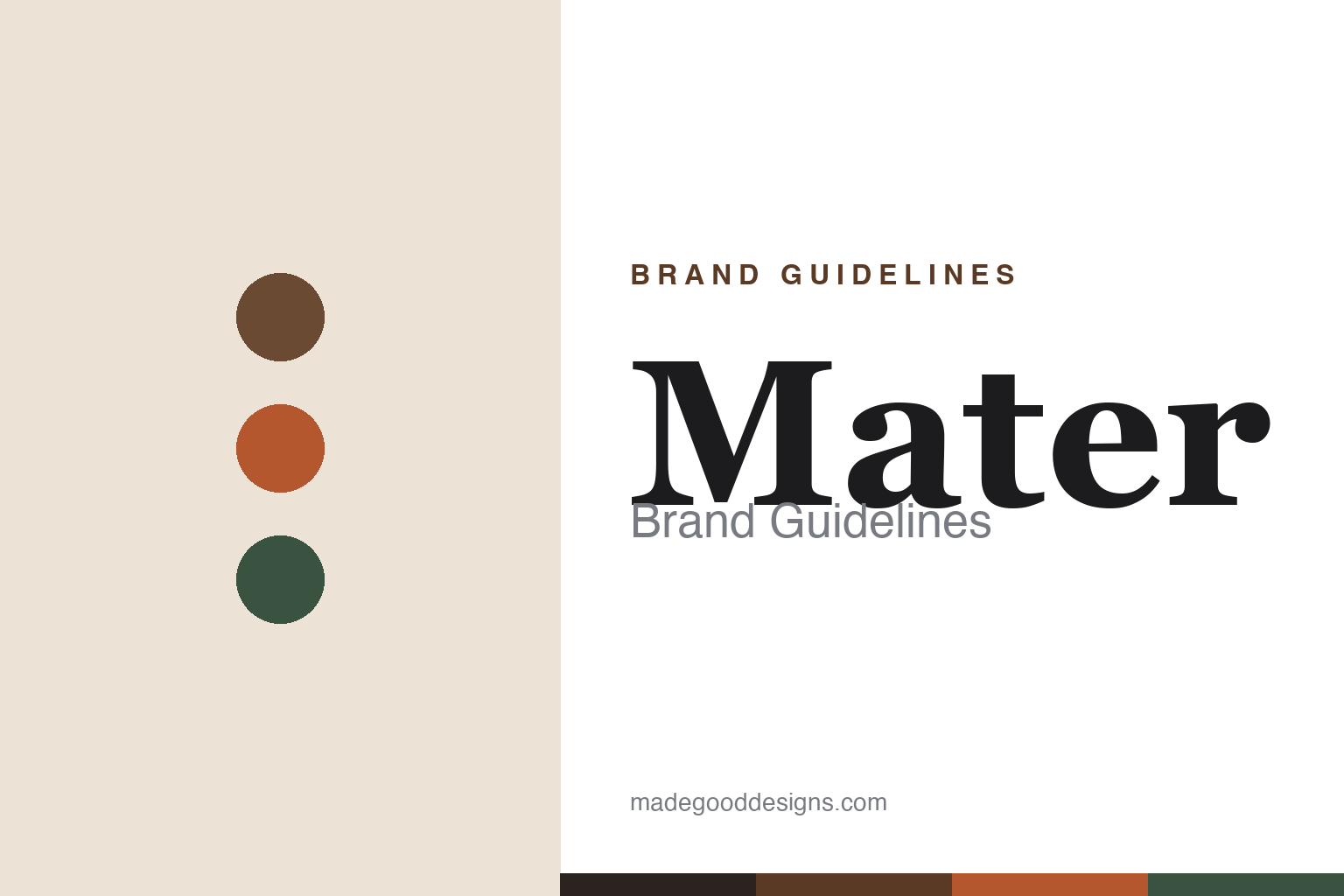
Mater Brand Guidelines
Mother Earth as a mission — waste turned into furniture, and the Matek® material.
Aa
Two constants: an earthy coffee-and-terracotta palette and a warm serif. Abstract homage — not the Mater wordmark.
Mother Earth as mission
Mater builds from waste.
Mater is a lesson in sustainability as the whole brand. It was founded in 2006 in Copenhagen by Henrik Marstrand (still its founder and CEO), and its name carries the mission: “Mater” is Latin for “mother” — a daily reminder of Mother Earth. Mater describes itself as “a pioneering green-tech design brand with sustainability and circularity at its core.” (Two honest notes: no official brand hex is published, and the wordmark typeface is undocumented.)
The brand’s signature is a material. Matek® is a press-moulded composite with a stone- or terrazzo-like look, made from waste fibre plus a plastic binder — documented inputs include coffee-bean husks (from roasting), sawdust and post-consumer e-waste plastic, and since 2024 also a sugarcane-derived biodegradable bioplastic. (A precise correction: the material is Matek, not “Matter” or “Matowa,” and — despite a common myth — it does not contain beer waste.) Alongside it, the Ocean collection is made from recycled fishing nets and hard plastic on a steel frame, with roughly two kilograms of ocean plastic per chair.
Mater’s catalogue pairs that material story with real design. The Ocean Chair reissues a 1955 design by Nanna & Jørgen Ditzel, remade in ocean-waste plastic; the High Stool, Bar Stool and Eternity chair are by Space Copenhagen; and the roster extends to Børge Mogensen, Eva Harlou and others. (An honest note: the Mater “Bowl” is a table by Ayush Kasliwal, not a chair — there is no Mater “Bowl Chair.”) On certification, Mater emphasises FSC-certified wood, a code of conduct and published sustainability reports. Mother Earth as mission.
Colour
Mater lives in an earthy coffee-and-terracotta palette. Click a swatch to copy the hex.
Mater’s identity leans on warm, earthy, natural tones — coffee brown, terracotta, forest green and clay, the colours of its own waste-based materials. The palette reads as grounded, organic and honest: the browns of coffee husk and sawdust, the terracotta of moulded Matek, the greens of a living planet. It’s a tonal world that signals sustainability without shouting it — natural, tactile and warm rather than clinical “eco” green. It’s an earthy palette that signals nature, craft and responsibility. The honest caveat: Mater publishes no official brand hex, so the coffee, terracotta and forest tones here are an original, unofficial interpretation drawn from the spirit of its materials, not first-party values.
The lesson is an earthy palette signals nature and responsibility. Mater’s coffee-and-clay world reads as grounded and honest. For designers, it’s a reminder that warm, natural tones can communicate sustainability more convincingly than a literal “green,” by evoking real materials rather than a badge. The takeaways: use warm, earthy tones to signal nature and craft; let material colour lead; and treat specific hexes as unofficial when there’s no published spec.
Typography
The wordmark is a warm serif — grounded and honest.
Mater’s identity carries a grounded, honest, humane spirit — a “mater” wordmark whose warm, steady letterforms read as considered and trustworthy. A warm serif captures the mood: it’s solid and human, matching a brand built on care for materials, people and the planet. Set against an earthy coffee-and-terracotta palette, the type feels grounded and honest — exactly the responsible, “Mother Earth” personality Mater cultivates across its Matek objects and Ocean furniture. It’s warm and considered rather than cold or techy, mirroring a green-tech brand that still puts craft and ethics first. Because the exact wordmark face isn’t publicly documented, the honest description is “a warm serif spirit,” not a named font. The type behaves like the brand: grounded, warm and honest.
Aa
A warm serif spirit — grounded and honest. (Specimen set in Fraunces, a warm serif in the spirit of the Mater identity; the real face is undocumented.)
Waste as the difference
Mater made rubbish beautiful.
Mater is a lesson in turning waste into desirable design. Plenty of brands add a recycled line as a gesture; Mater’s differentiator is that sustainability is the starting point, engineered into a proprietary material. Matek® takes coffee husks, sawdust and post-consumer plastic — genuine waste streams, sourced from partners across industries — and press-moulds them into a durable, terrazzo-like surface, while the Ocean collection turns discarded fishing nets into chairs. Crucially, Mater pairs that with real design credibility: a reissued 1955 Ditzel chair, a Space Copenhagen stool family, FSC-certified wood and published sustainability reporting. The result is furniture you want because it’s good, not only because it’s green — waste made genuinely beautiful. The lesson is that circularity works best when it produces objects people would choose on their merits, with the sustainability as the deeper reward. Anyone can bolt on a recycled SKU; Mater built the material. Design the waste well, and responsibility becomes desirable. Make the rubbish beautiful.
For designers and brand-builders, Mater offers a clear takeaway: sustainability is most persuasive when it’s also good design. The lessons: build the responsibility into the material itself (Matek, ocean plastic); partner with serious designers so the object stands on its own (Space Copenhagen, the Ditzels); and keep the claims precise — Mater was founded in 2006 by Henrik Marstrand, its material is Matek (coffee husk, sawdust, e-waste — not beer), and it emphasises FSC certification. It’s also a reminder to keep the facts honest: no official brand hex or typeface is published, so the palette and type here are an interpretation. Mater made rubbish beautiful — proof that circular design can be something you actually want.
Explore & save
Keep Mater’s identity on hand — save it to a board in the Made Good inspiration library.
Mater identity set
Pin the earthy palette and the warm-serif spirit to your own board.


