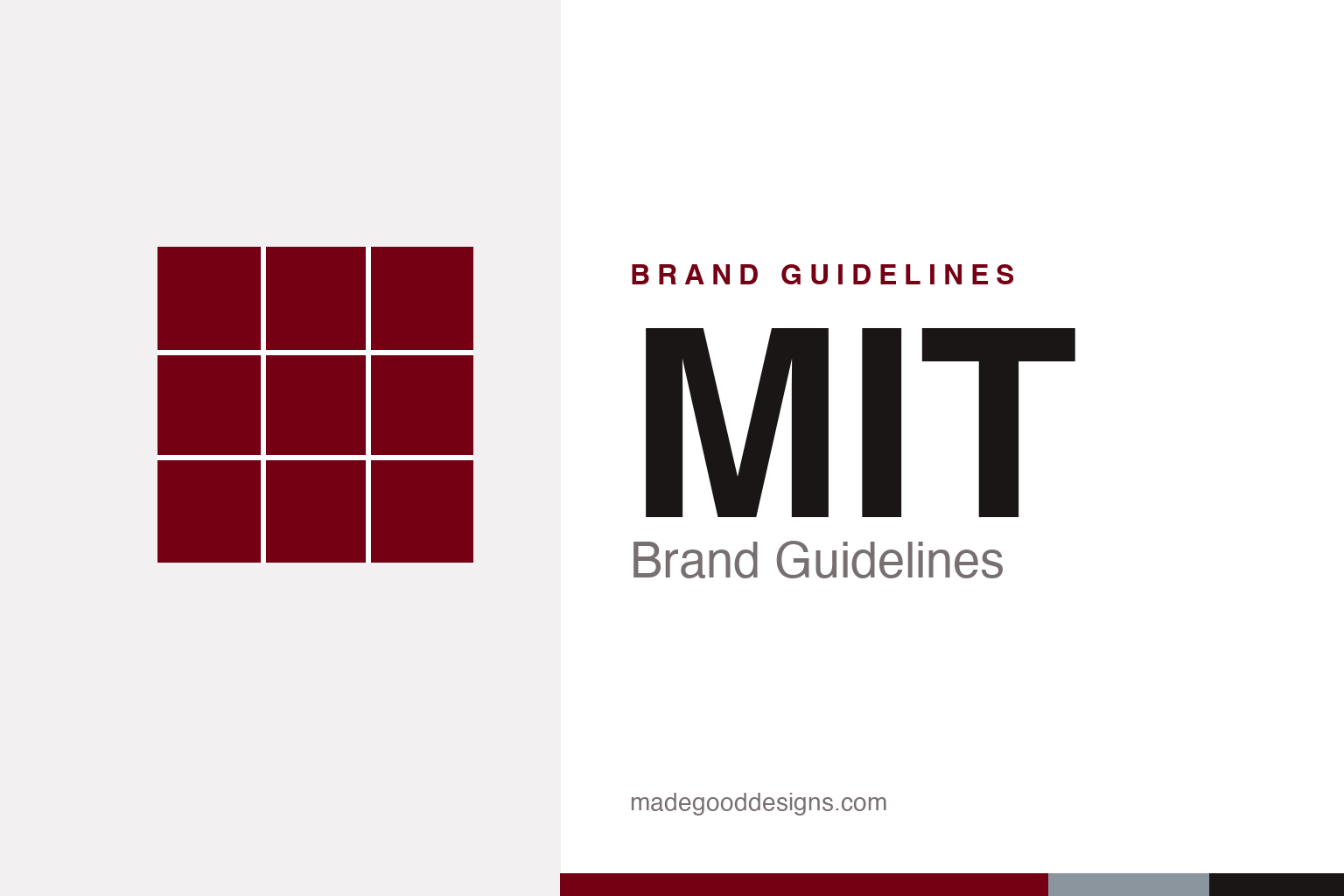
MIT Brand Guidelines
A 150-year-old red, a Swiss grotesque, and the most beloved mark on campus — which isn’t the logo at all.
Aa
Two constants: MIT Red (since 1876) and a rigorous Swiss grotesque. Abstract homage — not the MIT wordmark, seal, or MIT Press colophon.
The mark that wasn’t the logo
Ask a designer about MIT’s identity and they’ll picture seven vertical bars. Here’s the twist: that mark was never the Institute’s logo.
Those bars are the MIT Press colophon, designed by the pioneering designer Muriel Cooper in 1965. Seven strokes abstract the letters “mitp” — and stand, like books on a shelf, for the press itself. The job was first offered to Paul Rand, who turned it down and recommended Cooper; she went on to become one of the most influential designers in computing, shaping how information looks on screens. Her colophon is so good it’s often mistaken for MIT’s institutional mark — which is actually a separate, bold red wordmark. It’s a lovely reminder that a brand is a system of marks, and sometimes the most famous one belongs to a single division.
Colour
MIT has worn the same red since 1876. It just got a precise new value. Click a swatch to copy the hex.
The current MIT Red is #750014 — a deep, serious maroon (Pantone 202C) that the Institute has used since 1876. A recent brand refresh pinned it to that exact value and paired it with a cool Silver Gray (#8b959e) and, for moments that need more energy, a Bright Red (#ff1423). (You’ll still see the older #A31F34 on legacy pages — worth knowing if you’re matching to current standards.) It’s a palette built for gravitas: the red of a 19th-century institution that also happens to build the future.
Typography
MIT sets itself in a Swiss grotesque — clean, neutral, and quietly precise, like the place itself.
The Institute’s primary typeface is Neue Haas Grotesk, which MIT’s own guidelines describe as “a sophisticated digital revival of the original Helvetica design.” It’s a fitting choice: a typeface engineered for clarity, with none of the flourish that would distract from the work. For everyday documents, Arial is the sanctioned fallback, so a spec sheet in Word still feels on-brand. The whole system prizes legibility and restraint over personality — typography as engineering.
Aa Bb Cc
Neutral, precise, Swiss — the type equivalent of a clean equation. (Specimen set in Archivo, a grotesque in Helvetica’s lineage.)
The living logo
MIT’s Media Lab did something few institutions dare: it let an algorithm draw the logo.
In 2011, for the Media Lab’s 25th anniversary, designers Richard The and Roon Kang built a generative identity — a 7×7 grid algorithm that spun out roughly 40,000 unique permutations, so every person and project could carry its own version of the mark. In 2014, Pentagram (Michael Bierut and Aron Fay) streamlined it into a bold “ML” monogram with a system of glyphs for the Lab’s research groups. It’s a distinct chapter from MIT’s main identity — and a landmark example of a brand designed as a living system rather than a fixed logo.
Mens et Manus
Long before the red and the grid, MIT’s identity began with a seal, a motto and a deliberately practical idea of what a university is for.
MIT was chartered in 1861, and its seal — adopted in 1864 — carries the Latin motto “Mens et Manus,” or “Mind and Hand.” The device shows two figures: a scholar with a book and an artisan at an anvil, standing either side of a plinth. That pairing was a genuine statement of intent in an era when book-learning and manual craft were kept firmly apart — MIT was founded on the conviction that theory and practice belong together, that you understand the world by building it. The whole ethos of the Institute’s later design — engineering-grade clarity, restraint over ornament — flows directly from that founding idea.
You can read the modern identity as the seal’s values expressed in colour and type. The deep MIT Red supplies the institutional gravitas of a nineteenth-century charter; the Swiss grotesque supplies the “hand” — precise, unfussy, built to communicate rather than to impress. Even the Institute’s habit of numbering everything, from its buildings to its famous course numbers, is the same “mind and hand” logic made visible: a system designed for use rather than display. It is a rare case where a 160-year-old motto still explains, almost exactly, why a place looks the way it does today — and why its design reads as calm, rigorous engineering rather than decoration.
Explore & save
Keep MIT’s identity on hand — save it to a board in the Made Good inspiration library.
MIT identity set
Pin the red, the grid and the type to your own board and build a living reference.