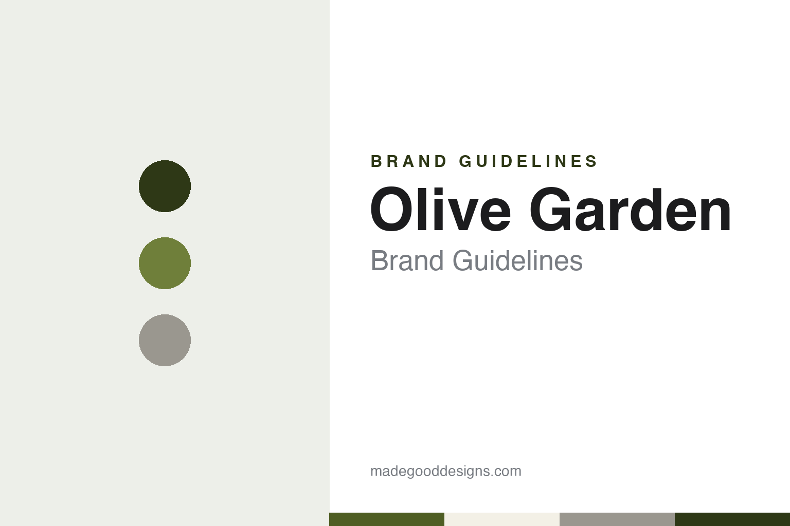
Olive Garden Brand Guidelines
An Orlando restaurant chain from a cereal company’s restaurant division.
Aa
Two constants: an olive branch, ash grey and plaster cream palette and a restrained script serif register. Abstract homage — not an Olive Garden product or mark; no sign, branch or logo is reproduced.
General Mills
A restaurant idea from a food company, opened in Orlando.
Olive Garden began inside a food company. English Wikipedia says the chain started as a unit of General Mills, and that its opening restaurant welcomed guests on 13 December 1982 in Orlando, Florida. The article names four co-founders — Blaine Sweatt, Mark Given, Gino DeSantis and Dave Manuchia — and records that the business traded until 1998 as The Olive Garden, with the definite article as part of the name. Citing the federal trademark record, it gives the legal entity behind the restaurants today as Darden Concepts, Inc., which does business as Olive Garden.
General Mills already ran a seafood chain when the Italian concept opened. Red Lobster, which Bill Darden and Charley Woodsby had started in Lakeland, Florida, in 1968, had been bought by General Mills in 1970, and Wikipedia describes Olive Garden as a sister company of the seafood chain inside the group’s restaurant division through the 1980s. The new restaurants were full-service, sit-down rooms with an Italian-American menu.
The two chains would later share more than an owner. In 1995 General Mills spun off its restaurant holdings as a stand-alone, publicly traded company, and the new business was named Darden Restaurants after Red Lobster’s founder. Darden Restaurants has owned Olive Garden since 1995. Wikipedia places Darden’s headquarters in Orange County, Florida, and gives the chain’s own address as the Darden Center in Orlando, so Olive Garden has stayed in the city where it opened, now as one of several restaurant brands under a single parent.
Three years after the spin-off the name itself was edited. Wikipedia says Olive Garden removed “The” from its name in 1998 as part of a rebranding that introduced the slogan “When you’re here, you’re family”. That line replaced the chain’s original slogan, “Good Times, Great Salad, Olive Garden”, which dated from a period when advertising concentrated on the salad served with meals. When unlimited soup and breadsticks joined the menu, the slogan moved to the family line; Wikipedia records that it changed again in early 2013 to “We’re all family here” and that the older wording later returned.
Colour
Darden, shared buildings and a 2014 renaissance.
Under Darden the chain’s buildings became a tool for the parent company as well as a stage for the brand. Wikipedia, citing a January 2011 report in the Orlando Sentinel, says Darden began testing co-located Olive Garden and Red Lobster restaurants that year, designed for smaller markets: each building had separate entrances and separate dining rooms, but a shared kitchen and support areas, and guests could order only from the menu of the side where they were seated. In 2014, as Darden moved to sell Red Lobster, Wikipedia says it announced that two shared sites would close and the rest would become standalone Olive Garden restaurants.
The same year brought a broad change to the chain’s identity. Bloomberg Businessweek reported on 9 July 2014 that Olive Garden had begun rolling out redesigned décor and a new logo, which the magazine called a two-course re-branding effort. Its design editor, Belinda Lanks, wrote that the overhaul was part of a “brand renaissance” that Darden had announced in March, alongside smaller lunch portions, faster dine-in service and online ordering, and that the logo had not been updated in more than fifteen years.
The magazine described the interior remodel in detail. Some walls were removed to give dining rooms a more open feel, and the remaining walls were painted in brighter hues and hung with modern art in place of the older, darker rooms with their imitation old-world finishes. Plateware became all white. Remodelled restaurants gained a lobby, and a bar area where diners could wait for a table. Businessweek also noted that the logo had been criticised when it was unveiled earlier in the year, and it quoted the design writer John Brownlee of Fast Company’s Co.Design site on the old mark.
The redesign arrived during a contest for control of the parent. In October 2014 Darden shareholders replaced the company’s entire board with a slate nominated by the activist investor Starboard Value, Bloomberg News reported, after a public campaign in which the fund had criticised how Olive Garden was run. Olive Garden remained with Darden afterwards, while Red Lobster, sold to Golden Gate Capital that summer, left the group for good.
Darden also opened the brand to outside operators. Wikipedia, citing Nation’s Restaurant News in 2010 and 2011, says the parent announced plans to expand Olive Garden into international markets, including the Middle East and Asia, through franchising partnerships — a new direction for a company that had traditionally relied on restaurants it owned itself. Wikipedia lists the areas served as including Brazil, Canada, Mexico, the Philippines, Saudi Arabia and India.
Typography
Design and documentation.
A casual-dining chain is recognised on the road before it is recognised on the plate. The sign is usually the first piece of the identity a guest meets: a pole sign near a highway exit, a lettered fascia above the door or a canopy that carries a colour from a long way off. Awnings, striped or plain, do a similar job at street level, giving a restaurant a face that reads the same in a city block and a suburban car park.
Inside, the identity moves from the façade to the room. Menus carry the logo, the typeface and the tone of voice into the guest’s hands, and they change more often than any sign. Interior décor — the lamps, the bar, the wall objects, the chairs on a porch or the booths along a window — is where a chain tells the story it wants to be known for, whether that story is a neighbourhood bar, a country store or a roadside coffee shop.
Because chains remodel, rename and change owners, the questions in each guide stay the same: who started the brand, who owns it now, and how its signs, rooms and marks have changed over time. Each guide separates what independent sources record from what the company says about itself.
Aa
A restrained script serif — the register of a lettered sign over a dining-room door. (Specimen set in Cormorant Garamond, a serif STAND-IN; NOT the Olive Garden logo.)
Olive Garden
A script name, a plant motif and a changing tagline.
The Olive Garden identity has always rested on a lettered name paired with a plant motif, and the 2014 update changed both while keeping the arrangement. Bloomberg Businessweek described the earlier symbol as a loose cursive script with a cluster of grapes set against a stucco-like background. The revised mark, the magazine reported, used a more restrained script on an ash-grey backdrop, with olive branches where the grapes had been — so the plant on the sign finally matched the plant in the name.
The tagline beneath the name changed too. The 2014 logo replaced the words “Italian Restaurant” with “Italian Kitchen”, which Businessweek read as a move toward the language of quicker, freshly prepared food used by fast-casual competitors. Olive Garden told the magazine that the revised mark was “based on work assisted by Lippincott”, a design firm, so the redesign is credited to the chain with an outside agency’s help rather than to a single named designer.
Words have carried as much of the brand as pictures. The 1998 rename, dropping “The” from the sign, and the slogan “When you’re here, you’re family” arrived together, and the family line has outlasted a 2013 attempt to replace it. Advertising built around unlimited salad, soup and breadsticks gave the chain its recurring promises, and Wikipedia records a “Never Ending Pasta Bowl” promotion in the autumn of 2013 and a limited “Never Ending Pasta Pass” sold online in 2014, which Time covered that September. Those names turned a menu offer into a branded event.
The buildings themselves are part of the identity. The 2014 remodels described by Businessweek traded heavier old-world finishes for open rooms, brighter colours and all-white plates, and the co-located restaurants Darden tested from 2011 show how far the chain’s architecture could flex: two brands under one roof, each with its own door and dining room.
For a design guide, Olive Garden shows how a chain can keep the same structure — a script name with a plant beside it and a short descriptor underneath — while editing each part in turn: the article in 1998, the grapes and the background in 2014, and “Restaurant” to “Kitchen” in the same update. Compare it with Red Lobster, its former sister chain under General Mills and Darden, and Chili’s, another casual-dining name built around a single plant. For this guide we use olive branch, ash grey and plaster cream with a serif, an unofficial interpretation; no product or logo is reproduced.
Explore & save
Keep Olive Garden’s identity on hand — save it to a board in the Made Good inspiration library.
Olive Garden identity set
Pin the Olive Garden olive branch, ash grey and plaster cream palette and the restrained script serif register to your own board.
