Sbarro Brand Guidelines
A Brooklyn salumeria, a mall food court and a slice outline.
Aa
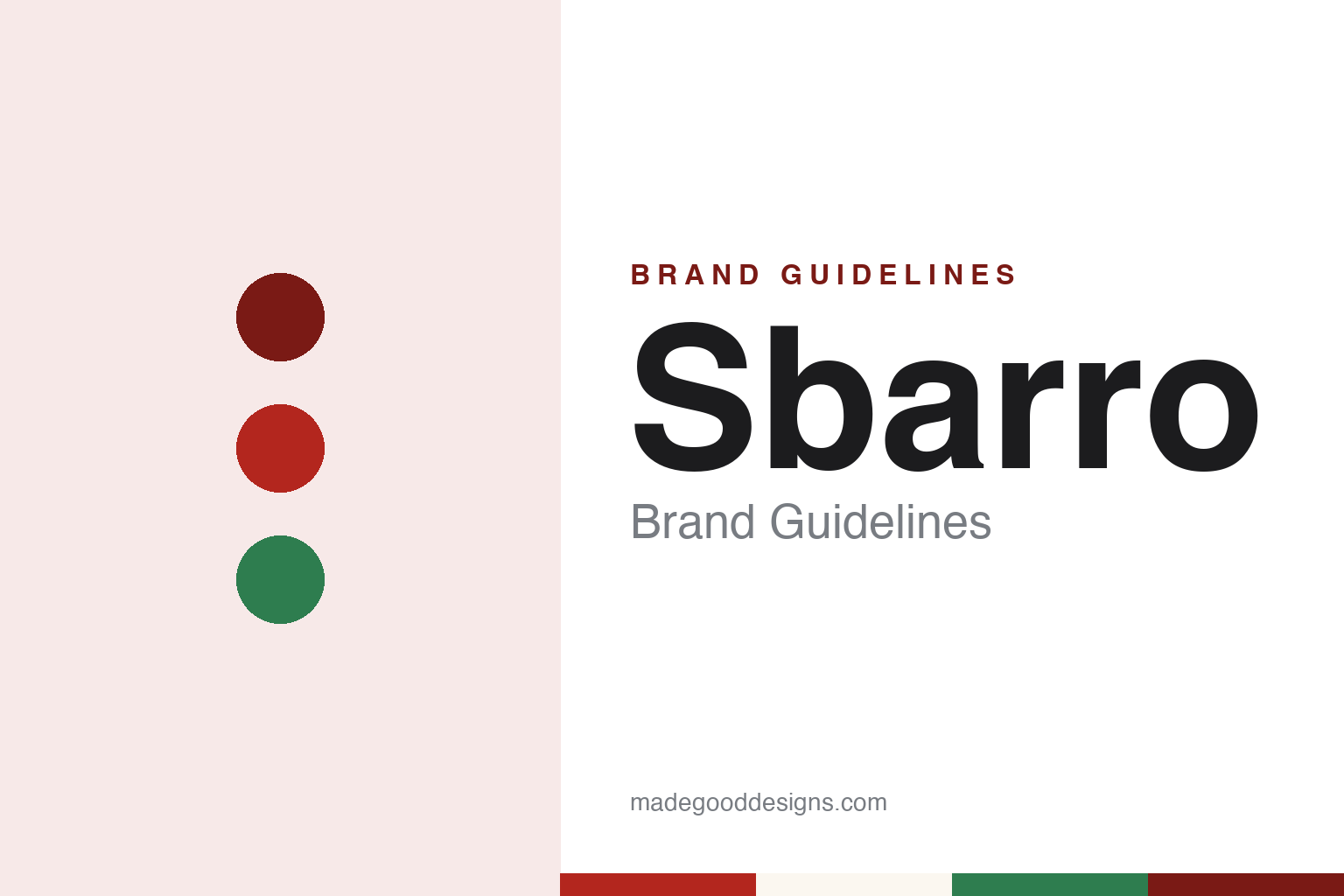
Two constants: a slice red, basil green and counter cream palette and a condensed signboard sans register. Abstract homage — not a Sbarro product or mark; no slice outline, sign or logo is reproduced.
Mama’s kitchen
A family shop in Brooklyn, then a counter in a mall.
Sbarro dates itself to 1956, when Gennaro and Carmela Sbarro opened an Italian salumeria — a delicatessen — in Brooklyn. The company’s own account says Carmela, known as “Mama” Sbarro, made pizza slices for shift workers who wanted a quick meal, and that the slices proved popular enough for the family to open a second shop devoted to pizza. English Wikipedia records that the couple and their three sons, Joseph, Mario and Anthony, had emigrated to the United States from Naples, and that the original location closed in 2004.
Eater, in a long feature by Gloria Dawson published in May 2016, told the same story from outside the company. It described the business as a family-owned Italian deli in Brooklyn, said Carmela ran the kitchen there until the early 2000s, and said the shop closed when she was no longer able to work. As the business grew into a chain, Eater reported, the three sons worked on the expansion.
The move that shaped the brand came in 1970, when Sbarro opened a restaurant in the Kings Plaza Shopping Center in Brooklyn. Eater quoted Anne Pritz, then Sbarro’s chief marketing officer, saying further mall openings followed the success of that site as malls and quick-service food grew in popularity. From there Sbarro counters appeared in shopping centres across the country, and the name became tied to the food court: Eater wrote that for many shoppers in the 1980s and 1990s a Sbarro slice was part of a weekend at the mall.
The chain also travelled abroad through franchise partners. Wikipedia dates the arrival of Sbarro in the Philippines to 1990, records a franchise agreement announced in March 2012 with Upper Crust Foods to open restaurants in the Indian state of Maharashtra, and says that in November 2020 Sbarro agreed a partnership with the UK retail group EG Group to enter the British market, starting at a forecourt site in Birmingham.
Colour
Private equity, two reorganisations and a move to Ohio.
The founding family’s control ended in the mid-2000s. Eater reported that in late 2006 the private equity firm MidOcean Partners announced it would acquire Sbarro, and that by 2007 the founding brothers were no longer involved in the company; Wikipedia gives early 2007 for the completed acquisition and describes MidOcean as a firm with offices in New York and London.
Two court reorganisations followed. Sbarro filed for Chapter 11 protection on 4 April 2011 and, according to Wikipedia, emerged that November under a plan that ceded ownership to its lenders. It filed again in March 2014 and left bankruptcy protection on 2 June 2014, Wikipedia says, closing a number of locations and announcing that it would move its headquarters from New York City to Columbus, Ohio. Eater confirmed the move in 2016, noting that the company had opened several stand-alone, off-mall restaurants in the Columbus market after relocating there.
New management came with the reorganisations. Wikipedia records that James J. Greco became chief executive in January 2012 to lead a turnaround that included a revised pizza recipe, new menu items and updated branding, and that J. David Karam was named chief executive in March 2013. In October 2013 Sbarro opened a fast-casual concept called Pizza Cucinova, with Neapolitan-style pizzas made to order; Wikipedia says its locations in Ohio and Texas closed in 2020.
Eater framed the post-2014 strategy as an attempt to reconnect the brand with its beginnings. Pritz told the publication that the company had been working in what she called the “Italian eatery space” and wanted to focus on the large New York slice, and the menu was trimmed accordingly. Part of that repositioning, Eater wrote, was to remind customers that the chain had started as a family deli in Brooklyn, even though the Sbarro family had not been part of the company for close to a decade.
Today the business trades as Sbarro LLC, the name that appears on its website, which presents the chain’s New York slice and its Brooklyn history side by side.
Typography
Design and documentation.
A pizza chain’s identity is carried by a handful of everyday objects more than by any single advert: the box that leaves the counter, the sign above the door, the shape of the building itself and, for some names, a character who stands in for the company. Each of these is a surface that the brand reaches customers through, often far from any office where the identity was drawn.
The box is the piece most people handle. It travels home, sits on a table and is printed in large numbers, so its lid tends to carry the name, a colour scheme and sometimes a slogan or illustration. Storefront signs do similar work at street level, in shopping centres and in food courts, where a name and a colour have to be read quickly and from a distance.
Buildings and mascots add a further layer. A distinctive roofline, an interior theme or a costumed figure can become part of how a chain is recognised, and those elements may be kept, revised or dropped as owners change. Each guide that follows records who started the chain, who has owned it over time and how its name, signs and marks have been presented, separating what independent sources report from what the company says about itself.
Aa
A condensed signboard sans — the register of a food-court fascia read from across a concourse. (Specimen set in Oswald, a sans-serif STAND-IN; NOT the Sbarro logo.)
Sbarro
From a flag to a slice.
For much of its life in the malls, Sbarro’s mark drew on the Italian flag. Eater described the older logo in 2016 as thick lettering set over the flag, a sign that announced an Italian eatery rather than a particular kind of pizza. Eater reported that the menu had grown along with the chain in the late 1990s and early 2000s.
The identity changed in January 2015. Wikipedia dates the switch to that month and describes the new design as an outline of a pizza slice in red and green, carrying the words “NYC.1956” as a reminder of the Brooklyn origins. Eater gave a closer reading: the name “Sbarro” cuts through the centre of the slice, and “NYC. 1956” sits on top as an homage to the original restaurant. The colours stayed in the same family as the flag, but the shape now pointed to one product — the large New York slice that Pritz told Eater the company wanted to be known for.
The change reached beyond the logo. Eater reported that Sbarro’s new stand-alone restaurants in Ohio had sleek designs and menu boards emphasising freshness, and Wikipedia says the rebranding that followed the 2011 reorganisation covered the recipe, the food offer and the branding together. The company’s current website leans into the same story, with pages devoted to the original salumeria, to Carmela Sbarro and to the family, and a light-hearted “Fold School” on how to eat a New York slice by folding it.
The name on every sign is the founders’ family name, and Wikipedia notes that the company stylises it in capital letters.
For a design guide, Sbarro shows how a chain can move from a general national symbol to a single product shape while keeping a founding date in view. Compare Domino’s and Pizza Hut. For this guide we use slice red, basil green and counter cream with a condensed sans, an unofficial interpretation; no product or logo is reproduced.
Explore & save
Keep Sbarro’s identity on hand — save it to a board in the Made Good inspiration library.
Sbarro identity set
Pin the Sbarro slice red, basil green and counter cream palette and the condensed signboard sans register to your own board.