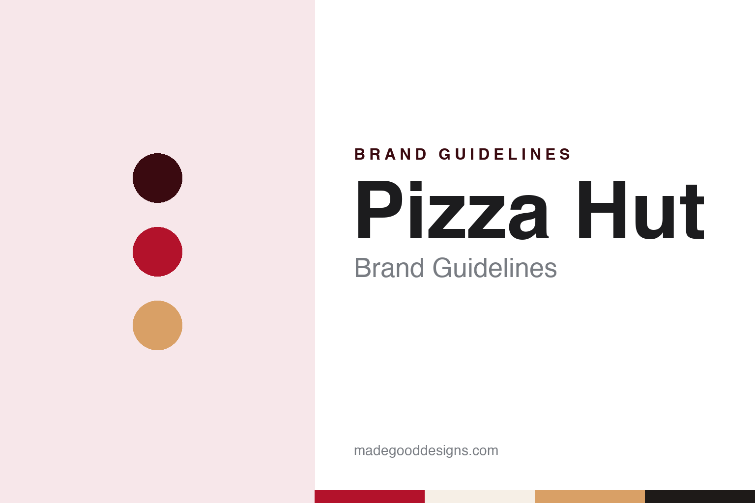
Pizza Hut Brand Guidelines
The Wichita red roof that became a logo.
Aa
Two constants: a roof red, crust tan and ink palette and a heavy slab serif register. Abstract homage — not a Pizza Hut product or mark; no roof, box or logo is reproduced.
Wichita
Two brothers, an eight-letter sign and a roof.
Pizza Hut opened on 31 May 1958 in Wichita, Kansas. English Wikipedia says it was started by the brothers Dan and Frank Carney while both were students at Wichita State University, and that they chose the name Pizza Hut because the sign they had could hold eight letters. The company’s own blog, in a 2015 post on the history of its buildings, describes the original restaurant as a simple red-brick building and says the brothers incorporated and recruited a franchisee to open a second Pizza Hut in Topeka, Kansas, a year later. Wikipedia dates the start of franchising to 1959 and says the Carneys took the company public in 1969.
The early restaurants did not have the roof that later defined the brand. Their roadside signs carried a cartoon chef called Pizza Pete, and the company blog says Pete appeared with the original logo on the early restaurants. Wikipedia says the character was later replaced on signage by a graphic red-roof emblem.
The roof itself arrived in 1969, according to the company blog, when the chain was beginning to grow abroad and the brothers wanted a way to make their restaurants stand apart from competitors. They turned to Richard D. Burke, a Wichita architect and artist who had been their college friend and fraternity brother. The blog says Burke agreed to be paid for each restaurant built to his design rather than taking a fee up front, and it quotes one of the architects who worked with him describing the design as a fusion of common sense, the architectural taste of the 1950s and the need for a building that would be both noticeable and appealing in many different settings. English Wikipedia also records an attribution of the building style to the Chicago architect George Lindstrom, dated 1963. The blog adds that the design was patented and that, in the same year it was being drawn, Pizza Hut opened restaurants in Canada, Mexico, Germany and Australia.
The building became a subject for architectural writers. In Orange Roofs, Golden Arches (Knopf, 1986), cited by Wikipedia, the critic Phillip Langdon described the Pizza Hut roof as a structure considered outside the realm of significant architecture yet quick to reflect shifts in popular taste, and one that rarely appeared in architectural journals. Curbed, in a 2014 survey of former Pizza Hut buildings cited by Wikipedia, noted that many traditional buildings with shingled roofs and trapezoidal windows were still standing in 2004, although the company had stopped building the form when it shifted toward delivery.
Colour
PepsiCo, Yum! Brands and a two-part sale in 2026.
Pizza Hut has changed owners several times. PepsiCo acquired the company in November 1977, English Wikipedia says, and kept it for two decades, under the owner of Pepsi. On 30 May 1997 PepsiCo spun off Pizza Hut, Taco Bell and Kentucky Fried Chicken into a new company, Tricon Global Restaurants; the Chicago Tribune reported the plan in January 1997. Tricon took the name Yum! Brands on 22 May 2002. Wikipedia gives Pizza Hut’s headquarters as Plano, Texas, where KFC is also based.
The restaurants changed shape as the business did. Wikipedia says that in the mid-1980s the company moved into delivery and carryout units and a fast-food “Express” format, often placed alongside sister brands in food courts, campuses and stores. An upscale Pizza Hut Italian Bistro followed in 2004, using a burgundy and tan scheme in place of black, white and red. Since 2019, Wikipedia says, some restaurants have been remodelled as Pizza Hut Classic locations whose interiors recall the 1980s and 1990s; citing The New York Times of March 2026, it describes the Classic model as a partnership between the company and its franchisees to celebrate the chain’s heritage.
The latest change of ownership came in 2026. Yum! sold Pizza Hut in two separate transactions. The brand in mainland China went to Yum China Holdings in August 2026; Wikipedia notes that Pizza Hut’s China restaurants were already run by Yum China, the company Yum! spun off in 2016. On 1 September 2026, Nation’s Restaurant News reported that the private equity firm LongRange Capital had completed its acquisition of Pizza Hut outside mainland China, ending the chain’s place in Yum! since 1997. LongRange Capital has owned Pizza Hut outside mainland China since September 2026.
The new owner took over in the middle of a leadership change. Nation’s Restaurant News reported that Eduardo Luz, previously chief executive of P.F. Chang’s and earlier an executive at Panera Bread and Kraft Heinz, was serving as interim chief executive, after Aaron Powell, global chief executive since 2021, announced on 14 August 2026 that he was stepping down. In a statement quoted by NRN, Luz said that as a standalone business Pizza Hut was now focused on its guests, franchisees and teams, and that the company planned to invest in the brand.
Typography
Design and documentation.
A pizza chain’s identity is carried by a handful of everyday objects more than by any single advert: the box that leaves the counter, the sign above the door, the shape of the building itself and, for some names, a character who stands in for the company. Each of these is a surface that the brand reaches customers through, often far from any office where the identity was drawn.
The box is the piece most people handle. It travels home, sits on a table and is printed in large numbers, so its lid tends to carry the name, a colour scheme and sometimes a slogan or illustration. Storefront signs do similar work at street level, in shopping centres and in food courts, where a name and a colour have to be read quickly and from a distance.
Buildings and mascots add a further layer. A distinctive roofline, an interior theme or a costumed figure can become part of how a chain is recognised, and those elements may be kept, revised or dropped as owners change. Each guide that follows records who started the chain, who has owned it over time and how its name, signs and marks have been presented, separating what independent sources report from what the company says about itself.
Aa
A heavy slab serif — the register of a roadside sign and a pizza box lid. (Specimen set in Alfa Slab One, a slab-serif STAND-IN; NOT the Pizza Hut logo.)
Pizza Hut
A building turned into an emblem, set aside and brought back.
The Pizza Hut identity is a building turned into a sign. The company blog says that after 1971 the red roof was folded into the logo to fix it as the brand’s image, at the expense of Pizza Pete, and that the roof stayed part of its heritage even at its Express locations. Wikipedia notes that some people read the emblem as a wide-brimmed red hat, especially in German-speaking countries, where the word Hut means hat.
In 2014 the logo changed shape. Wikipedia dates the start of that rebrand to 19 November 2014 and says it brought redesigned employee uniforms. CNN Business, describing the mark in 2019, said the 2014 version dropped the black lettering, turned the roof from red to white and set it inside a round red shape meant to represent a splotch of tomato sauce, and that it arrived with the slogan “The Flavor of Now”.
On 25 June 2019 CNN reported that Pizza Hut was bringing back its retro logo, which CNN said the company had used from 1967 to 1999. Compared with the round mark, CNN said, the older version gave the red roof more prominence and set the Pizza Hut name in a bolder, black letterform. The chief brand officer, Marianne Radley, told CNN that the two logos would be used interchangeably, that the classic logo would begin appearing on packaging later that year, and that the change was not a major rebrand involving store remodels; it would appear in television advertising that week. Wikipedia also records the return of the red roof design in the same announcement.
By 2015 the company blog was acknowledging that many of its newer restaurants had abandoned the red roof for a more modern design, while describing the story behind the roof as one the company was proud of.
For a design guide, Pizza Hut shows how a roof shape drawn for buildings can outlast the buildings themselves, surviving a round tomato-sauce logo and returning to the packaging after five years. Compare it with KFC, its sister brand under Yum! from 1997 to 2026, and Domino’s, a rival pizza chain whose mark is built from a domino tile. For this guide we use roof red, crust tan and ink with a slab serif, an unofficial interpretation; no product or logo is reproduced.
Explore & save
Keep Pizza Hut’s identity on hand — save it to a board in the Made Good inspiration library.
Pizza Hut identity set
Pin the Pizza Hut roof red, crust tan and ink palette and the heavy slab serif register to your own board.